Software
Houzz Logo Print
linds1

Need a wall colour for a "wee-bit beachy" white kitchen!

10 years ago

Hi all,

I'm scratching my head over this and hoping to get some help! We're doing a full kitchen reno and am trying to finalize wall colour before my hubby finishes mudding/taping/sanding the walls....

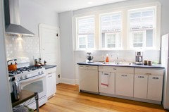
Here's the general run-down: crisp white shaker cabinets, minimal uppers, a couple floating shelves in a mid-tone wood kept natural (that will be for white, everyday dishware and a few decorative pieces), mid-tone quartz with browns predominant, cream/white and some black flecks (berkeley by cambria), white subway tile backsplash, stainless appliances, mid-to-dark tone hardwood floor. I have a couple pendant lights for above the peninsula that are in a clear seed-glass.

The room gets a lot of light with south-west exposure though we're on the west coast (Nanaimo, Vancouver Island) so a fair number of gloomy days too! Some colours seem to look a little washed out during the day in our space so want something with some "strength" to it but not super dark.

I'm envisioning a slightly beachy feel without going too obvious. Want the space to be fresh but also cozy. Thinking of blue-greens and are devoted Benjamin Moore fans. Any ideas??? HUGELY appreciate any help!


Comments (24)

  • 10 years ago

    Hi csch, thanks for a quick reply! I can't seem to find this colour on my BM colour deck...

  • 10 years ago
    I like BM elephant gray. Beachy feel goes great with white.
    Lindsay White thanked Liza Wild
  • 10 years ago

    Thanks Liza! I hadn't considered anything like elephant gray. Under my dreary basement lighting (where I happen to be right now!), this looks be to a brownish-grey. My initial thought was to go toward a bluish-green colour. Thanks for broadening my horizons!

  • 10 years ago
    last modified: 10 years ago

    It's AF-20 cream w/yellow undertones

    Mascarpone


    I also also like mayonnaise for a creamy white

    http://www.benjaminmoore.com/ShowPropertyServlet?nodePath=/BEA%20Repository/imagerepository/article_images_new/Interior/Bathroom/IA_int_blue_bathroom_02//zoom_image.content_en_US

    Mayonnaise

    2152-70

    Of course there's simply white or chantilly lace for a bit cooler tones. You may have different names in Canada.

  • 10 years ago

    Thanks again csch! My BM colour deck doesn't have any colours listed with AF (maybe different country?). Unfortunately, I think any off-white or light cream colours would get completely washed-out in my kitchen. I have Revere Pewter in another room (exact same side of house with same south-west exposure) and it barely reads as anything beyond a slightly off-white during the day.

  • 10 years ago
    last modified: 10 years ago
    Lindsay White thanked csch
  • 10 years ago

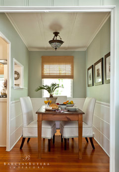
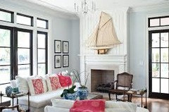
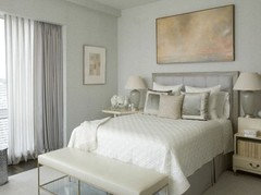
    I know that Glass Slipper has been popular.

    Here are a few others. These are all BM paints Night Mist
    Emerald Vapor
    Genesis White
    Tranquility
    Some of these colors are probably not as saturated as you wish.

    Lindsay White thanked emmarene9
  • 10 years ago

    Really appreciate your suggestions csch! I'll have to look at bit more for these colours. The only one that I can find on my BM deck is Sandy Hook gray! I have the "designer classics" deck and the "colour preview collection" deck that I bought a little over a year ago. I'm in Canada and wondering if there are some variations in the names from country to country? I like Sandy Hood gray though! thanks again.

  • 10 years ago

    emmarene - Love the look of Glass slipper! Thanks for the pictures!

    Darzy - I've been toying with the idea of gray cashmere! Do you think the next one down in the colour deck (misted green) might work as well or is that too dark for the "fresh-ish", "beach-ish" (you can tell I have commitment issues!) look i'm striving for?

  • 10 years ago

    For a beach-ish, fresh look I wouldn't go much darker than the gray cashmere but if you'd like a more "sunset beach" mood...go for the misted green. But, I vote the lighter one if your furnishings on the lighter side. If you have mid/dark hardwood floors, I think the cashmere may be best. It also depends on your nearby furnishings? Sofa color and side tables?

    Lindsay White thanked Darzy
  • 10 years ago

    csch - I love Vancouver Island too! We've just moved back after 15 years on the other side of the country. Would be great to head down to Washington for paint (the Canadian dollar is so low, I could buy a LOT of paint on the other side of the border right now!). Sadly, it a 2 hour ferry plus a lot of driving.. One of these days! Love that dining room picture!

    Darzy - thanks for the advice. Yep, I'm thinking more "chillin' on a nice day" kind of beachy as opposed to sunset. Good way of narrowing it down for me! Our dining room is next door (not open concept but you DO have to see "through" the dining room to see the kitchen if standing in my living room - does that make sense?). In fact, that raises a good point since the DR is BM Amherst gray (though we do get a lot of sun in that room as well)...... But pretty dark colour with dark wood table/chairs. But it the Amherst gray does seem to have greeny undertones so maybe cashmere gray would work with it?


  • 10 years ago
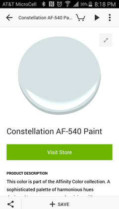
    Great BM neutral light blue/green.
    Lindsay White thanked Jamie
  • 10 years ago
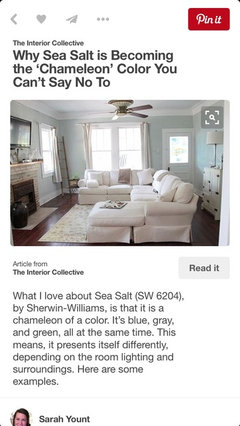
    Check out Sherwin Williams Seasalt if your willing to cheat on BM! It's a very popular color and sounds like it might fit the bill.
    Lindsay White thanked User
  • 10 years ago
    My all time favorite paint colors are SW amazing grey and restoration hardware silver sage.
    Lindsay White thanked Emily Gower
  • 10 years ago
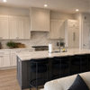
    Here's a pic. Check out Houzz photos with this color as well.
    Lindsay White thanked User
  • 10 years ago

    Thanks everyone! Jamie - Constellation looks beautiful. I can't get it on my colour deck (though I'm actually thinking that the local store should be able to look up these colours and make them for me special order if I commit to one that isn't part of their normal Canadian offerings...). From how it looks on my monitor, I think this colour might get washed out in my bright room..?

    Scootersassy - VERY intrigued by this "chameleon colour". Might have to do some googling on SeaSalt. Could I be woo'ed away from BM???... Will have to stay tuned!

    Emily - I like the sounds of "silver sage" - will have to check it out.

  • 10 years ago
    last modified: 10 years ago

    This post has pictures with many different BM colors. It also features many beach houses:

    http://www.homebunch.com/the-best-benjamin-moore-paint-colors/

    This website shows many beachy type kitchens:

    http://www.houseofturquoise.com

    Remember to test a sample. Colors on a monitor can be off.

    I was also going to recommend SW Sea Salt, but you said BM, but Sea Salt looks like a great color.

    Lindsay White thanked jhmarie
  • 10 years ago

    jhmarie - thanks for these links! Lots of inspiring pictures for me to drool over....

  • 10 years ago

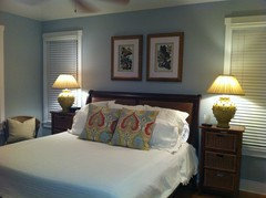
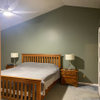
    Not to drool over, but here's a pic of Misted Green in our kitchen:


    It's really a pretty color and brighter in full daylight. It works in our home, but may be dark for yours. Hope this image helps!

  • 10 years ago
    Linds1 - Benjamin Moore has many fan decks of colors. I believe the colors that have an AF prefix are in the Affinity book. If you have a Benjamin Moore dealer close to you, I recommend going by and getting paint chips for ideas.
  • 10 years ago

    Have you found anything?

  • 10 years ago

    Thanks everyone for all the great advice! We went with BM Cashmere Gray in the end. The white cabinets are going in and I think this colour is going to work great - a nice soft watery colour that isn't too dark or too light. So appreciate everyone's help.

  • 10 years ago

    Cashmere Gray is also a color I looked at - it should be pretty!