

Backsplash help for granite island and quartz perimeter
10 years ago
last modified: 10 years ago


Sort by:Oldest
Comments (2)
Related Stories
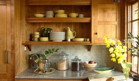
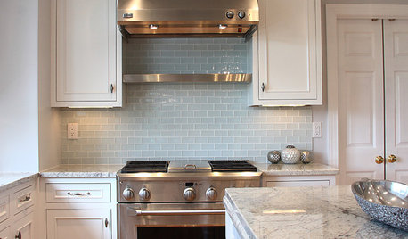
KITCHEN BACKSPLASHESHow to Choose a Backsplash for Your Granite Counters
If you’ve fallen for a gorgeous slab, pair it with a backsplash material that will show it at its best
Full Story
KITCHEN DESIGNKitchen Counters: Stunning, Easy-Care Engineered Quartz
There's a lot to like about this durable blend of quartz and resin for kitchen countertops, and the downsides are minimal
Full Story
KITCHEN DESIGNKitchen Sinks: Granite Composite Offers Superior Durability
It beats out quartz composite for strength and scratch resistance. Could this kitchen sink material be right for you?
Full Story
KITCHEN DESIGNKey Measurements for Your Kitchen Design
Get the ideal kitchen setup by understanding spatial relationships, dimensions and work zones
Full Story
MOST POPULAR7 Ways to Design Your Kitchen to Help You Lose Weight
In his new book, Slim by Design, eating-behavior expert Brian Wansink shows us how to get our kitchens working better
Full Story
KITCHEN DESIGN5 Favorite Granites for Gorgeous Kitchen Countertops
See granite types from white to black in action, and learn which cabinet finishes and fixture materials pair best with each
Full Story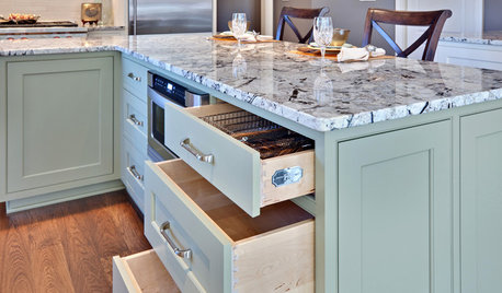
KITCHEN DESIGNWhat Goes With Granite Counters?
Coordinate your kitchen finishes beautifully by choosing colors that complement granite’s natural tones
Full Story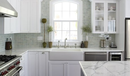
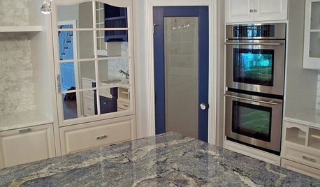
KITCHEN COUNTERTOPSKitchen Counters: Granite, Still a Go-to Surface Choice
Every slab of this natural stone is one of a kind — but there are things to watch for while you're admiring its unique beauty
Full Story

eam44
User
Related Professionals
Owensboro Kitchen & Bathroom Designers · Traverse City Kitchen & Bathroom Designers · Watertown Kitchen & Bathroom Designers · Glenwood Springs Kitchen & Bathroom Designers · Marietta Kitchen Remodelers · Killeen Kitchen Remodelers · Lynchburg Kitchen Remodelers · Marinette Kitchen Remodelers · Milwaukee Kitchen Remodelers · Los Angeles Kitchen Remodelers · San Francisco Kitchen Remodelers · Amarillo Kitchen Remodelers · Toronto Kitchen Remodelers · Fort Worth Custom Countertops · Honolulu Custom Countertops