

Help with paint colours
10 years ago
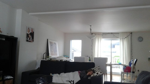
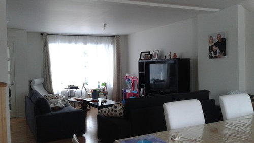
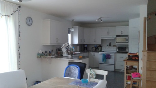
Featured Answer
Sort by:Oldest
Comments (6)
 10 years ago
Related Professionals
Gulfport Interior Designers & Decorators · Grand Rapids Interior Designers & Decorators · Stockton Interior Designers & Decorators · Durango Interior Designers & Decorators · Dodge City Interior Designers & Decorators · Salina Kitchen & Bathroom Designers · Athens Kitchen & Bathroom Designers · Waco Kitchen & Bathroom Designers · North Adams Kitchen & Bathroom Designers · Lansing Kitchen & Bathroom Designers · Stockton Kitchen & Bathroom Designers · Twin Falls Kitchen & Bathroom Designers · Fairbanks Kitchen & Bathroom Designers · Phoenix Furniture & Accessories · Coos Bay Furniture & Accessories 10 years ago
- 10 years ago
- 10 years ago
 10 years ago

Related Stories

EXTERIORSHelp! What Color Should I Paint My House Exterior?
Real homeowners get real help in choosing paint palettes. Bonus: 3 tips for everyone on picking exterior colors
Full Story
COLORColor Palette Extravaganza: Room-by-Room Help for Your Paint Picks
Take the guesswork out of choosing paint colors with these conveniently collected links to well-considered interior palettes
Full Story
ENTRYWAYSHelp! What Color Should I Paint My Front Door?
We come to the rescue of three Houzzers, offering color palette options for the front door, trim and siding
Full Story
COLORPick-a-Paint Help: How to Create a Whole-House Color Palette
Don't be daunted. With these strategies, building a cohesive palette for your entire home is less difficult than it seems
Full Story
COLORPick-a-Paint Help: 11 Ways to Mine Your World for Colors
Color, color everywhere. Discover the paint palettes that are there for the taking in nature, shops and anywhere else you roam
Full Story
COLORPaint-Picking Help and Secrets From a Color Expert
Advice for wall and trim colors, what to always do before committing and the one paint feature you should completely ignore
Full Story
COLORPick-a-Paint Help: How to Quit Procrastinating on Color Choice
If you're up to your ears in paint chips but no further to pinning down a hue, our new 3-part series is for you
Full Story
HOUZZ TOURSMy Houzz: Saturated Colors Help a 1920s Fixer-Upper Flourish
Bright paint and cheerful patterns give this Spanish-style Los Angeles home a thriving new personality
Full Story
DECORATING GUIDESCould a Mission Statement Help Your House?
Identify your home’s purpose and style to make everything from choosing paint colors to buying a new home easier
Full Story
DECORATING GUIDESDownsizing Help: Color and Scale Ideas for Comfy Compact Spaces
White walls and bitsy furniture aren’t your only options for tight spaces. Let’s revisit some decorating ‘rules’
Full Story

Annie Deighnaugh