

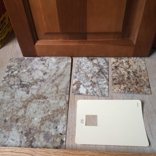
kitchens counter decision
10 years ago
Featured Answer
Sort by:Oldest
Comments (22)
 10 years ago
Related Professionals
Belleville Interior Designers & Decorators · Aberdeen Interior Designers & Decorators · Cookeville Interior Designers & Decorators · La Crosse Interior Designers & Decorators · Pullman Interior Designers & Decorators · Bronx Interior Designers & Decorators · Anderson Architects & Building Designers · Beaumont Architects & Building Designers · Laredo Architects & Building Designers · Kearney Architects & Building Designers · Lima Architects & Building Designers · Tampa Kitchen & Bathroom Designers · Huntington Kitchen & Bathroom Designers · Bloomington Kitchen & Bathroom Designers · Winona Kitchen & Bathroom Designers 10 years ago
- 10 years ago
 PRO10 years agolast modified: 10 years ago
- 10 years ago
 10 years ago
- 10 years ago
- 10 years ago
 10 years ago
- 10 years ago
- 10 years ago
 10 years ago
- 10 years ago
 PRO10 years ago
- 10 years ago
- 10 years ago
- 10 years ago
 PRO10 years ago
- PRO10 years ago
- 10 years ago
 10 years ago

Related Stories
KITCHEN COUNTERTOPS10 Great Backsplashes to Pair With Stainless Steel Counters
Simplify your decision-making with these ideas for materials that work well with stainless steel counters
Full Story
KITCHEN DESIGNThe Best Backsplashes to Pair With Wood Counters
Simplify your decision-making with these ideas for materials that work well with wood counters
Full Story
KITCHEN BACKSPLASHES10 Top Backsplashes to Pair With Concrete Counters
Simplify your decision making with these ideas for materials that work well with concrete
Full Story
DECORATING GUIDESThe Dumbest Decorating Decisions I’ve Ever Made
Caution: Do not try these at home
Full Story
KITCHEN COUNTERTOPS10 Top Backsplashes to Pair With Soapstone Countertops
Simplify your decision-making process by checking out how these styles work with soapstone
Full Story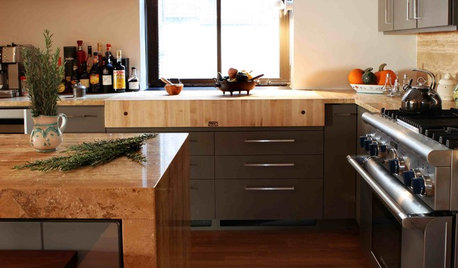
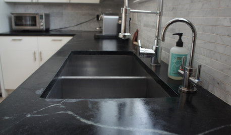
KITCHEN DESIGNSoapstone Counters: A Love Story
Love means accepting — maybe even celebrating — imperfections. See if soapstone’s assets and imperfections will work for you
Full Story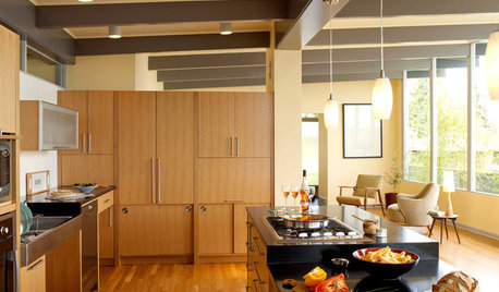
KITCHEN DESIGNThe Kitchen Counter Goes to New Heights
Varying counter heights can make cooking, cleaning and eating easier — and enhance your kitchen's design
Full Story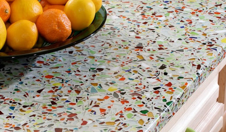
KITCHEN DESIGNKitchen Counters: Sturdy, Striking Recycled Glass With Cement
Ecofriendly and full of character, this heat- and scratch-resistant material is a great fit for custom kitchen counters
Full Story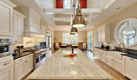
KITCHEN COUNTERTOPSKitchen Countertops: Granite for Incredible Longevity
This natural stone has been around for thousands of years, and it comes in myriad color options to match any kitchen
Full Story


Sativa McGee Designs