Software
Houzz Logo Print
lorraineg570

Two tone cabinet help?

10 years ago
last modified: 10 years ago


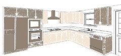
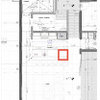
Hey folks. I'm putting latitude cabinets (from Lowes) in my new kitchen (floor plan above). There is also a 30" x 7' island that I left out of the picture because then you can't see half of the cabinets. The cabinets are very contemporary flat panel, full overlay. I'm trying to
nail down my colors and placement. I want to do two tone but keep it light and airy.
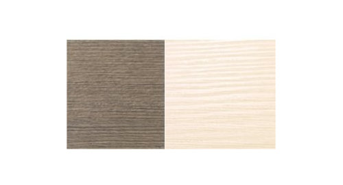
Looking at Beach for the light shade as the taupe graining in it matches
my hardwood floors. Trying to decide on a medium tone for the other
shade, which I'm going to the store to pick out tomorrow. What I really need help with is placement of the colors. The girl at Lowes made an attempt but it just looked like she threw in a darker cabinet randomly. It wasn't a good look. Also trying to decide if two horizontal grain patterns are too
much or if I should go with a gloss for one of them. The color swatches here are off. The beach is a white with a taupe grain. The second color is still up for debate but something dark enough to contrast without being dark if that makes any sense. Trying to keep it light and airy. Any input would be appreciated.

Comments (37)

  • 10 years ago
    last modified: 10 years ago
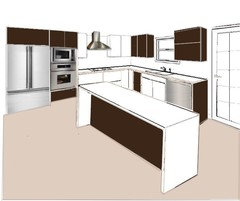
    Are your appliances SS? Here's a version with the darker color on the uppers over SS appliances.


    Darker color framing the kitchen:
    Dark lowers, light uppers:

    One more with dark lowers, and dark cabs over the large appliances:


    I don't know if the lower cabinets are just placeholders, but you do have one drawer base drawn. Except for the sink base and corner susan, have you considered all drawer bases? I would use an under-sink trash pullout, left side of the sink.

    GW discussions--all drawer bases.

    GW discussions--under-sink trash pull-outs

    lorraineg570 thanked mama goose_gw zn6OH
  • 10 years ago

    Light and airy comes from overall feel. Dark color actually recedes and make a room feel larger if used correctly.

    lorraineg570 thanked beachem
  • 10 years ago

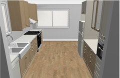
    Hi lorraineg. I'm also doing a two-tone kitchen and trying to get a light and airy feel too! I'll be mixing rift oak cabinets with painted white cabinets. I haven't finalized my plan yet but right now I've laid it out so that one half of my kitchen will be all white cabinets (wall and base cabinets) and the other half will be all oak. But I have a galley kitchen so it doesn't look so strange to have that half and half layout.

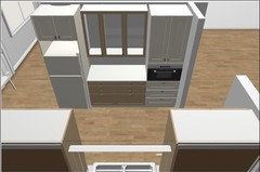
    Here's some pictures in case they're any help to you:

    The other option I was thinking of was to do my tall cabinets in white and to make the cabinets in between them wood:

  • 10 years ago
    last modified: 10 years ago

    Lorraine, my cabinets are from Bellmont (which I believe makes the Latitude cabinets for Lowe's), and are also two-tone, with the Terra Stone horizontal stripe and white acrylic. We did the entire island, the lowers on the wall opposite, and the fridge (along with some "framing") in the Terra Stone. Only the upper cabinets are white. Here's a picture that might help you to visualize it.

  • 10 years ago

    I did a two tone kitchen. My cabinets are shaker style. I did something similar to Mama Goose - last version. Uppers are the lighter color, except the wall with my 2 wall ovens and fridge. I do have a lighter upper cab between the ovens and fridge. I'm very happy with the look. Originally I was going for a big contrast between the two tones but ended up getting tones that were close - a dark gray stain on cherry wood and a brownish gray on walnut. Good luck with your decision.

  • 10 years ago

    mama goose, Thank so much for input. I'm leaning toward putting the dark cabinets over the SS appliances. I have a Schrock cabinet book here and it looks like that is what they did. Thanks for taking time to do illustrations for me. Makes it much easier to visualize. I keep wanting to open it up in PSP and play but my contractor is keeping me hopping.... :)


  • 10 years ago

    Beachem, could you give examples please? How would I accomplish that?

  • 10 years ago

    Ms K, if you don't mind my asking, what software are you using for your mock ups? Oh....and I personally really like the second picture.

  • 10 years ago

    SJhockeyfan, I LOVED the Terra Stone but my husband thought it was a little too patterned. I really liked it but thought it might be too much on two full walls. Yours is gorgeous! And yes, Bellmont is the parent company of Latitude. I asked when I was at Lowes yesterday.

  • 10 years ago

    keagle, that's where I am torn. I keep going back and forth between light and medium or light and dark. I had it in my brain that I wanted everything light. My mind is like a steel trap and not in a good way. I get an idea in there and I have a hard time considering other possibilities. On one hand I wanted everything lighter (I had it in my head that I did NOT want dark cabinets.). On the other hand, I don't want everything to just blend together either. My floor is a lighter taupe/gray and a medium shade will blend right in to my floors. Wouldn't be such a hard decision if I didn't know I was going to have to live with it until I die.... ;) Do you have pics you can share?

  • 10 years ago
    Hi lorraine: I used IKEA's free kitchen planning software. It was the easiest of all the free programs to use. :)
  • 10 years ago

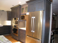
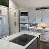
    Here are some pictures. We are not done with back splash and painting and other finishes.

    Middle above micro is lighter cab. If there was more contrast we would have done this entire section in one color.


    range hood was taken down to tile (below)


  • 10 years ago

    lorraine, I'm so sorry to hijack this thread but I just have to compliment keagle on that beautiful kitchen! It is gorgeous! I love the mix of tones you have and the grey has a nice modern, rustic look to it. What wood is it and is that a stain or glaze that's on it? It looks like nicely aged wood.

  • 10 years ago

    Ms K, that's ok! Yes, it is beautiful!


  • 10 years ago

    Thank you Ms K and Lorraine.

    The cabinets are Dynasty omega. The lowers are smokey hill stain on cherry wood. The uppers are Pumice stain on walnut. (The floor is less orange in person. It's white oak with "weathered oak" stain, which brings out the gray grain. We needed floor to match other flooring in addition to cabinets.) I am so happy how it turned out. I plan to do a Kitchen reveal after tiles are grouted. DH did backsplash and will be doing grout etc. So not sure when :)

  • 10 years ago

    Lorraine, I kept my backsplash and counters light so the kitchen wouldn't seem too dark. We plan to paint a very light gray, also to not darken the kitchen. I don't know if you have time before you place your order, but I lived with a few door samples for awhile so I could see how the lighting changed the tones. I would move them around the kitchen at different times of the day. We almost went with a color called porch swing and then DH went to another kitchen store and spotted the Pumice. He brought it home and after living with the 3 door samples we knew which one. I hope this info and the pics helped. I'm sure whatever you decide will turn out great. Please be sure to share.

  • 10 years ago

    keagle,

    Lowes doesn't have doors that you can bring home, just little samples. They do have doors in the store but like you say, different light, different look. 3/4 of the house is down to the studs since we're redoing the entire thing (foreclosure in bad shape but good price) so we're not living there. My countertops are a very light (white) quartz that almost looks like marble and I was thinking of white glass subway tile. The quartz will come down the sides of the island as well. I have a few days to decide. The one cabinet book (Schrock) that has a really contemporary kitchen has the dark cabinets over the SS so mine would be similar to this. I just look at this sometimes and think "dark"..... Everyone here has been immensely helpful.


  • 10 years ago

    You can also do light around appliances with dark lowers everywhere else. But if your counters are light you may be better off with dark around the appliances. I saw some pics on houzz. I will try to find them and post. Is your floor dark? I think the dark floor is making you think dark in this picture. Does the room get a lot of natural light?

    I still like the last version from Mamagoose, especially with white quartz.

  • 10 years ago

    Lorraine, you need to look at my idea book "kitchens". I'm not exactly sure if I will get it right but I will try to send it or invite you to view it. I have a ton of two toned kitchen pics in it.

  • 10 years ago

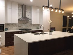
    Lorraine, I've shown my photos on several threads so you have seen them already but we just built a contemporary house with a two tone kitchen. We went with white uppers and cherry lowers and island cabinets in a "sienna" stain that is actually a nice rich brown color that is hard to see in the photos. We also went with white Quartz counters and a waterfall edge island. I'm very happy with how it turned out. We have white cabinets over our refrigerator (though the doors are missing in this picture.)

  • 10 years ago

    namarie, nice kitchen. I love the backsplash and how it brings the 2 tones together.

  • 10 years ago

    keagle, thanks for sharing your idea book. There is a lot to look at there and I think I've nailed down a couple options. The problem I'm having is that I think I like the look of vertical "blocks" of color. I can't figure out how to do that in the corner since the bottom cabinets don't line up vertically with the tops. Also, I feel like the cabinets right next to the door don't qualify as a block because of the dishwasher. Here are a few I've worked up on Paint Shop. I couldn't get the Ikea planner to work, it was very glitchy and kept freezing. I like the look of the second one but I'm sure the dark cabinets in the corner aren't going to line up like that unless I do a diagonal cabinet top and bottom which I don't want to do.


  • 10 years ago

    What if you do dark around the Windows/sink

  • 10 years ago

    like this?


  • 10 years ago

    Are you asking for votes? If you are, I vote for the first picture - the second and third ones looks too blocky to me. I like the first one a lot.

    lorraineg570 thanked sjhockeyfan325
  • 10 years ago

    Yes and thank you! It's funny how you can be sure what you like. Then someone else mentions something and you're like "oh.....yeah....I see that now too....."

  • 10 years ago

    Lorraineg, yes - if you want to do blocks of color. I like framing the window rather than doing corner.

  • 10 years ago
    I'd vote for the first option too (with white in the middle and dark on the outsides). With the white on the island, it just looks right. Sorry I have no design sense... this is totally just based on what I think looks the best! ;)
  • 10 years ago

    keagle, disregarding the fact that I said I like blocks of color, which do you prefer?

  • 10 years ago
    BTW I had issues with IKEA'S software too. It seems to work best on Google Chrome. Maybe that will help with the glitchiness?
  • 10 years ago

    Mrs. K, lol....sure you do. I'm just looking for opinions on what looks good to other people. I'm too emotionally involved...haha. You get an idea stuck in your head (what you think you want) so you don't see things with unbiased eyes....

  • 10 years ago

    Mrs K, it was just easier for me to scan in a drawing and edit it in PSP. There is free software called Sweet Home 3d (free) that works much better than Ikea's did. I just didn't bother much because I already knew my layout. Didn't have a lot of options in that aspect.


  • 10 years ago

    I prefer White in middle, dark sides.

  • 10 years ago

    don't care for dark around window..in fact, have you considered a smaller wall cabinet between window and patio door...seems boxed in with large dark cabinet ...I'd do an 18 in single door cabinet and open shelves, if you don't care for all open on that wall area..... Consider as well, 30 in wide voided door cabinet with matching interior. The walls seem heavily laden.....editing the space right of window might solve it.....it's not too much open shelving......I use a couple openl shelves for small plates, coffee mugs..a few bowls..things that "turn around" quickly so dust is never an issue......Generally, the darker on bottom and lighter on top is what I'd do.....or intersperse a dark framed cabinet in the middle corner wall area, with glass doors if you want some dark on top...dark on each end seems to box it all in.....the window end is a logical place to lighten it up with sizing, configuration, editing...whatever your preference.

  • 8 years ago
    last modified: 8 years ago

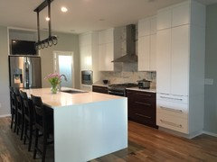
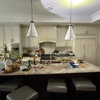
    I realize this is a really old thread but still figured I'd post what I ended up with. :)


  • 8 years ago
    last modified: 8 years ago

    I like how you did the horizontal cabinet to the left of the window. When I first looked I thought the dark was horizontal too.

    lorraineg570 thanked Karen Eagle