

hood design question
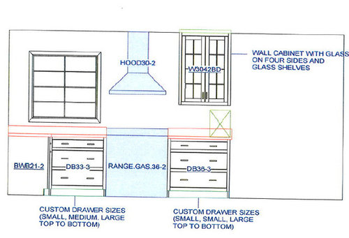
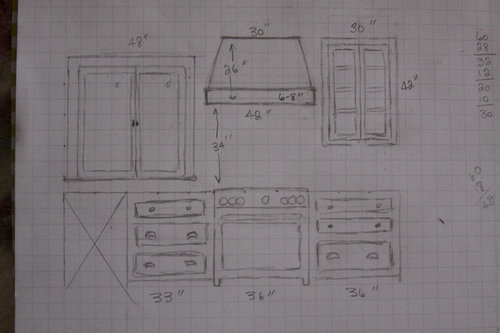
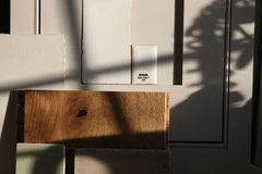
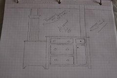
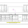
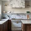
Is this hood (pic #2) proportional to the range and other items? Also, what height would be appropriate for the bottom trim piece? 6 inches? 8 inches?
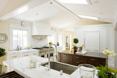
First pic is KD rendering.
Second pic is hood design.
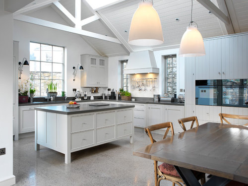
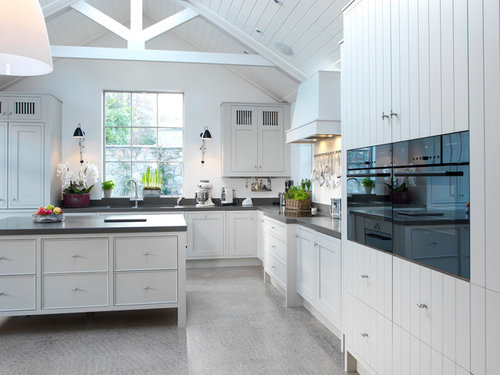
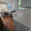
Third and forth pics are hood inspiration.
Comments (45)
 10 years ago
Looks good to my eye! My guess is the trim on the hood in the inspiration pic is 8", including the small trim at the top of the bottom. (does that make sense?)
Wendy thanked nancyjwbWendy
Original Author10 years agoThank you much. Yes, you make perfect sense, 8 inches including the small bullnose trim.
Related Professionals
Anderson Kitchen & Bathroom Designers · Houston Kitchen & Bathroom Designers · Mission Viejo Kitchen & Bathroom Designers · Sebring Kitchen Remodelers · Farmington Kitchen Remodelers · Ocala Custom Countertops · Elizabethtown Custom Countertops · Austin Custom Countertops · Newport News Custom Countertops · Virginia Beach Custom Countertops · Hackettstown Custom Countertops · Kenosha Custom Countertops · Bismarck Custom Countertops · Tacoma Custom Countertops · Leamington Custom Countertops- 10 years ago
Is the window glass in each pane about 20-22 in or so, to left of hood? I think I would take that width and similar height of window and adjust wall cabinet on the right to mimic that........yes....down about as far as window is....but get a 9 in deep cabinet.....In the inspiration photo the hood works because of it's connection to the windows flanking-symmetry, and clearance around hood for full effect of it's architectural nature..and the "whitewashed" effect of the finish which than progresses and blends right in with ceiling . In other words .go for a more shallow depth taller cabinet.....the glass on 3 sides is a distraction-don't need it...the hood is a beautiful style and strong statement...it stands alone....you just need symmetry flanking it .without strong or striking detail. The issue of 6-8 inches lower trim isn't as important as how it sits with items around it. With the hood design stage....the finish and details being offered by your maker should be selected with care as this is a big ticket item...but if you can't line up the window on left with something that works a little better on the right I would go for a couple floating shelves on right and with money saved get more into the detail of the hood itself. It's not stainless chimney style which is a cut and dry look...and it's not resting under cabinet which is a kind of meld with cabinet look.It's an architectural element and the surrounding "stuff" has to be just right. Yes- be extremely particular with this .wall . I don't think you're there yet.
Wendy thanked herbflavor Wendy
Original Author10 years agoThe cabinet is ordered, but thank you for the suggestion, appreciated.
My question, is the hood proportional to the range and wall, as a whole?
 10 years ago
Hoods should be 6" wider than the cooktop. The extra 3" on each side greatly increase the ability of the hood to capture the GOSS (grease, odors, steam, smoke) and often allow you to only, or mainly, use the lowest setting. A wider hood also looks more attractive to my eye. So, no, I don't think your narrow hood, same width as range, looks proportional. However, a wider hood would crowd the window and wall cabinet. Unless it's a hood set into a wall of cabinets, they look better with breading space. A bigger hood wouldn't give you that breathing space. I'm not sure how to resolve that but I think herbflavor's suggestions are on the right track. I don't consider myself a designer. I'm just stating what you technically need for good hood function plus my own preferences. FWIW.
Wendy thanked funkycamperWendy
Original Author10 years agoThe range is 36 and the hood is 42, as represented in pic #2. Thank you for your thoughts.
 10 years ago
Wendy, I think the width is at where it needs to be at 42" above the 36" range. The only thing you could possibly do is lower the hood a couple inches to add a little more height at the top. It's hard to tell, but your hood drawing looks slightly shorter proportion then the inspiration hood.
You will have to check the specs for your hood first though to see how high from the stovetop it needs to be. If it's at 34", you may have some play. Mine is at 30" from range top and we wanted it plenty high. Although if you are tall people, you may like it higher. Maybe you could try it somewhere between 30 - 32" adding the extra inches to top of the wood surround.
I cannot remember your exact layout, but have you considered maybe adding some kind of trim molding at the ceiling to connect the one lone cabinet on the right to the rest of the kitchen? Sorry, I couldn't find a good example of what I was thinking. This is all I could find for now.
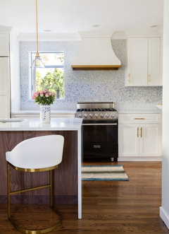
Overall looking great. Cannot wait to see the reveal!
Wendy thanked rebunky- 10 years agolast modified: 10 years ago
The cabinet to the right is throwing off the perception of the hood. It doesn't work. Lose it. There appears to be different amounts of space between the hood and window and hood and cabinet. It wrecks the symmetry. Move the range further to the right to surround it with more negative space on the wall. It feels both crowded by the window and cabinet. Your inspiration feels connected to the windows by occupying more symmetric space between them.
Lower the hood so it can be taller. It's too squatty proportionately, and it just feels wrong without some idea of how it will integrate into the ceiling.
Just a plain hanging box on a wall with different reveals left and right doesn't work here. Your original inspiration is connected to the beam, and has up lighting. It is placed symmetrically between those windows, which connects it as a visual whole. Yours reads as too many disconnected parts without relationship or flow.
Wendy thanked User Wendy
Original Author10 years agolast modified: 10 years agoRebunky, thank you. My concern is the height as well. My ceiling is like the inspiration pic. The instructions to the range say:
NOTE: 28” minimum clearance between the cooktop and the bottom of the cabinet when the bottom of wood or metal cabinet is protected by not less than 1/4” flame retardant millboard covered with not less than No. 28 MSG sheet metal, 0.015” stainless steel, 0.024” aluminum, or 0.020” copper. 34” minimum clearance when the cabinet is unprotected.
LWO, Thanks, the window is sitting in my DR and the cabinet is ordered. I need a hood that works with what I have.
Wendy
Original Author10 years agolast modified: 10 years agoI should say sort of ordered. I put down the deposit, but haven't signed a contract and have a finish awareness form sitting here that I need to sign off on.
And, this is how is is sort of going to look overall. I think. Although, the measurements were wrong in this rendering.
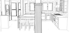 kitchen: flowing as one space · More Info
- 10 years ago
It's not ordered until the acknowledgement is received from the factory and confirmed by the dealer. You still have time to make changes. Make them.
That wall doesn't work. And it's mainly due to that glass cabinet. Visual symmetry is much more important in uppers than in lowers. The entire bottom run of cabinets can be 15 different sizes according to the functional needs if the uppers arrange themselves neatly around a focal point. The focal point of that wall should be the hood, and the hood only. No extra cabinets, no shelves. Nothing else. Center it, and work out the lower cabinet spacing how it falls.
Wendy thanked User Wendy
Original Author10 years agoSophie, I get what you are saying, but I don't want my hood to be a focal point. I don't want a focal in the kitchen at all, really. And, as far as symmetry goes, I only have one issue, the sink must be centered on the windows. Other than that, I'm okay with things being a little quirky. Quirky is interesting.
Like this pic, that little cabinet shouldn't work, but it does. Maybe change to wood on the sides of the cabinet? I want that cabinet for cooking supplies, oils and whatever. I also don't want to bring it down to the counter, because my mixer is going below it.
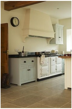 Photo from https://s-media-cache-ak0.pinimg.com/236x/9c/8d/81/9c8d81038ac1cf6835 · More Info
 10 years agolast modified: 10 years ago
Wendy, I liked rebunky's photo with the molding around the hood and the cabinet. As you know, I am not wild about this hood's proportions; maybe what lwo and rebunky are saying about it looking to me to be a bit, ahem, squat. ( Sorry hood!.)
If you're happy, that's fine. But maybe you could play around for fun with relating a hood to the cabinet via trim; or the cabinet to the window, (as herbflavor was musing about) with more than the glass tying them together. A smaller cabinet to give the hood some breathing room. Then see what you like.
Wendy thanked barncatzWendy
Original Author10 years agoThanks, Barncatz. I probably shouldn't have started this thread. The hood was looking a squatty to me too, that's why I did. Maybe there was an easy fix. But, if I change one thing, it effects everything else. I can't put ceiling moldings up. If I did that, it would change the feel that I am going for. Also, I would then have to consider adding it to the dining/living area, since it is one big room and that would change the feel those 2 areas. I may have to live with a squatty hood, lol.
- 10 years agolast modified: 10 years ago
Sorry, but that example doesn't work either. That cabinet crowds what would otherwise be a nice graceful understated hood. Well, as understated as something so gigantic could be.
Substitute central organizing idea for ''focal point''. A cooking wall is about cooking. A glass cabinet is about display, not revealing your hodgepodge of containers spice storage. It doesn't provide function there. It doesn't work as a practical matter, and it doesn't work in the design zoning hierarchy. It's the wrong spot for a mixer too. A mixer belongs in your prep area, not your cooking zone.
Wendy thanked User Wendy
Original Author10 years agolast modified: 10 years agoThanks, I appreciate your thoughts. Our previous home was a 1920's craftsman. The original to the home kitchen had one small lower, a sink base, and 2 uppers. Both uppers were glass. I'm sure the purpose was not display, but storage.
- 10 years ago
I think your kitchen is going to be very nice except for that range wall. That little cabinet just looks off. Maybe if you did what herbflavor suggested it would work but, as currently designed, it just doesn't. I agree with Sophie that your example picture that you think works, really doesn't. At least, imho.
I'm curious why you want your mixer to the right of the range. It doesn't make functional sense to me but maybe you have a plan that would make it make sense? From looking at the drawn rendering of your plan, I'm unsure of where the sink is but I think it's barely showing as it's being hidden by the column. Is that correct? For function, I would have your main meal prepping to right of sink, around corner, to range. And I would consider a baking center to the left of the sink and put the mixer there.
Have you considered putting your spices in a drawer?
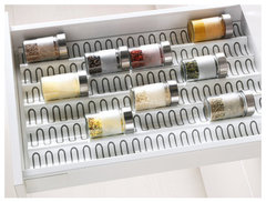 VARIERA Insert for spice jars - IKEA · More Info
And your oils in a deeper drawer?
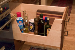 Storage_Solutions · More InfoWendy thanked funkycamper
Wendy
Original Author10 years agoThanks, FunkyCamper. Yes, I will have a spice drawer. All my drawers are set and claimed.
My mixer is to the right of the range because the entire kitchen design is based on the windows. The windows were and still are the priority.
- 10 years agolast modified: 10 years ago
Wendy, didn't mean ceiling molding. I was thinking I liked rebunky's suggestion of lowering the hood by trimming it and trimming the cabinet in a congruent fashion, like her photo. Oh, wait, I just reread your answer and I guess we are talking about the same thing. You know, if this thread helped you realize the wall and hood looks the way you want it to, it served its purpose.
Wendy thanked barncatz Wendy
Original Author10 years agolast modified: 10 years agolol, I don't know if I like it or not. I do think it is a little squatty. But, I don't think it is horrible. I don't get the hate of the glass cabinet. To me, it looks fine.
I could do a stainless hood, but I think that would be worse.
- 10 years agolast modified: 10 years ago
I have to agree with Sophie and Live Wire Oak. Just lose that wall cabinet. Even if you are not a fan of symmetry, you are nevertheless noting that something is "off". It's not just a matter of the hood trim. You need to just slide over the whole thing, and take the other advice offered about lengthening the chimney, etc. I am not trying to be critical, only honest. The photo you posted above as quirky where you say "the cabinet shouldn't work, but it does"....to me actually it doesn't. That is a very charming kitchen which I'd love to have, but with an unfortunate cabinet stuck on the wall.
There have been many posts on this forum from people saying "thank you for talking me out of the thing I was so determined to have. I resisted like my life depended on it, but I am now so grateful I ultimately listened to you all".
Wendy thanked friedajune - 10 years ago
I'm glad you are making your windows a priority in your kitchen design. I have, too. There can't be enough windows in most kitchens, imho. But I don't understand why your windows would determine where you keep your mixer. You don't have to explain if you don't want to but I just don't understand. The mixer should be stored where it will be used and most of us like to bake and, thus, mix near a sink. If you have a nice looking mixer, like maybe a KA in a fun color, it will look fine even if it's in front of a window. In fact, I would imagine it would look really cute in front of the window to the left of your sink. Am I missing something?
Wendy thanked funkycamper  10 years ago
I am a huge fan of symmetry and balance, but I kind of love your original drawings. I'd do the 6" trim on the hood with angled sides. I also love your pic of the little cab beside the hood. And while there are many many instances of people being saved by the forum, there are also just as many times that people did their own thing and it worked. The kitchens that people go the most crazy over are the ones that are out of the ordinary. Full disclosure: I love crazy English kitchens, oddball islands and I didn't fully enclose my fridge.
Wendy thanked daisychain Zn3bWendy
Original Author10 years agoKristen, I'll doodle it in and see. Thank you for the suggestion.
LWO, I'm really happy with my layout, but thank you.
FunkyCamper, they are French push-out windows with French pull-in screens. To open the screen I would need to move the mixer.
Thank you, DaisyChain. I love the English kitchens too, so much. They are like kitchen perfection to me.
- 10 years ago
BTW, while the lack of symmetry in the first drawing bothered me, now that I see it in context, it doesn't bother me at all. I really love the rendering you posted of the whole kitchen.
It made me think of some kitchens I had in my inspiration book that tiled their range hoods. Not to spend all of your money -- though, my apologies, I realize I am totally doing that -- but have you considered that?
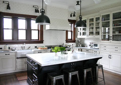 Traditional Kitchen · More InfoWendy thanked Kristen R
Wendy
Original Author10 years agoKristen, I have considered having a tiled hood, on more than one ocassion. I love that look. But, for some reason, I'm not sure it will work. (That kitchen was one I also saved.)
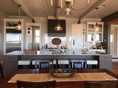
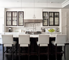
The following 2 pics are my inspiration kitchen and my inspiration island.
 Farmhouse Kitchen · More Info
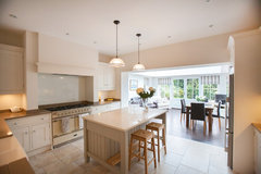 Detached House Reigate · More Info
- 10 years agolast modified: 10 years ago
Kristen, I have had that kitchen saved forever. One of my favorites!
Wendy, I see the tile is going above the Windows in the drawing. Is the gorgeous soft green crackle tile going all the way to the ceiling peak? Oh my word, that would sure look awesome! It would probably cost your right arm and leg but awesome none the less. Lol!
Well, as far as the hood and glass cab goes. I know you are keeping them, but please just let me try and make an appeal to your more practical side because we all agree it is beautiful.
Here are a few reasons I'm concerned with it.
1) With that 30" glass cabinet opening in the center and being that close to the hood, isn't it possible the left door could swing into the hood and break? I guess you could have a hinge restrictor on it.
2) I love the glass on the three sides, but won't the side next to the hood get super filthy with all the cooking grease and steam right below and the hood sucking it right towards it? I think that one side is going to be a real bugger to clean. I'm imagining reaching in between it and the side of the hood with windex and paper towels. I'd at least make that side solid.
3) The glass interior shelves are also going to be very difficult to clean. I'm imagining you having to take every single item out since you cannot just wipe around stuff like in a regular shelf. You'll get smears. Every speck will show. You will probably have to clean both the top and the undersides of each shelf to really look their best. Especially with cooking items being stored in there, you will be actually using that cab, rather then it being like a curio cabinet for decorative items.
4) Regarding storing cooking items in the glass cab. I would not store oils and vinegars because for me they tend to drip down on the sides. My shelf ends up getting messy and oily. I wipe it constantly, but it's easy and nobody sees it even when I don't. See #3 again. ;-)
5) It is so much more convenient to have the cabinet door open out or away from the hood. It is so easy to just reach up, swing the door away from the range, and grab what you need. Not open the door into your face while grabbing something to sprinkle on the dish you are cooking. I was planning to do two larger double door cabs on the sides of my range hood, but my KD talked me into doing two 15" uppers flanking my range with doors that swing out. I am so glad I listened to her.
So, with all that said.... Phew, that was long!
Would you be open to making that glass cabinet the widest single door cab you could get, possibly a 21" instead? You'd still get your pretty glass, but here what else this does for you.
Besides fixing #5, it allows you now to slide the range and hood over a little to the right to give the needed breathing room to the window and hood and the cab.
It's hard to find a perfect photo, but I think this one show what a little more breathing space feels like.
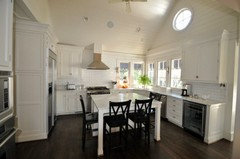
I am sure what ever you decide will be the best decision for you.
Wendy thanked rebunky - 10 years agolast modified: 10 years ago
I second Kirsten's suggestion of a more squared off hood rather then tapered. I think if you want it to disappear, the more simple clean lines is better. Here is the best I could find with an angled ceiling.
 Wendy thanked rebunky
- 10 years agolast modified: 10 years ago
Ha! It's a very popular kitchen, I see.
Looking at your inspiration photos, I understand why the tiled hood might not work. It's a lovely softer palette. Most of the kitchens that I've seen with tiled hoods have a very specific look. Like, a lot of black and white, etc. Retro industrial farmhouse? Modern Parisian bistro? Clearly, I don't know what to call it so I've resorted to throwing random words together.
I do love kitchens where the hood kind of disappears. Of course, we went the other way and put in a stainless steel circus tent. But it suits our clown car kitchen!
Wendy thanked Kristen R - 10 years ago
Oh brother I see now that one cab is 48" tall. A single door cabinet would probably look ridiculously skinny next to the wide wood hood. Good grief, please just ignore me! Haha!
Wendy
Original Author10 years agoRebunky, I'm not sure that I can change anything. When I talk to the KD this morning, she said that Omega had already called her a few times to clarify details.
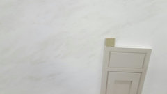
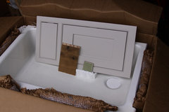
Yes, the green tile up to the ceiling on the sink and range wall. Also on the back of the shelving that surrounds the fridge. That's what I'm hoping, anyways. My goal is a very quiet overall feeling. Plain English with a touch of Bohemian cottage, as weird as that sounds, lol. The tile should fit? I'll post my finishes below.
Kristen, your descriptions sound spot on.
 kitchen: flowing as one space · More Info
 kitchen: flowing as one space · More Info
 kitchen: flowing as one space · More Info
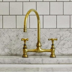 Barber Wilsons 1010ML Deck Mount Bridge Faucet With Fixed Mushroom Deck Unions · More Info
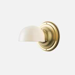 Otis Wall Sconce Light Fixture | Schoolhouse Electric & Supply Co. · More Info
Wendy
Original Author10 years agoBarncatz, then I would need to put that finish somewhere else. I'm not sure how I would do that.
 10 years ago
What I don't understand is why, when Wendy has repeatedly said she likes the cabinet, wants the cabinet, has ordered the cabinet, everyone keeps telling her to get rid of the cabinet. Her question was about trim for the hood. She didn't ask for layout advice, or where she should have her mixer. She doesn't necessarily want the "symmetry" people are pushing. People are individuals with individual tastes. Not everyone needs or wants the exact same kitchen. There is not just one "correct" place where everybody MUST have their mixer. It should go where Wendy wants it to go, where she will find it the most useful for HER. If it turns out to be a mistake of Titanic proportions, she can move it. And what she puts into her glass cabinets shouldn't bother anyone. Whether she's displaying the Queen's tiara or keeping her cooking stuff where she can see it is really her decision, as she's the one who lives there and uses the kitchen. Not everyone has the same taste in art, whether it be a painting, sculpture, or a dream kitchen. This is Wendy's dream. I think it looks beautiful. But that doesn't really matter, because a) it's her kitchen, not mine, and b) she didn't ask what we thought about her kitchen design, she asked something about inches and trim.
I'm sorry if I sound grumpy. I know you all really, really, REALLY are passionate about kitchens. And I know with all my heart that you mean well and are trying to be helpful. But I have read dozens of similar threads where people's stated "you can't change this" guidelines are ignored and where the advice given, no matter how well meaning, doesn't answer the question asked. According to the Read Me First post, a person's "I can't" or "I don't want to" change this list is supposed to be respected.
Wendy's range wall is not symmetrical. This is not on a par with global warming or impending nuclear war. In fact, it may turn out to be the most interesting thing about her kitchen. :-)
Sincerely,
Debbie :-)
Wendy thanked Debbie B.- 10 years agolast modified: 10 years ago
Wendy, the tile is SO going to fit, MO. There's just something satisfying; even about Winchester's "hand feel" and I found their glazes, when I finally got real samples in my kitchen, to be ..... lovely, to use my overused but highest compliment. They're like your marble. There's a depth there in both.
Wendy thanked barncatz Wendy
Original Author10 years agoThank you, Deb.
Barncatz, I think their glazes are gorgeous. My only concern.....will it blend enough. I think it is muted and soft enough to blend in, but I always second guess myself.
- 10 years agolast modified: 10 years ago
Debbie, there is a very good reason why we bring those types of issues up. My response here is in general and certainly not specific to this particular kitchen. There have been many threads here where someone wants to do something and is adamant about doing it a certain way until all the drawbacks to it are pointed out to them. Sometimes repeatedly.
Sometimes people do accept the advice, change their plan, and express how grateful they are that people kept stressing that the plan needed that change because it resulted in a better kitchen. Sometimes people come back later and they have ignored the advice and admit that they regret it as their kitchen isn't working for them as well as it could have. And sometimes people ignore it and are thrilled they did because they love their finished kitchen.
And, other times, people find GW after they have completed their remodel because they have problems they need to fix and wish they had known sooner what the drawbacks to their original plan were prior to their remodel so they could have avoided having issues.
In any of these situations, if the OP is told that there are certain drawbacks to their plan, they hear the concerns and mull whether they want to make changes or not, and then, for whatever reason choose not to make the recommended changes, at least they have gone into their remodel knowing all the pros and cons.
So, in the end, they have made a deliberate choice. And that's fine, if the choice is deliberate. But what if nobody said anything and they made that choice and found that it didn't work for them and it was a horrible, expensive mistake and then we here, at GW, said later, that we noticed it wasn't a good choice but didn't say anything because the OP clearly thought they would like it? Then it wasn't a deliberate choice but, rather, an uninformed choice.
Deliberate choices to go against functional rules or standard design choices are fine as long as they are deliberate, not due to misinformation or being misinformed/uninformed.
Of course, this is also far more critical when it comes to functional issues vs. aesthetics. Aesthetics are definitely individual. And if the OP in any situation ignores aesthetic advice because they like something, that's IS cool and fine and their choice. And I'm always glad to hear later that they love their choice.
In this particular case, the cabinet/hood are design issues. If the OP likes them the way they are designed and wants to stick with the original plan...fine, cool, awesome. People have pointed out both aesthetic concerns and Rebunky did a great job of pointing out potential functional concerns. Now the OP has more information to make an informed, deliberate decision. How is this a bad thing?
The mixer issue? I use my mixer almost daily and, for how the great majority of us who bake or use our mixer regularly work, her choice of placement makes absolutely no sense. The reasons are, it is on a narrow counter, under an upper cabinet, requiring her to pull out the mixer to use it, which means the usable counter space has shrunk even smaller. Since that is the area where her cooking oils, seasonings, etc, are being stored, I doubt very much that there is room there for her baking supplies as well. This means she will need to carry all her baking supplies over to the mixer, then carry them back to put away. Extra steps, time and work. Not efficient. And since that counter area is so small, there likely won't be room for the flour, sugar, etc., to be placed on the counter while she's mixing things. Add to that, most baking and other tasks where a mixer is used, require access to water. Now add in more steps back-and-forth to the sink. Even more inefficient.
In this case, since I suspect the windows and screens aren't open daily, I would rather scoot the mixer over when I needed to do that than have it placed in a spot where it's difficult to use. But, in the end, the OP can make any decision she wants.
I see nothing wrong with pointing that out to someone so they can make an informed decision rather than, later, making a mistake. Of course, a mixer is easy to move but it certainly doesn't hurt to plan for these things ahead of time. Maybe the OP would then decide that they would prefer their mixer on one of those pull-up shelves in a lower cabinet and, because she wasn't considering usage issues, she now doesn't have an appropriate cabinet to place such a device. Or maybe they would change something in another spot in the kitchen to allow for a better baking center with a good place for their mixer in the midst of it. Or maybe they need to add an outlet to whatever location they might prefer using their mixer at.
Again, thinking it through, knowing the pros and cons, and weighing these to make the choice that works best for them, means having advance knowledge. And their decision could be ignoring all advice and, again, as long as that's an informed, deliberate decision...fine, cool, awesome.
I would feel guilty as heck if I spotted something of concern, didn't mention it because the OP didn't ask specifically about it, and then they came back later and shared their frustration with that issue, and I realize I could have helped before an expensive mistake was made.
In short, I think you got grumpy over nothing.
Wendy
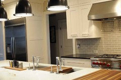
Original Author10 years agoFunkyCamper. here is the original design of my island, including lowered bake area. It could/would be located directly across from the range and mixer counter. Mixer lift was considered and eliminated, because it could not be done in lowered height cabinet. Still working on this plan and design.
 kitchen: flowing as one space · More Info
- 10 years ago
Hi Wendy - I haven't read this whole thing and I am not an expert on kitchens. That said, part of the great process here is being able to be okay with your choices when the potential flaws are pointed out. People are just trying to be helpful based on their own experiences and what they are seeing on a computer screen. If you are good with it despite other's concerns, that is really the end of the process here and the rest will be people cheering you along.
For my reno, people were concerned about lack of symmetry, wider than average upper cabinets, less than 15" seating overhang, microwave not too near the frig, and a frig a bit out of the kitchen center. We listened and narrowed an upper cabinet and are VERY GLAD we did. As for symmetry, something in our plan had to give and that was it. Function beat form, as it should.
As for that frig, it is just fine and we actually really like having it out of the way, yet 2 steps from the island for loading and unloading.
 Wendy thanked User
- 10 years ago
Wendy, I like your plan for your island and it does look like you've thought through how you will do your baking and use your mixer. Please understand that the suggestions and ideas thrown out were based on the available information. And we didn't know about the thoughtfully designed island when you mentioned your mixer location.
Wendy thanked funkycamper Wendy
Original Author10 years agoWell yea. I wasn't asking for layout advise, I was asking if the hood was proportional to the range and other items on the wall. That needs to be decided soon, so it can be added to the order.
The "L" cabinets are ordered. So, that is a done deal.



User