Software
Houzz Logo Print
hzdeleted_19691726

So pretty!

10 years ago
last modified: 10 years ago
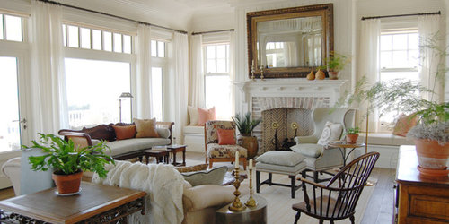
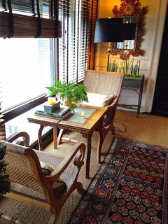
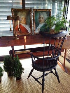
I saw a photo on Instagram yesterday posted in Traditional Home's feed of Charleston architect Mark Maresca's home. It intrigued me, so I went searching for more images. I'm linking below to some photos of his house, but also found these pics of a Maresca-designed room that just made my heart go pitter-patter and wanted to share. This would be such a gorgeous place to while away a quiet Sunday afternoon! It probably won't appeal to those who crave a lot of color, but I find it so soothing. And all that natural light! I'm in love.

Unfortunately, I can't share the IG photo here that started my Maresca quest, but the link directly below shows other angles of the room. I like his use of dark and light. And his garden is luscious. I think what I like most is that this feels "high style" to me, but it doesn't seem stuffy or pretentious at all.

Mark Maresca's Charleston home

See more Maresca-designed interiors at the last link below. There are a number of especially lovely spaces shown here (like this one:)

I note that his lamp cords sort of go trailing all over the place. Somehow, I find that endearing. ;-)

Maresca's website

Comments (45)

  • 10 years ago
    last modified: 10 years ago
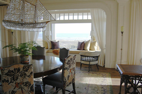
    Love! The neutrals allow the view to be the star. Interesting that there's so much seating available. And, it's a mix, not matched for the conversation areas.

  • 10 years ago

    Mmm, very nice! That chandelier is awesome. I agree--very relaxing rooms!

  • 10 years ago

    I agree, it's overall very well done, but I would sacrifice some of the windows for walls to have space for art. The dining room is very pretty and I also like the last picture, probably because it has more color. Love the blue and white lamp and the overall comfortable look, with plenty of seating. I think he creates happy spaces.

  • 10 years ago

    Thanks for sharing! I could be happy in any of these rooms.

    TR, I'm going to start a thread about who we follow on Instagram. I meant to do that a while back when we compared a few notes. I hope you respond!

  • 10 years ago

    I like it a lot. Not crazy about that ship chandelier.

  • 10 years ago

    For anyone who wants the ship chandelier, that was from Z-Gallerie. They still have one, but it's a bit different now:

    http://www.zgallerie.com/p-14864-crystal-ship-chandelier.aspx

  • 10 years ago

    Thank you for sharing! I love the room that you pictured so I had to look at his home. Isn't it just gorgeous? I would love to have a home that lovely and furnished with such charm and character.

  • 10 years ago
    last modified: 10 years ago
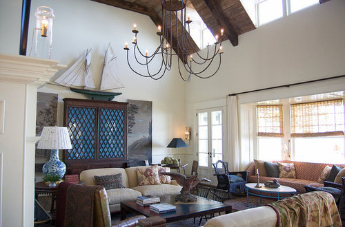
    Thanks for sharing these lovely, livable rooms.

  • 10 years ago

    The ship chandelier is definitely an "acquired taste," I think! It's not what I would have chosen but I also don't mind it terribly!

  • 10 years ago

    I love it. Windows > wall art. Also not crazy about the ship chandelier, but I could eat that wood trim color with a spoon.

  • 10 years ago

    "I could eat that wood trim color with a spoon."

    LOL! Yes! So could I!

  • 10 years ago

    The ship chandelier is definitely an "acquired taste," I think! It's not what I would have chosen but I also don't mind it terribly!

    Yeah, that's the only decent use of it I've seen, and I had a friend who was mad to get one and so he kept showing me every pic he ever found of one installed. Between the space and the calm of the rest of the room it actually almost works here; certainly it doesn't detract from a lovely space.

  • 10 years ago

    Thanks for sharing the links. I agree, very pretty. I like the restrained color, and everything is gorgeous, but very livable. That's a rare combination.

    I see a lot of design that is pretty or interesting, but seems so contrived (like the Chip & Joanna Gaines style, for example). These rooms feel very natural, to me at least. Maybe with the exception of the ship chandelier ;-)

  • 10 years ago

    Love the overall brightness of the home and all the windows...sorry Ingrid, but if I had to make a choice between walls or windows, the latter would win out. Art can be hung in hallways if wall space in public areas isn't available. Windows bring in not only light, but ALL the beauty from the outdoors. I saw the ship chandy years ago at Z Gallerie and can't believe it's still available, though slightly changed. I find it tacky and out of place in this beautiful home.

  • 10 years ago

    Lovely, peaceful, cozy room . . . but then again, I've always been partial to beautiful calm, neutral rooms. I do have to say, though, that I really dislike the ship chandler.

  • 10 years ago

    OK, ship chandy aside - what do you suppose is the "secret" to creating spaces like this? Aside from hiring Mr. Maresca, of course. Can the average person achieve a similar feeling in their own home, perhaps without the benefit of the beautiful architectural features? I like the way jlc712 describes these rooms as natural and uncontrived. They are beautifully decorated, but don't feel DECORATED if that makes any sense.

  • 10 years ago

    Are those rooms as big as they look? Maybe I've been stuck in mid century ranch country too long...

  • 10 years ago

    Natural light, i.e. no plantation shutters, blinds, etc. Simple wall treatments. Creamy white walls and trim. Natural wood. Off white fabrics. Natural fibers and natural materials or at least the look. Classic but simple lines. Some brass. A little bit time worn. Plants.

  • 10 years ago

    Yes on the natural light - although Maresca does have blinds in his own home, as evidenced by these photos. Note the wonkiness of the bottom of the blinds in the second pic. I love it. :-)

    And there's those electrical cords again. In both photos. :-D

    It all strikes me as very real and livable, and there are a number of rooms in these links that I could just sink right down into. Or (as Linelle put it), eat with a spoon!

  • 10 years ago

    Altho I like to look at all-white or nearly all-white rooms, I'm not so sure I would feel comfortable whiling away a Sunday afternoon in one. First of all, no shoes. No drinking or eating while sitting in those chairs (at least not me, I'd leave crumbs and fear sloshing my tea cup). I do love the light, it's not too bright or glaring.

    However, I really like the two photos of the room in his own home. Now there I would feel comfortable.

  • 10 years ago

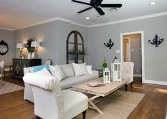
    Just to illustrate what was said above, comparing Joanna Gaines' style to Maresca's ... here's a room Joanna styled.

    Having stunning architectural details really adds immeasurably to a room, does it not? Joanna's room, while perfectly nice and comfortable-looking, just lacks the soul that Maresca's has. It does have a contrived look in comparison, and I've grown really tired of seeing architectural pieces hung on walls, in an apparent effort to mimic something that's just not there. I've done it before myself, but it's just not the same as having those amazing bones to begin with.

  • 10 years ago

    But one reason Joanna's rooms are like that is that she rips all the soul out before she starts. When you turn every charming old home into an open-plan contemporary tract home, generic is what you're going to get, especially when all the furniture comes from box store sponsors.

  • 10 years ago
    last modified: 10 years ago

    Good point, writersblock. It really is comparing apples to oranges.

  • 10 years ago
    last modified: 10 years ago

    Yeah, I'm sure she would have started by getting rid of the arch and window seat in your second photo, in the name of "flow" or "opening up the view" or something. :)

  • 10 years ago

    I'd never even heard of Joanna Gaines or her show before reading about her here, but her room above looks flat, one-dimensional and just plain boring. There is no warmth there and nothing to hold the eye, quite different from Maresca's rooms. Part of it certainly is the architecture, but her room frankly looks amateurish compared to his layering of colors and patterns, and the placement of the furniture, and the amount of furniture he uses. The very first thing I judge in a room is whether I'd be comfortable in it, and with Maresca it's a big yes and Gaines a big no. Now she does have plenty of wall space but there's nothing on the walls worth looking at. It all looks more like stage props than something that feels personal and meaningful. I know there are Gaines fans here, and I don't want to offend anyone, but this is just my personal feeling and her style is worlds away from my own.

  • 10 years ago

    I've just now clicked on Maresca's website and I'm absolutely crazy about his rooms. Being an interior design nut, I've looked at thousands of rooms in books and on-line, and can now say that this little-known designer is my favorite of all. Along with many other features, I think one of the "secrets" of his appeal is that in every single room most of his colors are warm, with cool colors used only as accents. I think this one quality may just separate good design from average. I wonder if that's because in nature most colors are warm and we just naturally respond to that. Thank you, TurquoiseRose, for introducing me to this wonderful designer.

  • 10 years ago

    Can the average person achieve a similar feeling in their own home, perhaps without the benefit of the beautiful architectural features?

    Unfortunately, there is nothing one can do about the natural light, but aside from that, I think the average person can achieve such a look. However, I do not think the look can be achieved by visiting a home decor store of choice and acquiring everything in 1 fell swoop. That is the difference I see between this house and the one posted above, by Gaines. The Gaines room looks like everything was done at just about the same time and could conceivably have all come from the same store, one shopping trip and you are done! If that is the space someone wants and feels comfortable in, great. The first pics have a lot of different pieces in them (like that turquoise based coffee table in front of the sofa) and the patterns reflect a variety of time periods so it is less predictable.

  • 10 years ago

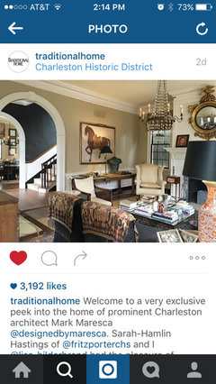
    I feel the same way, Ingrid! I've become a little bit obsessed with Mr. Maresca's style and have been searching for more of his work online; unfortunately, Google searches go to Pinterest a lot of the time, when what I crave are "real" websites that will give us more. The first I heard of Maresca was, as I said, on the Traditional Home Instagram feed. It was this photo that made me want to see more. I thought it had a very gentrified, yet comfortable, look about it.

    tishtosh, I think you're right about the way that the Maresca rooms are perfectly "collected." They definitely don't look as though they were put together all at once, but as though they gradually evolved. His rooms feel organic, somehow. The Gaines projects have a much more systematic feel. They feel decorated and not collected.

  • 10 years ago

    Ingrid, well put. I can't always describe what I like--give it a name--but I can point to something and say, THIS!!! Even the rooms that are way more formal than I would ever have, they are lovely. I would just love to be in those rooms.

  • 10 years ago
    last modified: 10 years ago

    I would venture to say that even in such a space there would be the same warm color schemes, and the superb use of paint, fabrics, carpets, pillows and accessories. That alone would put it in a different category and make it feel like no ordinary home.

    TurquoiseRose, you said it perfectly with "decorated and not collected" and also "systematic" versus "organic". Those are very important differences, and I also think of his as more of a "curated" design, a look that really resonates with me.

  • 10 years ago

    Ingrid, I'd like to see that. I live in a builder's grade home in a modest neighborhood. A room such as on his website would be squandered in my house. Actually, it probably couldn't be done in the first place. Nor could I afford his services. Etc., etc. However, it would fun to say, I want that, but this is what I have to work with, what can you do?

  • 10 years ago

    You've gotten me hooked on his designs, too!


  • 10 years ago

    Nosoccermom, I also disagree re:plantation shutters/blinds. A soft window treatment could be used along with either. The classic style is what stands out imo, with nothing too quirky except the ship chandy. I first noticed a balance of color, with brights being almost non-existent, but the light to dark ratio being fairly even. I'm also in agreement with the touches of black~I read years ago that every room should have a touch of black. The lampshades are obvious, but picture frames/matting, a chair frame, the black straps on the wood tone blinds, and the black wall leading up the stairs all add impact to the home. All aside, it's the classic/traditional style of furnishings, lamps/light fixtures, and accessories, with the absence of painted furniture, other than the black captain's chair, and the closest thing to MCM, is the kidney shaped table holding the two pictures, maybe sheerly accidental. PB, RH, Arhaus, and the like, have tried to kick traditional style to the curb, and many homeowners feel/have felt it's dated. Mr. Macesca has held firm to what he knows will never be dated, no matter what the trends. i'm in total agreement, and and will stick to what i've loved for almost 40 years.

  • 10 years ago

    His rooms are timeless classics that have that lived in look.

    It seems his beliefs regarding his garden sum up what he follows in his interiors:

    " The previous owner had established the garden merely for show, but Maresca believes it’s about living in and sharing the space, so he restored and reconfigured it as a pattern garden for modern use."

    Thanks for sharing this TR.

  • 10 years ago
    last modified: 10 years ago

    Linelle, never say that such a room would be squandered in your house. Don't you deserve the best that you can afford? Yes, part of the effect he achieves is because of the quality of everything, but haven't we all seen hideously expensive rooms that we'd hate to live in? The colors, the way the furniture is arranged, the balance of dark to light, the use of pillows, textiles and carpets, these are all things you can achieve without the use of mega dollars or fabulous architecture. I live in a ranchburger that we "gussied up" with new windows and French doors, new rugs and curtains, some new furniture, but also furniture inherited from others, and I'm not talking about anything valuable, believe me. I used colors I loved, art that I already had, slowly buying new pieces, and some that my talented husband painted, and added antique Chinese porcelain not because it would "go" with anything but because it became a passion. It's all about what you love and what makes you feel good to be around. Be inspired by others, but listen to that inner voice that tells you exactly what you want and need.

  • 10 years ago

    Lovely rooms! I too looked at the top one and tried to figure out how I could achieve something similar in our home. (Then I wondered where are the designers that work with "normal" sized rooms?)

    I hope this doesn't come across as snarky, but as I was evaluating the top room, I got to thinking "what would we have advised on GW if someone presented this as their living space?" Would we have told him the chairs were unbalanced because of the difference in heights and styles? That there were too many seating options? That the plants needed to go, that the room didn't need any softening?

    What is it that makes one room beautiful, and another a mishmash? I'm still trying to figure it out. I do notice (again, the top picture) that the fabrics are all in the same depth of color, that if you were looking at paint chips, they might be all about the 3rd or 4th color down from the top of the strip. The throw pillows give some contrast, but not too much. The curtains and throw blanket simply blend and soften without distracting the eye with color or pattern. There is a lot going on in this room, and yet it still feels soothing.

  • 10 years ago

    Nothing in his rooms reads "brand new, store bought" (like the Gaines decor). Everything has a patina, even though it may perhaps be new. I'm sure those pieces are very expensive, but they are, at the same time, inviting. There's no pretense of "too precious to use" either.

  • 10 years ago

    laughablemoments, I thought the same thing about what "we" would suggest if a forum member posted these photos, especially the one with the ship and that ginormous blue and white lamp (third pic). Surely we would say that the lamp was much too large and out of scale, right? Looking at it in Maresca's room, though, I can't imagine anything else there. It just seems perfect. What gives?

  • 10 years ago

    I love the first two pictures, although the colors are a bit too white for my taste. It might be a little darker IRL, though, as I've noticed that my 'Heavy Cream' walls look white in some pictures. The third picture makes me uncomfortable, probably because I've become used to low ceilings, and smaller rooms. The furniture seems to have more modern lines in the third pic, but I love every piece in the first two pics (except for the chandy ;). The rooms are so grand, I can't imagine them in my little house--although bits and pieces would fit right in.

  • 10 years ago
    last modified: 10 years ago

    What I meant with respect to shutters/blinds/window treatments: Let in the light!

    So, I have to say that the first room is my favorite room because it's light, lots of windows, comfortable, and doesn't look perfect.

    Some of the other rooms on the linked site are too formal and styled for my taste.


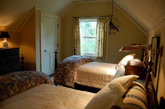
    As far as modest rooms in terms of size and architectural features, this is one:

  • 10 years ago

    NSM, that bedroom is exactly my style!

  • 10 years ago
    last modified: 10 years ago

    Even in that simple, cottagey bedroom though - look at the wealth of details! That door looks to be high end. Notice the corners of the moulding. The nook-and-cranny angles of the space. The old boards on the ceiling. The charming mullioned window. That would be difficult to recreate in a "builder grade" house, I'd think. You could get the basics right, but without the details? I just don't know.

  • 10 years ago

    The door is a vintage door, or custom made to resemble one. Have seen plenty of them in older San Diego homes/apartments. Shiplap could be installed on a ceiling to give a similar look. Mullions can be purchased which pop in/out, mainly to make cleaning easier. And a good carpenter can do anything for the right price. I've seen pricey new homes with details which would normally be found in homes from an older era, and that's a big part of their being 'pricey'. Your shelving is a great start to getting such detailing. ;)

  • 10 years ago
    last modified: 10 years ago

    That would be difficult to recreate in a "builder grade" house, I'd think.

    That probably came from a builder-grade or kit house. There was plenty of detail in years gone by. And if you pay enough, they can put it back again, too.

    I live near an area where old cottages which belonged to farmers or domestic workers fetch big bucks now and they all suffer one of two fates: a complete gut to the outer wall studs and conversion to something like a NY loft inside (NYT will love you and come down and do a feature), or much careful putting back of old details that people got rid of when times were bad and they just couldn't afford to repair/replace them when needed.

    The second kind of restoration is very much more expensive, and often goes horribly wrong when people don't know enough about what they're doing, like one cottage which had one of those wonderful 20's corner tubs and gorgeous iridescent colored tile, which the new owner ripped out for a clawfoot and white subway, in an attempt to recreate the post-millenial misconception of a 20s bathroom. (In our area a clawfoot was was the 20s equivalent of a bootz steel tub.)

    And yeah, I know that a good designer can do good things in those tiny rooms, because I've seen it. It's just that till quite recently, except maybe in Beverly Hills, tiny rooms in once-inexpensive houses and big deal designers didn't go together, not that they can't.

Sponsored
Bella Casa LLC
Average rating: 5 out of 5 stars17 Reviews
The Leading Interior Design Studio in Franklin County