Software
Houzz Logo Print
indyhomer

Help improve elevation

10 years ago
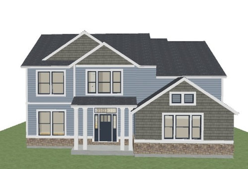
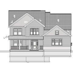
Seeking feedback on improving front elevation.

Don't like rafter tails cut to install column near the garage, not sure about fake double gable, porch would be nice, but not required. Not sure about columns, if I should put stone at the bottom. Not sure about fake windows over the garage...

Comments (26)

  • 10 years ago

    Why does the roof eave drop on the right side of the main house? Plans would help. What is the climate?

  • 10 years ago

    it a split floorplan, Zone 5

  • 10 years ago

    I would start by reducing the complexity and lack of clarity of the structure and massing. For instance the garage in partly in one element and partly in another. The split level is another unnecessary complication.

  • 10 years ago

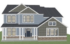
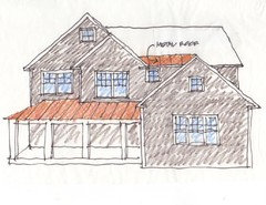
    What about this. Not 100% sure if I should connect roof planes of the garage and porch or push garage planes lower.....

  • 10 years ago

    Thank you JDS, you have been really great help.


    What about this look?

  • 10 years ago

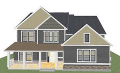
    Can you remove that really awkward step-down in the right side roof? And try to unify / simplify your exterior finishes - I count either 4 or 5 depending on if that grey is foundation that will show. (horizontal siding, vertical siding, shingles, stone, foundation?)

    I do like what you've done with the porch, and I liked the garage area in the previous iteration....

  • 10 years ago

    Are you working with an architect?

  • 10 years ago

    A fusion of JDS and Brians design would be a quantum leap in the aesthetics. Just make sure if using JDS' change and you live in a heavy snow area, you have a 3rd support column for that snow that accumulates in that section. By all means save yourself from that costly and garish roof section break.

  • PRO
    10 years ago
    last modified: 10 years ago

    To properly evaluate a home's design one would need a site plan and know your wants and needs. The design shown lacks balance and proper structural expression. Seek the assistance from a local architect, or as ArchitectRunnerGuy would say, "Designer of Talent".

  • 10 years ago
    last modified: 10 years ago

    You seem to be drawn to builder cliches like moth to a flame. It is not necessary to use randomly placed contrasting materials and colors on a well designed house, in fact, such visual distraction can ruin a well designed house.

    What is also hurting the design is the split-level that appears in the roof, flat trim under the windows instead of sub-sills, no window mullions, seemingly random window shapes, missing porch roof beam, token masonry band at base of siding, and the most common builder feature of all: multiple roof gables jammed together to create an awkward "roof wedgie" (there is no reason to stop a roof rake when it needs to continue to simplify the roof drainage pattern; its a natural and functional design element and should be featured instead of avoided)

    Make the design work on all sides of the house with no materials and colors first, then add them very slowly and very carefully. Think about compatible shapes and compositions rather than assembling features.

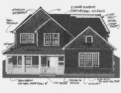
    From the drawing below I am convinced this house would look smaller and less elegant with multiple materials and colors.

  • PRO
    10 years ago

    I like all of JDS's comments, but the "No Booties" is my favorite.

  • 10 years ago

    For once I have to disagree with you Mark. My favorite is "roof wedgie", followed by "No".

  • 10 years ago

    I think I have to agree with ARG on this one Mark. I spit my coffee out when I read that JDS wrote "roof wedgie".

  • PRO
    10 years ago

    "No" is a classic.

  • 10 years ago
    last modified: 10 years ago

    Thanks but its not wise to encourage me.

    Another more conventional option:

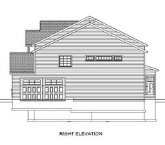
    The more difficult design issue is the stunningly awkward and unattractive side elevation posted earlier. Why would you draw a 3D model and only show the front view that foreshortens the monster house behind it? You should post views from the front corners. No matter how good the front facade is, it won't make up for bad sides. The drawing shown earlier is 2 1/2 stories tall with all the charm of an airplane hanger.

  • 10 years ago

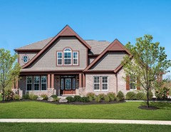
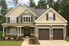
    Sorry but I don't find your inspiration picture attractive at all. My eye keeps jumping from one gable to the next. There are way too many elements competing with one another.

    On a house when you first drive up, the most important element is not the siding, or the gables, or the garage. It's the front entry. The area that is supposed to welcome you into the home. Look at the difference between your inspiration picture and the drawings JDS did for you. Notice how in each of his sketches your eye is not bouncing all over the place but it led to the front entry.

    Here's an experiment I give to my art students. Have the inspiration picture in front of you. Now close your eyes for 10 seconds. Open them again. What is the first thing you see? Now try the same thing with JDS's sketches.

  • 10 years ago

    P.S> I did remove 3" extensions to the lintels and the bottom of the windows. I thought it looked cool.


    I did not realized porch had 4" beam and 10"x10" newels. :) . I will add mullions. Also I noticed that the Inspiration photo has a missing cricket...


  • 10 years ago
    last modified: 10 years ago

    cpartist> Thank you. I appreciate all the help I can get.

    There is absolutely NO doubt that inspiration picture appears to advertise 9' garage doors. These massive, oversized, highlighted doors pull your eyes like a magnet. One of the reason I have the garage turned sideways.

    My main concern with what to do with the nasty valley on the left side.... I do not know if it will be high maintenance.

    This is for 12 acres farm property.

  • 10 years ago

    Cpartist, I like JDS's sketches, but when I do your art student experiment, my eye isn't drawn to the front entry. It's drawn to the big window above the front entry and the little round window above that. Does yours go to the porch?

    When I do the art student experiment for the poster's inspiration, my eye goes to the white trim forming four triangles at the peak of each gable. I don't actually notice the garage doors for quite a while.

  • 10 years ago

    I agree on JDS's first elevation it tends to first see the circular window, but that window is above the front door, so check where your eye moves to. My eye then follows down in a straight line to the door.

    On the second house JDS drew, my eye is drawn to the porch and the door partly because of it being lighter and partly because he's created more interest there.

    On the third one, my eye is immediately drawn to the porch and with that, it will be easy to find the front door.

    Compare it to Brian's inspiration where your eye is first drawn to the gables and then you have to almost search for that front door because there is so much going on.

  • 10 years ago

    Brian, if you're on 12 acres, why the heck do you need the garage attached to the side of the house like that?

  • 10 years ago
    last modified: 10 years ago

    Richard (JDS), please step in here if I'm wrong but I don't believe your original elevation had ANY brick. I'm seeing it as weathered shingles....Not too shabby BTW....You pass jury!!

    No one's seen a plan yet. Would be great if one was posted. And I think you need some "outside the box" thinking. And I mean that in a very literal sense.

  • 10 years ago
    last modified: 10 years ago

    These are tri-splits (or as builders calls them five levels), they nearly all identical.

    Click on this link to see about every possible way to arrange roof masses Link Here. These above are designed to be McMansion. Your choices between countless models are: if bathroom located upstairs between the two rooms to be Jack and Jill or straight, or if you want laundry room upstairs or down stairs. We looked at number of them in Ohio because of greater number of builder, but they all nearly all the same. Here is Rockford home and some video and video. We have to have this settings because of current issues with security of the property, despite of no trespassing signs. (nobody lived there for five years). And here is yet another one, derivative of Rockford imho.

    More farmish look, however despite the presence of massive windows including half circle the front rooms are dark, in addition windows are way all off-center. I visually do not like how 6:12 pitch looks with 12:12 gable. I do like porch. I like gable I do not like New England roof. So here's another.

  • 10 years ago
    last modified: 10 years ago

    Yes, my original sketch was all shingles. I've never designed a house with more than one kind of cladding. To me the arbitrary mixing of cladding is an ineffective attempt to disguise uninteresting house designs.

    I suggested posting a plan in my first comment and later recommended dropping the split level. I guess I should have stopped there because I see no improvement in the design so far.

    The roof wedgie is not a result of poor detailing; it is due to poor conceptual thinking or what Worthy calls the Mr. Potato Head design approach. Don't use narrow lot developer schemes if you have a large lot. If you like front facing gables, put a space between them. But this is not the most serious problem with the design. Drop the awkward split levels, stretch the house and narrow it front to back to let in more light and make the main roof steeper.

    You can't fix a bad massing scheme with a computer-altered front elevation lifted from an imitative siding catalog.

  • 10 years ago

    Richard,

    I did not meant to offend you. I appreciate your help and feedback. I have engineering background and I enjoy the challenges. This was springbreak week @elementary schools - we were out. I'll post plans.


    The house faces North with set of very large and mature trees. We do not wish "usable rooms" to face North. What faces North right now: is a computer room and spare bedroom.


    I have seen some really good work done by the architect, where very house was built in 1902 NJ suburb looked like it was always been there. I do not know what good architecture is until I see it. As an engineer I enjoy examining support, and the challenge of hiding it. Fresh from GreatWoolfLodge I enjoyed seeing massive trusses with bottom members 8x24 (glulam) and massive purlins spanning 16 - 24 ft between trusses. I apologize again if I offended you, have all intent to try different looks.

    >I see no improvement in the design so far.

    Just getting to it now.

    >and make the main roof steeper.

    Current roof is 7:12, should I go 8:12? 9:12