Software
Houzz Logo Print
pippiep

Paint: I keep changing my mind!

10 years ago

We've narrowed down the pain to three colors, and my husband slightly prefers one over the others but likes them all. I change my mind daily! I know we can always change it later, but I'd rather not do that.

I wanted to wait to get the cabinets to decide, and since they're here, I can finally make a decision.

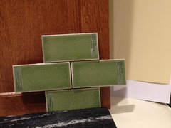
These are all Benjamin Moore: Butter Cookie, Bronzed Beige, Gloucester Green, and Camouflage. I've always liked Camouflage, but my husband has disliked it from the start. I tried it again and think it actually looks pretty good with the cabinets. But I think they all look good! Help?

Comments (30)

  • 10 years ago

    #4!!!

  • 10 years ago

    I like the last one, too.

  • 10 years ago

    Not to make you crazy, but have you tried Ben Moore powell buff?


  • 10 years ago

    I like the last one best.

  • 10 years ago

    #4 looks great.

  • 10 years ago

    Last one - definitely

  • 10 years ago
    last modified: 10 years ago

    benjesbride -- I actually have a color sheet of that one! I'll post it when I can get a pic.

    I have large color sheets of the following; let me know if there's anything else I should take a pic of:

    Adams Gold ~ Aganthus Green ~ Agave ~ Ally's Earring ~ Amulet ~ Ashwood ~ Baby Turtle ~ Beacon Hill Damask ~ Bracken Cream ~ Bronzed Beige ~ Brookside Moss ~ Butter Cookie ~ Camouflage ~ Carrington Beige ~ Chestertown Buff ~ Croquet ~ Dark Linen ~ Dill Pickle ~ Doily ~ Dove Wing ~ Dried Parsley ~ Fernwood Green ~ Flowering Herbs ~ Georgian Green
    ~
    Gloucester Green ~ Golden Tan ~ Grant Beige ~ Grasshopper ~ Grasslands ~ Green Umber ~ Greenmount Silk ~ Halo ~ Hampton Green ~ Hancock Green ~ Handmade Paper ~ Hazy Skies ~ Henderson Buff ~ Hidden Cove ~ Hillside Green ~ Ivy Lane ~ Jalapeno Pepper ~ Jute ~ Knitted Cape ~ Lancaster Whitewash ~ Late Wheat ~ Lewiville Green ~ Light Khaki ~ Limesicle ~ Louisburg Green ~ Manchester Tan ~ Mellowed Ivory ~ Minced Onion ~ Misted Fern ~ Misty Air ~ Monroe Bisque ~ Mountain Lane ~ Nantucket Breeze ~ Nature Lover ~ November Rain ~ Oat Straw ~ October Mist ~ Old Prairie ~ Overcast ~ Pale Avocado ~ Pale Celery ~ Pale Sea Mist ~ Peaceful Garden ~ Pistachio Ice Cream ~ Powell Buff ~ Rainforest Dew ~ Rosemary Sprig ~ Scenic Drive ~ Seashell ~ Soft Fern ~ Splendor ~ Spring Dust ~ Springview Green ~ Sulfur Yellow ~ Sweet Cream ~ Sweet Daphne ~ Timothy Straw ~ Urban Nature ~ Vellum ~ Vichyssoise ~ Wasabi ~ Weekend Getaway ~ White Chocolate ~ White Marigold ~ Winds Breath

  • 10 years ago

    Powell Buff:

  • 10 years ago

    It is SO difficult to see paint colors clearly on anyone else's monitor.


    My advice....choose the color you like, which brings out the warm tones of the cabinets.

    I was going to paint our kitchen blue, but it made the wood cabinets look dull and grayed out. So, we went with Jadeite green instead and it's lovely.

  • 10 years ago

    I really like bronzed beige. i think yellow/golden is the color that bridges the color of the wood and the tile.

  • 10 years ago
    last modified: 10 years ago

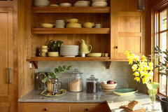
    I've always admired this kitchen. They used BM Philadelphia Cream. Their tile is not as deep as yours but they definitely are in your color palette area. Any of your choices would look great.

    Saint Paul Craftsman · More Info

    Saint Paul Craftsman · More Info

  • 10 years ago

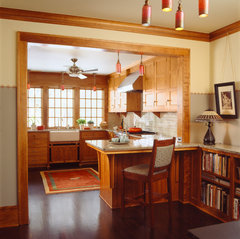
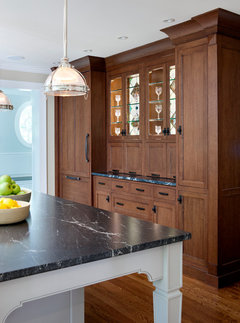
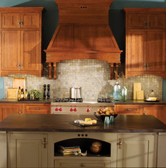
    Thanks for all the advice! I'm surprised at how much I like Camouflage with these cabinets. I want the cabinets to look more brown, not golden or reddish. I want a look closer to the following, and NOT like the bottom pic (which is the same brand, different stain):


    Shornecliffe- Kitchen · More Info

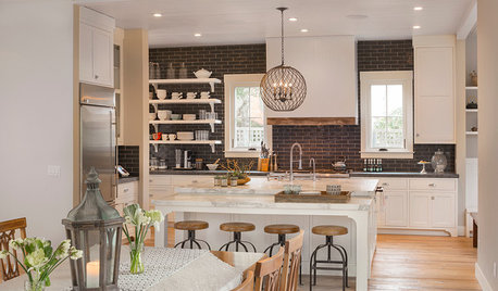
    I don't want this:


    Craftsman Kitchen · More Info

  • 10 years ago

    The pic in my "sneak peek" thread has a more true-to-color pic of my cabinets:

  • 10 years ago

    to my eye, anything with a green undertone will bring out any red in the wood.

  • 10 years ago

    I'd wait until everything is installed then paint larger swatches on the wall. Looks like you have lots of great options though.

  • 10 years ago

    Oh girl, those cabinets are gorgeous! I must say, I'm still leaning towards that Camoflage!

  • 10 years ago

    I agree with benjesbride: I think that the green tiles are making the cabinets look more red. Are you completely set on those?

  • 10 years ago

    I like 4 best! But also like 1 :)

  • 10 years ago
    They're going to paint before installing the cabinets, since they're replacing the walls.

    The green tile has already been ordered. Maybe I just need to embrace the reddish tone? My husband loves it. He would've chosen a redder stain if I'd let him.
  • 10 years ago
    Oh, and I also thought the full cabinets would sway him toward Camouflage, but he still absolutely hates it.
  • 10 years ago

    The last one looks best when I kick up the brightness on my monitor. If your room has any tendency towards darkness I'd pick a lighter color in that family....

  • 10 years ago

    How about BM Mannequin Cream?

  • 10 years ago

    Just my opinion, I really like the butter cookie. Like I tell the kids at school, sometimes too much of a good thing doesn't work the way you think, i.e. too much green. To have the green of the tile pop, use the contrast of the yellow- otherwise it is too monochromatic. I really don't think you'll have a huge issue with pulling out red with that brown.

    Heather

  • 10 years ago

    Black sheep here, I like number #1. But I think cpartist has given some great advice.

  • 10 years ago

    #1 was my favorite before I read comments & began to overthink it.

  • 10 years ago

    ^^^Thats too funny, because number 1 was my first choice too, until I read all the other comments. I think I'm influenced by the yellow at the base of each photo. Is that your current countertop? Will that yellow be part of the new kitchen? Is it the floor? I'm just not sure. But the first paint color looks great with the cabinets, countertop, tile, and that other yellow.

  • 10 years ago

    BM Grant Beige would also work really well with your cab/counter/BS choices.

  • PRO
    10 years ago

    Too bad your husband is so opposed to camouflage- I really think it looks best with your tile.

  • 10 years ago
    The yellow at the bottom of each pic is my current off-white laminate counter. This whole setup was so hard to photograph!

    My husband wants something bright and cheerful. Not dreary, gray, or dingy, which is how he describes Camouflage. Our current kitchen and all the hallways are a blah pink-beige, and it's bringing him down. He wants to add life! Eventually we'll get around to painting the rest of the house, but for now, he wants one cheery and uplifting room.

    I get that! So, we're going with Butter Cookie (first photo). We can always change it later once we start painting the other rooms.