Software
Houzz Logo Print
smittyg

WHAT AM I DOING WRONG?!!

13 years ago
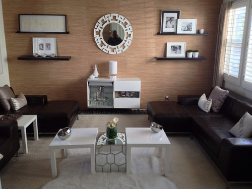
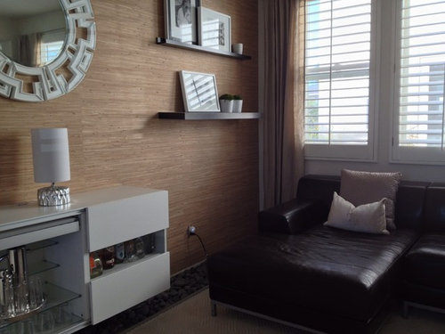
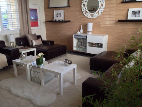
Can't figure out why the room doesn't look as good as it did in my head. just doesn't look "finished". Very contrasty dark sectional / white tables, rug. I've found that I gravitate toward natural finishes; grass cloth, river rock, leather. Was going for "earthy elegance" not sure if that combination is even possible ...contradictory?
Tables seem too small, hate the mirror over the bar, (wife chose it) thought sunburst might work better. Tried to soften sectional with throw pillows...didn't work, floating shelves not as great as I had imagined. Can't figure out why the room doesn't flow. Any suggestions would be appreciated, I so admire your ability to look at a space and immediately figure out design issues. Please help. Oh and excuse the dead flowers

Comments (36)

  • PRO
    13 years ago
    last modified: 13 years ago
    I feel like I want the floating shelves to be moved in towards the mirror. I don't hate the mirror, but the mirror/bar seem underscale right now. What does it look like to put a white table on either side of bar and little mirror cube just floating in an end table position?
  • PRO
    13 years ago
    Or can bar be in front of the window, coffee table in front of sectional?
  • 13 years ago
    You say you want "earthy" but where are the natural materials? I'm guessing the shelves are real wood, and a few of the furniture real leather, maybe the rug is real fur. But the overwhelming impression is non-natural, even in color. I definitely think earthy can be elegant - the Japanese do it best - but it usually derives from reverence for natural materials.
  • 13 years ago
    What about a plant ?
  • 13 years ago
    Oops just noticed it !
  • 13 years ago
    there is no imperfection :) i think, everything fits too good together (except the red-orange & red-violet pictures). it looks like out of an ikea catalogue and a little unpersonally.

    the small tables look like lack's from ikea. i would get rid of those 2 next to the mirror-table.
    I'd rather take a vintage commode instead of the modern white sideboard, either in natural wood or shabby-chic-white.
    And instead of all the pictures, put books on at least one of the shelves. somes vertically and somes horizontally. you can choose them by colour and change it easily if you want to redecorate.
    Also i would change the plants on the shelve, they look kind of dead - even if they may be absolutely okay ;) - i would replace them by something green that "floats" over the pot.
    And maybe some other pillows, I can't get warm with those :) somes with big patterns on, just like stripes or so...
    (sorry for my english. hope, i could help; if you don't like my suggestions, just ignore :))
  • 13 years ago
    I like the furnishings that you have chosen. However, I would move the seating into a U shape.
  • 13 years ago
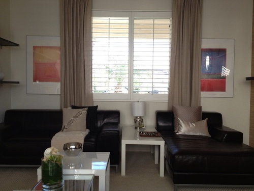
    Some suggestions... the bigger pictures are partially hidden by the drapes. Perhaps you could eliminate the shelves, put the colorful, larger pictures on that wall, and put the personal photos in the smaller spaces where those big pictures are now. Then, get some throw pillows with some color, especially using colors you can pull out of the bigger pictures. Doing this, however, may make the mirror look out of place - you might have to find something else :) Perhaps a nice wall clock?
    Also - the lamp between the 2 seats is too small - it looks out of scale. Proper lighting is so important in creating a feeling of warmth. Another possibility - eliminate the heavy drapes and use cornices.
  • 13 years ago
    It is too symmetrical, in my opinion, and there are too many 'itsy bitsy' pieces that make it look cluttered. Why not ditch the white cabinet against the wall, and put the long sofa along that wall instead. Place the smaller sofa/single chair on a 45 degree angle from the corner between the long wall and the window. Make sure part of it sits across the hide rug. Get rid of the 3 white coffee tables and use the mirror cube instead. I'd probably put it between the single sofa/chair and the window.
  • 13 years ago
    last modified: 13 years ago
    I agree on the 'too symmetrical' and the 'u-shape idea'. And the buffet is too small to be the focal point. Place the large couch against the wall in the middle and the longer table and bar next to it. Keep the two square tables in the middle. Looking at the first picture, place the loveseat on the left and the sofa on the right, lengthwise under the window with the mirrored table next to it. Can't tell exactly how it will all look without wall #4 with the door, but you could move and play with the smaller tables and deco until you're satisfied.

    Note: if the large couch with the bar and table won't fit against the wall, you could try and switch it with the loveseat.
  • PRO
    13 years ago
    I like the grasscloth and the leather, but I think the shiny white finish on the tables distracts and feels cold. Try something with a warmer finish to bring it all together - lighter coloured wood maybe
  • 13 years ago
    it looks like a Dr's waiting room....stagger the tables in the center perhaps....maybe stagger the shelves as well....and some color...just a smidge.
  • 13 years ago
    I am assuming that because you asked for help, you really want to know what is wrong with the room. So, here are some factors to consider.

    1. There is no focal point in the room which means that the eye must continually rove about the room. This is not very restful. It seems that you have tried to make the bar wall the focal point but this leads to the next problem. 2. The bar wall is unbalanced. Because the shelves are of a darker wood and are not centered above the bar, but, rather, are hanging out past the sides of the bar, this gives the wall an uncomfortable, unbalanced feeling. Just two shelves centered directly over the bar would have been better, or, NO shelves with just the mirror over the bar would have been more balanced, which leads us to the next problem. 3. This is a classic case of more is less. Your room is over-decorated. In attempt to make everything feel pulled together and coordinated, you have added too many accessories. Everything technically matches but it all feels disconnected because of the problem of scale, which is the next problem. 4. The sofas are very large and dark which gives them a big presence in the room but the end tables, the bar, the lamps, the small chrome and white accessories and even the rug are all too SMALL for the scale of the sofas, again leading to an unbalanced feeling. That's the bad news. Now on to the good news.

    1. Start by removing things. Remove the colored prints on the wall. (They are great but just don't go in this room at all.) Remove the rug and everything pertaining to the little table arrangement in the middle of the room.

    2. I would even recommend that you remove the brown/black wall shelves and only have the mirror and bar on that wall but I know you will probably resist this now that you have put holes in the wall. So, instead, remove all the pictures, etc. that you have on the shelves. (The largest picture you have on the top left shelf is simply too large to fit up there at all. It is contributing to the top-heavy feeling with the shelves hanging out over the too small bar.) Instead of the way that you have things grouped, place one picture on the top left shelf and a group of three small white planters with some green plants in them on the bottom shelf. (Simple grass seed makes a lovely, tidy plant.) On the right side top shelf place the 2 white vases from the bar off center right on the shelf and place one picture on the bottom shelf. By doing this you have made the shelves feel lighter, less top heavy. Move the lamp which remains on the bar to the right so that it is centered above the right, white half of the bar.

    Now, stand back and look at this wall again. With the "clutter island" gone from the middle of the room and the accessories down-sized and more balanced on the bar wall, I think you will begin to feel better about the room already.

    3. The sofas do need some attention but I cannot advise you on this until you let us know what the wall directly opposite the bar wall looks like and until you advise us what this room is used for. Is there a television in here somewhere? Is this a conversation/reading room? Purpose and use help determine the furniture arrangement.

    Hope this helps somewhat. Your main problem is a matter of balance. Thankfully, because everything in the room is so beautiful already, it is simply a matter of re-arrangement.
  • 13 years ago
    If some Houzzer could photoshop all of the white elements in the picture to brown, I think it would simplify the color issue for you. I also suggest he try removing everything from the room except the grasscloth and leather, and shelves, and get their arrangement right first. Then we can audition and appropriately cast the remaining elements. This strategy will let you isolate the off-notes and fix them one by one. Do this before spending any money replacing what you've invested in. I think you can make a pleasing arrangement. My GUESS is that you overdid the white and mirrors. If there were just a small pop, you'd have your "earthy elegance."
  • 13 years ago
    I am sure you don't want to move those shelves, so why not replace the white mirror with a larger mirror with either a mirror frame or dark wood frame? That might help balance that wall. I agree with all the comments about the small white tables. I think you need wood or glass and larger. The white seems to jump out and draw the eye. I like contrast, too, but I think white plastic or enamel is not the way to go. I, too, wish I could see more of the room.
  • PRO
    13 years ago
    I think you are very close to having it look right, i do think the shelves are too high and too far away from the mirror. You want the highest shelf to be between 60" and 66"....I can see your reflection in the mirror so I would go to the lower 60". This will make your art work and objects eye level. I think then you just need to add some earthiness. Natural fibers- baskets, wood objects, etc. A wood tray on the table. Some darker tan pillows. Then choose one pop of color- maybe a pretty teal or green. Add it in 3 spots around the room....a vase, a pillow or two. I think the space is going to be gorgeous!
  • PRO
    13 years ago
    Looks like everything is the same size and shape and with 2 colors, brown and white.
  • 13 years ago
    the art work on the wall are not balanced. one side looks heavier then the other.
    the tables in the middle are just looking akward, one bigger table would look better and maybe use the smaller white ones as side tables.
  • 13 years ago
    I think your place is beautiful!! If I were you, I would replace the white table between the sectionals with a tall floor lamp, but that's only a suggestion. It looks really very cool!
  • 13 years ago
    last modified: 13 years ago
    I have only glanced over the previous posts, so please forgive if I repeat what has already been said. A few tweaks and your room will be fabulous!

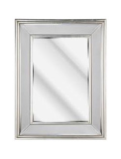
    1) The mirror is out of scale with the shelving. Not only is it out of scale, but the sudden introduction of a round object is jarring. It is kinda like trying to put a round peg in a square hole; it doesn't work. Replace it with a large retangular mirror framed in mirror.

    2) Your lamps are much too small...which makes them out of scale as well. They need to be much taller. The existing lamps are small accents lamps. Meant to be used more as night lights or bedside table lamps. (see picture for appropriate scale)

    3) The mirrored table is out of scale with the two white tables. And the long white table between the two pieces of furniture is too long. Try using it as a coffee table turned long ways. Use one of the two smaller tables in its place. Remove the extra one.

    4) Angle the rug to provide interest.

    5) A silver floor lamp would add the additional lighting that is need, while adding interest.

    6) Remove the two prints that are half hidden by the drapes.

    7) You have a small amout of green in the room already. Try adding 3 green printed throw pillows for some much needed color.

    Hope to see updated photos soon!
  • 13 years ago
    last modified: 13 years ago
    The white and silver doesn't work, nor does the black and white with the rest of the room. I would switch out the rug for a sisal rug and larger. Get light shade wood for the tables and larger. Larger lamps, color's ok, but perhaps with a linen shade. The feature wall, the shelves work but are too close together. The cabinet doesn't work. Nor does the mirror. I would change it to a wood table and pictures with some color instead of the mirror and on the shelves. It's as if you have two different rooms here the silver and white laminates with the parsons tables, lamps and the feature wall, and then everything else. Think you need to choose one or the other, but they don't work well together.
  • PRO
    13 years ago
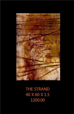
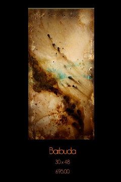
    You can incorporate color and still remain true to your earthy theme. A nice piece of art would really bring the room together. I have several I have recently completed. www.jul313.com or you can contact me at julie@jul313.com. Have fun!!
  • 13 years ago
    I agree with most of the above comments, especially Michelle Mink and janishill's suggestions - great details there! I also think that a larger rug in a square or rectangular shape may help. The rest of the room is very geometric and symmetrical and I find that irregular shape quite jarring. Choosing a different rug will also provide an option to bring some subtle colour in - a sludgy teal, perhaps, or even a warmer pale burnt orange. A larger coffee table would also help to balance out te emopty space in the middle of what is otherwise a busy room. Something with a glass top, though, to keep the feeling light. The other jarring element in the room, for me, is the bright artwork on the wall next to the window. (I do love the mirrored cube, if you turf it, could you send it my way? ;-)
  • PRO
    13 years ago
    Need some pattern on the rug! That is all it will take to tie it together!
  • 11 years ago

    Change the direction of the the three tables to invite the eye into the room. The shelving could be moved in closer to the focal mirror and bar. I would look for a silver sunburst style mirror, slightly larger. The wall has too much white, the silver mirror will be beautiful.

  • 11 years ago

    TWO years old!!!

  • PRO
    11 years ago

    When I look at this room the first thing I see is that there seems to be too many disconnected pieces-ie.,the floating shelves. It is like looking at the ocean and seeing things floating in the water that detract from the view. This is a focal wall and I would use longer shelves-maybe put the ones you have side by side and add a strip of the puck style lights to the bottom of each shelf so it will shine down on the objects of the shelf below. Repeat for each shelf you want to have and maybe center the lit shelves on that wall. The console could go over to one side with a taller mirror on it that would be at the same height as the shelves. Let me know if you have any questions.

  • 11 years ago
    Aaarg, old post from 2013 and I read it all.
  • 11 years ago

    I believe the wall with the mirror would look better if you painted the floating shelves white and had white chests or shelving units (perhaps 40-48 inches high) to flank the white bar. For the sake of accent, I would suggest making just the tops of the shelving units the dark brown you have in other furnishings. As a result, the dark upholstery still will stand out against the white at this end of the room. I think the bright orange prints are pretty, but they should be moved toward each side to avoid being partially covered by the curtain. I believe the prints would show up better if placed in wide, wooden frames that are stained or painted to match the dark brown in the room. Frankly, I like the peachy beige of the accent wall, and I think it would be beautiful on all the walls of the room because it adds warmth and still contrasts from the dark and light neutrals in the room.

  • 11 years ago

    To me, it seems to be a problem of scale. There's no one thing, other than the mirror, that really draws the eye. I'd go for either a bigger "Here I am!" mirror (and I'm with you on the starburst), or a much bigger, longer bar… something that's an obvious statement.

  • 11 years ago

    Old post from 2013. Again.

  • 11 years ago
    It seems a little too cluttered and deliberate. Try bringing the wall accessories closer together. Also, add some greenery. Real plants. Large leaves. They will add the layer you are missing.
  • 11 years ago
    I find myself wondering what happens in the room. Doesn't seem built for conversation OR tv watching Or dancing. Maybe there would be a clue in your answer to inform the couch.

    The shelves might work if they were closer to the mirror and the top ones lower. Maybe replace the top ones along side the lower ones to create a single longer lower shelf.

    I love the paintings and could see them on the grass wall. Close together and low. Above the singly shelf. Lose the mirror. It's too small for the job of focal piece.
  • 10 years ago

    I believe you should take down the floating shelves and put the large red and blue framed art, which you have above the sectional pieces, on the wall so that they flank the mirror. You may need to change the wall color to something more neutral so that the pictures will not clash. Then, I would suggest you find another location for the small, framed pictures you did have on the floating shelves, but you might put two of the larger pictures where you did have the red and blue wall art. I would suggest you get matching chests or low bookcases (up to 48 inches high) to put on each side of the console that is under the mirror.

  • 10 years ago
    The coffee table and the table next to the wall are out of proportion to the sofa. While color is very personal the wall color fights with the sofa and white furniture
Sponsored
Hope Restoration & General Contracting
Average rating: 4.7 out of 5 stars35 Reviews
Columbus Design-Build, Kitchen & Bath Remodeling, Historic Renovations