

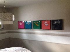
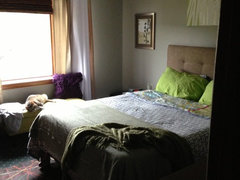
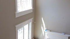
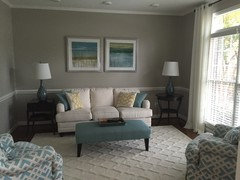
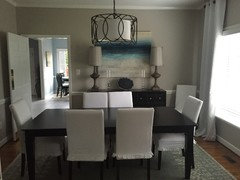
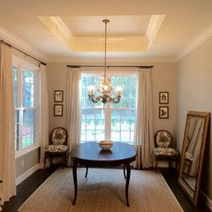
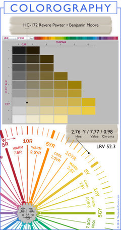
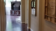
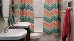
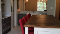
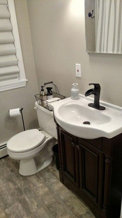
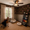
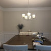
Revere Pewter (BM) can someone show rooms painted with this color
10 years ago
Featured Answer
Sort by:Oldest
Comments (15)
Related Professionals
Rome Interior Designers & Decorators · Concord Interior Designers & Decorators · Columbia Interior Designers & Decorators · Guymon Interior Designers & Decorators · Spokane Interior Designers & Decorators · Abilene Kitchen & Bathroom Designers · Laredo Kitchen & Bathroom Designers · Longview Kitchen & Bathroom Designers · Beckley Kitchen & Bathroom Designers · Fall River Kitchen & Bathroom Designers · San Angelo Kitchen & Bathroom Designers · Calgary Kitchen & Bathroom Designers · Houma Furniture & Accessories · Odessa Furniture & Accessories · Leamington Furniture & Accessories 10 years ago
 10 years ago
 10 years ago
- 10 years ago
- 10 years ago
 10 years ago
 PRO10 years agolast modified: 10 years ago
- 10 years ago
 10 years ago
- 10 years ago
 10 years ago


Related Stories
Houzz Call: Show Us Your Paint Makeovers
Let your newly repainted house or room do the "How d'ya like me now?" strut right here — it might just be featured in an upcoming ideabook
Full Story
LAUNDRY ROOMSThe Cure for Houzz Envy: Laundry Room Touches Anyone Can Do
Make fluffing and folding more enjoyable by borrowing these ideas from beautifully designed laundry rooms
Full Story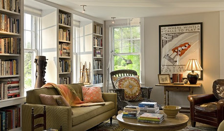
BUDGET DECORATINGThe Cure for Houzz Envy: Living Room Touches Anyone Can Do
Spiff up your living room with very little effort or expense, using ideas borrowed from covetable ones
Full Story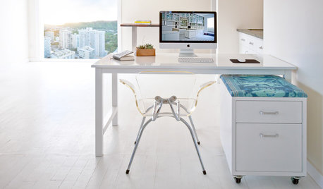
HOME OFFICESYou Can Kick That Ugly Filing Cabinet to the Curb
When you’re ready to break out of the gray metal box, consider these creative options for storing your files
Full Story
DECORATING GUIDESSee How Wabi-Sabi Can Bring Harmony and Beauty to Your Home
Create your own wabi-style style with beautifully weathered, humble materials around the house
Full Story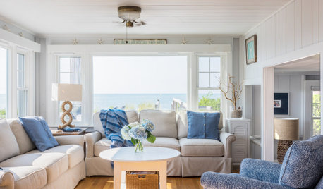
WHITEWhat to Know Before You Paint Your Walls White
A coat of white paint can do wonders in one room and wreak havoc in another. Here are tips for using the popular hue
Full Story
ENTRYWAYSSingle Design Moves That Can Transform an Entry
Take your foyer from merely fine to fabulous with one brilliant touch
Full Story
INSIDE HOUZZDecorating Trends: A New Houzz Survey Shows What Homeowners Want
Is the TV gaining or losing ground? Are women or men trendier? Find out and learn more about people’s decorating plans right here
Full Story
MIDCENTURY HOMESHouzz Tour: How Can We Get Invited to This Awesome Midcentury Home?
A redwood-clad gem in California’s Marin County features a dreamy outdoor oasis with an open-door policy for the homeowners’ friends
Full Story
EVENTSColors and Patterns Wow at the 2015 Kips Bay Decorator Show House
Go on a virtual tour as 22 designers put on a beautiful interior fashion show in NYC’s Arthur Sachs mansion
Full Story


nosoccermom