Software
Houzz Logo Print
redphoenix2k1

Failed Paint colors for the 2nd time... Need help!

10 years ago
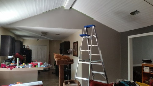
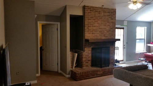
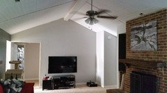
Good evening folks. My wife and I have been trying to do our greatroom, hallway and eventually our kitchen in the grey tones for awhile. I just painted our greatroom mostly today and the color is dreary.

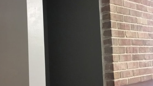
We love our accent wall (its Valspar Rugged Suede http://m.valsparpaint.com/color-detail.php?id=1878&g=1021 )

We have been trying to use a light color grey for the rest of the house, however we have struck out twice. We originally chose "Modest Silver" ( http://m.valsparpaint.com/color-detail.php?id=1844&g=1007) since it seemed like a perfect light color for us. However it had a purple tint in it and in the light that our greatroom had, it was driving us nuts.

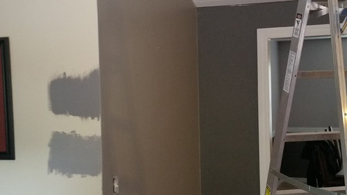
Today I painted the room again with Valspar "Rocky Bluffs" (http://m.valsparpaint.com/color-detail.php?id=1876&g=1021) and certain parts of the room in the day time look good but certain parts look dreary. At night it feels dark, which is to be expected, but now the accent wall no longer pops and overall my wife hates it.

I decided to call for help. We are not that good at this color choosing aspect and desperately need help. We still wanted to keep with the neutral colors, but maybe the grey whole house interior color is not for us.

Any help would be fantastic! The ceiling is a work in progress, I still need to add faux beams to cover up the seems. Also we are putting in wood tile too after all the painting is done.


Comments (11)

  • 10 years ago

    I'm not familiar with Valspar paint colors, and I'm using my laptop which is not so good at rendering colors, so take this with a few grains of salt.

    I didn't like any of Valspar's grays with Rugged Suede--they were all either too dark or had the wrong undertones. Then I went looking at their warm whites. Paint companies are very liberal with their use of the word "white;" some of them have quite a lot of color. I thought Vanilla Steam or Ballroom Belle might be a good pairing for you. I also quite liked Snow Cap, which leans a bit more toward yellow--I thought it was very pretty with the Rugged Suede.

  • 10 years ago

    Rugged Suede is the color on the peaked wall that divides the rooms? That's a very warm grey or a beige with grey and you are trying to pair it with cool greys -- onces with more blue. The warm undertones and cool undertones are going to accentuate each other when you put the two together. I'm not sure I understand what look you are after -- lighter/darker contrast or beiger/greyer contrast.

    If you are happy with the Rugged Suede, have you considered just using that color at a ligher value? You can have the paint mixed at a percentage of the formula for a gallon of Rugged Suede. If you try to mix it yourself with white, you could have trouble matching the color if you need more.

    Lowe's here has Sherwin WIlliams colors -- if you want a different color rather than a lighter shade of the same color, try looking at something like Requisite Gray or Wordly Gray. On my monitor, they look good with the Rugged Suede photo. If they aren't right, maybe they will give you an idea of the direction to look. You could also look at Anew Gray and Mega Greige -- Agreeable Grey if you want something lighter.

    If that doesn't help, give us a better idea of the look you are after. Grey means different things to different people and in different contexts.

  • 10 years ago

    our GW color gurus will certainly weigh soon. But until then, I think you now realize that you can't can't pick a paint color. Lighting has everything to do with the way the paint will appear on your walls.

    Your exposure is very important in choosing a color. It is a fact that the same exact color can look entirely different in two different room in your home.

    It's not easy to get the grays and taupes right.

  • 10 years ago

    I would do the entire FR in the Rugged Suede and use a complimentary but wholly different color in the kitchen. It looks like the light in the kitchen is fairly low, so I'd go with a medium saturated color or a very warm white.

  • 10 years ago

    I love the big orange kitty!! Ha

    Paint colors are so hard. I think your trying to go too dark.

    Lots of big paint swatches are your friend & live with them for days.

  • 10 years ago

    When we were picking paint colors for the new house, the best method of looking at colors was grabbing a large (24"x36") piece of foam core/poster board and painting it with a paint sample... that way you can move it around to different rooms in different lights. Although the color is still SLIGHTLY different because of the different finish of the poster board compared to your wall.

    How about the Woodlawn Dewkist that is recommended on the Valspar page? The paints seem to err on the darker side in your room, so that lighter gray might transform into a nice medium gray?

  • 10 years ago

    I would pick several colors and do as others have suggested by putting them on foam core.

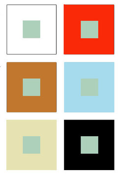
    Do realize that all color is affected by the colors and light surrounding it. Here is an example. All greens in the center are exactly the same, yet notice how the color surrounding it changes the green?

    Another example: When I painted my house in NY, I chose a yellow/tan color that looked perfect for my north facing living room. When we were deciding on colors for our west facing condo in FL, I suggested we do the same color as I had up in NY.

    I painted a swatch on the walls, and was immediately dismayed. What looked yellow tan in NY, looked like the color of coffee after you add milk in FL. Why? Because the light in FL is redder and warmer and it tends to wash colors out a bit too.

    I would not pick a gray as grays tend to be dreary. I would choose a very grayed version of an actual color you like. Personally I'd pick a grayed green as it would be a wonderful complement to the fireplace (green is the complement of red) and will help bring in a bit of the outdoors in.

    Maybe something like this. (Disclaimer: On my screen it reads the color I'm trying to explain but on your screen it might read entirely different.)

  • PRO
    10 years ago

    Try what you have half strength. I had the same problem wit SW Repose Gray. I had it made up half strength for the kitchen walls (a room where light varies dramatically!), and it looked pink/mauve. That goodness it was just a sample pot used in a small area! I went back and looked at the formula and discovered that it had a bit of maroon in it. Had them make a test pot - still half strength Repose Gray but totally leaving out the maroon. Gorgeous color - had walls done last week.

  • 10 years ago

    Thanks for all the replies. It really helped us.


    I went with Seashell grey, but it was mint green in the sunlight, light grey at night. I then tried the Rocky Bluffs at 1/2 the strength and the color between Rocky Bluffs and Seashell Grey, which was Filtered Shade. Both looked great, but we actually lived with the color through the day and saw that Filtered Grey looked light and open during the day and still light enough at night.

    I really appreciate all your help, now what am I to do with the 15 samples of paint I have here haha.


  • 10 years ago
    last modified: 10 years ago

    cpartist,

    I have a sample grey from ACE (only) Valspar bought during a 99 cent sale, called Modern Gray.

    Didn't care for it on the sample board, so retired it . I have an accent wall in the kitchen where I wanted to explore grays, so I later put Modern Gray up just to see where I need to move to with other grays that might work, if at all.. Wow, it changed colors and was so beautiful I painted the wall with half the sample can (their samples go a long way). I look at it everyday thinking I love that color.

    Next problem: Painting two bathrooms with yellow tiles in them. I put up that gray just to see where I need to go to get a gray that worked with the yellow, surely this would not work.

    This gray changed color due to light, etc. It works with the yellow tile perfectly. Looks so modern, it is like I selected the modern gray and matched it with a modern colored tile to create a unique modern look.

    Incidentally I looked it up on my computer and it does not look like the real color.

Sponsored
Haus Studio
Average rating: 4.8 out of 5 stars28 Reviews
Franklin County's Preferred Custom Cabinetry & Design Studio