Software
Houzz Logo Print
kristin_moussamarouf

Which picture above FP?!!

10 years ago
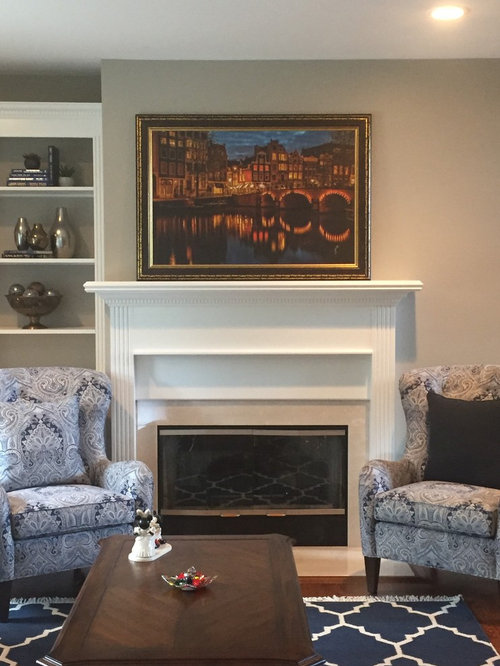
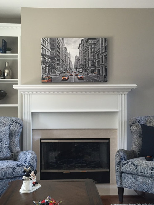
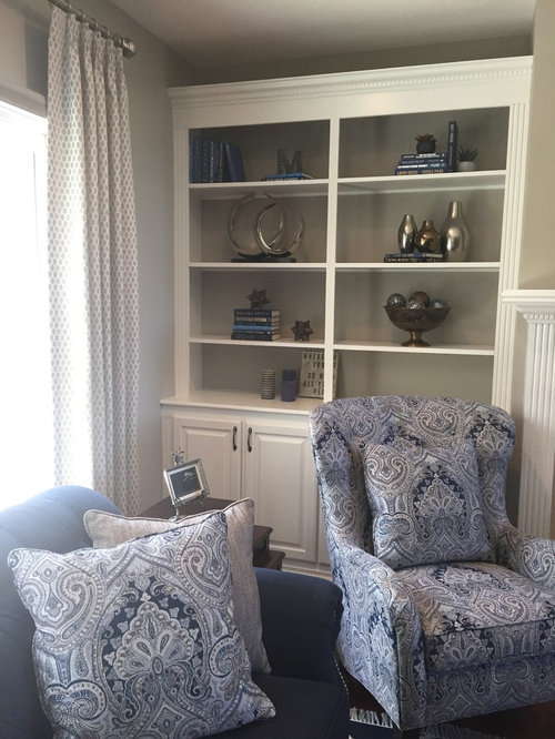
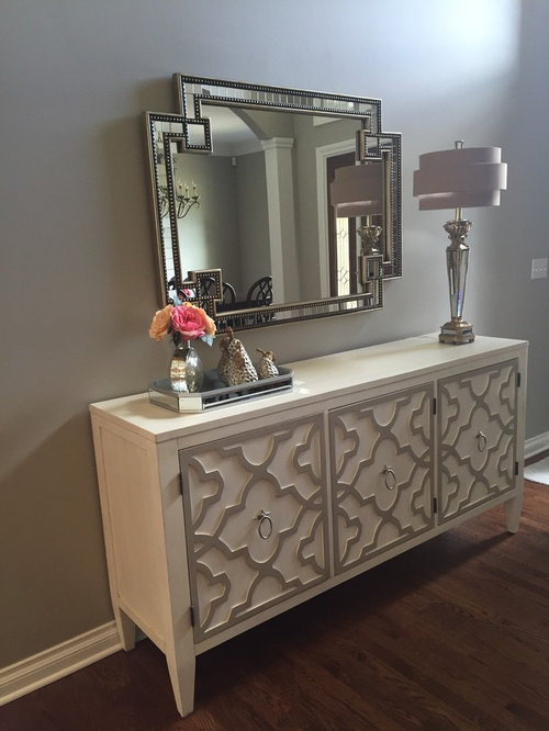
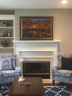
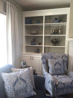
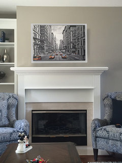
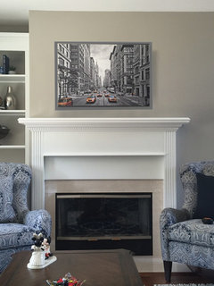
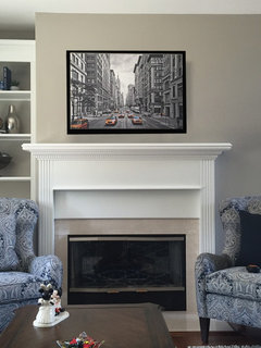
I can't decide which picture looks better above the fireplace. First I hung the NYC street picture as a filler until I found a different one, and it grew on me. Now I got the one of the bridge and I can't decide if it's too busy or not. What do you think? There is a bookcase on the left, and waaaay down the wall to the right is a console with mirror. Thoughts???

Comments (40)

  • 10 years ago

    Oh, I love the NYC street art in that spot! I vote for that one.

  • 10 years ago

    NYC street art for sure!

  • 10 years ago
    last modified: 10 years ago

    Are you planning on framing the NYC art (I think it suits your room better), as it's a bit small and once framed it will be more impactful. Have you ever tried your mirror above the fireplace and art over the buffet?

  • 10 years ago
    I was going to frame it, then I decided against it since I didn't think it worked in the space. Now I'm not so sure. Should I do a black frame?? Or metal!?
  • 10 years ago
    Oh and I tried the mirror above the fireplace. It looked awful because it reflected the hood in the kitchen lol! So that's out!
  • 10 years ago
    last modified: 10 years ago

    I think a metal frame may be nice..will compliment the bookcase accessories and also feel lighter. I'm still getting a feeling it may be a bit too small? Maybe it's too low and then when you accessorize the mantle, it will feel more balanced. Before you decide...try to move it up a bit and add items, to really get a better feeling - for instance, try your 3 silver vases or the two large ringed items from the bookcase on the mantle.

  • 10 years ago
    I agree it did look a bit small at first, but now it's grown on me. And like you said, with a frame and some accessories it can work. But I really did like the oranges and yellows in the other picture because they compliment the navy colors. I just don't know what feels off about it. The frame maybe?? Hhmmmmm
  • 10 years ago
    last modified: 10 years ago

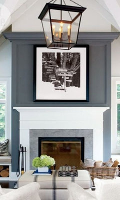
    The other art is nice too, but feels a bit dark with what else you have in the room. To tell you the truth, if you can return both or move them to other locations, that is what I would do. I would buy something you absolutely love - you'll know right away and in the case of both of these you are having doubts. The style/frame of the art in my previous picture would really make a statement in your room.

  • 10 years ago

    Your home and furnishings are beautiful. IMO the artwork choices are very ordinary. Wait until you find a special piece of art that you are in love with...one that enhances your decor.

  • 10 years ago

    Commission a local artist to paint you something no one else has or can get! Support living artists. The dead ones don't need the money.

    Joe

  • 10 years ago

    The street scene is awesome in that spot. It echoes all the silver in the room and makes it totally harmonious.

  • 10 years ago
    I have a hard time with art because the things I like are, I guess, more ordinary. I love scenes in European cities because it reminds me of my travels and brings back good memories. The bridge is a photo taken in Amsterdam by a local photographer. He prints them on canvas and then paints acrylic over it. I like the photo more than the NYC scene which is just something I picked up on Amazon in my rental years ago. But I do agree that it fits better
  • PRO
    10 years ago
    last modified: 10 years ago

    I like NYC of the two.

    Art is soooo subjective that to suggest something I love is not going to work for you. But, I am wondering if you should do something in all the tones of the fabric (which I love).


  • 10 years ago

    I don't think it's too small, but will probably look better if you raise it 2 -3 inches. Here it is in three frames, white or silver, gray, and black. Not necessary though.


  • PRO
    10 years ago

    Kristin, girl, you have two posts going at the same time.

  • 10 years ago
    I don't mind the idea of something either silver, or light blue like the chairs. Now if only I can find something I like in those colors! lol and I like the silver frame. I also don't mind the black, but I'm thinking silver is best. And yes I have two posts somehow - maybe someone can get rid of the other one?!
  • 10 years ago

    I also like the silver frame best but it looks great as is, with no frame. I think its size is great.

  • 10 years ago

    Art shouldn't be wider than the firebox opening, so I'd say the smaller silver one. Just add a thin silver frame. Hang the piece 5" above the mantel. Try the mirror over the credenza vertically for more visual height.

  • 10 years ago
    Hmmm I've read different things about the art above the FP. One thing suggested it should be the size of the box, the size of the marble outline around it OR the size of the entire square under the mantle. I'm not sure, at first I thought NYC was too small but now I sometimes think the orange bridge picture is too big. Aahh
  • PRO
    10 years ago

    NYC is not too small; it leaves some room to breathe on the left of the artwork (why the bridge looks too big). Definitely a thin silver frame. Black or anything too thick will overwhelm the composition of the piece. We like it:)

  • 10 years ago

    Like Deco, I agree with the size of the firebox, so the NYC is perfect IMO.

  • 10 years ago

    Size won't matter if the art work is interesting enough. Sometimes smaller works (like a Klee) will draw the viewer closer by nature.

    And what about when you have something else you want to add to the mantle?

    There is no one rule that governs taste. Only context.

    Joe

  • 10 years ago
    As usual, I go to a different beat. I like the bridge picture, adds some warm color to the room. The NYC is too cold for me. I like the complimentary orange with blue.
  • PRO
    10 years ago
    last modified: 10 years ago

    One last thought...I think the two pictures have such a different effect on the eye and that is probably what makes such a difference. The NYC draws you in almost hypnotically and the bridge pulls your eye along horizontally. Totally different mood/feeling.

  • 10 years ago
    Thanks for all your thoughts! I'm leaving the bridge picture up for a few days to see how I feel about it. At this point, I'm still pretty torn. I tried looking for other art, but I don't even know which direction to go
  • PRO
    10 years ago
    last modified: 10 years ago

    Seascapes · More Info

    Stills · More Info

    We may be too coastal for your taste, but you could take a look through our gallery if you like photography. Good luck!
    Series · More Info

  • PRO
    10 years ago

    The NYC print pulls all of your blues together, I think you should go with that one.

  • 10 years ago

    I hope the NYC print wins. It's perfect in every way!

  • PRO
    10 years ago

    Definitely vote for the NYC image over here. I don't feel it's too small but I definitely feel it's too low. Raise it up and accessorize the mantel as you have your other surfaces and I think it will look much better. Not to throw another wrench in but I feel like it's maybe the color of the surround (cream tile around the fp box) that's throwing it off. My eye keeps being drawn to that color.

  • 10 years ago

    A lot of votes for NYC. I might go that route. The other picture is pretty expensive and I haven't bought it yet. The artist left it at my house until next week so I may be sending it back with him. I'll look into framing the NYC one. It's definitely going to cost more than the picture did, but still much cheaper than the other one.


    And I agree about the brown stone around the fireplace. I think I'm going to get a big FP screen to cover that area up

  • PRO
    10 years ago

    There are some great wholesale frame shops online. We're guessing it is a canvas that you'll need a simple floater for. If you get stuck, contact us privately on our account and we'll be glad to give you referrals.

  • 10 years ago
    last modified: 10 years ago

    I missed that the one is an original. I love Amsterdam and just did not recognize the view. I would also suggest raising the painting up a bit to let the wall frame it a bit more. I always vote for original work.

    Which would you rather look at more often (and show off)? Something that disappears into the decor (which means you won't be looking at it much and likely even forget you have it there)? Or something you know is one of a kind (well -ish, unless the artist told you otherwise)?

    Plus with your wall color being neutral, the painting could get away with a thinner frame (if it was just the inner gold perimeter). As it is, the frame is a bit overwhelming on the wall, imho. There isn't any colour in the painting that will get lost in the decor.

    Joe

  • 10 years ago
    Thanks everyone. I do appreciate the suggestion that maybe it's the frame on the bridge picture that's the problem. I'm going to see if I can get it out of the frame tomorrow and see how it looks then. I'll post a picture. I'm thinking it can even go in a thinner silver frame to give it a more modern twist and tie it in with the rest of the decor. Thoughts? I still like the NYC picture, but I want to give this one a chance in a different frame.
  • PRO
    10 years ago

    Hi Kristin....you are young and the art does not reflect that...seems a little outdated...your room has a very traditional feel so when you add such a Very traditional picture and frame it gives it a outdated feel....Sorry :( does this art have sentimental meaning? Why are you trying to make it work?

    Have you decided on anything yet?

    your home is really very pretty and you have a lot to decide on...it can be so over whelming.

  • PRO
    10 years ago
    last modified: 10 years ago

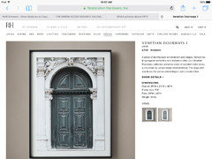
    Here Is a suggestion from RHardware...I don't have your measurements so not sure about size....this is traditional and contemporary all in one perfect for your space. Good Luck...oh and Vertical is much better for over fireplace..it will give a taller more grand feeling.

  • 10 years ago

    Love the NYC art...even if you don't decide to frame it, you can raise it a little bit and then add some more deco on top of your mantel.

  • 10 years ago

    Thanks! I ended up returning the Amsterdam picture. Currently have the NYC hanging but looking at buying something different. I'll continue looking until I find just the right thing. I do agree that the Amsterdam one made things look TOO traditional

  • 10 years ago

    Sounds like a good decision. I really like the NYC art!

  • PRO
    10 years ago

    I really like the NYC street and vote for it to stay. Compared to the first painting you showed us it gives the whole room a more modern look. Goes great with the furniture and decor you own.