Software
Houzz Logo Print
ohagas

External wall colour advice

10 years ago
last modified: 10 years ago
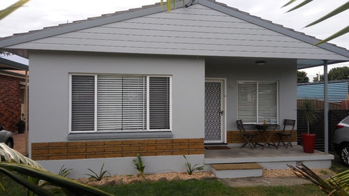
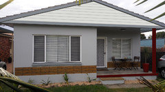
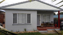
Could I please have some advice on the wall colour scheme of this house. The walls including the Weathertex boards are shale grey and the trim is windspray.

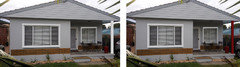
Current look:


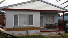
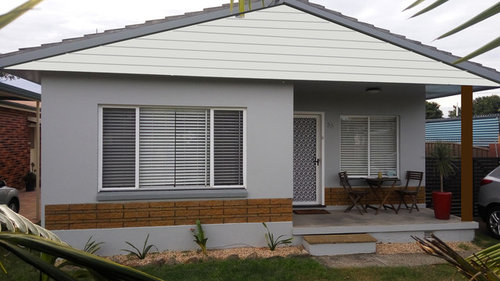
I find it's a bit drab and am thinking the Weathertex boards would be better in a lighter colour - such as surfmist. I did this mock up in Photoshop, but not quite sure how realistic it is. Any feedback would be great...

Thanks in advance.

Photoshopped mockup:

Comments (23)

  • 10 years ago

    Thanks practical. So you mean the darker windspray (the barge boards and window sills) all across the bottom?

    I agree about the porch post - in fact in the second image I have photoshopped it to make it square and brown.

    Do you think the boards are definitely suited to the lighter grey then? It's surfmist which is a very pale grey.

  • 10 years ago

    Would you consider painting out the brick trim in a similar color to the wall? I find the long horizontal line makes the home look shorter and the color in the brick doesn't relate to the other colors on the facade. Or changing the color of the walls too so they relate better to the brick?

    ohagas thanked Annie Deighnaugh
  • 10 years ago
    last modified: 10 years ago
    If you want to change the color anywhere, I'd paint the porch area a different color. I'd want a color rather than that warm cream because I don't think it coordinates well with the gray. Then I'd use some colorful porch furniture to add some interest, or if you use a darker color on the walls, then use a lighter color furniture, maybe to match the grey you have. This is a materials change that gives the two colors, but kind of the idea.


    I like this teal color with the gray, but may be too wild for what you're thinking!


    ohagas thanked Olychick
  • 10 years ago
    last modified: 10 years ago

    I might try to find a way to put a horizontal brown line along that eave all the way across. Love the brown post. What if you took the step below the porch all the way across? Or you could add a guardrail (white or brown). Also the screen door bugs me - I might do full view glass if you don't need the screen and put a brown door behind it. More landscaping, then if it's still too dark, find places to introduce white trim. Bigger planter, bigger furniture, both with more color.

    You could take all the paint colors warmer and lighter or white, or different, like sage green or light blue. Play in Photoshop and try something you would never expect.

    Try thick window and door trim too, just to see.

    Overall I think if you add more brown and white features, it would brighten it up. But try mocking up different overall paint colors too. I'm not a huge fan of gray with brown, unless there is more to break it up.

    ohagas thanked Jane
  • 10 years ago

    Thanks for all the feedback!

    Regarding painting the brick - others suggested that in the past, however the brick is textured (more like stone) and not flush with the wall surface. I don't think paint would work on it. Also, we do use the security/flyscreen a lot in the summer, so reluctant to get rid of it. I've just finished painting it from mission brown to white!

    I do now agree painting the porch a different colour is a good idea. Question is should it match the boards? Also, I'm thinking of getting the porch floor and step tiled in a brownish red imitation wood tile - to make it look like a deck. Any thoughts on that?

    I've only basic Photoshop skills and unable to show the porch or porch floor in a different colour. Here's a couple of new images with the bottom board coloured and a possible colour for the porch floor.

    Any further ideas? Thanks

  • 10 years ago

    I was thinking of painting the 3 walls of the porch the different color :-)

  • 10 years ago

    I wouldn't paint the boards. Painting them a different color makes the rest of the house look short and squat. The only thing I might paint like Olychick suggested are the walls at the front entrance.

    ohagas thanked k9arlene
  • 10 years ago

    Even if the bricks are rough, you can still paint them. They'd look better in the darker gray. It would pull the front of the house all together to make it cohesive.

    ohagas thanked Yayagal
  • 10 years ago

    bit more playing around in Photoshop!

  • 10 years ago

    I am no expert but I don't care for the cream colored addition.

  • 10 years ago

    Looking at it again, I think the only thing I'd do to the original is add more substantial trim around the windows and paint it white, paint the brick the color of the house and enlarge the post and paint it white. You could then paint your screen door something colorful.

    ohagas thanked k9arlene
  • 10 years ago

    I do like the idea of everything being gray and white, and removing all of the brown.


    Can you cover up the brick sections with trim or a window box?


    Still would love to see a white guardrail with square pickets around the porch, with the beefed up post in white. This would balance out the front left side of the house. If you do more vertical white lines, the house may look taller. Getting rid of the contrasting brick color in your mockup made part of the house look taller. You could play with more contrasting horizontal lines to make it mid century modern, or more vertical lines to make it taller.


    Also trim out the windows in white. You can adjust side and top/bottom proportions to get a look you like.


    Do everything in photoshop first.

    ohagas thanked Jane
  • 10 years ago

    When I was walking around my neighborhood last night I took note of the houses with a similar roof line. None had the bottom board painted but they all had a sizeable decoration (a wood birdhouse or a ceramic sun) near the apex of the triangle. It helped reduce the flatness of that area-but the sun looked hokey....

    I really like your most recent photoshop post. That line of brick should go.

    Neighbors near me added a "wood" deck to their porch and front steps. It looks fabulous.

    On the porch color if you can see the porch from the rooms inside then paint the porch a color you will want to look out at.

    ohagas thanked practigal
  • 10 years ago
    last modified: 10 years ago

    Thanks for all the feedback. I definitely think adding extra trim in white to the windows is a great idea and should be easy enough to do.

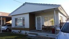
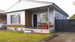
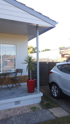
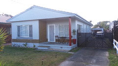
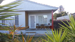
    I may also try painting a small section of the brick to see how it looks. And still contemplating surfmist for the porch wall. Leave the boards for now. The other wall of the porch is all the same brick. Here's another couple of photos showing more of the porch...

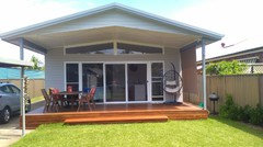
    The front of the house faces south and is mostly in shadow so the grey can change colour and be deceiving. This is the new rear of the house which we're very happy with...

  • 10 years ago

    Oh now I understand where the bricks come in! I did not realize they wrapped. I guess I am still a little puzzled why you want to paint the top of the house and not the wall part? Is this a trend in your area? If you don't want to paint the bricks maybe taller bushes to disguise them?

    ohagas thanked shari13
  • 10 years ago

    Hi shari13, my original idea was to focus on painting the boards a lighter shade of grey to add more contrast to the overall look on the front. Certainly not following any trend in the area lol. (I should point out though, that in the previous colour schemes of the house, the boards were a different colour to the wall).

    Anyway, your suggestion about taller plants is a good one. Even if I painted over the brick, better shrubs would improve the landscaping.

  • 10 years ago
    last modified: 10 years ago

    I really like the back. What if you tried to mimic that in the front? Maybe you could paint below the brick a similar or complimentary color to the brick so that the bottom of the house was all warm tones. You would need to do something else to the front, but I'm not sure what yet. If you like the bottom brown, look at the colorblock thread and try to find some colorblock house exterior pics for inspiration.

    This type of thing is never easy. Keep working on the design until you get it right. The back of the house looks great. I still like the idea of beefing up the posts, but IDK if brown or gray would be better.

  • 10 years ago

    I noticed on some of the new homes where I live they are doing window molding that is only top and bottom of windows but not sides. I know it sounds weird but does not look bad and would be easy to do and paint contrasting color.

  • 10 years ago

    The brick stripe makes much more sense now that we can see the entire front. I don't mind it. It adds interest. I'd beef up the window trim and the post and paint the screen door a darker, contrasting color, add some additional landscaping and I think you're done.

  • 10 years ago
    last modified: 10 years ago

    It's certainly a challenge trying to get it right! It would be nice if we could replicate the back, but that's a brand new extension and the funds have run dry. It's funny how when you see more of the brick you tend to see how it adds interest. Hence I'm so hesitant about painting over it.

    I did another nasty Photoshop mockup with wider window trim and a white/red-brown post. Not sure which is better...

  • 10 years ago

    I like the brown to complement the brick. Your extension is really very nice looking!

  • 10 years ago

    Quick update - I've just boxed in the post using treated pine boards with a jarrah stain. It was quite a simple and cheap job - fitted very snugly around the existing pole. Next project is to tile the porch. A few photos...

    Post before:

    After: