Software
Houzz Logo Print
dc83

Wall color ideas for multi-wood room

10 years ago
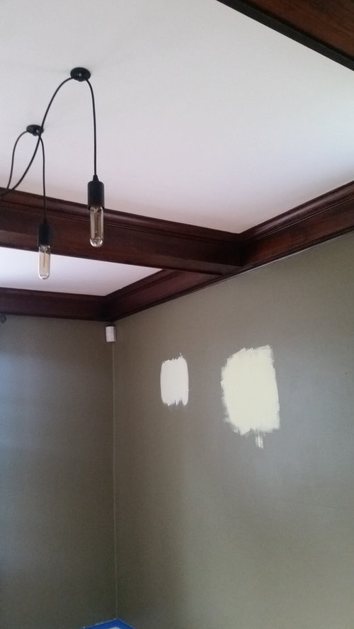
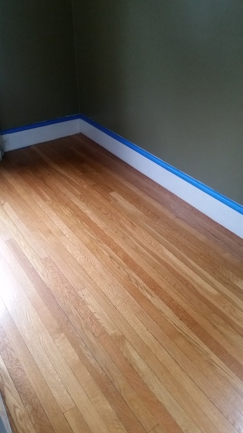
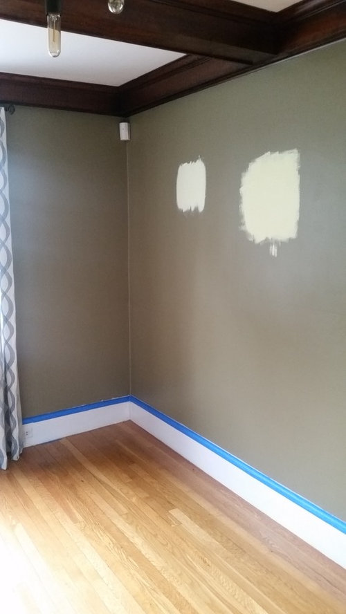
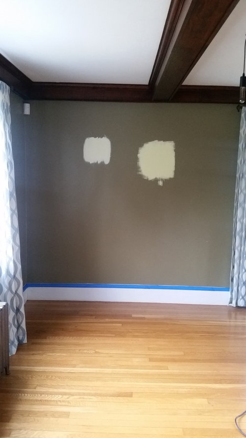
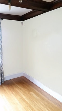
Hi everyone! I am hoping you can help me figure out what paint color will look good with orange-toned wood floors and brownish-red wood beams in my dining room. We inherited this dark olive color, and it's too drab for me. Any help is appreciated. Thanks!

Comments (29)

  • 10 years ago

    The right wall colour will be affected by what you have in the room, but a soft blue would work with both woods. A blue-grey would also be good, or you could go in the other direction with cream.

  • 10 years ago

    I see your problem with the olive, by the way, but it's not way off mark. A light sage green is worth looking at.

  • 10 years ago

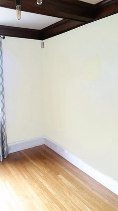
    PS I like the look of the right cream swatch you have on the wall. Okay I'll shush now.

  • 10 years ago
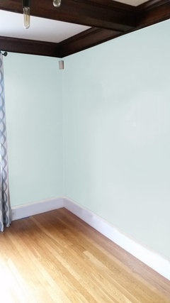
    Thanks, Rina! The swatch on the right is a light lime. I'm considering it but I'm nervous it'll clash with the orangey wood. I have fear of commitment!
  • 10 years ago
    I would paint the beams the same colour as the ceiling, then you would have more wall colour options.
  • 10 years ago

    Yeah, I know the commitment thing. I can't say about the light lime, I'd have to see it for real. Limes and oranges ... both citrus. Can look beautiful. But one has to see the exact colours to have an opinion. We have to play it a bit safe on Houzz, colour reproduction being what it is.

  • 10 years ago

    Try painting a piece of board in that colour, so you can place it against the floor, and see what you think. You only have to please you, unless Decor Gorgeous magazine is coming round for a shoot next weekend. I'm not too worried about the dark wood, as although the tone is red (I think), it's sufficiently dark for that not to be a problem.

  • 10 years ago
    you definitely need to paint the sample on a white board, any color you put up on the Olive will be distorted by it
    beautiful room
  • 10 years ago

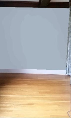
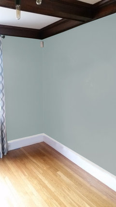
    If you look closely you can see the swatches on your wall next to the paint I applied. I don't think you want to go this light and bright.


  • PRO
    10 years ago
    last modified: 10 years ago

    Are you putting down a rug? That will influence your choices.

  • 10 years ago

    Valspar makes 2 related colors that work really well with the orangey floor:
    Jekyll Crane Cottage Green (a National Trust for Historic Preservation color), 6004-3C
    and a lighter version, Willow Wind, 6004-3B

    Even the first one above is much lighter than what you have now (and less grey).

  • 10 years ago
    groveraxle, I think you're right. I'm wondering if I should go with a darker blue/teal to compliment the floor. as for a rug, I may add one in the future, but that's not on my radar yet.
  • 10 years ago

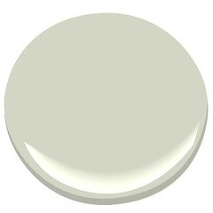
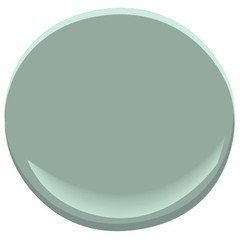
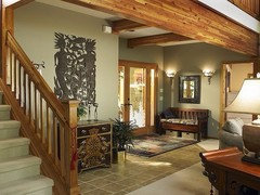
    BM Silver Sage

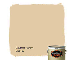
    Gourmet Honey Dunn Edwards

    BM Stratton Blue


  • 10 years ago

    Any blue is going to pop the orange in the floor.


  • PRO
    10 years ago
    What furniture are you putting in this room? I hate the idea of painting the beams. Are you leaning to modern look? Light fixture looks modern. Style of house and your vision? China pattern? Any colors in that to be aware of. Looks like formal dining room? Need more info to pick color. A rug on floor would be priority for me, because that is harder to find than paint color. If you have a choice in mind for that, then you can pull color from that. Are the drapes staying? I would want to tone down color of floor first, with rug.
  • 10 years ago
    Hi Flo! Our house was built in 1886, so she's old. Our style is a little industrial, a lil' bohemian -- ecclectic, I guess you could say! I like saturated color. I definitely will switch up those drapes. We're going to build an industrial-style table with benches and modern end chairs (if I get my way). Our dinnerware is clean, stark white. Nothing fancy. Hope this helps?
  • 10 years ago
    I love the color of both your floor and beams:)
  • PRO
    10 years ago
    Very helpful. Sounds super. With that I think a sage green would work, but kind of depends on other colors you like. Bohemian suggests reds, to me so that would work with table, walls in lighter sage green. Not too light. I might even do ceiling in the wall color. That would reduce contrast with beams and create cozy, madrigal kind of look with eventual antique rug with the Reds would look really interesting. I will hunt for some pics to bring this concept to life. Thanks!
  • PRO
    10 years ago

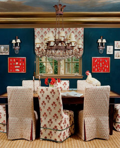
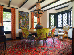
    I have a few other options for your consideration. After hearing the "eclectic/bohemian" style you are going for, I have changed my mind. Now, hold your hat on, this could be too far out for you, but what if we did the walls in a dark quirky blue. See photos below.

    Bohemian Sanctuary · More Info
    This wall color, might be great to work with but not sure of your other colors. If the table is "industrial-ish", and that means some wood and metal, then white dishes and chairs with various and interesting fabrics would be very interesting. The age of the home lends itself to this as well. Then you could bring in other whites, such as a tablescape of a collection of white pitchers for example. Or perhaps you have some "collection" you could string down the middle of your table. For now, you could also get a sisal type rug that would help "ground" your table. So that is one option.
    Fort Worth, TX: Mike & Ann Williams · More Info
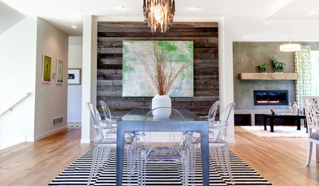
    Here is example with off white walls and ceiling to match, but with all kinds of other colors and mixes of chairs, etc. Note the rug with the reds, even though there are oranges, chartreuse and many other colors.
    Woollhara Terrace · More Info
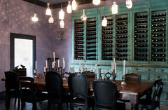
    This one reminded me of your light fixture kind of. Dropped lights. Great antique wine keeper, but imagine a piece that had "recycled wood" with the aquas and greens to set up against a dark blue wall! Then your white plates and loads of candlesticks with white candles, very intimate setting.
    Little Venice apartment · More Info
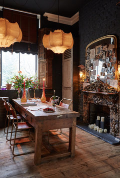
    This is another option, with a darker grey wall and loads of woods, and rustic table and metal chairs. Do any of these looks come close to your vision?? See how that information changes how you do the walls?


  • PRO
    10 years ago


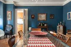
    Deep Blue Dining Room · More Info
    The blue on these walls is really nice with the white trim. I am liking the idea of the kind of intense blue walls. Would brighten without just being light off whites. Give your "style" something to consider. Give us some feedback on direction and we can go from there.

  • PRO
    10 years ago

    Also, in above picture, look at the flooring. Very similar to yours. Works really well. In many of these "idea" pictures, you will notice that the table is surrounded with chairs that are all mismatched. Another good idea for eclectic look. With this wall color, you could leave the ceiling white. Depending on how crazy you want to go, I could also see having an artist do some "gold" stenciling on the beams to give them interest and take away some of the all dark brown coloring. So many ideas! So little time! lol

  • 10 years ago
    Go provincial stain or walnut on floors.
  • 10 years ago
    Flo, you nailed in. I love all the photos, and the last on with the dark teal is my favorite. I definitely think accents of white, gold and red would be perfect. Thank you so much! I'm going to use these photos as inspiration for my other neglected rooms!
  • PRO
    10 years ago

    Wonderful! I love the last one too! We connected mentally! Great. I want pictures of "After". That color by the way, is a Behr color S-G-570 Saffire Lace or something close to it to give you a starting point. Benjamin Moore Paints (not an advertisement here, just facts) are full spectrum paints so you could find a similar color in their paints as well. TIP: Get a couple of samples and put on foam center white boards, using two coats. Leave about 1" of white space around 3 sides, and one side paint all the way to the edge. That way you can get separation, but an edge for comparison also. Then check them out in your room in different lights. You can decide then, whether you need to go lighter or darker in the intensity to suit your desires. Wow. This is exciting. Best to you and so happy to provide inspiration for great spaces for you and your family and home.

  • 10 years ago
    Thanks, Flo! Painting in two weeks, so I'll post the "after." Thanks again!!!
  • PRO
    10 years ago
    My pleasure.
  • 10 years ago
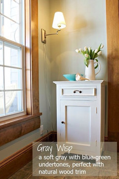
    Like the sage green, SW svelte sage or grey wisp
  • 10 years ago

    Good morning from here. Great work, Flo. Deb, if you started off with the feeling that not many colours would work in your room I think that idea has been well and truly squished by Grover and especially Flo. So keen to see your revamp pictures.

Sponsored
Bella Casa LLC
Average rating: 5 out of 5 stars17 Reviews
The Leading Interior Design Studio in Franklin County