Software
Houzz Logo Print
ncgraciemay

15 years ago
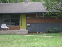
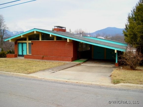
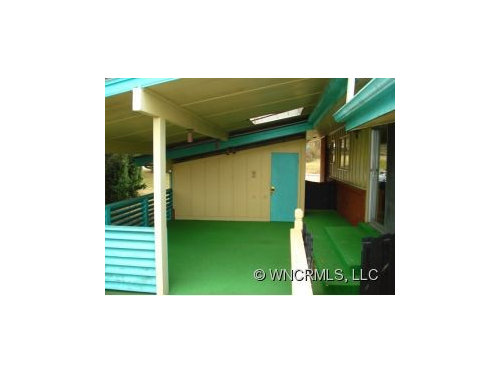
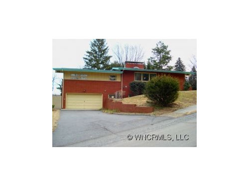
I am buying this time capsule atomic ranch! Part of me loves these colors, but it's a little too kitchy for the neighborhood. I'm thinking of painting the wood siding and trim shades of gray. Or should i keep some of the turquoise? (The front door will remain in all its turquoise glory!) And what to replace that green astroturf with?!

Comments (72)

  • 15 years ago
    Great house! I'd love to see photos of the inside too.
  • 15 years ago
    Nice house - clean lines. Martha Stewart has a wonderful brown (morel) that would go with that brick. If you want a green door - what about bringing in some copper panels on the front door? You might find after you paint the trim that the front door is calling for a fresh look.
  • 15 years ago
    The turquoise doors are alright, but they are just too solid. If they were mostly glass with turquoise frames, or even a natural stained wood door with windows it would appeal to me.
  • PRO
    15 years ago
    Becorcari's color mock-ups are very instructive. Some nice choices there. My only suggestion would be to repeat a touch of black somewhere, if you are leaving the doors turquoise with black trim. Even if it's just on the far right garage post, or on a couple of rectangular doorside planters. Great house!
  • 15 years ago
    thanks for all the comments. Colorhelp, i was thinking the same thing, that a repeat of the black is needed somewhere.
  • PRO
    15 years ago
    Yes Gracie, and I wish I could be more specific with that suggestion, but I'm not able to tell exactly how the roof and rafter architecture comes together. I wondered if one might do the rafter tails in black, but was afraid that could look too harsh or too Arts & Crafts... and also was not sure where those lines started and stopped. I would print out those mock-ups in color, and maybe play around with a black marker, see how various touches of black affect the overall composition. Another possibility is a mod black spotlight mounted on the wall - maybe that would be enough black to bring it together.
  • 15 years ago
    Very interesting home!! Paint the brick a medium gray and the trim a white. Get rid of all the bright aqua colors....it's not attractive from the exterior. Purchase wooden double doors for the front doors, and paint them a Chinese red, or a deep orange. Orange was a popular color in the 50s & 60s. Put some well trimmed shrubs in the planter and maybe a Japanese Maple in the front yard. In the mide-century, people didn't have glass doors in front and with all those windows on top, you don't need them. Put some sky-lights in the cover over the patio and remove the railing out there to open that space up and make it appear larger.......or......paint the entire exterior a pale taupe, and put in wooden doors in front, which are painted a bright color, or an olive green, also a popular color in mid-century. Good luck!!
  • 15 years ago
    like you I think the original colours are pretty fun, however they aren't entirely pulled off. Love that you want to keep the turquoise door. especially with the black/navy trim, it works for me. Of the options that becorcari has created, I like the third and the fourth.. the red/brown tone plays well with the brick, it makes the trim less noticeable, which I like.(which also makes the door sing). I agree that the dark around the door should be pulled off elsewhere to tie in, may i recommend painting your house number on the brick immediately to the left of the carport? I would opt to go vertically with larger numbers, although horizontally with smaller numbers would work as well.
    As for the green astroturf, definitely has to go, though it certainly doesn't look any the worse for wear. ;)
    I think just removing it will make things look a lot fresher, but if it requires more help, I'm thinking dark.
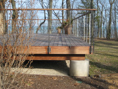
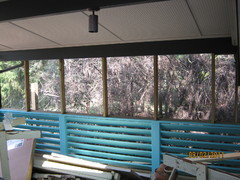
    This leads me to your other photos, which I have puzzled over. I'm not a fan of the little deck area, and the astroturf is part of it, but the rest would need to be updated also. However, I'm not feeling the same browny red tones would work well in here, it would feel very dark in the space, even with the skylight. Here's my thought: paint the ceiling, and wall of house a very light turqoise (I'm thinking white with tones of blue)- so it will be a white enough area to keep it bright and open feeling. Green floor gone, replaced with darker neutral, and I would paint the deck rail, and various trims/supports in the brown/red tone from the front of the house.
    Re: the back of the house, garage doors I would hit with black, to tie in with the front, the turquoise trim would be red/brown tone, also the trim around the windows, and the light yellow I would go with the light blue in this area also, since it is small and will be well balanced with the black doors below.
    Also wanted to say please plan awesome things for your planter in the front of the house. Also I would s
  • 15 years ago
    I'm leaning toward becorcari's 7th color scheme. :)
  • 15 years ago
    We are half way through our rennovation of our 50's ranch and painted it Sherwin Williams Peppercorn. Absolutely love the color and think it would contrast your brick beautifully! I realize you are talking about keeping the doors but if you find you want to/need to get more light into the entry check out Crestview Doors. We used one of their window inserts and absolutely love it.
  • 15 years ago
    ...and have to say I love becorcari's idea to paint the brick...can be controversial I know but looks great and really sets off the front doors!
  • 15 years ago
    The different paint palletts were all dark colors; I'd like to see white or cream brick, even a pale gray with a darker gray trim. Although turquoise and brown are faves of mine, the brown just looks muddy.

    Too much of a good thing can be boring and tired; up-to-date designs follow the retro-50s trend while incorporating better function. Pepto Bismal Pink baths -- overwhelming at 6:00 AM! Had one; argh! After all, it's not a design museum, but a functional house. Design integrity can be sustained with modernizations and be much more livable. Go for it!
  • 15 years ago
    Thanks for these thoughtful suggestions. I love leticia's ideas, especially for the patio/sitting area. And audra, your home is beautiful and i'm strongly leaning toward a gray like you used at the moment. Totally agree with inkwitch about too much of a good thing; i don't want my home to be a replication of 1959 necessarily. However, i do like the pink bathroom and will keep it; so trying to decide how to paint the wall above to give it a more up to date feel.
  • 15 years ago
    last modified: 15 years ago
    oh, i meant to add that the deck will have to be replaced. It is old, not to code, and not safe (besides being ugly). Thinking about something like this:
    modern ipe and stainless deck · More Info

  • 15 years ago
    The barn red and turquoise could be the original color scheme. It's a very 50's combination and was original on many Eichlers here in California.

    Check out Sherwin Williams' historic collection.
  • 15 years ago
    last modified: 15 years ago
    The more I look at it, I actually am loving the idea of maintaining the brick and turquoise color scheme. Just a fresh coat of paint and some landscaping would really enhance the exterior of this house.

    And @audraemerson, I am loving your house. We would love to see more of it!
  • PRO
    15 years ago
    Great color studies - I prefer colors in 3 or 4. Also, I too think that the door is too monolith- I think a pair of single panel glass doors would look better - turq would be OK, but the Chinese red idea is great too
  • 15 years ago
    I would paint the brick white, love the turquoise, but perhaps it could be softened? and I would get rid of the yellow (make it white?). Is the astroturf on concrete? If so, I would perhaps stain the concrete.
  • 15 years ago
    I would make the doors clear, and maybe just keep the turqois around the trim.And maybe a nice warm light effect coming from inside upper windows, to make it looks more inviting.
  • PRO
    15 years ago
    Have the same dilema with a permanently leaking roof and bad landscaping. Leaving the house "submarine grey" and working on the inside....White if very dramatic..and sophisticated. We will probably go with a moss to blend into nature having the 100 foot GA pines all around.
  • 15 years ago
    WOW! You must be overwhelmed with all this advice.I love the turquoise but is it defining too much of your other choices.I love all the grays but also like gray/greens.An alternative to painting your brick is to stain it which will leave it natural looking.You will have to experiment in hidden areas.I have done this two ways.Method one,mix latex paint and water 50:50.Paint on brick and LIGHTLY spritz with water.Method two,use a wood stain and paint on.The professionals will tell you this won't work but any of us who have spilled stain know it doesn't come off :) I would paint the brick but this may be a safer choice for you.Remember,just because something is original doesn't mean it is right.
  • 15 years ago
    I'd lose the turquoise, and find another color scheme
  • 15 years ago
    with such a beautiful background of sky/mountains, I would tone down the turquoise and go with a light blue....keeps it interesting, more modern and natural looking.
  • 15 years ago
    We just bought a mid-century design beaty in California that is also "frozen in time"--perfection. We thought we'd live in it a bit to settle into the vibe/tone and get a deeper sense of how to approach the place from the outside. Really like the simulation photos. I think the turquoise could be a knock-out with a neutral tone painted on all other exterior surfaces.
  • 15 years ago
    A no-brainer...Grey or Taupe trim!!!
  • 15 years ago
    Oh..I missed the "all white" photo..that would be great also..with the subtle Grey door. That is appropriate to the period and easy to live with over time. There is a reason that the FUN look of mid-century colors did not hold its popularity and just became regarded as tacky.
  • PRO
    15 years ago
    I would paint the whole house white if you live in California, or charcoal grey or taupe any place else...love the lines
  • 15 years ago
    Love the ideas becorcari had!....good luck!....smiles.
  • 15 years ago
    I liked the link to the deck you put up for replacing with. Nice clean lines, and an open feel. These people that are saying no to the turquoise are just spamming the comments. :(
    She wants to keep some of it! Either offer advice to work with that scheme or keep your comments to yourself! No one wants to hear that the design scheme they've embraced, "lost it's popularity for a reason." The only thing that's in bad taste about mid century color schemes is telling other people that they're not allowed to like them.
  • 15 years ago
    Your house reminds me so much of our house. We just finished painting our soffits and trim. We went with Valspar Earthy impressions ( a brown) and Urban Gold ( a tan with some yellow in it). I looked into painting our brick, but we live in the midwest and with our harsh winters it is advisable not to paint brick. If you live in milder climates, such as the south you can get away with painting the brick. If you really want to there is a product called dyebrick that is a stain for your brick and can change the look of your brick. We too have green turf carpeting; our hope is to tear it up and stain the concrete or paint it. If you choose to paint make sure your paint has some sand in it so the surface does not become slippery when wet.
  • 14 years ago
    Whether or not your home is an Eichler, there is a terrific "idea gallery" website for remodeling mid-century moderns:

    http://www.eichlerforsale.com/Eichler_Remodeling_Ideas

    Click on "painting" and you will find a great palette of colors.

    Best of luck!
  • 14 years ago
    Thanks creekgirl!
  • 14 years ago
    What did you end up doing? I have a house with similar color brick. I painted the part of the house that was not brick turquoise, a little paler shade than what you have there. Most of my neighbors love it, just one, right across the street unfortunately for her, thinks it is "too much." The turquoise on the door looks great, but I would paint the rest of the doors and trim a color that more coordinates with the brick. We saw a house that had the trim painted a pale aquamarine, and the driveway and garage floor were painted to match. That looked awesome!
  • 14 years ago
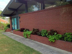
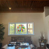
    We painted the part of the house that was yellow a light/medium gray. The trim is charcoal. You can see the trim in the first picture and the lighter gray in the second (i think!) That turquoise on the railing is now charcoal; it seemed like too much. The doors are all still turquoise. I think that i may paint them a burnt orange someday if i get tired of the turquoise; i agree that it would coordinate with the brick more. Just loving the turquoise at the moment, and hey...it's my house, why not! :) Our neighbors are happy with the change and we get lots of drive-by compliments on the makeover..
  • 14 years ago
    That looks beautiful, nice wall garden along the front, too. Plants make everything better! I love turquoise, and I think the double doors adds just the perfect amount of color to the front of the house, along with those coleus and the green drapey plants.
  • 13 years ago
    This is a great house and a great example of residential architecture from that era. That being said, you don't want to have your house look like a caricature from the past but rather bring it respectfully into the 21st century. I am glad you narrowed the number of colors that were on the house and given it a more tailored look look with the grays. My favorite thing about this style are the windows which provide privacy from the street and I am sure give very nice light qualities to the interior.
  • 13 years ago
    This is a great house and a great example of residential architecture from that era. That being said, you don't want to have your house look like a caricature from the past but rather bring it respectfully into the 21st century. I am glad you narrowed the number of colors that were on the house and given it a more tailored look look with the grays. My favorite thing about this style are the windows which provide privacy from the street and I am sure give very nice light qualities to the interior.
  • 13 years ago
    This is a great house and a great example of residential architecture from that era. That being said, you don't want to have your house look like a caricature from the past but rather bring it respectfully into the 21st century. I am glad you narrowed the number of colors that were on the house and given it a more tailored look look with the grays. My favorite thing about this style are the windows which provide privacy from the street and I am sure give very nice light qualities to the interior.
  • 13 years ago
    This is a great house and a great example of residential architecture from that era. That being said, you don't want to have your house look like a caricature from the past but rather bring it respectfully into the 21st century. I am glad you narrowed the number of colors that were on the house and given it a more tailored look look with the grays. My favorite thing about this style are the windows which provide privacy from the street and I am sure give very nice light qualities to the interior.
  • PRO
    13 years ago
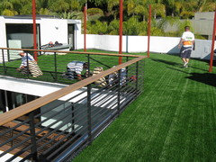
    Easyturf is another alternative to replacing that old astroturf. We're using it in so many more applications now than the traditional back yard - balcony and rooftop installations are on the rise. Because there's no need to water and mow, you can put it just about anywhere - it might be perfect for the spaces you have. Here's a recent rooftop install.
  • 13 years ago
    I would do anything to have a home like that bagain... stick to your heart; the neihbors will just have to catch up....
  • PRO
    13 years ago
    orange was also all the rage back then - so was brown.
  • 12 years ago
    You are so lucky!!! I'm so excited for you. Hope you keep the entryway. I love preservation. Personally, in the spirit of the atomic age, I would go full modern with the bathroom and kitchen reno. The more 21st century, the better. We pulled in the retro in our lighting.
  • 12 years ago
    how pretty!
    i love the turquoise.
  • 12 years ago
    Don't do something to match the neighbors, match the house. Which is awesome!
  • 12 years ago
    Well, I finally put together a Pinterest board, in response to the requests here for more recent pics. Houzz was interested in featuring it at one point, but my pictures weren't good enough. But they're good enough to see on Pinterest, so - here it is! Oh and my other board has lots of good midcentury modern pics, too. http://www.pinterest.com/maggiepanther/atomic-ranch-in-the-mountains/.
  • 12 years ago
    What a beautiful house! I wish I had found one like this. Mine was 1964 original but mucn more traditionally decorated and furnished. I really appreciate how you are restoring the look.
  • PRO
    12 years ago
    Your gray idea sounds more like it would fit into the neighborhood. This home is so cool and I'm loving the mid-century palm springs vibe. I also love that you're keeping the turquoise door. Splashes of color are just what this home needs, but perhaps maybe just no the roof :)