Software
Houzz Logo Print
handmethathammer

What color to paint my living room?

9 years ago
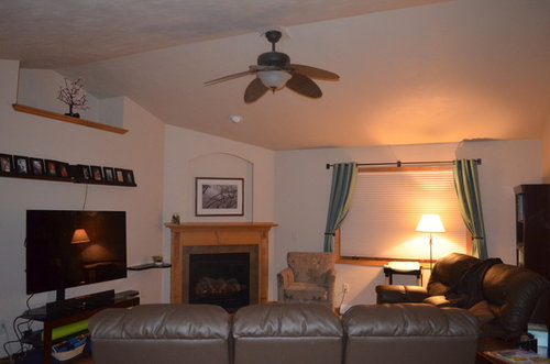
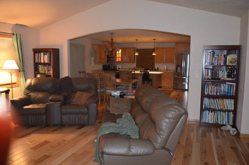
My house is five years old and still has the builder's beige in most of the rooms. I don't mind the color, but it is cheap paint and getting hard to keep clean.

I was thinking of just doing the same or similar color, but wanted to get some other ideas. Most of my house is pretty neutral, with some teal here and there. I could use more color, but feel limited by the orangish maple wood we have everywhere, but Mr. Hammer refuses to let me paint that.

Any ideas? I don't like gray, and I am cautious to go too dark as I don't get a lot of light.

I am playing with the idea of painting the cut outs (over the fireplace and plant shelf over tv a different color).


Comments (27)

  • 9 years ago

    Agree with greenish with the wood. Several companies have "visualize it" apps that allow you to virtually paint your room to get a idea of how the color will look

  • 9 years ago

    Are you open to other suggestions on the room? Or just paint color?

  • 9 years ago

    I love BM Edgecomb gray. It comes across as a warm neutral rather than gray

  • 9 years ago

    If it's as dark as the pics suggest, I would go with either a more saturated color.

  • 9 years ago

    It looks very adobe style, so I would stick with a warmer beige tone, maybe BM Flawless from the affinity line

  • 9 years ago
    last modified: 9 years ago

    i agree with everybody(lol! but I do)-i'd take more saturated color, something like warm beige, probably green beige-it will make for a warmer feeling, and furnishings will stand out more; it will also play very nicely with the wood.

    If you want to paint the niche-you can go with the same color, but, say, a shade or two darker..it will give these nice details even bigger depth.

    The ceilings are slanted, right?..if you decide to paint, take the ceilings into account as well. the more lines you've got there going on, between the ceiling and the walls-the more you have to consider it.

  • 9 years ago
    last modified: 9 years ago

    I would use a green gray which would look stunning with your wood and furnishings.BM green gray paint

  • 9 years ago

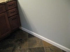
    I can understand not liking gray, especially when a lot of people associate it with a depressing mood. However, grays that are tinted green (or even blue) will not look gray on the walls. They will be a sagey green or a pale blue that isn't to bright or brash. For example, the two greens below are actually grays, SW Oyster Bay and Comfort Gray, which we currently have in our master bath. As you can see, the gray in the color tones the brightness downs.

    Oyster Bay

    Comfort Gray and below is the Comfort Gray up close. It's a wonderful color.


  • 9 years ago
    Sounds like I should start with greenish gray. I like that Oyster Bay.

    There is a cathedral ceiling in the living room.

    I am sure that room needs a lot of help. It is a work in progress.

    Thanks for the input.
  • 9 years ago
    last modified: 9 years ago

    That oyster bay would look great in your room. I went with a blue gray SW krypton and absolutely love it. The color changes and each one is just as good. Some color would give more life to the space. Add some textures and more splashes with pillows. The chair by the fireplace could use some pops of colors with pillows and maybe a throw. Art over the fireplace is another good place to add something a little more bold. In the niche above the TV maybe some colorful and textural baskets, and a few on the mantel. Easy small accessories.

  • 9 years ago

    I would stay away from gray, including in colors. Gray is death in a room with low lighting.

  • 9 years ago

    I'd be more inclined to bring color into the room and reduce the emphasis on the wood with area rugs, decorative pillows/throws, curtains, art, accessories rather than with paint,

  • 9 years ago

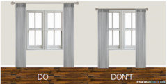
    If part of the update will include curtains, I would suggest you hang the rod higher and wider so the curtains have room to stack back while leaving the window unobstructed. Hanging them higher will make the window look taller.

  • 9 years ago

    Benjamin Moore abalone maybe..I tried a pale gray green with the visualizer and liked beige more.....

  • 9 years ago

    I really couldn't disagree with you more Tib. Our bathroom has very little gray and the Comfort Gray is fabulous in there. My mother doesn't get much light in her house and she had it painted a very soft blue gray, it's beautiful. I do believe it really depends on the space and how the light flows through it.

  • 9 years ago

    You can have 50 windows in a room but if it's mainly used in the evenings after the sun sets, it's a dark room. I think a green-gray or blue-gray would be nice. I think a gray with a purple undertone would be more dreary.

    Agree with Annie to raise the curtain rod all the way to where the ceiling starts. Even that extra 12 inches or so will give the room a lift.

  • 9 years ago

    Hmmm, I didn't hang the curtain rod in the first place. If I raise it, the curtains won't touch the floor.

    We have been here 2 years and I have been shopping for an area rug and pillows for the living room. I get sticker shock whenever I find something. I fell in love with a rug at Parade of Homes last year, got the name of it, found it online and it was $800! And it was polyester and made in China!

    Even pillows give me sticker shock, for something that will never be where I set it. Half the time the throw pillows and blankets are in the basement in front of the Xbox or used for a fort.

  • 9 years ago

    Well then there's your answer in your current situation throw pillows are not a good idea. Maybe a colorful throw would be better and actually hang around. Have you looked at Lowe's for a rug? I got one I absolutely love for a very reasonable price. I doubt it will last a lifetime but I can enjoy it now.

  • 9 years ago
    last modified: 9 years ago

    I had sticker shock too...the solution I came up with was to get pillow inserts and separate covers. While the covers I got were still expensive (Pottery Barn Outlet), I can buy a collection in different colors and prints to change out now and then. They are also fairly easy to sew if you're so inclined. I also got the feather pillows from PB, again a tad bit more in price but they never stay flat and always look good.

  • 9 years ago
    last modified: 9 years ago

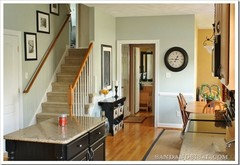
    If you want to stay lighter how about Benjamin Moore Manchester Tan? I've done two small, darker bedrooms in it and like it enough that I'm going to do the rest of my house with it.

    Here's an [example[(https://www.houzz.com/photos/bethesda-contemporary-family-room-dc-metro-phvw-vp~1426219)

  • 9 years ago

    Or look at SW Agreeable Gray or Accessible Beige.

  • 9 years ago
    Lullirkish, I like your idea for sewing pillow covers. That would make it more affordable and less likely lead me to buy something made in an overseas factory by child labor.

    I am going to get some paint swatches this week to see what I like. I noticed the ceiling is the same beige. If I go more grey, I will have to paint the ceilings too.
  • 9 years ago

    Someone above suggested a green toned beige. I have Lenox Tan in one of our bathrooms. I see green as an undertone.

  • 9 years ago

    Yeah, it's great if you can sew them, some really cute patterns are available too. I wouldn't just assume that you'll have to paint the ceiling too, though if it's builder paint, you may want to. Gray is a neutral and it's the green that will show on the wall, not the gray so the beige might be fine.