Software
Houzz Logo Print
4466whyem

Consistent vs Eclectic Window Design for New Home

10 years ago
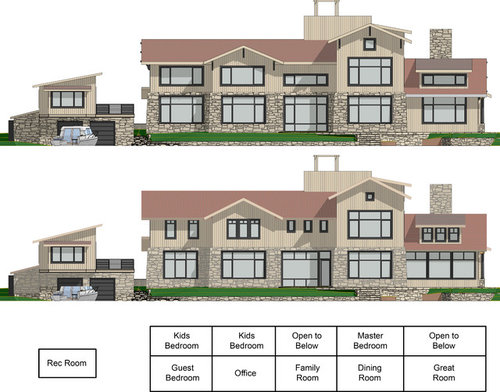
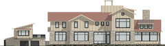
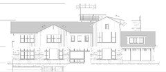
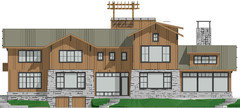
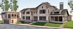
We are finalizing the design of a new home build and don't know whether to go more eclectic with the window design or more standard throughout. The below elevation shows the front of the house that is about 10 feet away from a lake (the main entrance is on the opposite side but this is the "front" or the house being on a lake).

The argument for the more consistent windows is that the house while a little eclectic isn't "funky" enough and looks better with limited variation from window to window. The eclectic windows are not clear and it makes it look like there was an old house with additions added, or that there were multiple architects working on the project with different opinions.

The argument for the more eclectic windows is that the house is a little eclectic / funky and the windows support that and add a sense of hierarchy, e.g. the foal point being the tallest section where the master bedroom is also has the largest windows on the second level. Also the treatment of the windows is different for different rooms with the kids bedrooms upstairs having the smallest windows as bedrooms are more private spaces.

Would you choose consistent or eclectic? Why?

Thank you for your feedback ... we only want to build a new home once and want to get it right!


Comments (39)

  • 10 years ago
    the second one or the eclectic one would be my preference.

    the first design with uniform windows lacks character and the lack of diversity in windows and materials make this large house appear even larger and more like a hotel.

    you might want to consider more diversity in finishes and paint colors to enhance the design with a wider variety of windows.

    in any respect, I would still go with the plan with the more eclectic window selection.

    another consideration is how the windows affect your use of the interior space.
    Michael Boyle thanked Kelley Dockrey
  • 10 years ago

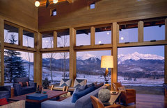
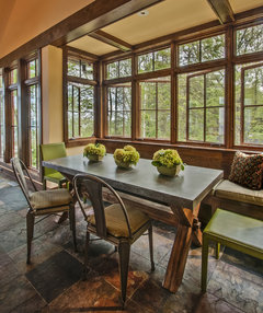
    Thanks Kelley. The more eclectic design aligns better with the different use of the interior spaces, e.g. the great room shown on the right has the best views of the house and basically wall-to-wall windows gives a panoramic view. We were going for a look similar to below, although not having the windows go all the way to the floor.

    Wilson Mountain Residence · More Info

  • 10 years ago
    cool.
  • 10 years ago

    I'd personally start over.

    The prairie/ arts and crafts window style demands a rhytm missing in the second. The varying heights, and too much glazing , in the first also bothers me.

    Are you tied to this window style? The massive vertical lines are limiting.


  • 10 years ago

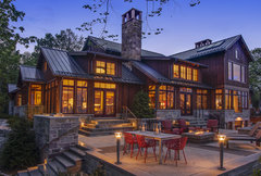
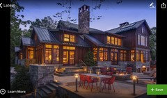
    Olivia, your comment makes me concerned about my project, but that's exactly why I posted here. We are looking to style the exterior and use materials as shown in this photo. We're open to reconsidering / starting over, but we'd need a little more direction to do so. I'd need to understand better what you mean about a missing rhythm.

    Lake Michigan Home · More Info

  • 10 years ago
    last modified: 10 years ago

    I love your example home. See how the window style is different from yours? Notice the big picture window on the right, flanked by windows with the same muntin pattern and same size? I don't know if rhythm is a correct technical term, but its what I see and feel.

    Granted, your example home has more complicated roof lines, and fewer second story windows than you do, but I dont think you need to resort to the total colonial symmetry of the first drawing, nor the more odd and nagged spacing of the second.

    d

  • 10 years ago

    Windows are really difficult, because they have to work from both i side and outside.

    If I wers working with your original (2nd) design, I think I would pull the upper windows together to line up with a portion of the windows below. And organize the lower windows with same sized windows with muntins (grills) on the outside, and picture windows in the center. See how you did that instictively on the bottom floor windows in the first illustration?

    You could do full on same size in a few areas upstairs, but they're bedrooms, and don't need all that glazing. Use the full repetition in the two places where the house pushes out, and smaller windows centered above the center sections of the second drawing, with or without muntins, not sure.

  • 10 years ago

    When you have a beautiful view, like a lake, I would go for the largest, most clear windows possible. Even in the bedrooms, it is nice to have great views. The only exception is the windows you have on the second story that are open to below. Depending on the direction of the sun, you may want the three smaller decorative windows rather than one large one, so you don't have to deal with window treatments. Also think about how the windows open, and how that may affect your choices. It also looks like only one plan has direct access to the lake. I would want that incorporated for sure.

    Michael Boyle thanked calidesign
  • 10 years ago
    The windows on the right of the second picture look great in my opinion, the left needs work, neither option is quite right.
  • 10 years ago
    ate you working with an architect?

    the style of your inspiration home could easily be replicated by an architect. it really does not match either of the layouts that you have included.

    the walls of windows in the inspiration home will most likely require more structural support than either window layout.
    Michael Boyle thanked Kelley Dockrey
  • 10 years ago

    calidesign, this faces north (or you might say 'north by east' as it's 8° east of true north. So we don't have to worry about direct sun and deal with window treatments on those second story windows open to below. Also, we have been thinking about how the windows open as the existing home that is being demolished has almost no windows that open (just a lot of sliding doors) and is far from ideal. The point about the bottom design having a door to access the lake is correct. From a flow inside the house, it is that middle section where the door should be and it would not make sense to not have a door at all. Thanks for your comments.

  • 10 years ago

    Kelley Dockrey, we were working with an architect and we were in fine tuning mode. We got a set of plans on July 13 for our builder to take to our county building department, and our architect unexpectedly died on July 18. He was a sole practitioner, so no colleague to transition to working with. Our builder is great and has the plans needed to build the house, but we're missing the architect for the ability to do fine tuning. That's partly why we turned to Houzz. Engaging a new architect might be the necessary next step.

  • 10 years ago
    I know your question is about windows. The first difference I notice is the long roof ridge on the left side of your design. It needs to be broken to look more like the example picture.
  • 10 years ago

    oliviag55, I think the starting point is the second design, and I see what you're saying about full repetition in the two places where the house pushes out. However that's where the balance between inside and outside comes in. The push out on the right is where the master bedroom and is okay (though some would argue less than ideal) to have the 1st and 2nd floor windows repeat. The push out on the left is a kids bedroom and also doesn't have the same vertical height as on the right or the floor below, so replicating the windows below doesn't make sense. Catherine Reimer mentioned that the windows on the left need some work, and maybe it is just the ones on the left that need help. The photo below shows a minor change with the push out on the left trying to better mirror the windows below it, but without the center window. I'm not sure that it's any better.

  • 10 years ago

    jpsx3, I hear what you are saying, but the inspiration house doesn't have any second story space aside from the section all the way to the right. I don't think we can get closer to their roof design without eliminating living space.

  • 10 years ago

    I think I do like that change a bit better.

    Could you try putting the long narrow window of the very first picture in this mix? I think the three little windows fight with the window and door below. Try to line up the muntins with the windows below. In other words, one long window, divided into four equal spaces. Is this a clerestory window?

    I hope one of the pros will also take a look here. Thank you for all the explanations. It makes it a bit easier to think through your issues.

  • 10 years ago
    did they issue permits based on either of these window plans?

    I would say that the window plans are similar enough that they would be OK with either plan.

    if your to change the layout so that the come more closely to replicate aspects of your inspiration home, I suspect that the local building and safety office will require approval from a structural engineer.

    one noticeable difference is
    the divided pane windows wrap around the corner of the inspiration home, which does not happen in either of your window layouts. this type of change may require structural changes and supporting documentation from a structural engineer. I assume that your architect worked with a structural engineer for the current plans.
  • 10 years ago

    Kelley Dockrey, where the great room is on the right hand side of the image, the windows do wrap around the corner In the dining room (in the tallest section of the house), there is a single window on the east and west sides of the bump out, though they are not wrap around windows.


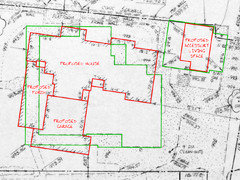
    Our plans are currently submitted for permits, based on the drawings in the lower image. I'd rather deal with any delay now rather than regret a decision on window choices later.

  • 10 years ago

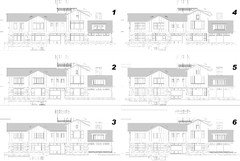
    oliviag55, Kelley Dockrey, jpsx3, calidesign, any thoughts on the various options in this photo

  • 10 years ago
    # 6 for me because I like more window panes and transoms and the lower right window being narrower to match the window above.
  • 10 years ago

    If I'm looking at it correctly, it seems that #1 has more of the windows that can't be opened, so I would bypass that one even though I like the symmetry better. Of the remaining options, I like #2, because it has the largest clear open window views. I would think about using double hung windows without the vertical grid though, because you already have so many broken lines with the transoms. I'm glad to see a door in all your options!

  • 10 years ago
    I was not picturing these as double hung. I prefer casements myself except for the large panes which would be fixed.
    Michael Boyle thanked jpsx3
  • 10 years ago
    We are planning casements, not double hung.
  • 10 years ago

    If you are doing casement windows I wouldn't use any grids on the windows themselves. In that case, I would go with plan #1 , assuming you can open those lower room windows, except I would make the window on the far upper left into a triple window to match all the others.

    Michael Boyle thanked calidesign
  • 10 years ago

    calidesign, could you tell me the rationale behind not using grids on casement windows? Below is the style we are inspired by and they look to be casements with grids. Thank you!

    Lake Michigan Home · More Info

  • 10 years ago

    Yes, those are casements with grids/ muntins. And entirely appropriate for the ops style.


    Michael Boyle thanked oliviag55
  • 10 years ago

    oliviag55, what do you mean by "ops" style?

  • 10 years ago

    I think we're narrowed down to this option. I'm wondering in the tallest section of the house if the picture window on the first floor should be slightly wider, making the group of windows wider than the group of windows above. The first floor is the dining area so it makes sense (the view of the lake from the kitchen looks through the dining area), while above is the master bedroom. In the other section with the picture window the first floor windows are slightly wider than the windows above on the second floor.

  • 10 years ago
    I like number 5.

    I really like divided lights. the lower bank of windows to the right of the door appears to be wider than it does in some of the images.

    while we are talking about window layout, have you thought about the windows themselves. I'm somewhat of a purist when it comes to divided window lights. they need to look realistic like Pella's Architectural line.
    I know that the true divided lights create more work and maintenance, but they look so much better than any of the windows with snap on grids or grids that are only between the glazings.
  • PRO
    10 years ago

    I think all of the options you are looking at are aesthetically pleasing enough. I would make my final decision based on the function of the room and how the window will affect the house on the interior. After all, that's where you'll be spending the most time with your new house.

    Michael Boyle thanked Coates Design Architecture + Interiors
  • 10 years ago

    Grids are fine if you like them. I think it's just personal preference - I just like a clear view.

  • 10 years ago

    Michael Boyle, op meant original poster, aka you. I hope you've found a design you love.

  • 9 years ago

    For those who were following the post, below is what our final design looks like.

  • 9 years ago
    thanks for sharing the final design. very nice!
  • 9 years ago
    Looks good!
  • 9 years ago

    Hope you will share final construction photos. Looks great.

  • 9 years ago

    I wanted to share for those who commented on this post last year. The process has been slow, but we are now underway and here's what a final rendering looks like as we begin construction.

  • 8 years ago

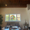
    Sharing a photo of what the house looks like after framing and window installation. We're quite excited with how it's coming along.