Software
Houzz Logo Print
pariela

What color walls

13 years ago
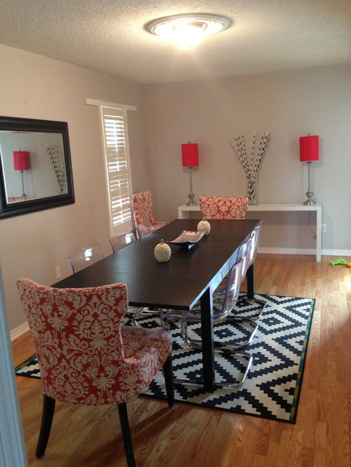
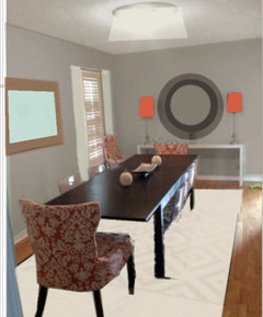
I just cant decide what color to paint my walls. My dining room is coral, black and white. Plz help! I'll looking for a modern rich look...

Comments (103)

  • 13 years ago
    I think charcoal is a huge mistake! I think you need to use the color you have now or a creme or white based color. then take that rug that is too small from under your table and hang it on the wall above your white side table. Let the accessories be the colors since your accessories are so bold. The lamps on each side like that don't look good, they don't seem big enough put them together at a staggering heights maybe some books under one then put other accessories on that table, move the black and white reeds closer to the staggering lamps. the way the table is now just looks very sterile and not natural. The drum shade is very good idea stick with that, and do a bold fun one with lots of drama. Personally I think your mirror needs to be a lot larger and thicker, but that's going to cost you. Add some printed drapes that are muted maybe in color so give it some texture but without over powering all the other patterns you got going on. Pull that red chair out of the back corner and put it on the other side. Good luck, I hope u post the new room.
  • 13 years ago
    Thank you all for your great suggestions.
    Bethk - i am going to look into Opal Essense and gold buff ( loving the sound of this one)... Still leaning towards a grey:)
    /tsudhonimh- thxs for all your input a lot of it makes sense. Ive just about started on the room so the color of the walls and the weird trim on the windows, the horrible lighting is from the previous owner... All are gonna go. As far as art is concerned i am going to buy some pieces soon. Mirror is going to go as well.
    Neema16- the rug is from IKEA
    U guys are great! Thank you so much!!
  • 13 years ago
    Jayjaystone- very interesting suggestion on placement of the lamps! Am going to try it.
    Im going to buy an identical rug and see if putting two rugs under the table will look good, of not then i might take the route of hanging it. Ive not put the chair on the other side becoz it blocks the entrance into the room.
  • 13 years ago
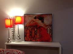
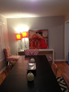
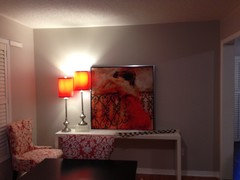
    Guysss!! I found the most gorgeous art for my room! Exactly what i was looking for!! Ive not hung it up yet ( need tips on that.. Height, level with lamps etc)...i just wanted to share with you guys.
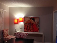
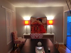
    Jayjaystone as you can see i am mulling over your suggestion of lamp placement!
    You guys rock! Thoughts?
  • 13 years ago
    The art looks nice! I also think the lamp placement is interesting but not with the vase in the middle. Could you take a photo as is but without the vase and one with the lamps on each side of the art (also without the vase), just so we can compare?
  • 13 years ago
    I like the color of the walls now.
    Try taking two of the clear ikea chairs out and pushing the printed chairs in more. Also what about moving the mirror to the wall with the lamps and getting a piece of artwork with color for the wall that had the mirror. Last thing a new light would be awesome.
  • 13 years ago
    U are so cute. Now step back and take a picture of that wall so we can mull over and think of placement for the picture. It does look on the small side... Maybe don't hang but just lean on the wall
  • 13 years ago
    Maybe take the black and white feathers in vase (not sure what they are) and set them on the other side of painting...and then take them out of the equation completely see which way u like em best sometimes too much is too much simple is nice and pleasing on the eye
  • 13 years ago
    I also really agree with Savvy Home Interiors above .... Scale is really important not just height but width etc so if you get a mirror to go On The wall u have now go big and thick make it a statement piece. The Martyn Lawrence Ballard room is beyond major there's alot to be learned in that picture alone it will teach alot . Scale, texture, pattern, hues, are things to be considered.
  • 13 years ago
    Ok am following your lead here:)
    Ive tried diff settings...
  • 13 years ago
    Ok that framed art looks bigger then I had thought anyway I like without the feather things the best the 2 and 3rd photo are my fav
  • 13 years ago
    We gotta find another place for the extra chair :) send more angles of the room and I know why you have those black and white feathers you want to toe j. The rug but we should find a better way to tie that rug in
  • 13 years ago
    *to tie in the rug
  • PRO
    13 years ago
    Okay,
    My thoughts. Too many cooks spoil the broth - but too many pieces that almost work spoil the room. One common theme here is that the mirror is too small. I think so too, but that's a detail. I need to see more of the floor plan to make an informed suggestion about where it should be.
    As to the color, that is something to work on after you address the chairs. The upholstered chairs you're using as armchairs have a great look but they don't relate to the plastic and chrome side chairs at all. Is that a square rug under a rectangular table?
    The main components- form, function,scale and color- have to be worked out before arranging lamps on a console table. I find the white table too distracting in a room with a gorgeous dark brown table with chair legs to match. Yes a drum lamp would be great, to add to the balance of the whole. It's not an integrated whole yet. Behr paint and a few others have simple programs where you can upload a photo and see how any color will work in a room.
    It has to speak to you. The main pieces and shapes just don't add up for me. If those are kids toys in the upper right... maybe you shouldn't have a rug at all ;) . I'm not a fan of rugs under tables because of crumbs, spills not being able to pull a chair in and out. Sanding the popcorn off the ceiling is the right advice - but keeping it off the floor is even better. I'm practical.

    I would wrap those two perpendicular walls in a warm darker neutral and if you love orange make it pop.There is no magic wand to wave. It's a process. If you lived in my town I'd come over. You could have a real gem with the guidance of an individual with a point of view. Each room has to play off each other. You should have a plan. Being bombarded with ideas from so many people with conflicting styles is very difficult. I couldn't take it.
  • PRO
    13 years ago
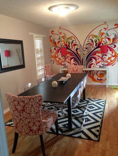
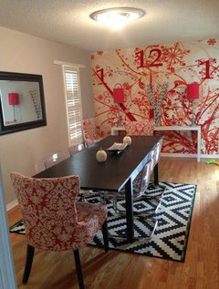
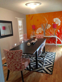
    I made some samples for your. How about try mural on your wall? This is sticker type. No glue and No residual on your wall. If you want to try diff designs, Just simply let me know. Thanks
  • 13 years ago
    I agree with Design Results. Everyone has a different opinion including her. I was only trying to help you with what you already had. Personally you and i have vast difference with we like in design, but thats ok, we can still be objective and spill ideas out for you to take or not to take. If I thought you would let me redesign the whole thing I would work that angle. But this is what you want, i think everyone is trying to be helpful. I like what the above poster proposed that background is flashy and dramatic.
  • 13 years ago
    Something seems out of alignment. Put the table and chairs where you want them (or under the place on ceiling where chandelier must go), then align the white table. I personally like the dark table and the white parson's table together - contrast! I think I like the first stencil, too! Very flamboyant! Like the lamps and picture. Could picture be on long wall, if you use stencil by end wall?
  • 13 years ago
    Design results- thank you for your input and ideas!
    I am loving the fact that there are so many people out here who are giving their ideas for this room ( including youself) as its really helping me realize what i really want the final look to be. A day ago i was clueless.. Today i feel ive gotten somewhere. Am sure a lot of people here are trying to work with what i've got irrespective of whether their taste is similar to mine or not.

    Smart miral stix- very cool idea but a bit tooooo extreme for me :)
    Jayjaystone- i am your fan... Thats all i have to say! Keep the ideas coming

    Ann- let me know your thoughts:)
  • 13 years ago
    Forgive me if you have answered this already, but ...what do the other two sides of the room look like? Is there more wall space?
  • 13 years ago
    I think your new art looks very nice. I can't decide if I think it should just lean against the wall as it is or be hung (not too high, if so). I like the lamps on each side now that I see the pictures for comparison, but I did think the side by side staggered suggestion was well worth trying. Now that you have the art, I'd put the vase and feathers somewhere else. The mural suggestions are way too much for me. I think you mentioned adding a second rug which should work well. I love your current wall paint color and wouldn't change it. Maybe the current mirror could work with sconces to give it a bit more width - it's actually not bad as is. I think the chair over by the white piece looks fine. I like the white table in the room. I liked the idea of having only two chairs on each long side of the table to push the end chairs in a bit more. Do you have a storage area to store the extra chairs to use when you have a larger group? I really like your room and think it doesn't need much to be changed!
  • 13 years ago
    Art in place of the current mirror, a rounded mirror above the buffet would look awesome. Yes a larger area rug, it could be black and white or neutral. Curtain panels on a semi- dark rod. And place the current faux plant that is on the piece serving as the buffet, on the floor to the left. And the new lighting suggestions above are perfect!!!!!
  • PRO
    13 years ago
    that's more like it!
  • 13 years ago
    You've found a very nice piece of art. It's a good size. I think you should hang it. The center of the painting should be at eye level. Usually about 58-60" from the floor. Could be lower, not often higher. Just what feels good to you. Above a piece of furniture about 4-10" from the top of the couch/table. It should be at a comfortable height, so you can easily enjoy it.
  • 13 years ago
    I almost always use one of carolins two methods for art height. In the case of your new art, I might use the "above furniture" technique rather than the "eye level" technique if the two methods don't result in the same height. Try having someone hold it so the bottom is about 5" from the table and see how that feels.
  • 13 years ago
    Beige?
  • 13 years ago
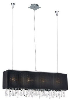
    Ok guys so just to give u a quick update, am now focusing on the lighting. A drum pendant light just wont look right coz my table is wayyy to long. I am leaning towards this linear pendant light. As most of you suggested i am going for black. My only concern with the black shade is whether it will b bright enough for the room. I know i have my lamps but i don't want my room to be tooo dim!
  • PRO
    13 years ago
    Your room is coming along great; love your eclectic-shabby chic taste

    Finishing Touches 44" Wide Rectangular Pendant Chandelier | LampsPlus.com · More Info
  • 13 years ago
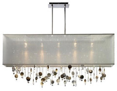
    Great thinking Pariela. A linear pendant will be fantastic. My vote goes to the lighter shade. Did you decide to go for a dark grey for the walls? I forget. Sorry. But in that case I'd certainly go for a lighter shade. I like the one Eileen A. posted.
  • 13 years ago
    I like both of those!
  • 13 years ago
    Nice room. Where did you get the buffet? I am looking for something like that in Black
  • 13 years ago
    Maybe create an accent wall by going with a soft turquoise color someone else had recommended. I think the longer wall would be the best choice for an accent wall. The rest can be the same color or a gray color.
  • 13 years ago
    Charcoal / grey was my initial thought. Turquoise - I would be over that in 6 months
  • 13 years ago
    you could alternatively add uni-coloured mats/rugs to either end of your existing carpet to lengthen it...
  • 13 years ago
    How do you make a picture of different wall colors?
  • 13 years ago
    I want to try it in my master bedroom
  • 13 years ago
    Final decision made. Going with a blueish grey with a gold accent wall( picked up a shade of gold from the art).
    Painting starts in a month! I'll send an "after" pic. Im excited about it and so far no second thoughts or cold feet re. my color choice. Wish me luck. Thank you for helping me on this project. Let hope it looks as good in real as its looking in my head :)
    Still hunting for my perfect lighting. Decided to go against any chandelier with a black shade( its too dim for my room).
    Also ive hung my art on the wall of the windows as opposed to over the console where it was prior. I dont remember who suggested it but it looks perfect for that wall:)
  • PRO
    13 years ago
    Absolutely love those chairs! Can't wait to see the "after" image! Good luck! :)
  • 13 years ago
    Fascinating to watch the suggestions.
  • 13 years ago
    How about a darker tan color for the walls. Love what you've done so far!
  • PRO
    13 years ago
    I actually liked that your original rug placement was breaking with 'convention'. There's not any law, that I know of, that would bring the Rug Police to your house for breaking it. I think it very practical to have your two bigger, heavier chairs sitting on the hard floor (when fully pulled up to the table, as shown) whilst having plenty of space for the lighter chairs to slide back easily on the rug. The combination of chair styles works well and I love the balance you had with the whole table chair and rug area. (Wait till you see what happens with a larger rug when you have to try pulling your larger chairs up to the table ... and you might wished you hadn't second-guessed your initial good judgment !:-) Love that third mural posted by Stix .. as I do the abstract and 'Poets Walk print, posted by Carolins. I'd throw caution to the winds and go for something like that big blue chandelier (assuming it is big) posted by mpoulson ... just to make it a total 'rule-breaker' of an original room ! ... Love it !
  • 13 years ago
    I'm late to the party! I love your space. I think coral color on the longest wall would be fabulous. Also, I like the fact the rug is "not the right size'. It's working here so please "break the rules" and leave it in this case. I do agree a fab chandelier would finish the room off beautifully. Not too "expected" tho, please. )
  • 13 years ago
    Another late comer to the party here, I love the grey oe even the mural a prevous post suggested. I think a few more layers are needed as well as the paint. Lighting fixture first of all, lots of suggestions and all of them are wonderful! I think the rug competes with your upholstered chairs, sorry... also the 4 plastic charirs disappear and are too small, they do not work with your coral chairs. I see you have one more by the window, maybe you have 4 of these, place then all along the sides of the table, sell the clear and get 2 others for the ends of your table. Then dress the window / windows with some simple linen panels maybe trimmed in the coral to work with the chairs. your are getting there, good luck.
  • PRO
    13 years ago
    Only just noticed that you added artwork .. can we get a clearer pic ? ... I'd suggest hanging it higher, rather than sitting it on the console, and using a wall mounted picture light above it ... that uplight from the lamps is not doing it any justice. ... And, Design Results, a lot of people love to come onto the Houzz website simply because they CAN start a 'brainstorming' session with amateurs and pros alike ! For some, that's the 'rush' that helps them decide what they want. "Form, function, scale and color" may well be the mantra of pros when undertaking a project (simply because it's 'taught') but many people, pros and amateurs alike, produce stunning rooms that seem to evolve, in a far more organic way ... out of a mishmash of furniture 'must keeps', less than perfect architectural details and barrel-loads of, often conflicting, 'advice' from all-comers ! :-) That's what Houzz is about, surely ? The day the place gets taken over by the 'pros' will be a sad one, in my opinion. (Not that it would ever happen.)
  • PRO
    13 years ago
    Hey Darzy ... Glad there are at least two 'rule'-breaking fans here ... I posted just a few minutes before you. We must have been scribbling the same thoughts at the same time. :-)
  • 13 years ago
    Not sure why you put lamps like that. I would hang pic, figure out a window treatment and put some color on the table. Maybe paint that one wall coral but I don't like any of the pics above with different wall colors or,the mural. Less is more!
  • PRO
    11 years ago
    nice
  • 11 years ago
    Old post!
  • 11 years ago
    I am with Jayme H. On the charcoal.
  • PRO
    11 years ago

    Add some crown molding!!!


  • PRO
    8 years ago

    Charcoal walls and crown molding for sure, ditch the accent lighting and get some sort of statement pendant for above the table. A solid window treatment might be nice too, nothing too heavy however