Software
Houzz Logo Print
nancyinri

Paint Color Help

10 years ago
last modified: 10 years ago
Tried this in the Paint forum but received very few responses.

We are buying a home that is currently being built and will be done mid October-mid November. I need to pick out paint colors for the inside of my home.

I have just painted the whole house I am putting on the market soon, my main home in New England. This home is in Florida. My brain is fried from the renovations being done on my main home and emptying/selling of my home in Florida. I am hoping since I was given such fantastic advice on a color for my master bedroom (for my main home going on the market ) that you will once again give me fabulous suggestions because you have such great taste!

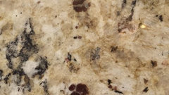
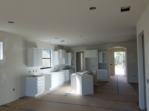
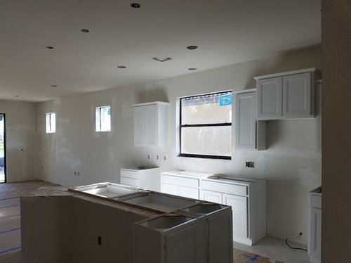
Here is a picture of my kitchen choices of cupboards, granite and tile for floor and back splash . Underneath you will see pictures of my kitchen, living room and dining area which are all together.

As you can see, because my living room faces northeast it can be a bit dark so I am looking for a soothing light color. I am assuming it would look best to have the same color in the kitchen, dining area and living room. because they are almost one big room Some of you may disagree and have other suggestions. I am open to any and all ideas. I

I do not like tan, beige, cream or white. I am looking for colors to brighten up my rooms but not too bright (like lime green or bright orange). I tend towards warm colors usually. I know grays are in and painted my main home with lots of grays. Not sure if I want to do that here and since the kitchen has more tan I would probably stay away from it (but not totally opposed if others feel it would be a good choice)..

I will need to pick out colors for the entryway (not sure if this should be different from the kitchen area) as well as the den to the right of the entry way and also the 2 bedrooms and bathrooms. I honestly have no idea what color scheme and colors I want for any of the rooms, I know what I do not like, just not what I really like.

As I said, my brain is completely fried....and empty.

Comments (34)

  • 10 years ago
    last modified: 10 years ago
    Start by looking at color guides from paint manufacturers. Find a pallette that appeals to you, has the calming brightness yet coordinates with your tan elements and go from there. Here is a link for the SW ones if you aren't sure what I'm referring to: http://www.sherwin-williams.com/homeowners/color/find-and-explore-colors/paint-colors-by-collection/color-guides-postcards/

    ETA: The PPG collection cards were the ones I was thinking of:

    https://www.ppgvoiceofcolor.com/collections#harmony-collection

    NewEnglandgal thanked stephja007
  • 10 years ago

    Thank you so much! It's not like I haven't picked out paint colors before. think I am on overload. Your links will be a big help! Appreciate it so much!

  • 10 years ago

    Very pale greens or pinks will work, but anything close to the beiges of your sample boards will be tricky, and you don't need that right now. A pale blush pink will warm up that space, and it won't necessarily be uber-girly or babyish, it just depends on the decor. Pale pink is surprisingly soothing, I've got some in my house, Ambrosia by Benjamin Moore. Even guys like it-- not to be sexist or anything. :)

    NewEnglandgal thanked scone911
  • PRO
    10 years ago

    In my personal opinion from that picture you have shown. Using neutral tones with warm highlights that can help reflect light around into dark spots of your kitchen. My suggestion that should go along with the rest of your colour scheme would be a brighter orange or a terry cotter.

  • 10 years ago

    Thank you both but Nottingham where would I place warm highlights?

  • 10 years ago

    cpartist I did not pick these. The house was being built for someone else. The deal fell through for whatever reason and so my husband and I are buying it at a great price. I knew ahead of giving an offer on the home that I could not change the kitchen choices already picked out as the house is too far along. The model home actually has the same cabinets and back splash and a granite close to this one. I actually like this granite better and I am fine with the floor and back splash. Would I have chosen something different for a back splash? Most likely, but I also would have gone crazy and agonized over the choices. The granite looks lighter in person and luckily does not look beige. I hate beige. That would have been a deal breaker. I was able to change my refrigerator (no way am I accepting a side by side) and I changed the handles on the cabinets.

    I should have been more specific-I do not want tans and beige on my walls.

    I will send you a message with more detail.

  • PRO
    10 years ago

    Well, everyone is a color expert, but since you asked, here's some thoughts:

    1. The existing color ranges for your kitchen finishes and cabinets are warm temperatures and rather neutral hues. This is always a good strategy when one wants something which will be lasting and durable, and which will let the interior spaces speak on their own without shouting a trendy or strong color here, there or everywhere.

    2. Based on your photos (and my monitor's calibration) the countertop hues range through part of the "earth color" spectrum, i.e., cream, ochre, sienna and the backsplash (?) tiles appear to have similar hues, with perhaps a bit of tinted orange, and no sienna.

    3. All of this points in the direction of some overall harmony throughout the house, but leaves open the option of a few carefully chosen "feature" walls which may be stronger hues and values of the basic color family.

    Since I don't like trendy paints, painting annually, and I don't like color schemes which attempt to overpower the architecture and interior spaces, a largely harmonious palette throughout the house (or at least the common, public spaces) makes a lot of sense to my way of thinking.

    If you like stronger "feature" walls, that may be a possibility, if carefully chosen from a palette harmonious with other areas in the public spaces. These feature walls may be complementary hues to the basic overall palette, or simply darker valued hues chosen from the overall palette.

    Your private spaces can be more individual, but I, for one, always hate to go to a home where every single room is some unrelated and individual hue.

    Furnishings and rugs, in particular, always help establish and support an overall approach to color, and you haven't said anything about these. Large paintings also offer an approach to choosing hues.

    In summary, my approach would be to either: 1) Select an overall neutral palette, which has possibilities for variety in hue or value (letting your furnishings and art contrast with this more neutral approach; or 2) Key carefully selected "feature walls" which echo a color or value found in your furnishings and art, keeping the rest of the space neutral.

    Just one approach, but a more timeless and enduring one. Hope this helps! Other's milage will certainly vary!

    NewEnglandgal thanked Virgil Carter Fine Art
  • 10 years ago

    Thanks so much for your suggestions. The make a lot of sense. I have no area rugs nor furniture for the house yet so I truly do have an empty pallet. :)

  • 10 years ago

    Yes what brand?

    What about a light turquoise?

    NewEnglandgal thanked cpartist
  • 10 years ago

    Some Sherwin williams markets have color consultants. My market is $95 for 90 minutes than you get a $50 gift card.

    i'd try something like cp mentioned. Since you don't want the beige family go to a complimentary color on the good ole color wheel.

    NewEnglandgal thanked whaas_5a
  • 10 years ago

    On the inside I can use whatever colors and brand I want. The outside color they are painting and eventually when I go to paint it again I have to choose from their selection of color schemes and it cannot be the same as my neighbor on either side of me.

  • 10 years ago

    I have to choose from their selection of color schemes and it cannot be the same as my neighbor on either side of me.

    Is that so when you've had one too many you can find your house?

    Sorry I couldn't resist. LOL. :)

    NewEnglandgal thanked cpartist
  • 10 years ago

    Lol Probably for when I get too senile to know the difference :)

  • 10 years ago

    Whaa I may do exactly that, see if I can hire a consultant if I have trouble making the decision. I usually look at colors, choose some I like, then plug them in to Houzz for the room I want the specific color in and see how it looks in the pictures to give me an idea how it will look. Really enjoying and appreciating all the help and suggestions!

  • 10 years ago

    Lilysmom Thank you so much for your reply!

    I think I painted my bathroom here at my main home coastal fog.

    I tend to like, greys, blue greys, blues and greens and taupes. I like my paint very light in color.

    I could paint my bedroom or a bathroom yellow but feel it might be kind of blah with the tans already in the kitchen and want a little pop of color . I do not like coral, pink (sorry scone), purple, reds or cranberry, beige or peach.

    Yes that is the floor tile behind everything on the left.

    I agree the color should be warm, especially because part of the home will be on the dark side facing northeast.

    My main home is 3000 sq ft. I had to choose 6 or 7 colors for this house and I do not have different colors in every room. Mostly greys, blues and greens (surprise, surprise). I have already chosen colors I really like and for the most part am hoping to have my vacation home painted different colors than this one however I love, love, love the BM Soothing Aloe I painted my master bedroom. The color was suggested to me on a thread here.

    I may end up choosing colors close to what I have now because those are what I tend to gravitate towards. Was hoping people would throw out paint color suggestions they know and love so I could check them out lol


  • 10 years ago

    We are going to hire a handyman to paint for us since we spend so little time there. We do not have the time to do it ourselves.

    I want to get the walls painted before we move in and we are also putting up crown molding on the ceiling in the main areas. I agree, if I do not like it I can always repaint. I have had paint chips up on walls for 2-3 weeks to see if I like it or to choose between 2 colors. It always helps.


  • 10 years ago

    Picked up some cards from Lowes - the HGTV collections of paint. You can find all the colors that work well together there - and it's pretty cool. Go grab some of those - the paint folks are really helping those of us who are color challenged. ;-)

    NewEnglandgal thanked just_janni
  • 10 years ago

    Thank you Jannicone. I have been looking at all kinds of colors this morning and trying to see how they look in different rooms. For instance, I love BM Sea Salt but feel it would look best in a bedroom. I love greys but feel they may look kind of blah with my neutral tones. I love BM Mount St Ann but am afraid it may be too dark in my kitchen. I also like Northern Cliffs which is a totally different color... .but again it looks too dark and I do tend toward the very light colors.

    I love going to to the paint stores and looking at the booklets with pictures and complimentary colors that go along with the main paint color. That is exactly what I need. Paint looks different in different rooms, different amounts of light etc so it needs to be painted on a wall or a big wallboard and tacked up for a good day or so to see how the color looks in the room and at different times of the day.

    There are so many different colors I like and they are not all the same. I am thinking possibly a light yellow for the entry and den that is directly off the entryway and then possibly a greige, grey/blue for the open kitchen/dining/living space but having difficulty deciding on that. I may choose the sea salt for my master. Thanks so much for your suggestion. I will go up to Lowe's this weekend and check it out.


  • 10 years ago
    last modified: 10 years ago
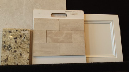
    Hmmm, o.k., the basic problem is, you are working with fixed elements in warm tones, but you like cool tones. Fortunately, the fixed elements look like they are in the yellow gold family, that's my assumption anyway, which is easy to work with.

    So how about a very pale earthy gold (yellow ocher, not bright yellow), or a very pale olive green, which has a lot of yellow ocher? There is an extremely elegant range of color, derived from Sung dynasty celadon porcelain, which would look great. If you google that, you'll see how the tones go with your stuff.

    You could use pale neutralized blues, like Wedgwood or Adam blues, but they can get very cold unless your room is in a hot climate with a lot of light.

    And I hate to even suggest this, because it's going to get shot down, but with your gold elements, you could use a neutralized lavender. Yes, lavender. I know, you're saying "gak, kill me now." But a grey-ed out lavender can be surprisingly neutral, and most people see it as periwinkle blue, so it's really not weird.

    NewEnglandgal thanked scone911
  • 10 years ago

    Thank you scone for your thoughts! It's funny you mention this because a girl at the paint store actually suggested a purple grey. I was looking at grey blues for the kitchen/dining/ living area and a light yellow for the entry and den area which precede that open area. I saw some of the colors but have to say IF I went that route I would not want it to look purple...and they did, even the ones with grey tones. I'm definitely not opposed to it.

    The house is in Florida and the back (living area) faces northwest. This is standing at the back living area facing in towards my kitchen.


  • 10 years ago

    It sounds like you are boiling this down to one of those in-between blue/grey/green colors, like BM Palladian Blue, Quiet Moments, Sweet Celadon, or Cool Breeze.

    That's fine, but IIWY I'd make sure there was enough gold in the mix to tie in with the fixed elements, and a tiny bit of gold ( yellow ocher) in the ceiling paint so it doesn't go cold at night. You won't even consciously see the gold, it will just look slightly "creamy."

    If you want that, the basic formula is something like thalo blue, thalo green, yelow ocher, and a tiny bit of red ocher to neutralize. Any paint line could do that.

    Greys are much more difficult. If they are based on black and white, they have all the friendliness of a police interrogation room. And greys always lean toward some color family anyway, like yellow-grey or blue-grey. Greys, beiges, and taupes are not easy at all.

  • 10 years ago

    Thank you for all your help scone. I don't really understand what you wrote as far as Thalomid and ocher but I assume most paint stores would understand. I agree that the greys all have undertones. I really want to find colors I love but that also lighten up the house. I know different light as well as outside areas (greens) can change the look of the paint color.

    Lots to take into consideration!

  • 10 years ago
    last modified: 10 years ago

    We used BM Seattle Mist which in our light does have a green undertone but it also does change from room to room - sometimes casting more gray and sometimes more tan. We have a lot of green outside from the woods and our first choice of paint casted dusty purple which for our furnishings and general liking was a no go-and I saw no purple in it on the paint chip with my eye at all. It was BM 1550 Cumulus Cloud.

    BM 1535 Seattle Mist

  • 10 years ago
    last modified: 10 years ago

    Thalo blue and thalo green are standard pigments, used in the colorants of most lines of paint these days. The reason for giving you the paint formula is to (I hope) help you cut down on the sampling you will have to do. It gets really expensive buying sample pots of paint, and those little chips are darn near useless. With the formula, you could mix up little batches of color using artist's tube colors, then paint it on cardboard. When you find a winner, have the paint shop match it.

    Another way to do this, and it might be easier, is to find an object in the color you like, put it in the room, and consider it for a while. A large piece of clothing on a hanger, like a t-shirt, would work. Once you find the right object, just take it to the paint store and have it matched.

    NewEnglandgal thanked scone911
  • 10 years ago

    "Another way to do this, and it might be easier, is to find an object in the color you like, put it in the room, and consider it for a while."

    That is a great idea! You know, I feel like the more I look at color chips the more indecisive and confused I feel. I do appreciate all your help!

    I feel like I know what I do not want but figuring out exactly what colors I want and will like is becoming a chore. Luckily I have a good month and a half to two months to think about it and figure it out. Harder to do when I am over a thousand miles away.

  • PRO
    10 years ago

    Have you considered buying an hour's time of a talented interior designer and letting a pro help with options?

    NewEnglandgal thanked Virgil Carter Fine Art
  • 10 years ago

    What Virgil said. We did that and it was some of the best money we spent...and it was quite reasonable.

    NewEnglandgal thanked autumn.4
  • 10 years ago

    Virgil, yes I am probably going to do that. I am in RI and the house is in Florida. I know some use these services online. How would I do that if I am not near the home and it is not finished quite yet?

  • PRO
    10 years ago

    nancyinri, you could have an interview or two with an experienced ID in your home location in RI. If you give her the floor plan and photos s/he can easily help you. Good luck!

    NewEnglandgal thanked Virgil Carter Fine Art
  • 10 years ago

    Ok thanks so much Virgil! I hope to find someone who is really good with color schemes.