Software
Houzz Logo Print
raffy_parcon

Colors in Living Room do not add up.

10 years ago
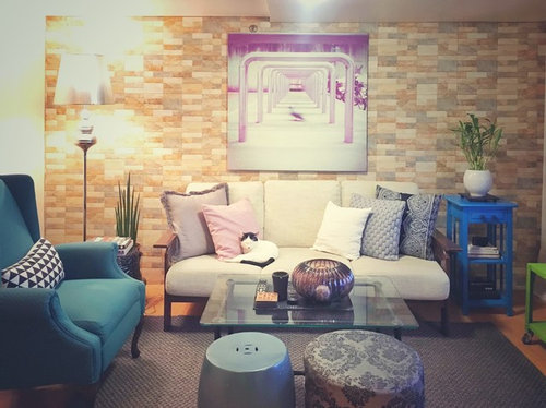
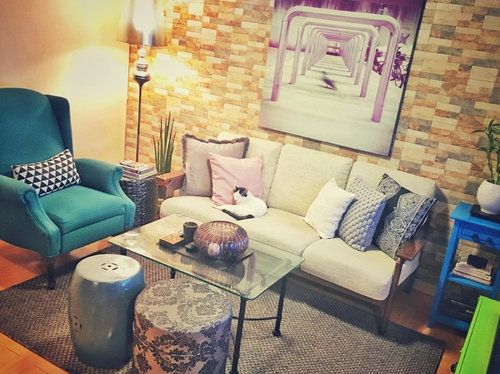
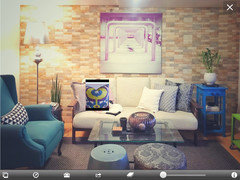
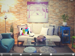
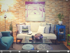
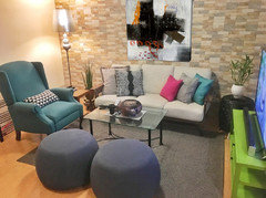
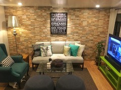
This is our living room. There are a number of things in it that I love - the wing chair, the artwork on the wall, the accent wall feature.

But I feel I went overboard somewhere. I think it's the colors. I tried to tone down the palette by introducing more grays, and blacks, and other pieces that echo the hue of the artwork and the painting.

Now the blue side table and the chartreuse media table/ TV stand stick like a sore thumb. I'm stuck.

Off the bat, I'm thinking of replacing the blue side table.

Will the chartreuse media table still work at all?

Help. :s

Comments (74)

  • 10 years ago
    last modified: 10 years ago

    @grover, yes! Bold graphic but $80.

  • 10 years ago

    I like Grover's idea.

    But if you're attached to the art, I'd say a solution is as simple as painting the chartreuse a muted pink/mauve to fit the cushion and art.

    I personally think the purple art on the sandy yellow feature wall is very complementary and then it's echoed by the pillows on the settee.

    And secondly if you can get the side table to match the arm chair better that'd do the trick. It'll still be bright and colourful, but it may maintain some things you like.

    For what it's worth though, I agree with advice here on the pouffe and more printed cushions. Perhaps more emphasizing the colours in the art work.


  • 10 years ago

    Please, what material is the accent wall, can't tell...?

  • 10 years ago
    @everdebz

    Hi! The wall is made of stone tile. :)
  • 10 years ago
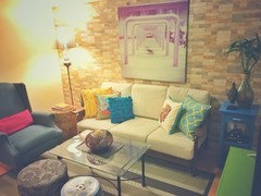
    This living room was WAY more colorful a few months back (see photo). I grew tired of the myriad of colors quite easily. A more muted palette is the way to go I've decided.
  • 10 years ago
    Having said that, I very much like the rendering of groveraxle (thanks grover!). It's beautiful.

    I like how disciplined the colors and entire space are, while keeping the eclectic style that I've been going for.
  • 10 years ago
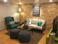
    So, I changed up some things A BIT - new throws. New matching pair of ottomans. Got rid of the blue side table.

    And now I'm thinking:

    1. the chartreuse media console is somehow working. Hmm.
    2. the brick wall is not working. A clean, neutral backdrop would work work best
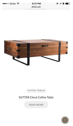
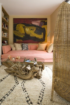
    3. I need a new coffee table (second photo is my peg) to warm the place up (assuming I keep the media console).
  • 10 years ago

    Hi. Thinking that you might like the stone after you add a similarly natural texture like wood [table]. Wait a while. You could add funky lantern or accessory in art's color / glossy like green unit. Have opposites of 'natural' and glossy [is it glossy?]..... what do you think?

  • 10 years ago

    Because from photos I see no teal [as chair seems to be] -- what about chalk painting it art color, or unit color?

  • 10 years ago
    The wall is what messed you up. Shouldn't have yellowish hue. Grey or white tones only. But now that it's there you're going to have to compensate by adjusting other items to offset it.
  • 10 years ago
    last modified: 10 years ago

    From her website: "Beige [paint] would die and look dirty in an interior with this much clean colour (unless it was super pale....) That's the reason the grey trend is here, it provides a crisp backdrop to cleaner colours."

    http://www.mariakillam.com/askmariaundertones/

  • 10 years ago
    last modified: 10 years ago

    Maybe that's correct and others that say too: the beiges in stone wall aren't complementing your saturated-clean lime, etc.... would you ever consider painting it white / as in white of the art??

  • 10 years ago
    Can you take the picture from further back?...the close ups don't really give a view of full area
  • 10 years ago
    Also...tho the accent wall is a challenge I think it is distinctive and interesting enough to try to keep it...the changes you have made are moving your space into a more conventional direction and I would hate to see you eliminate all the interesting things...have you vetoed putting the couch on the beige wall to the left?
  • 10 years ago
    The beige wall would allow the subtler colors of the couch grouping to stand out better...and the green piece has never been shown for the style and size in your pics
  • PRO
    10 years ago

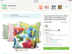
    I would keep it all and change up your pillows! Room looks full of life and eclectic just needs a little cohesive colors to bring it all together...super fun room!!

  • 10 years ago

    I also wonder about the photos -- what the art really looks like -- is it pastel in appearance?

    What if shiny green were seen against the rough stone, etc.......

  • 10 years ago
    last modified: 10 years ago

    I love color and texture but you've gone way overboard and it's mainly the "FEATURE WALL" as you call it and the picture that's hung on it. Both should go. Then your room will probably look fine. If the feature wall is brick then paint it the same color as the remainder of the wall. Then you can reevaluate what the room looks like without those two very distracting things.

    You might find that the coffee table is okay, too.

  • 10 years ago

    You have to fix the problem before you can add or subtract other items. So don't go buy anything else for now.

  • 10 years ago
    last modified: 10 years ago

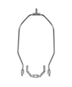
    When sitting on your sofa or in the wing chair you shouldn't be able to see the light bulb in the floor lamp. Can you? It looks too tall. Maybe all you need is a shorter harp so the shade sits lower. Or you might move it to the other side of the room.

  • 10 years ago
    When you have several windows in close proximity Roman shades can add pattern, color and softness without yards of fabric.
  • PRO
    10 years ago

    I really do believe it would only take one pillow to pull it together..I think the room is super cute!

    I love the idea of a wood cocktail table but not necessary

    i love the idea of a wood or black simple frame on canvas art but not necessary.

    good luck!

  • 10 years ago

    Well Home Int. showed a great 1st pillow. If the art is fairly vibrant, good!!

  • 10 years ago

    I definitely don't mind the feature wall.

    I think the pink/purple and biege palette go really nicely together.

  • 10 years ago
    last modified: 10 years ago

    I like your new side table and table moved to the blue chair. I really like the idea of the new wood coffee table - that was really pretty. Glad you could keep your art you love and made it work. I love Ease's idea with 1 pillow with all of the colors. For me personally, I think that really pulls the whole room together and might be a better next purchase than the new coffee table (that I really really really liked.) Just throwing in my 2 cents in for the sake ... Looks good to me. :) ...

  • 9 years ago
    Thanks again for all your great ideas. Still taking it all in. :)

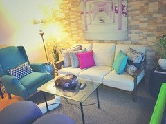
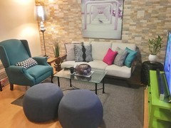
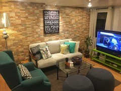
    There's a request for a picture of the living room from a wider angle. I also used another camera to show the colors more accurately.

    What has changed from the very first post:
    1. New pouf chairs.
    2. New throws to echo the palette more strongly
    3. No more bright blue side table, which was replaced by a circular black one.
    4. A new side table by the floor lamp.
  • 9 years ago
    Finally ...a view of what is on that green console...have been thinking all along it would look good on the accent wall...and how nice to be able to see the tv better from the rest of the space...also the couch on the beige wall is a natural.....there may be reasons not shown to contradict these changes but all the changes so far have been only addressing the smaller details..not the layout
  • 9 years ago

    Its the couch. Too neutral on the neutral wall. Color would really pop the wall and the wall would really pop the color. Maybe try wrapping the sofa cushions in a bright solid bedspread and see what you think. You might be surprised.

  • 9 years ago

    I like poufs -- are they a blue-grey? if so, doesn't seem balanced with wall and sofa and rug [all which I like].

    Is rug a mushroom-beige?

  • 9 years ago

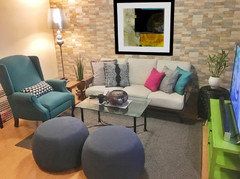
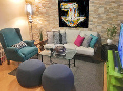
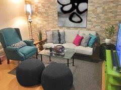
    I'm sorry, but I just don't think that pink art works on that yellow wall. It needs something bolder and darker. I'd like to see bolder ottomans, too. In the last image below, I made them more of a charcoal.


  • 9 years ago
    My take was that you have enough pop and what you were seeking is more cohesion ...the painting and the accent wall needed to be presented in a way that featured them rather than pairing them with conflicting elements...the neutral background is needed to let the painting become all it can be...the accent wall is a perfect foil for the cool green console...they live up to each other ...if you love it as it is I would try removing the pillows..to me this would be enough activity on that wall..be more striking...with perhaps a couple larger neutral pillows if needed....and allow the eye to focus on the wall and the painting..the accessory changes you have made so far are good
  • 9 years ago
    Grover makes some good point,too
  • 9 years ago

    The pink picture must go.....it is keeping your room from coming together. Grover's examples are splendid.

  • 9 years ago

    Grover yeh! Seems you can have too many kinds of neutrals. The charcoal poufs now seem to match pillows, which is fine, cause there are enough other items of interest. Blue-green chair and yellow-green unit for instance, which are exciting together.

  • 9 years ago

    Love the big and bold art and would like to see a touch of green in the art....just a touch....that ties in with the cabinet under the tv....give them a reason to be in the room together.

  • 9 years ago

    I like Grover's ideas too. Maybe she could do one with a bold colored sofa.

  • 9 years ago
    Hey Guys!

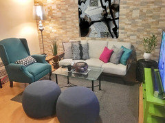
    Renovations are finally done after a couple of months. I realized updating the look of the living area had to flow to the rest of the house. So I did some fairly big changes: Painting the wall, adding trim, changing the floor, and updating the lighting.

    As I really wanted to keep the brick wall in the living area, I used it instead to dictate the overall palette of the house: gray color for the wall, dark gray trim, light oak floors.

    Dark wood furniture provide contrast, plus a fairly disciplined palette when it comes to accents leaning towards blues and greens.

    Admittedly, I was hesitant at first to replace the artwork in the living room wall. But replacing it with a smaller one - and in black - provided a good final touch to pull the living room together.

    Quite happy with how all these turned out.

    Thanks for all your suggestions! And continue to share your passion!

    ❤️
  • 9 years ago
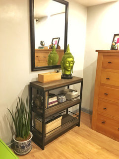
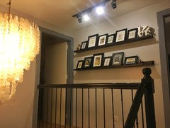
    More pictures: upstairs hallway and laundry area.
  • 9 years ago

    Oh yes!! This is so much better. I bet you love it!

  • 9 years ago

    You nailed it.

  • 9 years ago
    last modified: 9 years ago

    I see amber/wood and greens -- pleasant to me to mix different greens! [Cats know where to relax/ hide don't they?!]

  • 9 years ago

    Your whole house -- what we can see -- looks just absolutely gorgeous and the living room fits in perfectly. Well done.

  • 9 years ago
    Really love the plants and the bright green rug in the laundry room!...sorry to see some of the personality and originality was lost in the search for a more formulaic overall result..think you have an innate feel for design and hope you will trust your flare for the unusual more in the future ...trust your inner design sense..it is a gift
  • 9 years ago

    Much improved. Your room looks 100 times better.

    Still, the over-the-sofa piece could go wider horizontal and be hung lower. At least 2/3 to 3/4 the width of the sofa. It is good that it's dark and basically one color.

  • 9 years ago
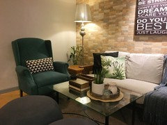
    Same room with new coffee table vignette. :)
  • 9 years ago

    Sooooo nice! What a cozy place! Now change out that coffee cup for a glass of wine, huh?


  • 9 years ago

    Very nice. I love your use of green in the space, with the plants and the foliage throw pillow.

  • 8 years ago
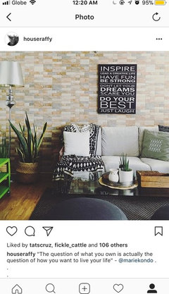
    So this I moved the furniture around again, and changed a bunch of pillows and the throw as well. I think this is A LOT more cohesive than when I started. Thanks for all your suggestions!
  • PRO
    8 years ago

    This is your best!

    looks great enjoy

  • 8 years ago
    Another view of the living room.