

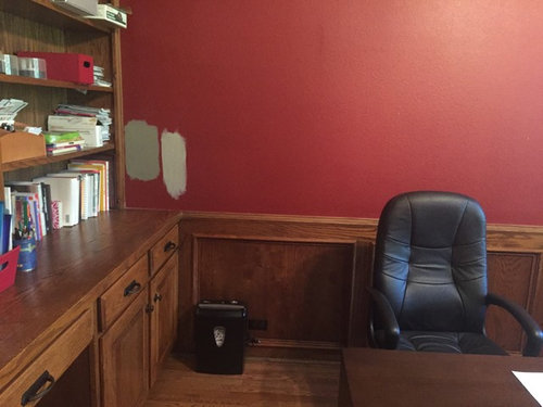
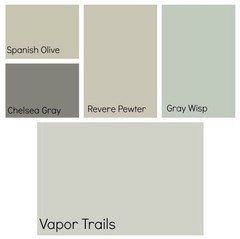
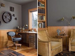
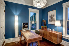
need help on wall color for this home office
10 years ago
Featured Answer
Sort by:Oldest
Comments (25)
 10 years ago
 10 years ago
Related Professionals
Wilmington Interior Designers & Decorators · Atlantic City Interior Designers & Decorators · Norfolk Interior Designers & Decorators · Hartford Interior Designers & Decorators · Des Moines Interior Designers & Decorators · Panama City Architects & Building Designers · Raleigh Architects & Building Designers · Middletown Architects & Building Designers · North Adams Architects & Building Designers · Monroe Architects & Building Designers · Mountain Home Kitchen & Bathroom Designers · Washington Kitchen & Bathroom Designers · Port Saint Lucie Kitchen & Bathroom Designers · Concord Kitchen & Bathroom Designers · Medford Kitchen & Bathroom Designers 10 years ago
 10 years ago
- 10 years ago
- 10 years ago
- 10 years ago
- 10 years ago
- 10 years ago
- 10 years ago
 PRO10 years ago
- 10 years ago
- 10 years ago
- 9 years ago
 9 years ago
- PRO9 years ago
 9 years ago
Related Stories
REMODELING GUIDESKey Measurements to Help You Design the Perfect Home Office
Fit all your work surfaces, equipment and storage with comfortable clearances by keeping these dimensions in mind
Full Story
STUDIOS AND WORKSHOPSYour Space Can Help You Get Down to Work. Here's How
Feed your creativity and reduce distractions with the right work surfaces, the right chair, and a good balance of sights and sounds
Full Story
PRODUCT PICKSGuest Picks: Help Your Home Blossom With Floral Decor
Sprinkle hints of spring around your rooms with fabrics, wall coverings and more that recall nature's charms
Full Story
STORAGEDownsizing Help: Shelve Your Storage Woes
Look to built-in, freestanding and hanging shelves for all the display and storage space you need in your smaller home
Full Story
HOUZZ TOURSHouzz Tour: A Modern Loft Gets a Little Help From Some Friends
With DIY spirit and a talented network of designers and craftsmen, a family transforms their loft to prepare for a new arrival
Full Story
ORGANIZINGDo It for the Kids! A Few Routines Help a Home Run More Smoothly
Not a Naturally Organized person? These tips can help you tackle the onslaught of papers, meals, laundry — and even help you find your keys
Full Story
SELLING YOUR HOUSEHelp for Selling Your Home Faster — and Maybe for More
Prep your home properly before you put it on the market. Learn what tasks are worth the money and the best pros for the jobs
Full Story
UNIVERSAL DESIGNMy Houzz: Universal Design Helps an 8-Year-Old Feel at Home
An innovative sensory room, wide doors and hallways, and other thoughtful design moves make this Canadian home work for the whole family
Full Story
STANDARD MEASUREMENTSKey Measurements to Help You Design Your Home
Architect Steven Randel has taken the measure of each room of the house and its contents. You’ll find everything here
Full Story
ARCHITECTUREHouse-Hunting Help: If You Could Pick Your Home Style ...
Love an open layout? Steer clear of Victorians. Hate stairs? Sidle up to a ranch. Whatever home you're looking for, this guide can help
Full Story


Bailey R