Software
Houzz Logo Print
diyer59

Bold Bath Paint Color--is it too bold?

9 years ago
last modified: 9 years ago
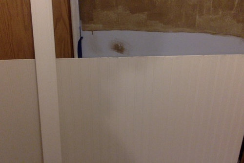
Recently, I tried some "textured paint" by Ralph Lauren called River Rock on my hall bath in a very bold dark chocolate brown. I put on the first coat...then stood back a couple of days trying to decide whether I should continue with the final coat, or lighten it up a bit.

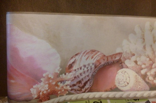
I'll be putting up off-white beadboard along the bottom (shown) with trim. Above the sink area will be travertine tiles with a border (shown) and the border will also go on top of the beadboard around the room, making it uniform with above the sink. I'm thinking of lightening the wall color to a taupe, closer to the color in the border shown. I'm undecided about the cabinet color, but leaning towards keeping it dark (like the walls) as shown.

Your opinions welcome! Thanks.


Comments (36)

  • PRO
    9 years ago

    There is a little bit too much contrast maybe the wall would be better if lighter

    diyer59 thanked Pyramid Design Group Architects
  • 9 years ago

    I don't like it.

    diyer59 thanked Kris Mays
  • 9 years ago
    It's hard to tell from your pics but what does come through is how blotchy this treatment looks. It is always a good idea( for future reference) to paint your wall first in a color as close to the finish color of the faux treatment. You will have a much more satisfactory result.
    diyer59 thanked Business_Name_Placeholder
  • 9 years ago

    lynartist-as I pointed out, this is only the first coat of paint (therefore "blotchy"). Kris-what don't you like specifically--the dark brown?

  • 9 years ago

    Pyramid Design (Pro)-so I'll probably be better off going with the lighter taupe color?

  • 9 years ago

    How are you going to finish the top edge of the beadboard? The travertine may look bulky.

    I can see this room coming out quite dramatic. What does the medicine cabinet look like?

    diyer59 thanked apple_pie_order
  • 9 years ago
    I painted our hall bath a beautiful brown suede, texture and all, I lived to regret it. EVERYONE laughed at the color saying how 'appropriate' it was! Needless to say, it only lasted a week before painting over it. Houzzers are correct, don't use brown or yellow in the bathrooms!
    diyer59 thanked Mary de Jesus
  • 9 years ago
    Foyer, yes, I was aware of that. As a professional decorative artist for thirty years I was trying to be helpful;)!
    diyer59 thanked Business_Name_Placeholder
  • 9 years ago
    Diyer! Auto correct strikes again!
  • 9 years ago

    If you want me to be specific, yes, I don't like the treatment or the color in that room.

    diyer59 thanked Kris Mays
  • 9 years ago
    last modified: 9 years ago
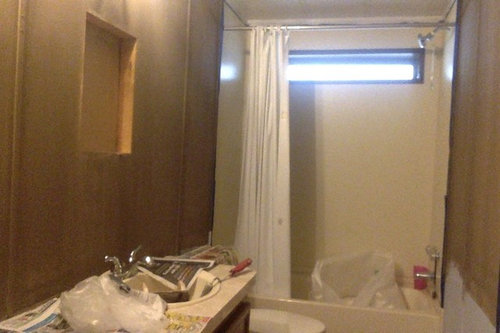
    apple_pie_order-The top edge of the beadboard (see photo) will be finished off with the trim next to it (it's approx. 2 1/2"). The travertine is not very thick. I did put everything up before I painted, lining up the beadboard, trim, tile, border and marking on the wall how to fit it all. The medicine cabinets right now are tan wood, I was thinking of making them off-white to match the beadboard. I'd really like to replace them with borderless glass (larger) but after shopping around, what I wanted was cost prohibitive.

  • 9 years ago

    Mary de Jesus-Yes, the color is "appropriate" for where it is, which is what concerned me once it was on the wall (the color on the can looks more deep taupe than dark chocolate brown)! Looks like I'll be lightening it to a true taupe.

  • 9 years ago

    No brown.

    diyer59 thanked User
  • 9 years ago

    lynartist-I wasn't sure if you saw this was the first coat, that's why I pointed it out. Also, I did put a good primer coat on too. The directions called for dampening the special roller first before loading it with paint. I regret following those directions, because I noticed the first wall I painted was more blotchy than the rest.

  • 9 years ago

    can you post a better photo?? its very grainy. I think i have a similar treatment in my bathroom (rough texture paint??) but I did it in a light gray.

    diyer59 thanked Beth H. :
  • 9 years ago
    last modified: 9 years ago
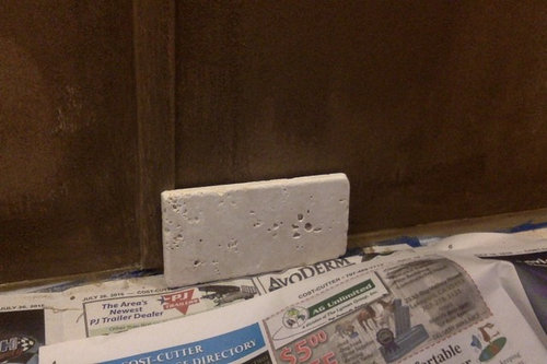
    Beth H.-ROFL, um...I think the grainy look is the paint! My computer doesn't take the greatest photos, unfortunately. Yes, they had gray, beige, dark blue and green besides this brown color (which showed as dark taupe) and it has grit in it to give a rough, matte finish. Wouldn't choose it again, but I was being brave! : [

  • 9 years ago

    How is the second coat different? Is it like a glaze or a different color, if it is just the same, then I have to say, it looks a bit like plywood.

    I think it can still work but in any case I oppose the travertine.

    diyer59 thanked emmarene9
  • 9 years ago
    last modified: 9 years ago
    emmarene-the second coat is supposed to give a more even coverage. There is no glaze (it's a matte finish) but I do have glaze from another project I was considering applying. At this point, I will have the color treated so it's the true dark taupe I originally thought it was, then I'll apply that as the last coat. Then, I'll see if it needs the glaze.

  • 9 years ago

    What was the name of the color you used? River Rock is just the texture.

  • 9 years ago

    emmarene-It's called "Moosewood" and the dab of paint on the lid is a dark taupe color.

  • 9 years ago

    I agree with most comments - to me it is just not making the room look as nice as it could be! It looks dreary and that texture makes it look like dirty walls to me. I would go with a light/cheery colour like a lighter blue or turquoise and if you're not into colour than white.

    diyer59 thanked mzapper
  • 9 years ago

    mzapper-the color of the tub, toilet, sinks and counter don't go well with blue and... certainly not turquoise! I had put a beautiful blue on the walls and it looked terrible. I needed a darker, warmer color. I try to stay away from white walls, so that's not an option either. I'm sticking with taupe, which is warm enough, but not as dark as what's up on the walls now. I'm looking for a somewhat dramatic bathroom treatment and I think that color will achieve what I want.

    Thanks everyone for your comments and suggestions. This helped me to make a final decision about the wall color. When finished, I'll post pictures.

  • 9 years ago

    Too dark.

  • 9 years ago
    It's only paint. The second color may come out stunning and dramatic like you want. Paint half of the bathroom with the second coat and decide. Change it up then if it doesn't work.
    diyer59 thanked Elvira Rago
  • 9 years ago
    last modified: 9 years ago

    I must be missing something as thought the tub, toilet and sinks all looked white or off white

  • 9 years ago
    last modified: 9 years ago

    It feels like you are trying to do a dramatic dim powder room effect on a full bathroom and its not working. Try a large scale pattern wallpaper on the sink wall perhaps? Maybe a pic or two on what you are trying to achieve would be helpful for the pros to advise you? Avoid all shades of diarrhea would be my two cents!

    mzapper... yes, I'd like to see the room blue as well.

    diyer59 thanked Paul F.
  • 9 years ago

    Diyer, your ideabooks show you liking a beach vibe in your house.

  • 9 years ago
    last modified: 9 years ago

    trib, thats why I thought something like this might work on one wall. I think the color of the Ralph Lauren paint "River rock" was supposed to bring to mind water...but in this setting it conjures something else.

    diyer59 thanked Paul F.
  • 9 years ago

    mzapper-no the photo doesn't show the true colors of the toilet, counter, bath and sinks, they aren't white or off white. If they were white or even off white, I would have stayed with the blue I had put up before the Ralph Lauren #2 color. I even considered a wonderful coral color (in the border) but that also looked bad next to the color of everything else.

    finndian-the wallpaper you posted is nice, I've seen that before. But, not interested in wallpaper, especially since the first coat of the textured paint is on--I'd have to sand the walls! Also, I don't want the expense of wallpapering (paper plus a hanger to do it, I don't do any wallpapering).

    Tribbletrouble-yes, it's a cottage with a "beachy" look, which is why I was going to put the border with the shells up in the bathroom.

    Elvira-yes, I was thinking of trying that, but after looking at it a couple of days with just one coat, I was really worried with the final coat it would be extremely dark. So, instead of spending another 2 hours painting, I decided to stop and rethink what I was doing.


    Again, thank you all for your comments and suggestions.


  • 9 years ago

    I don't think the brown is beachy.

  • 9 years ago

    You need at least one more coat as the texture is not uniform.

  • 9 years ago
    While I agree that this doesn't read as "beachy", with the right lighting and accessories, it will look amazing. Those with "potty minds" will laugh, but let them. As long as you love it.
    diyer59 thanked teamaltese
  • 9 years ago
    It's a bummer that you aren't pleased with the outcome, but GOOD FOR YOU, diyer, for trying something bold! I'm proud of you.
    diyer59 thanked ackcx3
  • 9 years ago

    ackcx3-thanks, I liked experimenting, have never used this type of paint and probably won't use it again! This is the first time one of my projects didn't quite pan out (I have 40 years of DIY experience). But at least it's easily corrected. Will be heading to the paint store to have them fix it tomorrow.

    teamaltese-yes, the lighting is key, I agree, and in the picture I only have two bulbs in, not the six in the fixtures. Plus, I have a window and skylight, during the day it's not a dark room. I took the picture late in the day, which made it look even darker. The "beachy" part is the border and art I'll be putting on the walls. I have light and dark taupe, coral, off-white and blue in my home decor, so this room will fit in well once the taupe color is applied. Also, if the matte still makes it look too dark (which matte can do), an application of glaze I have will help with reflecting light.