Software
Houzz Logo Print
ekaterine

Winds Breath OC-24

9 years ago
My trim and doors are freshly painted with Ben Moore Cotton Balls OC-122 but the sample poster board I put on the wall with Winds Breath is turning pink on me. Has anyone ever had that happen? Not sure I want pinkish walls! It was supposed to be a warm greige. The painter will be here on the morning ready to paint the walls.......not sure what to do now.

Comments (32)

  • 9 years ago

    I don't blame you at all on the pink issue. All I can say is I've not had that problem with Winds Breath at all. I've found it to be a nice neutral shade. Could it possibly be the lighting in the room...?

    ekaterine thanked chloebud
  • PRO
    9 years ago
    last modified: 9 years ago

    You need an off white with gray undertones to work with cotton balls.

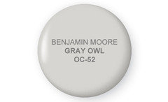
    Try B.M. Gray Owl. I bet it will work.

    ekaterine thanked JudyG Designs
  • 9 years ago
    That's a good point about the lighting. Thank you. It was around sunset that I looked and saw the pink, and the window does face west so maybe that was causing the pinkish tinge. Maybe it will be fine at other times of the day. Good to hear it hasn't done that for you. I'll cross my fingers and put my faith in a popular Benjamin Moore neutral !
  • 9 years ago
    Hmm....an off white with gray undertones? I'm in trouble!
  • 9 years ago

    Gray Owl would be a nice choice, too!

    ekaterine thanked chloebud
  • 9 years ago

    I like Gray Owl but it's a darker color than I really want. Maybe Classic Gray or Ballet White......I so want to like winds breath, it photographs beautifully. :(

  • 9 years ago
    Thanks Chloebud. The first coat of Winds Breath paint went on today and there's no pink!! It's beautiful and it actually works well with the Cotton Balls trim.
  • 9 years ago

    Good to hear.

  • 9 years ago

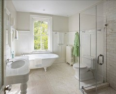
    Great! This online pic of Winds Breath on the upper bathroom walls is what first caught my attention to such a nice neutral greige.

    ekaterine thanked chloebud
  • 9 years ago
    I love that photo too and it's one that drew me to winds breath.
    Unfortunately, I think the pink tone on my walls is back !! Sometimes I see it more than others, and I'm trying to not let it bother me and I'm trying to do some wishful thinking! There is nothing remotely pink in the bathroom, or pink-beige, only a white floor, white sink, white shower, white bathtub. When did I go wrong I wonder? Cotton balls is supposed to be not too cool, not too warm and fairly neutral. Perhaps not as much as simply white, but it should really work in this situation with winds breath. Why didn't I hire a decorator?!
  • 9 years ago
    Can you post a picture of the area to be painted? Used Wind's Breath in my kitchen to offset the yellow pickled maple cabinets, and it seemed to work in that context, or at least better than the yellow that was the previous wall color. Perhaps it has to do with the quality of light in your room?
  • 9 years ago
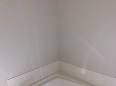
    Work still in progress, no fixtures or blinds yet. Excuse the post -it note for painter. In one photo it looks light and airy, the other which is in a different part of the room looks darker. Taken today on a cloudless and very bright October day.
  • 9 years ago
    Second photo:
  • 9 years ago
    Ekatrine, Windsbreath is a very soft greige with a slight pink cast but it looks lovely in your room! This is such a flattering color for a bathroom; perhaps you should give it a little time to let it grow on you!
  • 9 years ago
    Lynartist: Thank you. What a good suggestion, to let it grow on me. I like that. Thanks for explaining that it is indeed a pale greige ......but with a slight pink cast. I'm not imagining it !
    I had tried a sample of Pale Oak but that didn't work for me. A bit more gray than greige . I know grays are popular, but greige is as far as I'm willing to go with the gray trend. Thanks for taking the time to make a helpful comment.
  • PRO
    9 years ago

    "Perhaps it has to do with the light in your room?"

    Color perception has EVERYTHING to do with light. Without light, there is no color. No color looks the same in every room, or even on different walls in the same room, at different times of the day or evening. If you can't see the undertones, then you could be in for a surprise, and not in a good way. And the undertones or true color does NOT come through on a computer monitor, or even on the printed page, since they are only replications of the color, and appear differently on different monitors.

    The best way to get the color you want is to either hire a color consultant who is familiar with paint brands and can see the undertones, by educating yourself as to the nuances of color, or by trial and error, which can be very frustrating and expensive.

  • 9 years ago

    ekaterine, I think giving it a little time to grow on you sounds good. Funny...I had the same experience as you with Pale Oak. I've yet to notice the pink in Winds Breath, and I think Diana Bier has some great points about lighting.

  • 9 years ago
    Chloebud, interesting about Pale oak taking time to grow on you. Maybe I have too much bright light as opposed to not enough light.......and maybe I should experiment with cool light bulbs. Or let it grow on me ! Do you like the Pale Oak and do you find it more greige or gray?
  • 9 years ago
    Pale oak may sometimes have a slight mauve cast ; a cooler tone that in certain light could look even more pink. A very pretty color though.
    ekaterine thanked Business_Name_Placeholder
  • 9 years ago

    Very good point.

  • PRO
    9 years ago

    Lynartist, I just wrote to Houzz asking them if they could have someone write an article on color and light. Perhaps you as an artist could do it!

    ekaterine thanked Diana Bier Interiors, LLC
  • 9 years ago

    ekaterine, sorry...I meant let the Winds Breath grow on you. Just didn't like Pale Oak as much.

    ekaterine thanked chloebud
  • 9 years ago
    Lynartist, excellent point that we never complain about a sunset! Colors look different in different rooms and with different lighting it's so true. Good thing to keep in mind. No color is static and we should embrace these changes!
  • 9 years ago

    All cats are gray in the dark.

  • 9 years ago
    Dianna Bier, I'm always happy to help! Thank you. Emmerine! That is so funny ;)!
  • 9 years ago
    Emmarene! Apologies!
  • 6 years ago

    Thinking of painting my kitchen Wind’s Breath. (White cabinets) I’m worried about the pink undertones . I’m pairing it with Carrington Beige. Thoughts?

  • 6 years ago

    Perhaps your local Benjamin Moore store could advise you. In my experience as a home owner, I absolutely love Winds Breath and have paired it with Cotton Balls, but there is a very very slight pink undertone in some lighting. I would definitely not pair it with Carrington Beige, which has a slight yellow undertone. If White Dove works with your white cabinets, would you consider that color? Or BM Cloud White? I have used BM Gray Mist successfully in a room where I was afraid of any pink undertones. It appears to have no undertones, I also like SW White Duck for a lovely pale griege with no weird undertones. But as a homeowner, I would strongly suggest you ask your local BM paint store. You are trying to pair three colors here and not all “white” cabinets are the same. Use you local store’s expertise! Full disclosure, I am only a homeowner not a professional but I’ve learned a few things along the way. Good luck.

  • 5 years ago

    I wanted to paint the outside of my home in Florida winds breath, do the trim in a bright white, what would you suggest for a front door color?
    I did windsbreath in the interior and have absolutely loved it. We wanted a much darker color for front door...

  • PRO
    5 years ago

    Hi! While Winds Breath has a creamy warmth tucked in it, it also has a bit of taupe, so it's VERY common for it to pick up a wink of pink, especially if you put it up against a yellow-based paint colour (BTW, Cotton Balls is a slight yellow-green).

  • 5 years ago

    What darker color for a front door?