Software
Houzz Logo Print
hannahptl

Narrowed down to 3 Backsplash Options

9 years ago
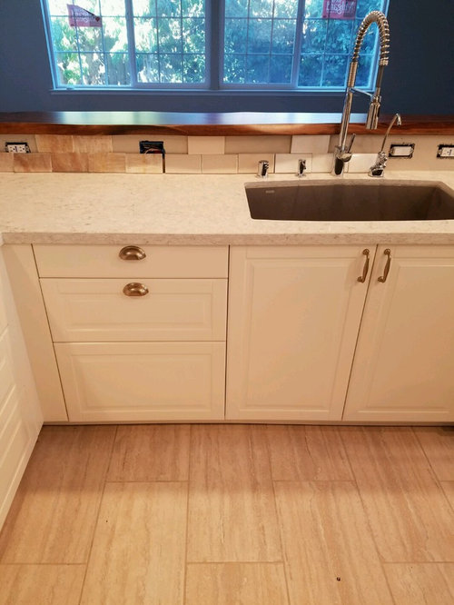
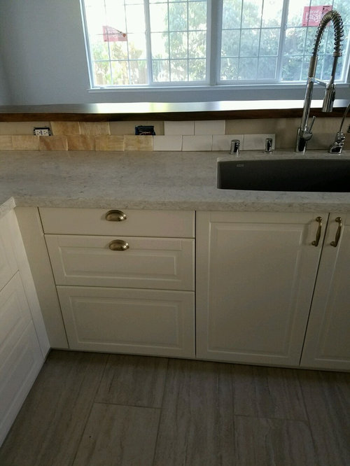
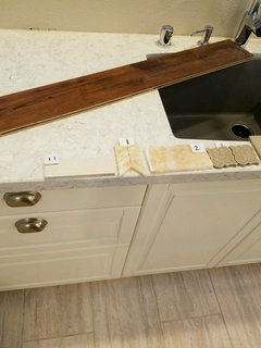
Subway 3x6 tiles, Left to right:

"Honey Onyx" (yellow with lots of variation, it's natural stone),

"Fawn" (cream colored), or

White

Having the toughest time deciding. I love the honey onyx myself, but have heard enough negatives from folks that I'm reconsidering. I'm totally open to repainting the walls to any color that would coordinate better than the current SW Accessible Beige. Please pardon me if you've seen my posting about backsplash before, I'm having a heck of a time with this!

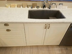
With all lights on: Honey Onyx, Fawn, or White


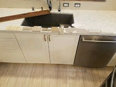
With natural light only, the Honey Onyx and the White tile


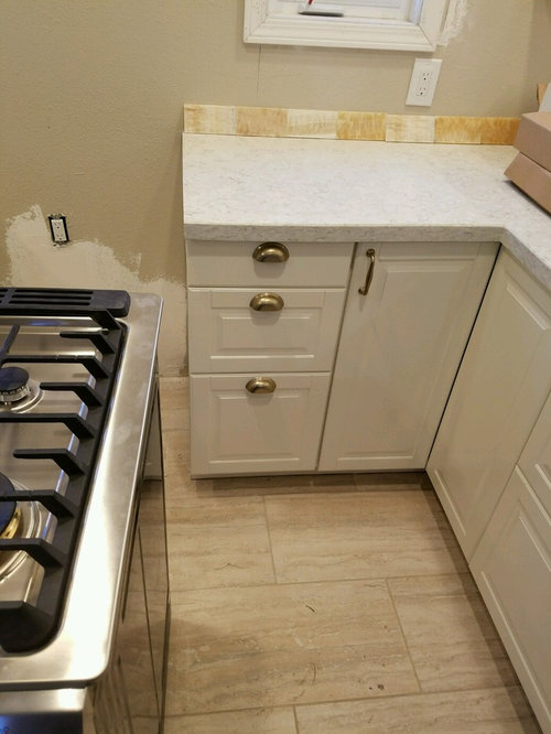
My favorite Honey Onyx on the other wall of the kitchen:


I'm so sorry if I'm nauseating anyone with my dilemma. I've gotten some gray sample tiles as well, but would like to keep the kitchen feeling bright. If it doesn't break any design rules, I'd love to use the Honey Onyx!


Thank you in advance for your input!

Comments (27)

  • 9 years ago

    ooh, the truth hurts. I tried so hard to coordinate the floor with the countertop, but alas, this is how the kitchen's turned out so far. I'm going to just try to make the most of it. I know I'll still enjoy being in this kitchen. For the backsplash, I would love to do the Honey Onyx, unless it would just be plain wrong. I bought all the Honey Onyx to do the kitchen but am afraid to do it after hearing all the negative feedback from people who see it in real life (friends and acquaintances and workers). Only a couple people have said the Honey Onyx looks good in this kitchen. My eyes must be cross eyed or something, or maybe I love the idea of a yellow kitchen so much that I can't see how it clashes. My fear is that I'll have it installed, and THEN I'll see it, "oh, now I see that that it clashes!". So far it look pretty to me, but I'm afraid, very afraid...

  • 9 years ago

    I'm sorry, I can tell you really want to use the Honey Onyx, but you should not. It doesn't work. It is beautiful tile and I can see why you would like to use it but it wont be beautiful in your kitchen. I personally really LOVE Honey Onyx and wanted to use it as an accent in my Master Bath but I couldn't get it to work so despite my longing I had to let it go. A sacrifice for the greater good, you might say....

    From the remaining two, the fawn and the white, in the first picture with all the lights on, the fawn looks warm and lovely, but you didnt show it in the other lights so I cant be sure.

    mathnmusic thanked localeater
  • 9 years ago

    I don't mind the honey onyx in the first pic but I really don't care for it in the second 2 pics. I like the white the best overall.

    mathnmusic thanked lakeerieamber
  • 9 years ago

    The honey onyx is just wrong. For all the reasons romy says. I also agree on the subway tiles. The white looks nice in the first pic but far far too bright in the second. In the first pic the fawn looks like it's almost the same color as the counter.

    mathnmusic thanked townlakecakes
  • 9 years ago

    How about if the wall color is repainted to something else? Then would the Honey Onyx work better? I paid for an online color consultation with a color specialist recommended on this forum, and she thought the problem was the wall paint color, and that if I repainted the walls a warm grey, then the honey onyx might look ok here...

  • 9 years ago
    last modified: 9 years ago

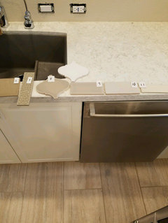
    Ok, so I'm laying out my cards...I've actually considered a lot more tiles than the 3 shown above. I thought the 3 were the top contenders, but backing up, here are the other options, numbered left to right.

    Some close ups:

    I love #3 but it's too $$$. The grey arabesque is nice too. The white looks very white, but maybe is the best (safest) choice, with grey grout?

  • 9 years ago

    Here's the thing about 1,2,3,5 & 7. They're textural and patterned. You have a pretty heavy pattern going on in the floor, and a pattern in the counter. You're better of with a solid color tile on the backsplash. The wall color isn't the problem. It might help somewhat but there's no color you can pick that will make that onyx play nicely with your counter, especially when you take the floor into consideration too. White tile with gray grout will do the same thing. It will make a simple backsplash look busier. Sorry.

    Personally, I'd go with one of the gray tiles. Subway for preference.

    mathnmusic thanked townlakecakes
  • 9 years ago

    townlakecakes - thank you so much for taking the extra time to look at all my backsplash options. I'm going to set up the kitchen with the grey option to see how to make that work (I have a lot of dark brown wood as accents in the kitchen - wooden pass through surface, 3 wooden floating shelves, and wood hood cover - and don't want the overall feeling to be too dark). I have a light grey subway tile from Lowe's that my husband bought in anticipation of doing the whole kitchen backsplash with it, so I'll set that up and see the overall effect. Will post pics of that soon. Thank you again for your thoughtful input, really appreciate it!

  • 9 years ago

    I hadn't noticed the wood pass through surface. That's a nice warm accent. Since your also planning wood floating shelves & taking the wall color into consideration, I'm thinking a solid white tile. You just need to find the right white. The wall color looks good with your countertops. Maybe just the right shade of yellow for a couple of countertop accessories?

  • 9 years ago

    I think I would go with the lightest of the gray tiles. It looks like you are really having to blast the lighting in there to make it not seem like a cave so I would not add to the cave like quality by using a darker gray. You do seem to have a lot going on in that room, the calmer the backsplash is the better.

  • 9 years ago

    Honey Onyx is a definite no. It looks terrible in all of the above, sorry! I probably like #10 best of the above. The "greys" you have picked are all really grieges and I think they are fighting too much with everything else in your kitchen.

  • 9 years ago

    I kind of missed the wood on the pass through. Gray probably won't look right with that. I think #10 is the really bright one in the first set of photos? #11 looks like it's a nice creamy white. I wouldn't mind seeing the 2 whites individually.

  • 9 years ago

    10 or 11, but I have a feeling that the colors on my monitor aren't really what you're seeing in your kitchen.

  • 9 years ago

    10 or 11.

    I would add a couple, but in different pics I see your countertop differently..

    I like Fawn from the first pic too..what number is that?

    Honey Onyx is too warm so it seems, in relation to your counter, and the undertones are different.

    The main problem(or beauty, doesn't matter) with a natural stone-it's never just one color. It has several inside. So we call this one Honey, for example, to make it simpler. But it has a lot of colors, subtle colors. within. That's why the colors that would work together if they were just plain colors-refuse to work together when they are stone etc. They have to have much more in common-that subtle color that's hiding in each of them.

    Now if you really, really want yellow backsplash-you can find plain yellow tile that will work in your kitchen. Won't be easy-peasy. But will be possible. For example, cooler yellow..something like lemon color..and you'll need to repaint too I guess

    But if you're after feel of warmth rather than specific shade-then choose one of the off-white options, or off white options in a deeper shade of same color.

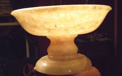
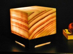
    I would go to compromise with myself, and a very pleasant one too. There are bowls made of honey onyx. There are amazing little sculptures made from honey onyx. I'd search for something like that, unique and making you happy...and I would gift it to myself, and there it would stand, in my new gorgeous kitchen.

  • 9 years ago

    One other thought. If you go with #10 or #11 (which i think you should, among those you have offered), i would not use a grey grout like you have suggested above. I think there are a few borderline competing elements already in your kitchen; specifically the countertop and floors. I think with the right neutral backsplash, those two elements work together. But you need to get the *right* backsplash, because the wrong one is going to make it all look very wrong. Grey grout in the backsplash will add just one more element that makes it all the more likely that the backsplash is going to throw everything else off.

  • 9 years ago

    number nine-it pulls in some of the floor shading....and the warmer shade of your hardware..... very nice.....I think the obvious cool whites way over on the right-10 and 11-are too blah. the little bit of mixing it up with number nine is far less jarring than the onyx. 9 is my pick.

  • 9 years ago

    I'm with Herb. I like 9. I see some of that color in your very pretty tile floor too.

  • 9 years ago

    My first instinct was 9. I think 10 would work too.

  • 9 years ago

    9 would be great, I think. Solid, warm, not fighting the floor. 10 as a second choice.

  • 9 years ago

    I like 9, too.

    Except that I see it gray-lavender when it lays on the counter, and khaki when it stands..))

    The counter also seems much grayer (on my monitor at least) in natural light, than in artificial

    Generally speaking-they all should be standing, because that's how they will look when installed. The angle changes the color perception for us.

    I think to choose will be easier if you take tile by tile..put it vertically(which you did; but as opposed to you we can't see it up close)..and look only on it, in the relationship to the counter and to the rest.

    Then go to the next one.

  • 9 years ago

    i like 8,9, & 10 for the colors. Do you have brass colored hardware? The floor has yellow in it to, right?

  • 9 years ago

    I think 9 ties everything together.

  • 9 years ago

    I like 9, but i don't like it with the blue paint on the adjoining room (seen when looking at the peninsula, that you posted at the very top).

  • 9 years ago

    9 or 10

  • 9 years ago

    I love honey onyx too and agree with Aprilneverends on using it as a decorative accent.


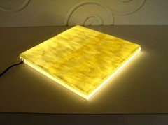
    Maybe a bowl, or to lighten things up, an onyx lamp, or illuminated board.


  • 9 years ago

    I vote either 9 or 10.

Sponsored
Bella Casa LLC
Average rating: 5 out of 5 stars17 Reviews
The Leading Interior Design Studio in Franklin County