Software
Houzz Logo Print
twobitz

LR needs decor help.

9 years ago
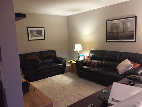
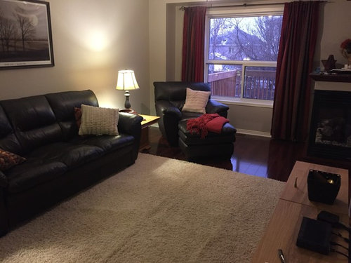
New coat of paint and much larger carpet.
Plants or ???

Comments (70)

  • PRO
    9 years ago

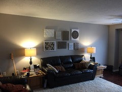
    Definitely higher end tables with taller lamps. Artwork should lowered. Ideally, the underside of your artwork should be about 6"-8" above your sofa back. If you're afraid to commit, try cutting a piece of cardboard that matches the size of your artwork, and tape it to the wall. Live with for a few days, and you'll soon discover that it "feels" better. The same with your lamps...prop them up with books until the underside of the lamp shade is at eye level (when sitting). Your room will immediately feel more balanced. As for a coffee table, I think an oval one would give you the most surface area without impeding traffic flow. Please keep us posted on your progress!

  • 9 years ago
    We lowered the pictures. Picking up new end table and coffee table. I will post a picture once it's all in place. Just finishing putting a new coat of paint on the trim.
  • 9 years ago

    Wow, Denise! You don't mess around. I don't think I've ever seen anyone take such quick action on suggestions here. Can't wait to see the new pics. How are you feeling about the changes?

  • 9 years ago
    Good getting it ready for selling it and staging it once we find a new place.
  • 9 years ago

    Oh for pete's sake Denise! You are putting all this work and worry in so that you can sell the place? What a gal! You're very smart to understand that once you decide to sell, you stage to sell, not design to live. Hope you get top dollar after all this. Keep us apprised, if you would.

  • 9 years ago
    Aww thank you. You would not believe how much I packed up and removed already. Still have to declutter and organize the kitchen. 130 items on the to do list. 8 more to go plus a little tweak to the living room. I think the new tables will fix the area nicely and tone down the shag rug a little. Looking for some books to boost up the lamps as recommended too. Thanks to everyone that is contributing. You are all helping me negotiate the art of design which I get overwhelmed trying to figure out. This site has been a great help.
  • 9 years ago
    Now trying to accommodate the Christmas tree. Ignore the table it is being replaced (picking up tonight). My question is if I pull out the loveseat and put a console table behind will it look okay?
    I am trying to find a way to keep the chair in the mix. Plan is to put up tree behind the chair in the middle of the window.
  • PRO
    9 years ago

    I completely agree that the seating grouping should be tighter. But instead of pulling the love seat forward (to meet the 3-seater), is there a way to shift the 3-seater towards the love seat ? By doing so, you would create more space for your tree, and free up the passageway between the love seat and media unit (which seems to quite narrow since you brought the love seat forward). Hmmmmmmm.

  • 9 years ago

    Leona has a great idea, Denise. I would forego any additional furniture in the space. You might even consider eliminating the chair. When selling, the idea is to suggest uses for each space, not necessarily fully furnish them. Your room is small and the more open you can make it seem, the better.

    People will respond emotionally to the Christmas tree (good), but they will also respond if the room feels crowded and too small (bad). Keep the tree medium-sized and not heavily decorated. You might want to wrap empty boxes, (if you have any left from all your packing up!), and place them under the tree like presents.

    You are working this like no tomorrow! Hope you have a stopping point so you get a break. Have you found any new places that appeal to you yet?

  • PRO
    9 years ago

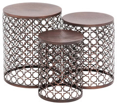
    You might consider a group of smaller tables instead of large coffee table. Small works better and is easier to integrate into new home! Here is an example. (inexpensive too). Are you listing before Christmas? If after, then don't worry about the tree right now. You can take it down before you list and make space as open and large as you can.

    Industrial Bronze Metal Accent Table 23941 · More Info
    Open look, keeps things "light". After the holidays, I would consider removing the long sofa completely. Just leave the love seat, end tables, etc. That will really open up your room. Large furniture just takes up too much "visual" space. You are totally on the right track. I have staged many homes and it has been very successful for my clients. De-cluttering, EVERYWHERE, CABINETS, drawers, closets, etc., biggest thing you can do. TIP: Research has shown that buyers make a buy or no buy decision upon 6-8 seconds of entering a home. So, concentrate on your entry area (outside) and as you first come into the house. TIP: Take photos and then look at them critically. You will see things in photos that you eye simply glosses over because you are used to seeing them. You will be surprised at what you see! Hope that helps and good luck.

  • 9 years ago
    Thanks everyone. I think I might remove the chair after all. I have been hard at it decluttering like crazy. Only space left to do that is the kitchen but I left it until last because I need the extra gear for the big meals during the season. I can pack that all up once we are done.

    Our current house is what they call a starter family 3 bedroom. Not too big on the character side or overall size for the matters. We have a walk out finished basement which makes it a big plus for growing families.

    Not worried at all about how it will show once we find our dream home. We are definitely going bigger....looking for a nice bungalow with a walkout basement on a mature lot. Apparently half the world is also looking for the same thing. The market around here is insane at the moment.

    This is why we are reluctant to make any significant furniture changes because we are certainly going to need more once we find the new place. But the existing leather set will likely get relegated to the basement. The Ikea sectional in the basement will get donated unless it happens to fit in my new office space ;)

    Believe it or not this room is far from where it started out thanks to everyone on Houzz. I am so thankful to have the support and encouragement from everyone....especially the ideas and vision for the spaces. We don't all come by that naturally. And I get overwhelmed going into the decor stores around here. I have no clue where to even begin.

    So once again, my sincerest thank you to everyone!!!
  • PRO
    9 years ago

    You are a joy for sure! Keep us posted.

  • PRO
    9 years ago

    Definitely prop your lamps up by a good 8"-10". It will make the room seem taller and more elegant. A wooden box....books...anything that would logically be in a living room would work. Your living room needs some vertical elements...more height.

  • PRO
    9 years ago

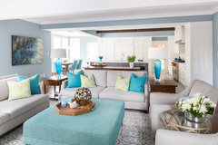
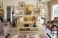
    Try pulling all the seats into and onto the rug and making a cozy space. Like the image you see of our design below.

    Luxury Lorne Park Reno · More Info

  • 9 years ago
    Added 3 books under each light as recommended. Looking great. Thank you all
  • 9 years ago

    Happy Holidays and a Prosperous New Year, Denise! Please keep letting us know how it's going.

  • 9 years ago
    last modified: 9 years ago

    Okay so I still think the long wall above the couch needs something more. Looks rather stranded. Thinking about ditching the pictures and starting over again. Maybe a wall of not matched prints picking up the lighter and rust coloured accent colours? Also thinking of maybe putting a sofa table behind the sofa to add accents that way....

    We are staging for selling the house so no personal photos etc. And I am actively looking for replacement end tables and a rectangular coffee table as suggested by everyone.....THANK YOU!!! PS: Chair and ottoman are removed as recommended.

  • 9 years ago

    Denise! Good to hear from you. Hope your holidays were bright.

    Now, I wouldn't recommend putting a table behind the sofa because you would have to move the sofa forward in the room. Keeping furniture to the minimum to make the room spacious. I agree that one picture on the wall above the sofa just isn't going to cut it. Try a grouping, like you've been thinking.

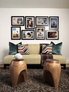
    Because your room is smaller (relatively speaking) I would like to see a calmer layout like #1 or #3 below, but this will give you an idea of how it could look. No need to spend a great deal of money either. See www.art.com

    Here's some examples of over -the-couch photo layouts:


    Pulp Design Studios · More Info


    Downtown Living · More Info


    Lakeview Residence Living Room · More Info

  • 9 years ago
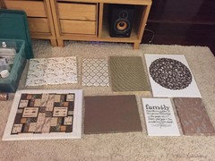
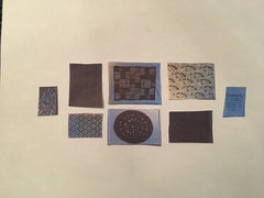
    Ok how's this for a gallery wall above the couch?
  • 9 years ago

    Nice! You're so good at taking hypotheticals and making them tangible. You'll want to spread them a little farther apart when you actually mount them on the wall, but I think the sizes work well for that space. Yay!

  • PRO
    9 years ago

    Hi! Denise - Are we still in the same house? Are you framing these? Is the wall a neutral color? If so, I suggest you use narrow black frames so they "show up". Very monochromatic scheme.

  • 9 years ago
    Black framing the canvases would not go at all with the decor.
  • 9 years ago
    last modified: 9 years ago

    Hi Flo! I agree that frames that distinguish the canvas from the wall is a good idea normally, but Denise is adding textures as opposed to colors. She's got the house on the market and is being smart about keeping a neutral palette as a result. Her room is kind of small, (not awfully so, but some), and keeping everything low key is a good way to go. As long as she adds some "air" between the canvases, I think she'll be okay. But, Denise, do add space between your pieces. Flo, you're the pro--how much space should she leave?

  • PRO
    9 years ago

    It depends on the wall size. But in general only about 1-1/2". Without frames, it could be tricky. Sometimes you just have to eyeball it! Lay it out on floor like you have and then measure the width of the whole group and height. Then put blue painter tape on the wall and see if it looks OK. Personally, for staging, I would put those little things on the wall. An inexpensive, but tasteful painting would be best. People want to be able to "view their stuff" in the space and that grouping looks very personal to me. I just don't see it helping on the wall over the sofa. Let me hunt around and find something that I think would be better. Sorry. :/

  • PRO
    9 years ago


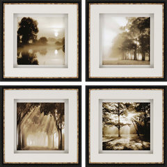
    Paragon Reflections Framed Artwork, 4 Piece Set · More Info

  • PRO
    9 years ago

    You could do a straight line of these above the sofa. Or something like these. Simple, black and sepia with black and gold framing. These are a little pricey and I'm sure you are trying to do this for not too much cash. But you could get some frames with wide white mats and put nice photos in them and get a nice product. Texture isn't going to matter in this setting IMO. A throw over the arm of a chair in a nubby yarn can add texture.

  • PRO
    9 years ago


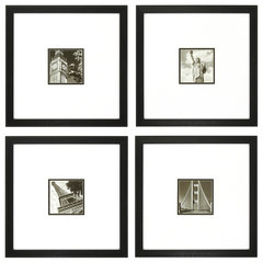
    Propac Images PHOTOSCAPE 4 Piece Framed Art Set · More Info

  • PRO
    9 years ago

    Less expensive and this is look I would go for.

  • PRO
    9 years ago

    What room are we doing? I thought we were in the living room with the black or dark leather sofas? Why won't black work? Guess I'm confused.

  • 9 years ago
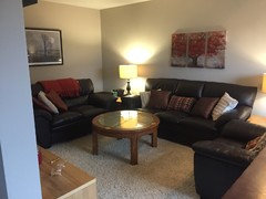
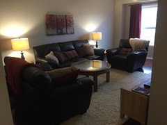
    The room is rectangular. Cherry floors dark brown leather sofas and an off white shag rug. We have a 3 sided fireplace that divides it from the dining area. We are staging so no personal pictures. Just want to neutralize the space and emphasize the room to lighten it up from all the dark finishes.

    I have had so much great input from everyone on here.
  • 9 years ago
    Okay thoughts???
  • 9 years ago

    I like it Denise. Much lighter on the wall than on the floor. However, and this is a common problem, they are hung too high above the sofa. The bottom of the lower row should be about six inches lower than they currently are along with the upper left piece. It should be closer to its lower companion, about like the group on the far right.

    That said, you do what makes sense to you since: #1 it's your house (!) and #2 you're seeing this in person as opposed to photos. We'll all chime in, obviously, but you must please yourself.

  • 9 years ago
    They can't be lower for when you sit on it.
  • 9 years ago

    Denise. Unless you are resting your head on the wall behind the couch, (and good luck with that with a thick couch back), you're not going to hit your head on the art. But as I said, it's your room! ::-)

  • PRO
    9 years ago

    Denise - I know you have worked hard on this, but this isn't quite right. They are too far apart and there isn't a cohesive design plan. I am going to play with this and post an alternative layout for you.

  • PRO
    9 years ago

    Here is an arrangement that will work better I believe. However, this is very "personal" and IMO from years of staging, we don't like "personal" touches because bulk of people searching can't visualize their "stuff" with a bunch of your "stuff". I think the large picture over the sofa was much better touch. Even empty wall space is OK. But here is my suggested layout.

    denise · More Info
    Notice top row is level and symmetry of central six pieces and two end pieces form the total "wide" shape you need. See what you think of this.

  • 9 years ago

    Excellent Flo Mangan. Really like!

  • 9 years ago
    Going to try to follow your design for the gallery wall. Thank you so much for the effort you did to help. Much appreciated. Going to look for replacement end tables to get those old ones outta there lol.
  • 9 years ago
    I could remake some of them too. Are you suggesting the middle ones be all the same size?
  • 9 years ago

    I don't know about Flo, but I like them differently sized, more interesting since they are informal, rather than formal pieces. Flo's layout is more formal, but I think that "supports" them more. It really goes with your long couch and long wall. See what you think when you get it done.

  • PRO
    9 years ago

    Not same sizes, just arrangement that is key. The one I would work on is the one with a white border that looks like it isn't stretched properly and is kind of wrinkled. I would fix that. I did do a more formal layout, because the pieces look too informal for your entry room. If we were doing a "boho" type look, then I would be more "unconventional". But we are "staging" this home, right?

  • 9 years ago

    Hey Flo. If you look closely at the original picture Denise sent of the wall pieces you will see that it is stretched correctly. It is the pattern on the central area that makes it look wrinkled. I've attached the picture again here. You can see those black flowing lines in the middle of the pattern. They look like wrinkles at first glance.

  • PRO
    9 years ago
    I thought the white border looked wrinkled. But if not good to go.
  • 9 years ago

    So did I until I took a closer look. (totally magnified!)

  • 9 years ago

    Thanks everyone. Been living with it for a ltitle while. Going to look for same sized framed prints and follow the pattern Flo suggested. Stay tuned :)

  • 9 years ago

    Denise you are so thorough. Think about it this way: most prospective buyers are looking for a clean, well-lighted, safe place to live. Short of pornography, what you put on the walls is not going to make or break a sale by itself. You've done all you can to make your place look spacious, clean, and inviting. Step back and look at how good it looks! Anytime you're ready...

  • 9 years ago

    Denise - Can't wait to see what you come up with!

  • 9 years ago
    Well been looking at attempt #1 for a while. Going to look for something else for the space following all the great suggestions you have all made. Will post new attempt soon.
  • 9 years ago

    Good to hear from you Denise! Keep those pics coming.

Sponsored
Miller Woodworks
Average rating: 5 out of 5 stars23 Reviews
Franklin County's Trusted Custom Cabinetry Solutions