Software
Houzz Logo Print
spw1

Our new kitchen needs a backsplash! Help!

9 years ago
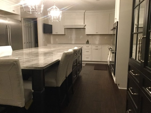
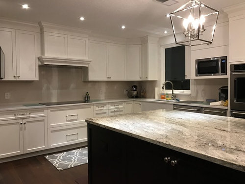
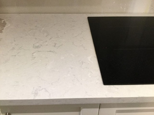
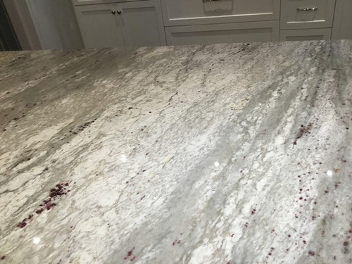
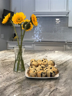
Our kitchen renovation has come a long way, and now we need to select the backsplash! This is not so simple, and suggestions are appreciated. The island is espresso shaker with Thunder White granite that is overall gray with lots of motion. The perimeter is white shaker with Cambria Swan Bridge (marble collection). Warm vs. cool with these two areas. The floor is wood look tile in cherry/walnut. Thanks!

Comments (93)

  • 9 years ago
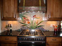
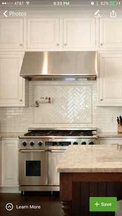
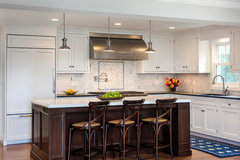
    ok whatever. some people like it. Kathi that's a beautiful kitchen. oh look, a framed area behind the stove. Apparently that's dated though.

  • 9 years ago
    BEAUTIFUL!!!! My new absolute favorite material - stacked stone - love the differing texture and so many colors!

  • 9 years ago
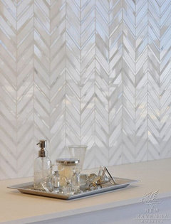
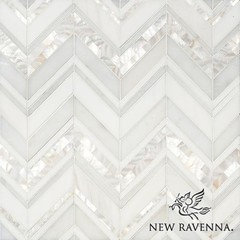
    Have a look at the new Ravena range, they look beautiful. You have a glorious kitchen, well done
  • 9 years ago

    Beth, I like the area behind the stove obviously, because I LOVE that kitchen. If I could have afforded the lighting, I would have put it in my kitchen.

    I don't like the tumbled marble with the scene that's not related to anything behind the stove. I think that might be what leelee meant.

    I think in this case...you are BOTH right.

  • 9 years ago

    I agree about that. although I don't know where the tumbled marble came from. I posted a few examples that I thought would look nice. that's when she mentioned she thought designs behind the stove were out of date. I agree, she is entitled to her opinion, but he OP was the one who wanted to do something. I don't think they are dated if done correctly. just a difference of opinions, that's all. no biggie.

  • PRO
    9 years ago
    last modified: 9 years ago

    We've done hundreds of backsplashes and can honestly say that even today, many people like a little something different above the stove. Not all, but I'd say more than half choose this option. Yes, the Tuscan "scenes" have gone by the wayside, but a change of tile pattern, or an interesting design of a complimenting nature are still used a great deal. There's no wrong answer there. You should do what you love. We are designing a feature now for a client who was inspired by the attached project which we designed and installed for another client. She wants an organic and artistic statement with mixed materials. Obviously we will be doing something different for her as we don't reproduce custom work. Of course this example isn't for everyone or every style home, BUT, there is not one answer to what a person should enjoy in their personal space. My point: features behind the stove or elsewhere are not gone. Not by a long shot. Follow your own heart.

  • 9 years ago

    That's beautiful work you did behind that stove. yes, that is a little 'dated', but I can appreciate the artwork that it provides. I'm sure you can produce something that looks good by todays standards. I'm sure in 10 years it will be completely dated, but so will everything else! I say redo the kitchens every 10 years!

  • 9 years ago
    Wow, this discussion is lively, and I welcome that we can all share here! The back and forth is informative.
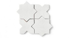
    I like some of the alternative white tiles that are in shapes other than subway. Thanks for some of the pics and links. So I'll order some samples of various shapes and sizes, and I'm pretty sure I'm sticking with white. I love it.
    I also expect that in the end, I'll select a subway, and looking for a very slight touch of interest. That's why I liked the hand made ceramics. But it's not over yet, heaven save me!
    Beth and Jan, I think your ideas are aligned with where I'm headed.
    My house is transitional. Built in the 80s, it was modern oak and wall paper! Everywhere. One good feature is a large brick fireplace in the living room. It is the anchoring feature of the home. The new kitchen floor ties in to the matching wood floors we installed throughout the house. We have been renovating this entire house for almost 7 years now. We are DIY and spreading out the projects also makes it possible with a budget.
    It has been a challenging process, and the feedback helps. I had no idea how many decisions have to be made- All. The. Time. Thank you so much to all of the posters on this thread! I only wish I would have asked you guys sooner!
  • PRO
    9 years ago

    Best wishes. You will have a beautiful kitchen!


  • 9 years ago
    Dragonfly - you have interesting work! Nice to see the creative flare.
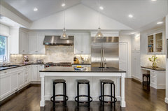
    Kathi - the Pic of the white kitchen with focal herringbone is beautiful. I was interested in a focal point there because the cooktop is at the end of a very long island, and i thought the eye needed another place to go upward, after the island.
    Lee- I think you posted the alternative shapes - I like the elongated hex a lot. It gives the eyes that upward place to go, and it can be used for the entire backsplash. It is very pretty. the stacked stone is interesting, I'll look at it, but I'm afraid it will be dated too soon or I'll tire of it.
    I need to keep the overall house style in mind with whatever I decide on.
    Thanks everyone.
  • 9 years ago
    Irene, that Revenna is beautiful! You're making this hard, ya know!
  • PRO
    9 years ago
    You could use a simple tile in a color that is in both of the counter top surfaces. That would help to tie the two surfaces together.
  • 9 years ago
    last modified: 9 years ago

    Oh I like more of the modern shapes for backsplash in whites or grays.....a light gray would make your whites pop, and tie in your stainless steel appliances...beautiful choices and palette!

  • 9 years ago
    What a beautiful kitchen you have! Use what you love for the backsplash, as this is your piece of art. Have to admit, the Ravena pics in earlier posting really caught my eye!
  • PRO
    9 years ago
    I think you are probably on overload with input, but simple white backsplash perhaps stacked instead of offset with matching grout. Done. Let the island stay the star. Simple would be stunning.
  • PRO
    9 years ago
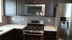
    Lately most of the interior designers that we work with are going larger wall tiles 12x 36 or larger rather than small mosaics. Specially wall tiles from Porcelanosa which are actually textured. Here are couple of photos of our work, you can see the metallic ridges. Something to consider.
  • PRO
    9 years ago
    Not sure why my photos didn't load, let me try one more time.
  • 9 years ago
    I read an interesting article recently and the author compared making an interior to preparing a stew. "You don't take everything you like and throw it in a pot, hoping for the best. Instead, you make selections, edit and edit again, and determine the overall intention. Choosing ingredients, settling on their proportions, attending to the nuances of color and texture are all things vital to a good stew and a good room. Design is about life being lived-it's as simple as that. There is no need to oversalt." -Steven Volpe. This really resonated with me and perhaps it will help you in your decision. Good luck.
  • PRO
    9 years ago
    last modified: 9 years ago

    Agree as just above! Or.........you need not be WOWED and in love with every element individually to love the result in total. In fact, to be wowed by every single element is to have Beyonce, JLO, and Mariah all fighting for the Grammy . The result will be an onstage cat fight .........with blood!!! Someone has to come in second, and someone third place, You already have the first and second place results. Beyonce ( the granite) is already holding the trophy....... )lol

  • 9 years ago

    I agree with Jan. I like the handmade wavy ceramic you posted. If you want options for different shapes, check out Fireclay.

  • 9 years ago
    I should also mention that this particular article was on the topic of Restraint which seems very applicable here. I would also consider the scale of the patterns you are putting together here and compare it to how you would mix patterns of pillows on a sofa. Large scale pattern mixed with a small scale, dots paired with a geometric and so on.
  • 9 years ago

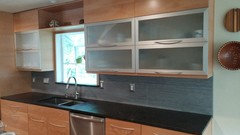
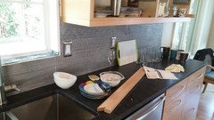
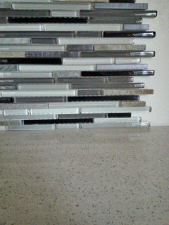
    White on white with more white is 80's! It's very "blah" The postage stamp designs behind the stove instantly create an issue for future buyers. Always, always design with the idea of being somewhat timeless. Piano key tile is timeless. My backsplash is shades of gray XD Counters are white quartz. My kitchen cost $40,000 it's not cheap in any sense. We did a very simple clean look. Modern/rustic, do what I did research like crazy. Make several folders, order tile samples. Narrow it to 3 you like and let your husband pick the tile! I did this with everything in our house.


    Our tile is from Home Depot. It's very masculine, and neutral.

  • 9 years ago

    The swirls look like vaginas. Sorry! It's too 70's, I liked the sample...but when I got to the overall repeat, I couldn't do it. The herringbone pattern rocks x1000. But you can't go wrong with those arabesque tiles. Home Depot has them in an array of colors and materials. I almost bought the same color granite as you. It's $$$$$$$!!

    http://www.homedepot.com/p/Merola-Tile-Arabesque-Selene-9-7-8-in-x-11-1-8-in-x-6-mm-Porcelain-Mosaic-Tile-FDXARSL/204205914

    Timeless, classy and I think it comes in marble. I presonally could not do marble, because it's a nightmare to maintain, and stains (kids!!)

    The marble costs substantially more $23/sq ft

    http://www.homedepot.com/p/MS-International-Greecian-White-Arabesque-12-in-x-12-in-x-10-mm-Polished-Marble-Mesh-Mounted-Mosaic-Floor-and-Wall-Tile-10-sqft-case-GRE-AREBESQ/205762446

    You could also save hundreds doing the $3/sq ft herringbone marble.

    http://www.homedepot.com/p/Splashback-Tile-Oriental-Sculpture-Herringbone-Marble-Mosaic-Floor-and-Wall-Tile-1-in-x-3-in-x-8-mm-Tile-Sample-L3B12/203217975?MERCH=REC--SearchPLPHorizontal1_rr--NA--203217975--N

  • 9 years ago

    S.lo....your photos aren't loading. either redo them or delete these blank spots.

  • 9 years ago

    100 percent agree with Jan!! Less money and will look the best....score...

  • 9 years ago

    S. Lo. Your backsplash is okay but your countertop is very neutral with very little pattern. The OPs countertops have lots of movement and with a backsplash like yours they would compete.

    spw1, your eye does not need any place to go because there will be so much else to see.

    Find pictures of kitchens with countertops like yours (Google Images) and see what backsplashes they have used. You have gotten a lot of advice here. You need someone to help YOU find YOUR voice.

    https://www.google.com/search?q=Thunder+white+granite+kitchens&biw=1506&bih=1093&tbm=isch&tbo=u&source=univ&sa=X&ved=0ahUKEwjL-sfwuLHRAhWE5IMKHVcfB8kQsAQIIA#imgrc=_

  • 9 years ago

    That masculine bs doesn't seem very neutral to me

  • 9 years ago

    "White on white with more white is 80's! It's very "blah" The postage stamp designs behind the stove instantly create an issue for future buyers." I am not sure what makes you think that. White on white on white is classic and has been around for more than 100 years. It is the definition of classic. Glass mosaic tiles, on the other hand.....

  • 9 years ago

    Arabesque isn't classic either

  • 9 years ago
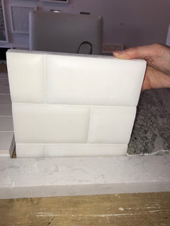
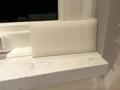
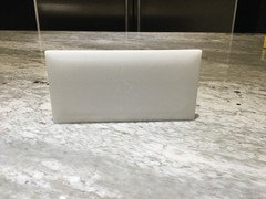
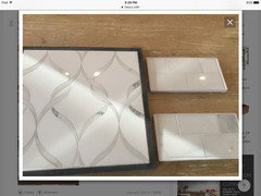
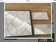
    Selected this subway tile. What do you think?
    It is paper white marble with a beveled pillow edge. It is the same shade as the cabinets. The pillow bevel gives it depth and interest.
  • 9 years ago
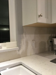
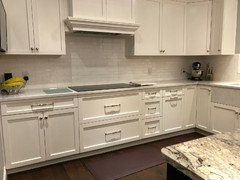
    Here are some photos of the tile sample in my kitchen.
  • 9 years ago
    Love the matte look! Are you planning on doing a different direction with the same tile above the stove? I know most have said not to do anything that would take away from your beautiful granite but I think using the same tile but adding some visual interest add a nice finished touch.
  • PRO
    9 years ago
    last modified: 9 years ago

    This combination is perfect....I usually suggest the same all around but you have a good size kitchen that can handle this gorgeous mosaic...for the entire range and vent fan wall (not just accent above range) and flat honed marble subway for all other areas..gorgeous!!

  • 9 years ago
    Thank you, that is good feedback from both posters.
    That particular mosaic is very expensive but beautiful.
  • PRO
    9 years ago

    Check for feedback on the matte. I have some feedback that it is hard to keep looking good. Cleans differently than shiny surface? I haven't used it yet.

  • 9 years ago

    I am not loving the matte surface, but if you like it, go for it. I think it will look lovely.

  • PRO
    9 years ago

    I kind of agree with Kathi Steele, I'm not feeling it, but if you don't need reflective light in your space then it might be a good choice?

  • 9 years ago
    I was also wondering about cleaning the matte, does the tile just need to sealed before grouting?
  • PRO
    9 years ago

    The honed surface is gorgeous and have several clients that have used it..with Marble honed is easier to care for but Marble has more upkeep and can stain much easier than granite and Quartz ...but the look is fabulous...with all white tiles no matter if they are honed or polished your kitchen will reflect light and be very bright..it's white!

  • PRO
    9 years ago

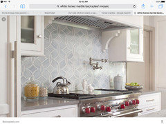
    I think this is just beautiful..looks similar to your mosaic design..I think the White mosaic you have chosen will look even brighter and IMO much prettier choice.

  • PRO
    9 years ago

    Oh and make sure it is sealed before you do anything in your kitchen!!

  • 9 years ago

    I wouldn't mix real marble with Quartz. If you like the white pillow edge subway, why not ceramic?

  • PRO
    9 years ago
    last modified: 9 years ago

    We're in agreement with a lot of others on this blog that you should keep it simple! We've done plain subway backsplash in the majority of our kitchens and we've done ones where the area behind the cooktop is a different material.

    In your kitchen, the granite is seriously the focal point so I wouldn't want to detract too much from that!

    Historic Beach House · More Info

    Black and White Kitchen · More Info

  • 9 years ago
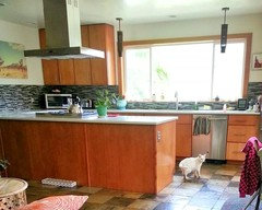
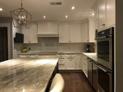
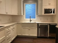
    It's done! White ceramic handmade, hand-glazed, 2x8" tiles. Simple, elegant, reflects light well. And really pretty. :-)
    Thank you for all the input, you really helped. I considered mosaics for over the cooktop, but in the end, it's too pricey. Easier to not have to update it, too.
    Still have the cabinet trim and under cabinet lighting to install. Feeling happy.
  • PRO
    9 years ago

    It all works really well, glad you are "happy" and your island granite is outstanding looking. Once you get the under-cabinet lighting in that is going to be huge! Lovely.

  • 9 years ago
    last modified: 9 years ago

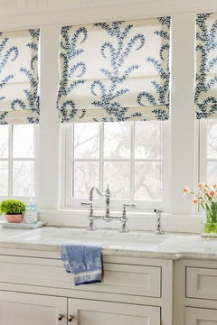
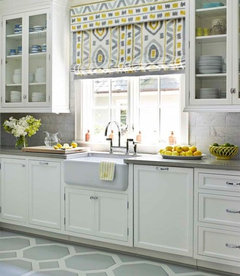
    One small detail that would soften the look of your beautiful kitchen that turned out perfectly.

    Add a roman shade over the sink window.


  • 9 years ago
    last modified: 9 years ago

    Keep it light but pick up a few colors from your other decor.

  • 9 years ago

    OH MY!!!! That is beautiful!! Your kitchen looks amazing!

  • 9 years ago
    Thank you! The glossy finish of the tiles made the space brighter.
  • 9 years ago
    What a great thread for me! Im looking for a backsplash right now. My perimeter granite is called thunder white too. It looks quite the same but yours seems to have a bit more streaks of gray. Our island granite is a leathered cosmic black. I was thinking of a glass grey lantern shaped tile or one in marble. I too had been thinking of something different behind the range but i think I'm going with one tile.