Software
Houzz Logo Print
vaneta_harper

Help, room doesn't look 'finished'

13 years ago
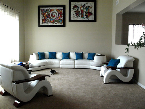
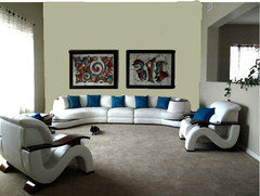
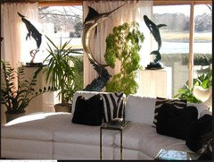
The living room just seems to be lacking something. The artwork sits centered on the wall from floor to ceiling, this leaves a large area of empty space from top of sofa to bottom of artwork. What can I incorporate to give the room the finishing touches?

Comments (34)

  • PRO
    13 years ago
    last modified: 13 years ago
    Have you thought about a center table or a rug to play off of the beautiful art work you have on display? The art would look much better lowered. You may consider mixing up the colors of the throw pillows to add more interest. You can bring in some of the colors from the artwork to tie things in a little better.
  • 13 years ago
    I think your artwork is far too high. Consider lowering it... considerably.
  • 13 years ago
    last modified: 13 years ago
    A table would be nice. To address the wall space, the pixs are way too high and should be aligned. Would the sofa fit on the half wall, looking toward the window or if not kitty-corner it two chairs facing the sofa, a coffee table, serpentine shape, and a white console on the wall with art work above?
    Various · More Info
  • 13 years ago
    use a 58" or 60" center (average eye level) to hang the artwork from and the artwork should either be parallel or stacked but not offset. and comment one
  • 13 years ago
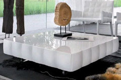
    I could envision this Italian white lacquer coffee table in your interesting space. I agree that the art needs to be substantially lowered and I would also suggest fewer matching throw pillows lined up on the sofa.
    Venice Modern Coffee Table By Tonin Casa · More Info
  • 13 years ago
    Eberhart · More Info

    Lower the art and add a coffee table
  • PRO
    13 years ago
    last modified: 13 years ago
    Vaneta, I agree with a suggestion to lower your art and display both pieces on the same level. Also, if possible, try hanging it vertically to see if it looks better this way, you can sometimes do it with abstract art. I would also add some accessories in warm colors you see in artwork. Looks like there are yellows and reds in it, so you can introduce those through pillows, etc. Best of luck!... Raisa
  • 13 years ago
    To really be able to admire any artwork, it should hang at eye level. So as the others already mentioned, lower it. The bottom of the art should be about 8-10" above the back of the sofa. Hang them both at the same height. Ignore the upper half of your room.

    Pick some colours that you like from the art and throw pillows in those colours on your sofa.

    I think you need either one large coffee table or a couple of smaller ones dotted around, so you have a place to put your drink. A large round ottoman could also be an option.
  • 13 years ago
    did you consider adding more patterns to the plain blue pillows? it would add more texture and vividness to the room
  • 13 years ago
    Pictures are to high and I agree t a table would be good
  • 13 years ago
    Beside chair opposite the window put a tall dark vase with vines or one big basket dark basket with a throw in it (pick a color from one of the " lowered" paintings ... maybe orange? ). Darker curtains too maybe brown or blue like cushions ... Hope this helps.
  • 13 years ago
    The flooring doesn't look right to me iam think a dark Laminate wood floor with a fair bit of black in it
  • PRO
    13 years ago
    Wall art is hung too high. The furniture is all matching which doesn't add any character to the room (Too showroom looking). Move the chairs to a different room or sell and replace with something that coordinates but isn't an exact match. Add a cool coffee table something with color or metal like chrome and glass or stone combination. You could also fix the problem by rearranging the pieces to create a more intimate grouping.
  • 13 years ago
    I agree charlotta1. Tall dark vase with that colour of them pillows in it
  • 13 years ago
    Keep the furniture I love it
  • 13 years ago
    To show you how it would look if you lowered the art:
  • 13 years ago
    Much better with the art lowered!
  • PRO
    13 years ago
    Hi, I think the room is a little stark. I agree with an area rug and a table. I would also use a darker drapy material to frame the window on the left. Like everyone said, the art is way too high. The middle of your art is supposed to be at eye level of an average height person. But I have to say your art doesn't match your furniture all that well - you have eclectic art with very modern furniture, and you need to mix it up. You can do an art collage on that wall. There's a lot of good art shown on Houzz. I also have some large and very large canvas prints that you can check out. Good luck.
  • 13 years ago
    I think having your pictures offset are fine. As with all the others...they need to be lowered. Do not place the top picture any higher than the top of your window...probably about 6-8 inches lower than the top of the window. I like the coffee table Interior International showed. You may want to consider an end table for the chairs and switch out a couple of the blue pillows with a color from your pictures.
  • 13 years ago
    much better with the art lowered but this is too low. it would be better if it should be in the line with the open wall on the right.
  • PRO
    13 years ago
    Plants in the corners
  • 13 years ago
    A center table or rug would bring the room together. Plus on hanging the art I think the first one was to high and now the 2nd one might be just a little to low, try for something right in the middle. Center it with the open air space to the right of the paintings
  • PRO
    13 years ago
    @carolins, what program are you using to adjust the photos?
  • 13 years ago
    Thanks everyone, I thought the artwork was to high as well, a 'designer' hung it at that height due to the extremely high ceilings. Just lowering it as in the example from carolins makes a great difference! I was going to put up lighting behind the sofa to shoot up the wall but won't need to do that once these are lowered!
  • 13 years ago
    @ Interiors International, I use Photoshop Elements.
  • 13 years ago
    Agree about the height of the paintings. Nice to see the colorful art. You have room for a beautiful sculpture, interesting lighting, a colorful throw, and I would also put a glass or white coffee table, keeping with the airy feel. A few tall plants.
  • 13 years ago
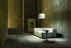
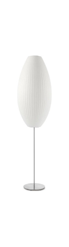
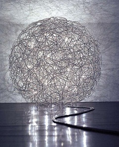
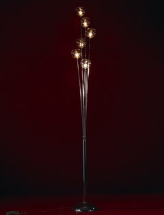
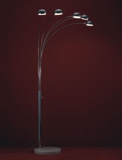
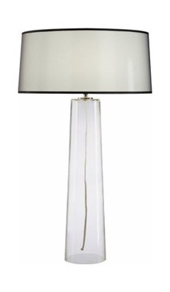
    Vaneta, since you mention lighting... I can't see any lamps. Is the only light in your room coming from the ceiling? That isn't the coziest light is it? Even if it comes from spots on a dimmer switch (for instance).
    Wouldn't you like to add a funky floor lamp? And perhaps some table lamps if you have tables next to the chairs. You have quite interesting furniture, so you wouldn't want to ruin the look with just the 'ordinary' table lamps.
  • 13 years ago
    Arco Floor Lamp | Room & Board · More Info

    Modern Floor Lamps · More Info

    Nelson | Lotus Floor Lamp - Cigar · More Info

    Fil De Fer floor lamp · More Info

    Sudrow Modern Floor Lamp - Modern Lighting · More Info

    Naiz 5 Floor Lamp - Decorative Lighting · More Info
  • 13 years ago
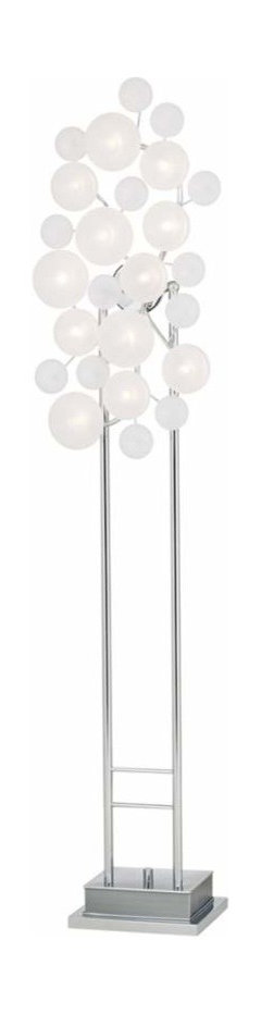
    And there are lots and lots more that I think would fit your style. The first one is another floorlamp.
    Modern Chrome Etched Glass Lilypad Possini Euro Floor Lamp · More Info


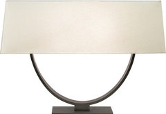
    Some table lamps

    Sonneman 7041.51 Brava 8" 2 Light Table Lamp in Bronze Forged Iron · More Info

    Robert Abbey | WCS212 Aire Control™ - 256 bit · More Info

    Alt Lucialternative - Amarcord table lamp · More Info
  • 13 years ago
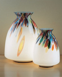
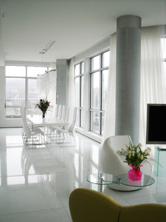
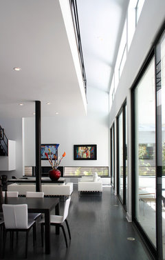
    I'd go for white entirely, or perhaps ebony floors as in #4 below. Let the art and accessories be the color and keep everything else white and large scale. Drapery (as #1 below) floors (as #3 or #4 below) coffee table, lamps (as #2 below), accessories are needed to "finish" your space. I am in agreement with removal of the two large awkwardly designed chairs. They detract from your sofa.
    MODERN · More Info

    White Modern Design - Living Room · More Info

    Studio NOO Design · More Info

    Essex Lane House · More Info
  • 13 years ago
    I think the pieces should come further away from the walls. Also, an area rug will really define the space and bring it together
  • 13 years ago
    I'd like to see a more crisp wall colour- the cream beige clashes a little with the white lounge .
  • 13 years ago
    Move sofa away from wall a foot or two, move the two arm chairs closer together, place table Inbetween the two arm chairs. This will create a cozier space and make a conversational area. As for the pics, lower them.