Software
Houzz Logo Print
gracefullyaged

Kitchen Wall Paint Color (X-Post)

9 years ago

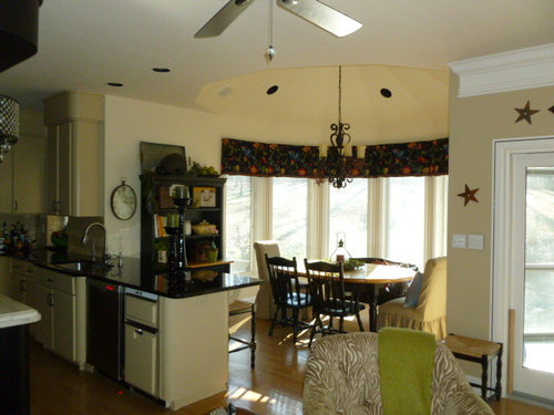
Looking for assistance with color for our kitchen
walls. This is the third color we’ve had
since moving in circa 2009.

This color was spec’d by a somewhat prominent color
blogger/designer and it just feels unfinished (as DH said, “It looks like it’s
primered and waiting for its real color.”).
She did a great job selecting colors for our master bath, office, and
guest room/bath though, so it wasn’t money wasted…

The cabinet color (PPG Spiced Vinegar) needs to stay… that was
a nearly year-long oil-based DIY project that we don’t care to repeat.

We’ve had PPG Fireweed (a brick red -- nice, but don’t want
red in the kitchen – apparently it stimulates the appetite, which we do not
require!) and BM Van Courtland Blue (dusty grayish-blue – selected by a local
designer – didn’t love the color), and now PPG Heavy Cream in the room.

In our previous homes, I’d go to the paint store, bring home
a couple chips, pick one, buy the paint, and be happy as a clam every
time. It seems I can never pick that “ahhhhh”
color the first time in this home (maybe the high ceilings or light throw me
off?).

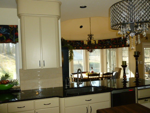
I apologize – these photos make it look like there is much
more contrast than there really is.

Would love to read your thoughts!! The first picture (no flash) is truest. Thank you!

Comments (16)

  • PRO
    9 years ago

    Look at Farrow and Ball's Blue Gray which reads more green and works very well with cream. You can order a tester or buy one if you live near a store.

  • 9 years ago

    Thank you, Anglo. From what I've read, you are in my geographical area (fortuitous!). There are no FB stores. I will order a tester; meanwhile, do you know who makes the best match (Maybe you would be willing to consult on the kitchen and spec exterior colors as well -- our next project? We are in Etown. I've found most folks in your area aren't willing to travel to Elizabethtown, but DD lives in the Highlands and the commute to visit isn't bad at all!)?

  • 9 years ago

    Have you thought about using the same color as the cabinets? or one of the companion colors they recommend.


    companion colors

  • PRO
    9 years ago
    last modified: 9 years ago

    With your current counter tops, cabinets, and other fixtures in the room you do have endless possibilities to choose from. I can see your dilemma. I have the same color scheme you do with the black (dark) counter tops and white cabinetry. I saw a photo in This Old House back when I remodeled the kitchen and it struck me so hard I said, That's it! I picked out the exact color and have been so happy with it and we get positive comments on it all the time. The color is Earth Tone in Behr paint 230F-6A. It's a terrible name for such a rich hue and if you look up the color chip online it looks almost mauve. Yuck. However, it's not red at all and not Terra Cotta either (which is not a favorite of mine being I live in MI). Here is a photo of our kitchen. It may be darker than you were thinking of, but you can always choose a color for your primary kitchen/prep area and another for the adjacent dining space. *edited to say I forgot this was our old door. We have a steal door now that has pained glass which is so much nicer.

  • 9 years ago

    I love it, Alison! Will check it out at HD tomorrow.

    Boop, Yes, but the wall color right now nearly matches the cabs (I know it doesn't look like it on photos -- my camera stinks!).


  • 9 years ago

    Is the cabinet color as caramel as it appears on the PPG site? It looks daraker there than in your photo.

    It looks like your wall color and cabinets are similar and don't have much contrast. That can be a rich tone on tone look, or it can be flat or unfinished. You said unfinished -- I might have said flat, but it isn't warm or interesting.

    Do you want to keep your window treatments? Do you want the cabinets to wind up looking warmer/darker or lighter, more towards off-white?

  • 9 years ago

    On my screen your cabinets look like their a pale yellow, if that's the case, I'd paint the room a soft cream color. White and yellow are really pretty together and it would keep the space light and airy.

  • 9 years ago
    last modified: 9 years ago

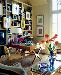
    How about something different like BM Spring Thaw 1508. On picture below it's on the wall with the pictures. Although...I might also change the trim to a less white white (in your picture). I would do the next lighter color on the same paint chit as your kitchen cabinets for trim or the lightest. And, maybe update the window treatment to some fun colors.

  • 9 years ago
    last modified: 9 years ago

    Just want to add that I think you might be having a hard time picking because the trim is so white...might be harder to imagine everything jiving in harmony without disconnects.

  • 9 years ago

    Thanks, everyone! For
    some reason (lighting/lack of photography skills), my photos are skewing yellow
    and neither the walls nor the cabinetry are.
    The walls are a flat, primer-looking color and the cabinetry is a caramel-ish
    light tan/beige that gets washed out in this room due to the lighting. We’ve had it in smaller rooms with less light
    and it was very rich looking (small bath on the walls with black cabinetry).

    Boopadaboo – Which brown?
    Both brown and olive green scare me a bit as they make me think our
    kitchen would look like a throw-back to the late 90s/early 00s.

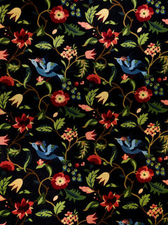
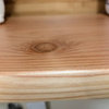
    Lascatx – I do want to keep the window treatments (close up
    of fabric below). A local decorator made
    them to go with the BM Van Courtland Blue paint she selected; I love the window
    treatments but was not a fan of the blue paint.
    I think I would like the cabinets to look warmer/darker. You’re right – now it is flat and not warm, interesting,
    or inviting. As a contributor on the
    Paint forum said, it’s “fine.” That’s
    all (not what I’m looking for).

    Lukkiirish – The walls right now are painted PPG “Heavy
    Cream.” It isn’t working. I’m not averse to a cream color (DH might
    be!) – this one just doesn’t work and selecting whites/creams intimidates me.

    Justerrilynn – I see how the trim looks white on my photos,
    but it isn’t as white as it appears.
    Think more BM “White Dove” than “Decorator’s White.” But you’re right -- nothing is jiving. Unfortunately, we have a LOT of trim in this
    house and it’s oil based (sigh… nothing is ever easy, is it?!).

    I should probably wait until next time my daughter visits
    and have her take photos with her iPhone for a better representation.

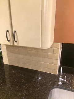
    Photos of sample boards with a couple of suggested colors follow. I’ve also added computer images of our window
    treatment fabric, back-splash, and counter tops that should give a better
    rendering than my photos in case that inspires someone toward the perfect wall
    color to “pull it all together.” Our
    ceilings are painted BM Feather Down and the turret ceiling over the breakfast
    room table gets painted the same as the wall color (not yellow or white at all
    as it appears in some photos). Thank you
    again!

    Window Treatment Fabric

    Backsplash (Horus Tiffany Crackle in Caramel)

    Counter top (Antique Brown)

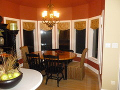
    Here is our original color (Fireweed); DH wants me to go back to it but I was hoping for a change...

  • 9 years ago

    I love the color Alison Alfredson Color & Design mentioned, and I know just which This Old House photo she is referring to, I love it too. Since you obviously are not afraid of color, how about a saturated green from the window treatments? We just painted our living room SW Cool Avocado, which I love, and our previous home had SW Sassy Green.


    SW Cool Avocado

    SW Sassy Green

  • 9 years ago

    I was going to say Apple Green. Like that throw on your chair.


  • 9 years ago

    Yeah, I was thinking the same thing, an Apple green would be really pretty

  • 9 years ago

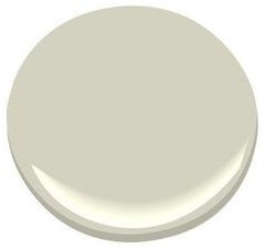
    Ben Moore October Mist 1495 is pretty much the same as Farrow & Ball Blue Gray.

  • 9 years ago

    I like the greens, too. Not liking your mock-up (?) with the rusty color paint. What about a tealish greenish shade...not in your face color but with a rich deep hue. The curtain fabric is beautiful, btw.