Software
Houzz Logo Print
hzdeleted_31436078

Cabinets and wall color help!!

9 years ago
last modified: 9 years ago
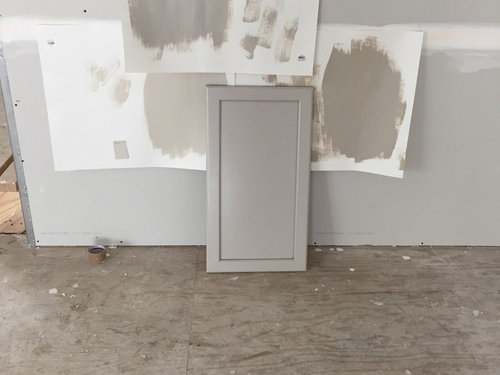
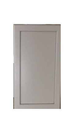
My cabinet color is chai with cinder glaze. I went to Sherwin Williams today and I thought I knew exactly what I wanted until I paired the prospective colors next to my cabinet. Now I'm not sure I like any of them. Left is accessible beige, right is balanced beige and top is versatile gray. Am I trying to blend too much of the same color?

Comments (32)

  • 9 years ago

    Lori, thank you so much! I am really aiming for a warm tone to complement the cabinet. I felt sure accessible beige was going to give that complement but it didn't look the way I anticipated or hoped. We are meeting with the painter when the drywall is finished. Likely sometime next week. I wanted to get a jump start. I will likely have the painter do some larger samples as you suggested. I thought this is was going to be so easy. Clearly this is going to take some time. Oh why are there so many color options?!?

  • PRO
    9 years ago

    I am really aiming for a warm tone to complement the cabinet.

    You have clarity about what you want, trust me that is 90% of the battle. You're doing great.

    Where di the Chai with Cinder Glaze color come from? A specific brand of cabinets? Custom finish? Lacquered?

  • 9 years ago

    They are Kraftmaid cabinets. They are a tough color because sometimes they have a soft gray and at other times it seems like a dirty white. Our island cabinets are a real dark gray called greyloft. I am aiming for a warm color that does not have any yellow/gold undertones. However, sometimes I see a purple/pink undertone in the gray/beiges. I look at the color wheel and feel like I'm going to go crazy. This is poor painter is going have his work cut out with me!

  • PRO
    9 years ago

    Oh, they have those at the Home Depot. I knew it sounded familiar. I'm heading over that way (to my Home Depot) for a lunch date. I'll pop in and take a look.

    User thanked Lori A. Sawaya
  • 9 years ago

    I hair had originally picked out versitile gray for our kitchen but noticed how much purple seemed to be in it when i took the sample over to our home. I ended up choosing agreeable gray which was a bit lighter and had more beige/less purple to it. Good luck. I agree, picking paints is a nightmare!


    Also, not sure your exact floor plan for your kitchen, but with the backsplash, will your wall paint color even go up against your kitchen cabinets that much? Just a thought...

  • 9 years ago

    Lakeerieamber I agree about the purple in versatile gray! I may try agreeable gray next. I really like that color too. We are holding off on a backsplash for now. I'm waiting to see how the room all comes together (open floor plan). Our cabinets do not go all the way to the ceiling so the wall will show there too. Before we starting building I thought I had it all figured out. I'm finding that's not the case. I am starting to question every little decision and detail. But still very thankful to be venturing through this process.

  • PRO
    9 years ago
    last modified: 9 years ago

    However, sometimes I see a purple/pink undertone in the gray/beiges. I look at the color wheel and feel like I'm going to go crazy.

    In the meantime...

    That whole 'undertones' thing is a micro color approach. If you step outside the purely subjective 'undertones' bubble and attempt to apply the theory to conventional macro methods for ordering and analyzing color, it will make you crazy. Because you're trying to make a mercurial approach to color, undertones, fit within ordered, objective, scientific (colorimetry) parameters. Won't work.

    That's because undertones are not measurable (in architectural terms). If you can't measure them, then they can not be consistently and objectively organized. If they can't be consistently and objectively organized, you can not plot them on a color wheel. A color wheel whose geometry naturally organizes color SO you can analyze color and craft harmonies.

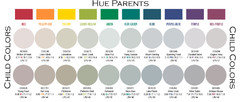
    Instead of thinking in terms of undertones, it's easier to think in terms of hue family so you can use time-tested color systems and tools that are over 100 years old. Like a color wheel.

    I've posted this image a million times and people are probably getting sick of seeing it but it illustrates that every tint, tone, and shade of color belongs to a hue family. Determine the hue family, find that hue family on a color wheel, and a full spectrum of color harmony is mapped out for you. It's just that simple.

    User thanked Lori A. Sawaya
  • 9 years ago

    I'm just wondering why you want a gray wall if you have gray cabinets? The cabinets are very pretty and It's one of those colors that looks beautiful with so many different tones that could really make them pop.

    User thanked User
  • 9 years ago

    I think the reason I'm leaning towards this tone is because it's a completely open floor plan so I'm really trying to tie everything into one without making it look too busy. I don't necessarily need a grayish paint but need help finding a warm tone that brings the different grays toghether.

  • 9 years ago
    last modified: 9 years ago

    I'm wondering the same thing. If you're trying to match but are slightly off, it will look like you were trying to match and screwed up. I'd probably go with a grey-white.

    Here's more pictures although you've probably looked at a bunch already

    http://www.homedit.com/gray-kitchen-cabinets/

    User thanked blfenton
  • 9 years ago
    last modified: 9 years ago

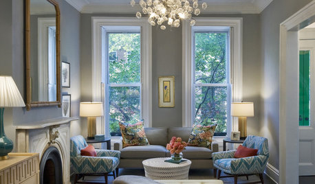
    You obviously have a vision - do you have an inspiration pic of that? I'm kind of with lukki, in that I'd be looking at something different to enhance/complement the color of the cabinets.

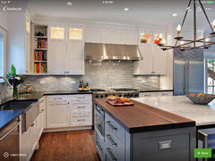
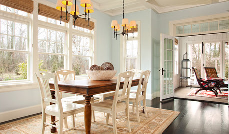
    I think this is particularly nice, but don't know your floor or counter colors:

    User thanked Olychick
  • 9 years ago


    Here is a good pic that is inspiration. Our island is dark gray like this also with a butcher block top. Our wall counters are honed black absolute and floors wood (magoney) red oak. So I already feel like I have a lot going on. I do really like a warm tan but terrified it will look yellow. Therefore, I end up in the land of gray. I truly appreciate all the help and feedback :)

  • PRO
    9 years ago

    I did walls and cabinets the same...sort of. Same color, half strength, and I had them leave out the very small amount of magenta that in some light went pink/purple. My kitchen is small -11x15 - and rather choppy with three door openings, so I didn't want any contrast - I let the white woodwork and countertops provide that. It worked.

    User thanked Anglophilia
  • 9 years ago

    I think your inspiration pic illustrates why you are looking for the colors you are. Esp with the darker gray and wood tones, I don't think I'd do cream either. I'd try to have the paint store color match to your cabinet door.

    User thanked Olychick
  • 9 years ago

    I agree. Creams tend to be yellow.

    User thanked blfenton
  • 9 years ago

    Anglophilia, our trim is also white and the kitchen is L shaped with a lot of natural light. Because I have so many other colors going on, the walls are throwing me for a loop.

  • 9 years ago

    Here's a picture that seems to describe the elements of your kitchen. The walls are quite a bit lighter and so almost become a non-element.


    Pine St. · More Info

    User thanked blfenton
  • 9 years ago

    blfenton, thanks!! I have that picture saved as well. I really love the look of that kitchen. I feel like I'm coming closer to a solution here!

  • 9 years ago

    Instead of a cream or tan have you considered a slightly tinted white? Depending on how much wall space you have it could work really well.

    User thanked User
  • 9 years ago

    likkiirish, I have not considered that, however I could see that being an option. It may be a nice crisp look. I'm realizing that just because I "like" a color that doesn't necessarily qualify it for the look I'm trying to achieve.

  • PRO
    9 years ago

    I think the reason I'm leaning towards this tone is because it's a completely open floor plan so I'm really trying to tie everything into one without making it look too busy. I don't necessarily need a grayish paint but need help finding a warm tone that brings the different grays together.

    Grab these chips and see what happens:

    Farrow & Ball's Elephant's Breath 229 - get the real-deal F&B paint sample if you can. LIke, I'd go out of my way to get it.

    SW 0054 Twilight Gray

    SW 7102 White Flour (not warm tone gray, but a lighter color to have in the mix)

    BenM 1469 Willow Creek

    BenM 861 Shale

    Glidden (Home Depot) A1774 Shadowbox


    User thanked Lori A. Sawaya
  • 9 years ago

    Thank you Lori! I will look into those :)

  • 9 years ago

    I think a softer white would be beautiful actually.

  • 9 years ago

    no help with the paint, but Winona, Minnesota?

  • 9 years ago

    I agree that a softer white would look great. I would consider something like the first photo olychick posted.

    User thanked amykath
  • 9 years ago

    justretired, Winona is my dog's name :) I am in Ohio!!

  • 9 years ago

    Ah, cute name! Good luck on the paint hunt.

    User thanked justretired
  • 9 years ago

    Another vote for a shade of white.

    User thanked theclose
  • 9 years ago

    I'd go with a warm white, like SW Creamy or BM Capitol White.

    User thanked nosoccermom
  • 9 years ago
    last modified: 9 years ago

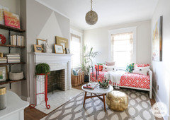
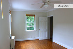
    I like SW Shoji White. Here it is in different lighting. In the fireplace picture below, the Shoji White is the lighter color of the triangle. The darker color around the triangle is SW Worldly Gray (they are on the same chit). The rest of the walls are Shoji. Looks great with grays and is warm.

    Your cabinet.

  • 9 years ago

    justerrilynn that is really nice! I like both colors and together they are even better. The painter just called and we are meeting Friday. I told him my issue and he is looking into it!