

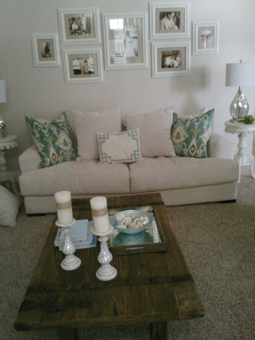
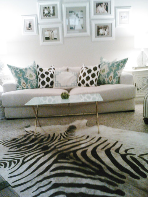
Do you like what I've changed in the living room?
13 years ago
Featured Answer
Sort by:Oldest
Comments (28)
 13 years ago
 13 years ago
 PRO13 years ago
 PRO13 years ago
 PRO13 years ago
 PRO13 years ago
 13 years ago
 PRO13 years ago
 13 years ago
 13 years ago
 13 years ago
 13 years ago
 13 years ago
- 13 years ago
 PRO13 years ago
- 13 years ago
 13 years ago
- 13 years ago
- 13 years ago
- 13 years ago
 PRO13 years ago
- 13 years ago
 PRO13 years ago
 13 years ago
 13 years ago
- PRO13 years ago
 PRO13 years ago




Related Stories

ARTBring In a View Like You’ve Never Imagined
See how art photographers turn a plain white wall into a magical window with a centuries-old camera technique — and how you could try it too
Full Story
DECORATING GUIDESThe Dumbest Decorating Decisions I’ve Ever Made
Caution: Do not try these at home
Full Story
DECORATING GUIDESRadiator Covers Like You’ve Never Seen
From custom to DIY, these 10 ideas will help the radiator blend in, become a storage standout or both
Full Story
FEEL-GOOD HOME12 Very Useful Things I've Learned From Designers
These simple ideas can make life at home more efficient and enjoyable
Full Story
DECORATING GUIDESRoom of the Day: Changes Come at the Speed of Life
An interior designer reacts to a family’s evolving needs in designing rooms that include a living room and entryway
Full Story
HOME TECHHow Smart TV Will Change Your Living Room
Get ready for the future of TV, in which your living room becomes a movie set, a communication hub and a gaming zone
Full Story
TRANSITIONAL HOMESHouzz Tour: Change of Heart Prompts Change of House
They were set for a New England look, but a weekend in the California wine country changed everything
Full Story
GARDENING AND LANDSCAPING13 Quick-Change Boosts for a Spring Patio
Enjoy your outdoor room more with these enhancements that are easy, impactful and kind to your budget
Full Story
ARCHITECTURE9 Modern Prefabs You've Got to See
You won't believe how far prefab architecture has come until you lay eyes on these stunning modern designs
Full Story
DIY Projects: Changing Your Look by Changing Your Table Arrangements
A guide to table decorations
Full Story




Virtus Design