Software
Houzz Logo Print
kimberly_hillegas

What works, what doesn't? Please help.

13 years ago
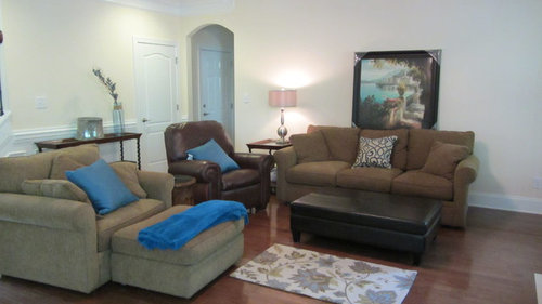
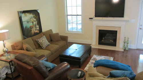
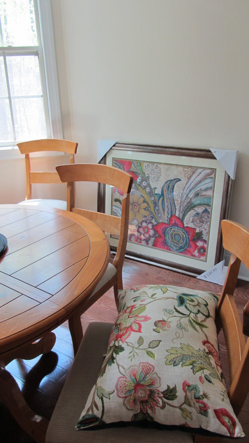
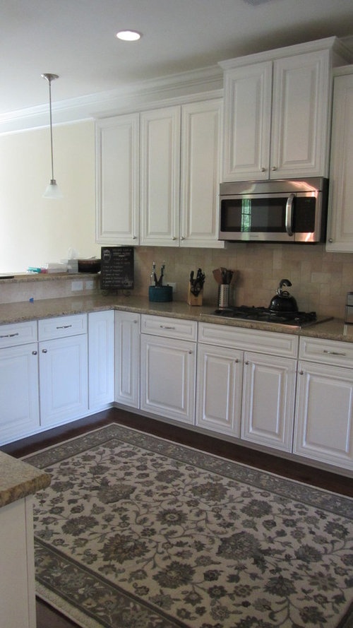
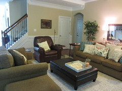
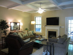
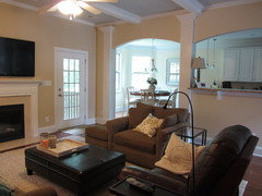
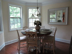
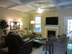
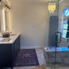
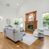
I'm trying to work with dark furniture in a dark family room. The rug is a sample of the bigger one I might order. I attached pictures of the kitchen and nook for reference since it is connected. Thank you in advance for your help!

Comments (82)

  • 13 years ago
    It's so hard when you move as furniture from one home isn't always the best fit for the new home.
    And if this is the room you watch TV comfort and function are important.
  • 13 years ago
    I think I'm hearing (and seeing) that lighter aqua blues and khaki's go with my existing furniture? do these color palates work and how can I incorporate them? BM Paladian blue or SW Quietude on walls - or maybe on a wide framed mirror?

    or am I way off?

    is there a good designer in the charlotte area that wont charge an arm and a leg?
  • 13 years ago
    I dont know the SW color, but I haven't found many living/family room photos on this site with Palladian Blue, it can be a bit dark depending on how much light the room gets.

    I think you're in a good direction with the fabric, but that wall color you should definitely sample first.

    To look for pros in your area, go to the "local pros" tab at top of page. Enter your zip code or city for ones near you and you can check their photos for those that seem to match your design style and give them a call. They can discuss options with you, even just helping steer you in the right color and fabric decisions would be valuable.
  • 13 years ago
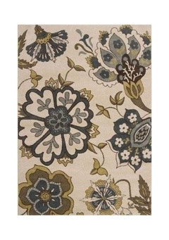
    The inspiration fabric definitely has the center of the flower in an aqua blue tones - so long as you stay with blue-green blues in your major rugs and pieces, it will work. However, it is predominantly rose and green with only a touch of the olive that the pinks send your neutral warm gold upholstery off to. Like the pinks with the olive toned upholstery, but the other greens fight it a little I think.

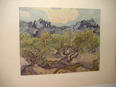
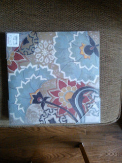
    The fabric in the second post with the art is a indigo / steel blue gray - no green in it at all - yep, it works with the olive in this fabric, and sings harmony well - as a gray that has blue undertones rather than a blue. The art on the right hand lower corner has both porcelain blue which works with the quietude walls above) and indigo / purple / blues which contrast. With these two elements, I would be looking for navy elements rather than a lighter blue rug. Navy and olive and steel blue.

    You can go either way - but pick a path and then make sure all your blues are in the same family. Some of what might have been pushing you off path is trying to combine them. One way to see which you gravitate towards is to go to the calicocorners website. they have blue fabrics sorted into those with green Aqua/teal and straight blues. Some fabrics do have both and there are so many variations even on the aqua teal side, but you could look through them and see which you really gravitate towards. You can be looking with the idea of them working with your new upholstery (which is great and is not hard, you are just working through what you want).
  • 13 years ago
    last modified: 13 years ago
    libradesigneye, I think you're on the right track. I read through these 2x, continually going back to photos and nothing made sense to me. I am def. not a designer, but this furniture (which I like) and the prints/floral rug/pillows-just did not flow for me at all. I like your choice of colors, it's exactly what I would do. I would even consider losing the light blue family all together and going to the green family-either olives with some great color (persimmon, oranges, etc.) would then throw in a bit of granny apple green or sea moss-not a vibrant green-muted. Could possibly add a blue jewel tone somewhere for color, if needed. My eye was going all over the place- I could not find a solid focal point. I see print/pattern here- not floral . Great house-good luck!
  • 13 years ago
    I was rather confused also as to what pics you were referring to but I don't matter, just Kimberly, but your advice sounds great as usual.
  • 13 years ago
    I have some more pictures, but my camera battery died. In the meantime...

    You have all been a wonderful help in identifying what is going wrong. I'm down to an essential question

    Can this couch and chair "go" with these walls if I leave them the bone white?

    If not, I would prefer to move them into the formal LR and paint in that room only.
  • 13 years ago
    I am thinking your floral prints are just to garden like to go with your warm furniture..Your furniture is nice I would move move upholstered chair next to sofa and move leather chair at angle facing into room so they are not all lined up but face TV.Your pillows should be a heavier fabric more like your sofa. Rusts, greens ,golds would work well .You could use rug you like and add blue pillows if you like but the pillow fabric should be a tapestry or chenille.The satin cotton look is just to light for feel of furniture.The paint could stay it looks like it has yellow undertones to it. You just need to add drapes with some texture like a linen.You have more of a texture problem than a color problem.
  • 13 years ago
    Don't move this comfy furniture into formal living room.That may be where you could put your lighter fabrics you seem to like.
  • 13 years ago
    jjnman12, thank you. I do need some drapery panels in the corner and heavier fabrics with this sofa. I had the rusts, oranges, greens and golds with this sofa in my old house and I'm really trying to go a different way in the majority of the new house. I have some "must keep" western art in the formal LR with the rusts, greens and golds -so I don't mind the CB stuff there, but you are right - they are sooo comfy.

    Keeping them in the FR is ideal. Reading again, libradesigneye, will the olive, navy and steel blue work with the couch AND the wall color? If I just paint the wall behind the couch, will it fight with the creamy yellow?
  • 13 years ago
    last modified: 13 years ago
    I'm not a big fan of the wall color with the couch, but lets see if we can find a fabric that combines soft yellow, navy, olive - once the eye has a coherent color story somewhere - even in an accent pillow or some art, it can make sense. It can just be two colors - olive and cream tending to yellow - I think as long as we can take your neutral couches into looking olive toned by careful selection of other colors, the pale butter walls will be okay. Maybe that is why I was headed in the olive, aqua direction - i think that adding blue-green next to this brings out its greenish olive tones best. I'm not a big fan of accent walls, especially in a room that is trending traditional / transitional unless it is a focal wall and your focal wall is not behind your couch. I understand about not painting - it may be as simple as the right art there.
  • 13 years ago
    this rug and window panels?
  • 13 years ago
    Pick one piece....like the rug, and pull the tones from it to make complimentary light colored pillows for the couch. Use other shades/colors to purchase glassware to decorate. Move the furniture so it is not heavy on one side of the room. I agree the wall color, artwork and pillows are incorrect - at least the colors we can see. Consider making lighter slipcovers for one piece, if you are able (using the colors from your inspiration piece). Lighting, in my opinion, is a make-it-or-break-it addition to a room. Lighten things up with some uplighting. The tv above the fireplace is distracting from what should be the focal point of the room. Put it on the long wall with the 2 smaller chairs flanking it at an angle (conversational. Then position the couch 45 degree facing the fireplace so you will be able to see both the tv or fireplace if desired. Nothing says you can't angle furniture. I would also remove the long table on the opposite side of the room if there's any obstruction of walking. Instead, use that wall above it now to place a large canvas that uses light colors or tone-on-tone. Make it yourself by covering canvas with gesso, use white glue to create thick ribbons on the canvas in swirls or geometric designs. When dry, just paint over it with a single color - light alabaster - to cover the glue and create a uniform color. You could also divide the piece visually and paint two squares white and 2 opposite squares yellow to create a color block. Have fun!
  • 13 years ago
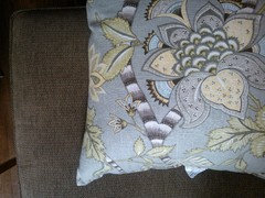
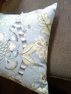
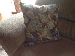
    Here's a pillow I found today. Has pale blue though, no navy
  • 13 years ago
    its much more green than this pic shows. Sheila, wow. great ideas! I'll need some time to sort through them. :)
  • 13 years ago
    Forget the bue..go red lol with green walls
  • 13 years ago
    Take that rug off your kitchen...something on the look below
  • 13 years ago
    I am trying to post a pic of my pillow that goes with similar style sofa fabric as yours I bought it at Kohls
  • 13 years ago
    Little hard to see but it has golds olives blue and rust.You could probably view it better online.I do like your other choices posted though.Sometimes you just need to get it home and look at everything together.
  • 13 years ago
    this pattern seems to go with the couch, but not the wall
  • 13 years ago
    which is a good example of why it is always best to paint last. Easier to match wall color to furniture/accessories than vice versa. Just sayin"
  • 13 years ago
    Ha-ha. no one seems to like my rug in the kitchen. Yes, I was paranoid about the wood floors. I've always had all tile.
  • 13 years ago
    I am wondering what might be nice for the room also is a sofa table behind the sofa and two lamps, one on each side. There is a very nice pillow in a paisley way up. You choose beautiful fabrics but you do need a heavier fabric. I would just keep looking for the right fabric before you start painting anything. Or find a rug. I went looking but can't see your kitchen rug. You have a very nice house!
  • 13 years ago
    @bevballew - the kitchen rug is in the original pictures in the post - 4th one.
  • 13 years ago
    Too bad. maybe you can put it somewhere else? It is too large for that area. It is nice but not best suited for your kitchen. Shucks!
  • 13 years ago
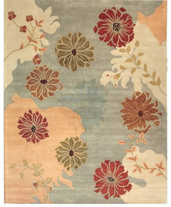
    how about this rug, then I pull colors from it for accessories?
  • 13 years ago
    Cute!
  • 13 years ago
    the pillow posted by stamps design services? I like that too.
  • 13 years ago
    thank you bevballew!
  • 13 years ago
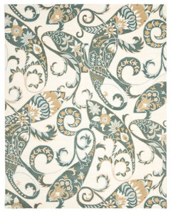
    I like this rug too, especially because I can get that lighter feel. Yet, I keep going back to prints with some red in them. I was trying to get away from red but I think it "works" again because the couch has the red and green threads running through it.
  • 13 years ago
    Like this one too! We have the same taste!
  • 13 years ago
    I life the one with the red it gives you more color to work with and works well with your furniture.it also looks like it would go well with walls and tie into your dining area picture.I think you have a winner!
  • 13 years ago
    busy weekend, sorry. I tried moving some of the furniture around, picked up a sample of quietude, spent some time in pier one, and talked to my husband about new couches (he said go for it - but i'm still frugal)
    anyway...
    I'm leaning towards trying to keep the couches, using the pillow and color palate below - going with a chunky wool jute rug from pottery barn ( or possibly the green jute from pier 1), and finding a lighter table and/or ottoman if needed. I also found some window panels at pier one that look just like quietude (smoke blue jute). Best of all - I hired a color consultant from the paint store to come out before I move ahead with anything. I'll post pics when I'm all done. thanks for all your help!
  • 13 years ago
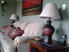
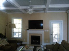
    Hi, I know its been a while, but I wanted to post some "after" pics. I'm keeping the sofa and chairs for now. I plan to move the mirror behind the couch a little higher and am trying to decide on window panels. Since there is about 17-18" wasted space behind the couch, what about a white bookcase wall instead of the sofa table?
  • 13 years ago
    It's looking much nicer! I like the furniture arrangement and the neutral rug!
    K Hill thanked Ann
  • 13 years ago
    What a transformations! It looks wonderful. Congrats
    K Hill thanked Nora Lambert
  • 13 years ago
    I think the wall of bookcases is a great idea.
    K Hill thanked libradesigneye
  • 13 years ago
    With only 18" of space there is not room for bookcases and a walkway so you can access them. If I needed bookcases, I'd be inclined to build them under the bar ledge at the kitchen pass through if you don't use it.
    K Hill thanked decoenthusiaste
  • 13 years ago
    The person on the sofa can lay down and watch tv. I suppose turn the one chair towards the tv, but yes I get what you say granny. Room looks very nice!
    K Hill thanked bevballew
  • PRO
    13 years ago
    Looks very cozy..... :-)
    K Hill thanked Stamps Design Services
  • 13 years ago
    thank you all! I'll post some pics if we decide to do bookshelves or window treatments. :)
  • PRO
    13 years ago
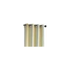
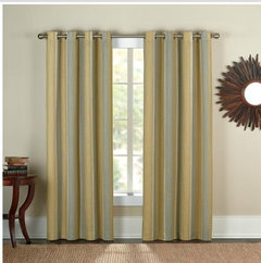
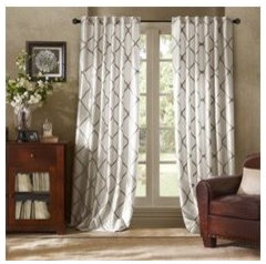
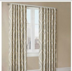
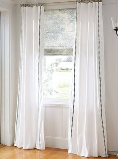
    Here are some draperies from Bed, Bath and Beyond....
  • 13 years ago
    Oh karla, I really like the middle ones! Thanks! These are the two windows (actually a window and door) that I would dress. Would I hang panels on the tv side or just the outside of each window? I would hang the rods high and even since the door and window are not even.
  • 13 years ago
    here's a better picture of that wall
  • PRO
    13 years ago
    last modified: 13 years ago
    I agree with Kimberly, if you hang them at the same height and and width; they will look like the same when the draperies are closed. (and still allow you to access the door when open) Some of the drapery panels come in longer lengths, which you may need. :-)
    K Hill thanked Stamps Design Services
  • 13 years ago
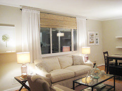
    I have seen this handled with panels layered over bamboo woven blinds hung at the ceiling and dropped just enough to mask the differences in headers / blinds used as valance primarily w/ flanking panels. nice in winter nights to be able to have layered coverings for insulation too.
    K Hill thanked libradesigneye
  • 13 years ago
    maybe like this?
  • 11 years ago
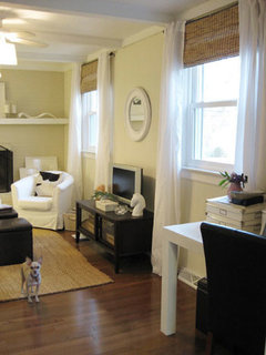
    Wonderful job. It looks so cozy. Window treatments as suggested will finish it off.
  • 11 years ago
    Last post in 2013. This is an old discussion.
Sponsored
AIS Renovations
Average rating: 4.5 out of 5 stars15 Reviews
Custom Craftsmanship & Construction Solutions in Franklin County, Ohio