

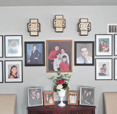
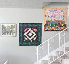
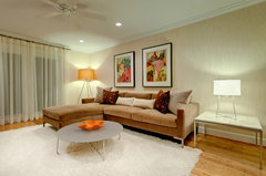
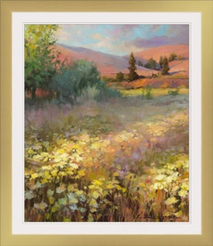
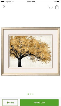
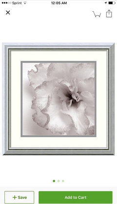
Picture frames throughout the house- should they be same color? Style?
9 years ago
Featured Answer
Sort by:Oldest
Comments (20)
Related Professionals
Wichita Interior Designers & Decorators · Rocky Mount Interior Designers & Decorators · Flint Interior Designers & Decorators · Lansing Interior Designers & Decorators · Willmar Interior Designers & Decorators · Manchester Interior Designers & Decorators · Erie Interior Designers & Decorators · Cowansville Interior Designers & Decorators · Hannibal Architects & Building Designers · Marinette Architects & Building Designers · Show Low Architects & Building Designers · Tacoma Architects & Building Designers · Savannah Kitchen & Bathroom Designers · Hannibal Kitchen & Bathroom Designers · Anniston Kitchen & Bathroom Designers- 9 years ago
- 9 years agolast modified: 9 years ago
 PRO9 years ago
- 9 years ago
- 9 years ago
- 9 years ago







Related Stories
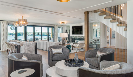
DECORATING GUIDESHow to Create a Cohesive Color Flow Throughout Your Home
Designers share eight techniques for avoiding a choppy feeling in your spaces
Full Story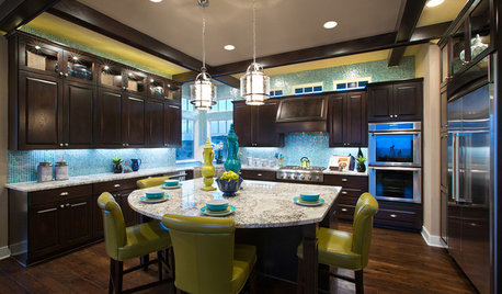
DECORATING GUIDESStrategies to Create Color Flow Throughout a Home — a Case Study
Unite your indoor and outdoor rooms with a consistent color palette, for cohesion and a polished look
Full Story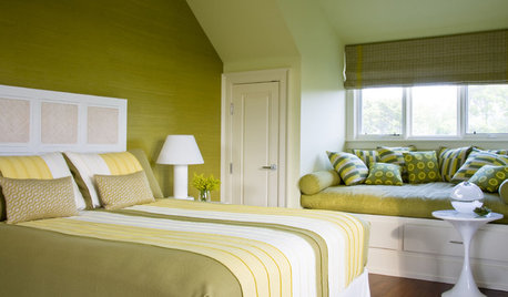
DECORATING GUIDESI'll Have the Same: How to Design With Monochromatic Color
Indulge the eye, offer a break from visual chaos and make decorating easier with single-color rooms in any shade you like
Full Story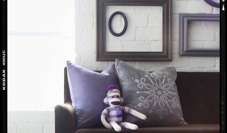
Clever New Uses for the Picture Frame
Frame Beach Stones, Jewelry, Wallpaper, More Frames — or Nothing at All
Full Story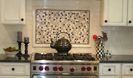
KITCHEN DESIGNKitchen Design: A Picture Frame for Your Backsplash
Frame a tile pattern for a piece of built-in wall art for your kitchen
Full Story
WINDOWSDesign Details: Framing Views
Large and Small, Frames Turn Windows Into Pictures of Your World
Full Story
KITCHEN OF THE WEEKDark Gray Sophistication in a Shaker-Style Kitchen
Rich paint used throughout this compact London space helps create a kitchen that’s contemporary and inviting
Full Story
HOUZZ TOURSHouzz Tour: Picture-Perfect Simplicity
It’s like camping out in a catalog sometimes at this classic farmhouse — Pottery Barn and other retailers love it for photo shoots
Full Story
HOUZZ TOURSMy Houzz: Swanky Vintage Style in Texas
No suburban sameness for this family — their Frisco home is a French-inspired eclectic wonderland with more chandeliers than people
Full Story
FUN HOUZZ12 Signs Your Coastal-Style Home May Have Gone Overboard
Accessories conjuring the beach often start innocently enough, but if you've framed your flip-flops, it may be time to reconsider
Full Story


jmm1837