

Somthing's missing
13 years ago
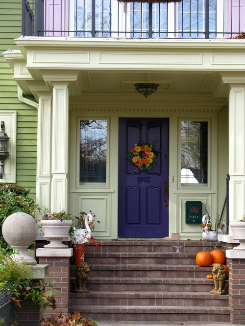
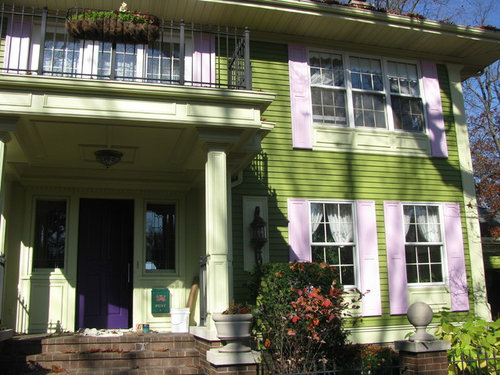
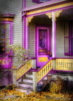
The house is green, the shutters lilac, the front door dark purple... it is not possible to change the color of the house (cost $15,000). Something is missing though, wondering if this is the white of the windows that do not fit the other colors, or perhaps adding something else... any comment or idea?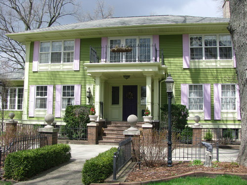
Featured Answer
Sort by:Oldest
Comments (122)
 13 years agoOne more comment - don't weigh all advice equally. Many are novices, like me! I saw one discussion (not this one) where the poster ended up far from her orig. ideas. It looked like any other nice, trendy room. She lost all of the room's individuality and personality. Navy is fantastic with green! Also like using your dark purple if you want to stay closer to your original ideas. Love landscaping advice!!
 13 years agoDon't remember who did what, but AI do like the dark grey or black shutters much better. You could even keep the door as is if you use the black or charcoal.
I like the cement balls.
I think the portico is the perfect size for your house Valerie. How old is the house by the way?Related Professionals
Somerset Interior Designers & Decorators · Concord Interior Designers & Decorators · Longview Interior Designers & Decorators · Chula Vista Interior Designers & Decorators · San Diego Interior Designers & Decorators · California Architects & Building Designers · New Braunfels Architects & Building Designers · Mansfield Architects & Building Designers · Bridgeport Architects & Building Designers · Gillette Architects & Building Designers · Laredo Kitchen & Bathroom Designers · Kankakee Kitchen & Bathroom Designers · Lebanon Kitchen & Bathroom Designers · Erie Kitchen & Bathroom Designers · Tucson Kitchen & Bathroom Designers 13 years agoThe shutters are just too light. Keep them purple - just darker. It's a lovely combination that is found often in nature. Take your cue from that. Try photoshopping them in with the same depth of color used in the green - just purple instead.
 PRO13 years agolast modified: 13 years agoThe shutters MAY be a little too light, but it is difficult to tell in the picture, because on the right half of the house they seem fine and it could just be the photograph itself, that makes them appear a little light on the left. I love the concrete balls. The are befitting of the style and scale of this home in my mind. I liked the black shutters, the best of the alternate suggestions, but not as much as your original paint palette for this home. The green and black as nice as it is, is not as special as what you came up with. One because of the more unique nature of the your color palette, and even most importantly it is a reflection of you. And your taste comes across in a very attractive and unique manner.
I would not make the shutters larger because then they would touch and you would lose the important definition between them. I personally would probably keep the shutters on the balcony, or if not, I would beef up the trimming in a special way particular to that set of windows. On the balcony, you could put a two concrete pots on either corner and plant with a boxwood, or privet, or pittosporum wheeler, and keep them trimmed in a nice ball shape, a "green" reflection of the concrete balls out front
Then fill the hanging planter on the balcony and the corresponding planter on in front, in a changing array of color. Big puffy white flowers, to striking shade of purple to even fall colors mixed with purples in the fall. It could be a lot of fun! Very nice home.
I would love to see some pictures straight up the front showing the landscape in front of the driveway, as well. 13 years agoAre you in love with the lilac? ( for the record I have periwinkle shutters and door). On my screen they seem too pastel fir the green. If you live them could you use charming potted flowers and landscaping to add sizzle? Love the bold choice of green. Where we live the homes are every fun shade so I have a hard time with traditional paint combos. Good luck!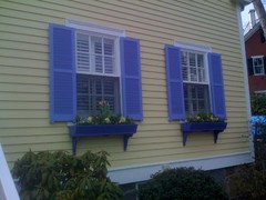

 PRO13 years agoMore white where there is very soft green will add to the contrast for the lilac and main color. Especially on the pillars and entryway, as well as the underside of the roof
- 13 years agoAre you using a spread sheet and classifying the ideas and comments?! I think we have beaten this up one side and down the other! I would be confused... I think you and most everyone else agree the shutters need to be repainted. I think there are primarily three good suggestions: dark purple; charcoal gray; or navy. Pick YOUR favorite. Have it done. Then let us see it and we can move on from the shutters. Love the green of the house and trim.
- PRO13 years agolast modified: 13 years agoHi Thedarlinsbecca. Just so as to not confuse Valerie, I do not agree on the primarily three good suggestions above. My opinion is perhaps a little deeper Lilac color, but landscape first. Gray and/or Navy do not make sense to me, and the dark Purple would be too much. I think the owner is on to something and I think she may just needs to finish out the landscaping. As it is right now, this home has little to no landscaping to balance out its scale. And it is in the landscaping where she can bring her colors in that will soften and bring it all together. However, I do respect your opinion, but I don't agree.
 13 years agolast modified: 13 years agoI love hydrangeas but either I am cursed or they aren't quite sturdy enough for my zone Look at Purple Hydrangea
Click here to get http://free-extras.com/images/purple_hydrangea-10317.htm and Blue http://gardenpartyflowers.ca/does-that-come-in-blue/ and countrified snowball bush : "The Common Snowball Bush, Viburnum opulus, also called the European Cranberry bush produces white flowers in late spring." http://joystudio.files.wordpress.com/2010/04/springsnowballs4.jpg Someone who actually knows how to garden
can set up your garden pulling in the green and purple/violet/blues flowering from spring to fall (early spring crocus) of if you like clematis (climbing) there is an amazing array of colours and varied shapes Houzz Photo · More Info
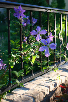 European Garden in Boulder · More Info
- 13 years agoHi Mary, I did say "most" agree (obviously not all). I do love your input, here, and on other posts. I would go ahead with just the shutters, then move on. I've never head of matching the house to the landscaping. I would match the landscaping to the house. I think there's value in this case of not getting frozen with indecision. Also, although the darker purple prob. Isn't the most popular choice, so what? I love the individuality of it. I'm tired of safe, let's all do everything in the expected mode of the moment and have about four safe style guides based on trends. Although you do not like Navy, it was one of our other designers who first suggested it. I appreciate your expert input and the time you give to all of us who read and post here. My best to you and our home owner.
 13 years agoI think the problem is that the house color is cool and the brick color is warm. I think black shutters would help.
- PRO13 years agoHi thedarlingsbecca. Thank you for your kind post. I have to admit that I, often :o) , share the viewpoint that a topic is so kicked around and tweaked etc, etc. That "what more is there to be said that hasn't already been said?", and I am just wanting to know what the owner finally decides and how it comes out. But, it is a good learning laboratory for everyone. The best to you and this homeowner as well.
- 13 years agoI LOVE the colors you chose for your home including the shutters. Besides you have spent a lot of money to have it these colors, so I assume these are some you like. The thing I would do is to landscape really well and across the entire front of the home. I love the wrought iron gate, as well. In summer, I would definitely include some flowers with dark purples and lavenders in them-maybe in huge pots on each side of steps going to front door with ivy trailing all the way around as well as some hanging baskets with flowers in deeper shades of purples. It looks great; it is different-makes for interesting conversation. Enjoy and love your beautiful home. If you and your family love it, then you're good!
- 13 years agoAfter seeing the photo shopped pictures of your shutters painted another color, I feel more strongly than before that the lilac is beautiful.
- 13 years agoI think one simple thing to do to make the place pop as it is.....Paint the cement ball caps on the stone columns the same color as the door or maybe even black.
- 13 years agoI think the shutters would look better painted the same colour as the front porch, and under the windows? Cream or celery green. Second option a bit lighter than the front door.
 PRO13 years agoYou seem to be going for a 'painted lady' aesthetic, similar to the way victorian houses are painted in San Francisco. I really like the green and the violet of the door, and I think that the shutters would probably be best in that same color - which I don't think the photoshop jobs above depicted very accurately. What I also think you may be missing here is the third side of your color triad - an orange. If you look at the pics you have posted, where they look best are where you have put in pumpkins and wreaths with orange in them. That is when your color scheme really becomes lively. One question would be where to put the orange, and which kind of orange to use. Personally, I think I would go for something in the darker pumpkin family. At the same time, recognizing that the lilac is lovely and that, when you have a very strong triad, it is sometimes useful to break the tension by incorporating details using different hues, I think it might be nice to include some of the lilac as well as a lighter orange that is more in the yellow-orange direction. You would have to determine where they might go - perhaps the panelings and moldings would provide opportunities?
- 13 years agoYou have an amazing house! As the house looks to be Georgan I would go with classic colors like green, navy and white. As a bright white might be too stark I would try different shades to see what works best but probably a milky white. I would paint the shutters a deep navy as well as the front door. I would paint the portico a milky white as well as the cement caps on the fence. I would start by painting just the sutters and front door first and see how you like it then move on to the portico in white but it might make it too busy so it could be better to just leave as is with the pale green. It looks like the photo was taken in the winter but you need more color and interest in the plantings. You could bring the purple or blue into the landcape with flowers that would work for your soil, zone and sun exposure. But the fastest fix would be to remove the window box from the upstairs balcony. It is way too small and out of place. You also need big plants in the pots by the front entrance to be to scale. I would put to large Boston ferns in them. They are cheap and hardy and would play to the green in the house. Best of luck!
- 13 years agoI agree with HERE Designs. I love the idea of adding orange to your color scheme. You could use plants with those same colors in the front. You could use Russian sage, orange cornflowers, green ornamental grasses with variegated leaves and add Hydrangeas or other plant with the minty green flowers. Green, purple and orange would be very pretty together. I think your house is really nice. Good luck with your project.
- 13 years agoDo you see how the shutters look pale against the house color? I think for this to work, and repainting the house being.cost prohibitive, the lilac color for the shutter should be as 'saturated' as the green of the house. I think a number of different colors would work well here. Just make certain they are of the same saturation.
 13 years agoI'd love to see a soft orangey red like cream of tomato soup or something stronger like a watermelon color, might as well be brave. It's already so original that it would take it to the next level. I think it's a lovely house. Good luck narrowing your choices.
- 13 years agoLove the colors and would not change a thing. What is missing are lots of evergreen plants and shrubs. You need to add lots of purple flowers to bring out the shutters. I would put huge ferns on the balcony over the door and maybe climbing jasmine of some of the fencing.
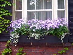
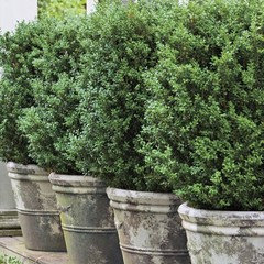
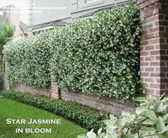
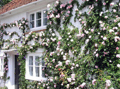
 13 years agoThe shutters are definately the problem. Go darker. Either the dark purple to match the door or a navy blue. Green and navy look awesome together!
- 13 years agoLike the window at the balcony without the shutters. The shutters seem too narrow but can see that there isn't enough room for wider ones. Real shutters are sized with enough width to fully close across the windows. I don't think you would typically see shutters on a three window set. Sorry, I haven't read all the responses, but wonder if you have considered not having any shutters on any of the windows. I think that would look best.
- 13 years agoValerie, Came across this photo on Houzz. Reminded me of your color scheme or maybe the shades of the colors will help you.
http://houzz.com/photos/3215021 - 13 years agoLike so many other commentors, I think the lavender is too light for the house color. Not sure about the purple door, but if you love it, perhaps just darkening (Purple) the shutters would help tie it together. I don't think that purple is quite right. Perhaps a more historical (not so saturated) purple would be better.
- 13 years agoIt's a beautiful house! I really like that green! To me, the only really awkward thing is that the shutters are too narrow to cover the windows and too long for the windows, but there isn't enough room to use shutters that are the proper size. Not only that but where there are three windows...that just doesn't work well with shutters. Shutters should be able to close in front of the window, so they need to be on hinges and held back with shutter dogs, not pasted flat to the house. When I saw the photoshop with the black shutters it seemed like the black grounded the house in a good way. If you removed the shutters and added some beefed up molding to the windows that might take way that odd feeling that somethings off...black planter boxes instead of those white panels below the windows maybe? Wouldn't pinky red flowers look nice with the green? Maybe black on some of the window trim? On the lower story there is room for some nice crossheads but not on top. Take a look at a few here: http://www.invitinghome.com/crossheads/entrance_crossheads.htm They are only around $100 each. Another poster said you could fill between the lower story windows with cypress. I like that idea. If you could move the lanterns to the coverd porch you could put the cypresses between each side of the porch and the window and they would grow up and fill in some of the empty space on the top floor.
You could leave the front door dark purple. That color works nice with green. Someone else said navy...that's ok, too. One other thing, you know you can not only paint brick, but you can stain it. They make a special stain for brick. - 13 years agoOne of the previous commentators mentioned saturation ~ I happened upon this image today. http://artistic-pursuits.photoshelter.com/image/I0000.hBa800kY6Y I really hope you will post pictures again when you've made your modifications.
- 13 years agoThe shutters, to me, are too pale and too "candy sweet". Victorian was colourful but not childish--bold in its colour (deep). Also, there are too few colours. I would pick a third colour for just the front door (among other reasons, because t door gets lost in the detail). When one looks at a house, one should be drawn naturally to the door.
- 13 years ago...and if you can, get bigger shutters, especially upstairs. Shutters are meant to cover a window, so the have to each be half the window's size, or 1/4 the windows size (in the latter case, because they'd fold in and then in again, sort of like a bifold door).
- 13 years ago… Sorry, yet one more thing: that panel below the window (currently pale green, I think) should be the same color as the window trim, so that it unifies and becomes part of the window (that's why the shutters go down that low – because it's really part of the window).
- 13 years agoI would leave brick alone, it blends in with natural elements,let's house be the star. Rather, paint trim under windows white and shutters darker tone like door or similar. Use purple and lavenders in landscape, maybe in larger black urns at porch. Overall stunning effect.Very enchanting house.
- 13 years agoSW 6620 rejuvenate
SW 6621 emotional
SW 6592 grenadine
SW 7593 coral bells
SW 6599 begonia
SW 6600 enticing red  PRO13 years agothe house needs some contrast - I'd paint the shutters a darker/richer color. Feels too pastel/childish.
- 13 years agoI agree that the shutters are the problem. I love the green and especially the door color. I think you shouldn't have shutters on the upper windows at all. They can't be functional with larger windows, so remove them entirely. Lovely house and bravo for being brave with color.
- 13 years agoThere isn't anything wrong with this lovely house EXCEPT the shutter color is too pale. Repaint them a deeper tone that is the same intensity as the green. The rest of your home is simply lovely.
 PRO13 years agolast modified: 13 years agoConsider eliminating the shutters. Authentically, they are not doing what they are intended to do and aesthetically don't have the weight to balance the façade with the large portico. Instead, they are being used to try to enhance the window profile and it's not working
Remove the shutters. Add cornice molding to the top of the 1st floor windows referencing the details of the portico to balance the effect of the lower panels. Widen the side casing on all windows and even consider a detail on the casing. This will add stature to the window and offset the weight of the portico and expanse of the façade. Once you have decided on your details, hire an experienced siding/carpentry contractor to do the work. He will know the proper techniques to be used for weather proofing/flashing the new details where applied to the house.
Photos follow for concept only. Also included a pic of a very nice way of doing planter boxes that are resting on window panels.- PRO13 years ago
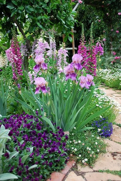
- 13 years agogarden
Stachys,+pansee,+erigeron,+iris,+digitale
Balloon flower, coneflowers, baby's breath, lobelia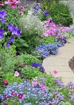
- 13 years agoTry deep Moroccan, or peacock, blue shutters....black too severe, and white is boring!


Related Stories
ARCHITECTUREThe ABCs of CAD
Computers help architects produce countless renderings and shorten lead times. But still there's one big thing CAD can't do
Full Story
HOUZZ TOURSVisit a Victorian Fairy-Tale Retreat in the Woods
By Alison Aves
This renovated cabin is an ultra-feminine getaway
Full StorySponsored

Mary Shipley Interiors
Average rating: 4.8 out of 5 stars34 Reviews
Columbus OH Premier Interior Designer 10x Best of Houzz



andreayoungc