Software
Houzz Logo Print
birdlover09

Having second thoughts about backsplash, need opinions!

9 years ago
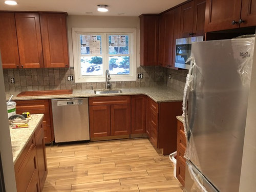
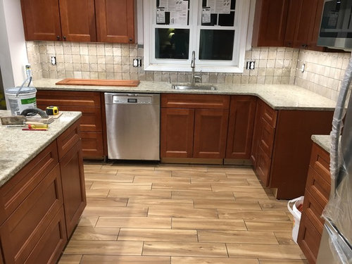
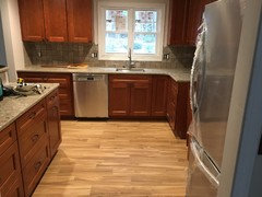
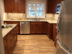
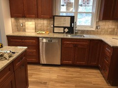
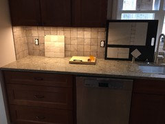
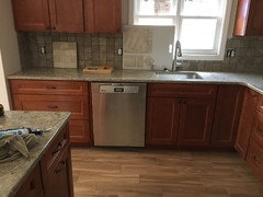
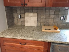
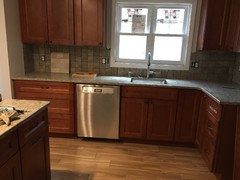
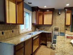
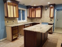
Help! Our kitchen backsplash is in but not grouted. It looks a lot darker and grayer than I realized. It seems to bring out the gray tones in the countertop which don't go as well with the warmer colors of the cabinets and floor. I had pictured a lighter colored backsplash, and not sure if it is worth changing the backsplash or not. The countertop looks kind of gray in certain light as well, but that would be a lot more to replace. Opinions please!

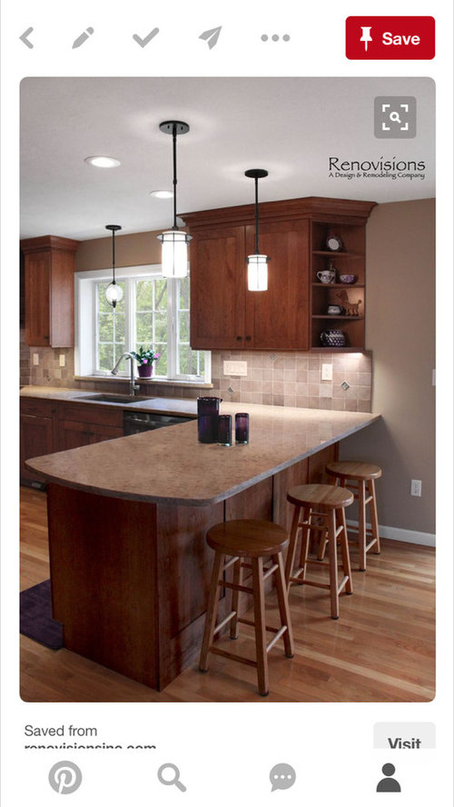
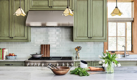
Below is the inspiration picture for the color scheme:

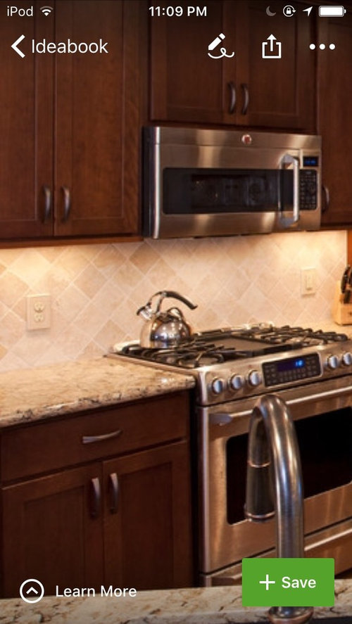
Below is an example of a backsplash color I had in mind:

Comments (27)

  • 9 years ago

    I think it looks a lot like your inspiration picture. The lighter grout and fantastic under-cabinet lighting will brighten it up to look even more like the inspiration picture. You will love it!

  • 9 years ago

    I agree with what mayflowers said. The backsplash, the counter and the cabinets go together but the floor is doing something else. I don't think it's that bad.

    A couple of things may be worthwhile trying. The idea is nuke some of the other tones to help the floor, the backsplash and the walls go together. Maybe soften the white walls and white trim as well as using a soft color (not white but maybe cream or one of the greiges). Do the same for the backsplash grout. Alternately, you could try a bit of the same cocoa colored grout used in the floor - it should push the tile to read lighter and it might unify the floor and the backsplash a little. You might be able to try it out by using something like the crayola markers (not the crayons). Or ask the tile guy to make a small sample on a board.


    You could also try switching the color of the undercabinet lights. With a simple lamp and a blue/daylight bulb and a yellow halogen bulb, you can get a pretty decent read on how that affects both the tile and the countertop. Even your can lights might need different colors. I can never tell from the photos but the light currently looks pretty blue.


    You could try placing some runners over the floor. Mat are available in a wider variety of colors than before and they will help you be able to stand on the floor for longer periods of time. I found tile to be awfully hard and cold.


    HTH.

  • 9 years ago

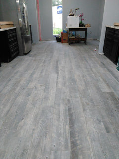
    Agreed it's the floor not the backsplash. Backsplash looks good with countertops and cabinets would keep it. I would suggest a nice neutral coordinating color rug for the area to help tone down the floor. Also involved is the pattern that the wood look tile was laid in. It should have been laid in a random lay as wood flooring is and not in a pattern lay like ceramic tile. The strong pattern lay is playing a part in bringing a lot of attention to the floor.

  • 9 years ago
    last modified: 9 years ago

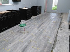
    Example of my wood look barn wood tile being installed. Very random joint and grout lines no pattern at all. As wood would be installed.

  • 9 years ago

    That's what it is, the tile is laid like wall tile. I knew something, other than the color was throwing me off.

  • 9 years ago

    Thanks all for your input. I didn't mention that the floor hadn't been grouted yet. Here's a couple pics with the grout that was put on the floor today. It sounds like the floor color is what's throwing the color scheme off, which is unfortunate because I really love the floor color. I didn't think a gray tone would go with the color of the cabinets. Just wondering if changing the backsplash color would help at all. Also, the backsplash hasn't been grouted yet, so the lines look darker. I have to run but will post more later, thanks again for everyone's suggestions!


  • 9 years ago
    last modified: 9 years ago

    birdlover09 - Your floor, cabinets and countertop are very pretty. I think your backsplash tiles are perhaps too small and too similar to the color of your countertop. I say perhaps, because now that your beautiful floor is in, perhaps now it's just a question of blending the tiles in. Perhaps, you can disguise this with the right grout color. Edited to add- build some sample boards and we can try to photoshop them in place. If one works, that will make things much easier for you. If none do - you're out the cost of the new grout color(s).

    Searching the forum is easy: site:ths.gardenweb.com search terms

    Ex: site:ths.gardenweb.com tile sample board

    Good luck - this is all really looking great!

  • 9 years ago

    The floor is MUCH better with the grout!! It was a little bold before when I thought the lines were supposed to be there but now it's nice and mellow. I think the backsplash will be fine with a light grout.

  • 9 years ago

    Computer monitors are often not true as to color. I think the floor is fine. Your last picture with the under cabinet lights on shows a warmer backsplash then it looked at first, so I think you will be fine. Just watch the mix of cool grays and warm wood tones - neither does anything for the other as cool grays were formulated for white or very dark cabinets.

  • 9 years ago

    It looks really nice. I think you did a great job.

  • 9 years ago

    Very pretty


  • 9 years ago

    That looks much better with the yellow-toned UCLs. When I looked at your first photos on my laptop, the floor looked pink, but now on my tablet, it looks yellow. I see some yellow in the counter and backsplash tile now too and less gray.

    I'd remove the side splash tile as that's an old, out-of-favor way of tiling.

  • 9 years ago

    The light in your last picture looks much better. Your backsplash does not look gray and matches the floor better and the grout of course helps. The grout in the backsplash will help too just don't go with a real gray grout, may be close to the floor grout to pull it together.

  • 9 years ago

    I think it looks lovely. It is very hard to tell from pics but I wonder if you could find a slightly warmer white for the window trim and maybe that would help. But perhaps the contrast is just right. It often seems like the quality of light that turns things slightly the wrong color sometimes. Your inspiration pics were well lit as were your second set of pics. I bet it looks more and more beautiful everyday!


  • 9 years ago

    Thanks everyone for your input and suggestions! Mayflowers, I like the idea of a more solid lighter backsplash. Bmorepanic and moggala, I like the idea of trying a different paint color that might tie things together better like the inspiration photo. Switching the color of the lights is also a good idea. Ravencajun, your floor looks beautiful! It goes great with your cabinets. Those are really long planks - it must have been a challenge to get those long planks to lay flat, but it looks like they did a great job! Thanks for the rug suggestions - I will check that site out.


    Oldbat2be, thanks for the suggestions of grout colors and making a sample board. I had never heard of a sample board but now that I've looked it up I can see where it can help! Mayflowers, that's a good point about the side splash tile - I didn't realize the contractor was going to do that. I assumed he was going to put the backsplash to the edge of the wall. It doesn't bother me terribly, so if we keep the backsplash, the side part is ok.


    I am thinking of running to get a box of a different color backsplash tile and just try to lay it temporarily against the wall to see if it looks any better. Maybe I can tape it to a piece of cardboard or something. Anyway, thanks again for everyone's input, I really appreciate it, and I'll let you know how it turns out! If I get some sample tiles to try, I'll try to post pictures this weekend. Thanks!!

  • 9 years ago

    Post a photo when you do. I still think it's too much pattern with the counter, not to mention the floor.

  • 9 years ago
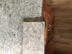
    Sigh, this is the other Cambria sample (Linwood) I was considering which seems to go better with the cabinets and floor. The Cambria color that we went with (Berkeley) has flecks of red in it which I thought would go well with the cabinets, but it looks like the undertone of the color that we have has a grayish tone, which I didn't pick up on when selecting it. The counter would be too much to replace, so that will have to stay. Well, if I get some tile samples I will post them. Thanks!
  • 9 years ago

    birdlover09 - Pick up some double-sided tape and do tape it to a board or rigid cardboard. You could even grout too :) The great part is after it dries and you take your pictures, you can chip the tiles off and re-use them.

  • 9 years ago

    birdlover, I think the countertop is going to be fine. I don't think the backsplash is a problem either, but then I am not standing in your kitchen. I don't like to throw backsplash ideas out to someone who has just installed a new one, but if you are dissatisfied, here is mine with my warm wood cabinets - very simple cream subway. Notice, there are some gray tones in my countertop.

    https://www.houzz.com/photos/my-pics-work-in-progress-phvw-vp~58830325

    https://www.houzz.com/photos/my-pics-work-in-progress-phvw-vp~57088087

    There also are stone type backsplash with more warm tones.

    Again, the picture with you under cabinet lighting on looks great.

  • 9 years ago

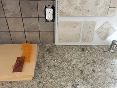
    Thanks jhmarie - you have a beautiful kitchen! Ok, here are some pics of some sample tiles. I like the lighter colors better, just not sure if it's worth changing out the tile or not. Thanks for any input everyone!


  • 9 years ago

    I think it looks great with the floor grout in and I think if you put a lighter grout in the backsplash it will all blend in nicely and tone it down like you did with the floor. The new tile sample is nice but I can't say it is much nicer than the one you have up. It is hard to always get a 10 out of a 10 but I think you have a 9 out a 10 and will look very nice when finished. I think if you are going through all the trouble to take out your nice new backsplash I think a solid light cream/almond subway tile would be a 10 to me. The floor and countertop have enough movement so you don't really need any more. But it really is not necessary, looks fine.

  • 9 years ago
    last modified: 9 years ago

    You have pattern in your floor and pattern in your counter; current backsplash adds another pattern and you show a replacement backsplash tile with patttern. If you want to replace the cuurrent tile, I would use a plain subway tile that does not add another pattern. Adding another backsplash tile with pattern that continues patterns fighting patterns does not seem worth it even if it is lighter.

  • 9 years ago

    In those close-ups, the current tile doesn't go at all with the counter. Tile looks pink or purple and the counter looks green.

    I am not a fan of pairing a stone-look tile with a stone-look counter. I think you need a solid ceramic or glass that pulls a color from the counter. Maybe a gray green the color of the resin blobs of the quartz, which would also look nice with the cabinets.

  • 9 years ago

    Thanks everyone for your input! Pearl1976, I love your description of it being a 9/10 - that makes a lot of sense and puts it in perspective. Rantontoo, thanks for the feedback on the patterns - apparently I have a lot to learn about design techniques! Thanks Mayflowers again for your suggestions on what to change. I'll talk to the contractor tomorrow and figure it out. If it's too much to change out the tile at this time, at the very least we'll remove the tile on the left side, which wasn't supposed to be there anyway. The tile could always be changed at a later time if we don't do it now. I've showed the pictures to people and a lot of people seem to like it, even though it's not as light as I wanted. Thanks again everyone - everyone's input has been very helpful!

  • 9 years ago

    The grout will change the look of the tile a lot. These are pictures from our kitchen with similar colors. You can see how much lighter the tile looks after the grout was added.