Software
Houzz Logo Print
palimpsest

This house is getting some internet attention

9 years ago
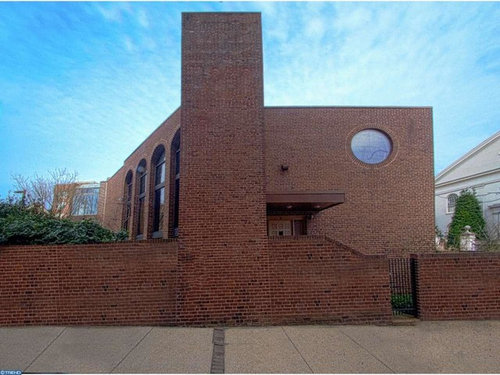
http://www.estately.com/21.9778,-125.2715,51.2579,-66.6924?max_days_listed=1&max_year_built=1980&min_year_built=1970&order=price_desc#listing-230-s-3rd-street--2

I know this house, and I had assumed it was dark and small-feeling inside. That was a misconception for the most part.

Comments (31)

  • 9 years ago

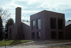
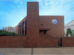
    It looks sadly out of place for its surroundings. I mourn for the historic homes that were demolished for this monument to bricks. I do like the light and airiness of it.

  • 9 years ago

    It replaced a gas station.

  • 9 years ago

    I think it's very interesting, but how could you ever feel warm in the winter with those high ceilings? Wouldn't all the warm air toast the upper floors while the heat rose above the lower floor?

  • 9 years ago
    last modified: 9 years ago

    It has many neat features but doesn't seem very cohesive. I was disappointed that the big round window was tucked away in the corner of a closet. And I like the look of open staircases but don't like walking on them.

    The price per square foot seems very high compared to other properties you have shared.


  • 9 years ago

    I like it.

  • 9 years ago

    I understand why it is getting a fair bit of interest. I like it too. I would love to know what a sympathetic decorator would do with it. It does not appear to have been much altered over the past 40 years.

  • 9 years ago

    Would love to see what Pal could do with the place. It could be quite beautiful I think.

  • 9 years ago

    I will try to give this house some context and make some comments now that people have looked at it.

    Nothing historic was destroyed to build this house. The historic house on this site was gone before the Civil War, was replaced by an office building which was in turn replaced by a gas station. The entire block across the street was built in the 1960s. Much of the interior of the block this house was built on was built in the seventies. It does share its frontage with a mix of historic and infill houses. This was a left over parcel and the reason this house is freestanding (which is a big deal for windows) is that it is surrounded by a small street, a service alley and a parking lot. At the time that this was built there was still great interest in saving any Colonial or Federal buildings that could be saved. They only tore down the unsalvageable.

    I will probably go and see this house in person, but from the pictures it looks like it has some really good rooms, and then some odd leftovers. The kitchen and baths don't look particularly pleasant.

    This house was built fairly late in the Modernist period and it does seem a bit heavy and commercial looking. And everything was brown in this period (Just like a lot of stuff is brown or gray now). It was also built in a time of high interest rates and not so great construction practices.

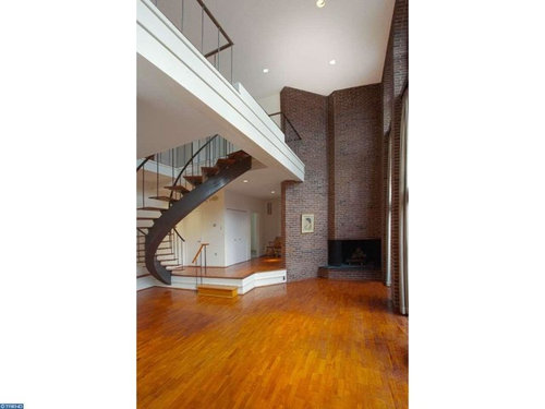
    That said, I think a lot of the more public spaces have nice volumes to them and a certain museum-like blankness to them that could be a nice backdrop for good furniture and art--which in some ways could make it more liveable than a modernist masterpiece in which furniture is almost superfluous.

  • 9 years ago

    It's really not bad--even though Pal did post the most institutional of the photos! I don't mind the institutional look though.

  • 9 years ago

    It's pretty cool.

  • 9 years ago
    last modified: 9 years ago

    Thanks for posting the article, it was very interesting. The photo caption was very complimentary :)

    "The Irani Home, viewed from the 3rd Street entrance to Bingham Court, could easily be mistaken for a PECO substation or an old city jail. "

  • 9 years ago

    GroJLart, the author, pretty much hates anything built after 1900.

  • 9 years ago

    There must be at least two big round windows, because in addition to the one that looks like it is in a closet (pic 16), there is one in what looks like a bedroom in pic 14. Actually, the closet one looks slightly out-of-round, so I think it's the bedroom window that is visible in the exterior shots.

  • 9 years ago

    You can see through the closet window that the view is not very good. The round/racetrack window is there to balance the facade.

    I would imagine heating and cooling could be an issue, but many houses built today have the same kind of openness of a great room to an upper floor.

  • 9 years ago
    last modified: 9 years ago

    I think with a ton of beautiful area rugs everywhere, art on the walls, and warm furnishings, it would not look as dry and uninviting. The stair raiings would need to be ripped out and replaced to Code - a miracle no child has fallen through yet (or no child has lived there).

  • 9 years ago

    I like it, except for the bathrooms. I can see working with the kitchen, but I'm curious to see what ideas you would have for the bathrooms, Pal.

  • 9 years ago
    last modified: 9 years ago

    I don't mind it for the most part, I like the space

    I would grow Boston ivy on the exterior

    Other than the first flr main room, I don't care for the arched windows but that could be fixed with WT's

    The honey-stained flr color needs to go

    In a few areas I would put transom windows over doorways or just increase the size of the opening w/taller doors

  • 9 years ago

    The house was built at relative low point in bath and kitchens I think, and the utility areas are a bit raw. The sizes of the kitchen and baths are not bad for an urban house of its era, but they do need to be redone. The kitchen has very dark traditional raised panel cabinetry which doesn't seem quite correct even though they are original. The baths could be amped up in terms of quality of finishes and finish level but essentially be styled the same way, just better. The danger here is doing something too contemporary or too 2010s. I believe the sellers are looking for a buyer who is primarily preservation-minded.

  • 9 years ago

    It's OK but the kitchen is terrible and the bathrooms look like something out of a hotel room. For 1.5 MILLION dollars, one would expect something better. I give it a thumbs down.

  • 9 years ago
    last modified: 9 years ago

    The price has to be put in context. Actually the $1.5M takes into account the house needs work. Another "free standing" property nearby is being sold at $350 a square foot essentially as "raw space" in which $1M + will have to be spent on renovations.

    Another "free standing" nearby property is on the market for $16M and $3000 a square foot.

    $1M is approximately "entry level" for the neighborhood for a house, (condos of course will be less but have highish carrying costs) and one with windows on three or more sides and garage parking will run more. Garage parking alone will add over $100,000 to the price of a house in that area.

  • 9 years ago

    I would love to live in a museum---up thread mention that it looks like a museum---which it doesn't to me. But I only saw the pics in this thread.

  • 9 years ago
    last modified: 9 years ago

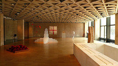
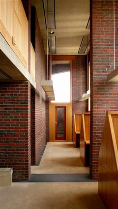
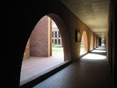
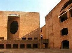
    While it's blasphemous to compare the better parts of this house to the works of Louis Kahn, there are some aspects which remind me of some of his public buildings, including the Yale Art Gallery. The house doesn't look like a museum, but like a museum it presents a certain blankness and supression of detail so the contents stand out rather than the architectural surfaces.

    The house

    Yale

    Phillips Exeter

    Bangladesh

    India

    Phillips Exeter Dining Hall (which is not considered one of Kahn's best works)

    The house

  • 9 years ago
    last modified: 9 years ago

    "Everything was brown in this period." Oh, yes! 1970ish it definitely is. The modern styles I'm most drawn to are very serenely simple and light in all respects, but this does have lots of sunlight, the most critical element. Most appealing to me, though, is how it develops this tiny lot. It was fun to google and stroll around. In context, it's a little infill miniature among much larger buildings.

    I do like the varied and unpredictable spaces and that they're not too large. And I really like all the light and the way they managed to make the view of its private garden a major feature of the main room. In the '70s there was likely a tree or three inside as well. For me, the kitchen space would be fine once updated and with a husband or friends for company, or just a radio and the glimpse of street scene.

    Although for style (not size!) the Greek Revival across the street would be my choice, it's easy to imagine loving living here, decorated, as friedajune says, with rich rugs, art, lots of books. Closable drapes where needed. Our kids are long grown, and the beautifully airy stair railing would stay, though, mercifully grandfathered in.

    That sun/garden room might make a favorite little aerie for working or relaxing, growing plants, and watching the clouds go by. Those windows in 3 walls, plus roof, remind me a bit of in being a tree house watching people below from its shelter. In this case, the foliage would have to be inside, but I'd be up to it. :)

    Thanks, Palimpsest.

  • 9 years ago

    Do you think this window arrangement was original or was this room partitioned? It seems like a small window for the size of the room. https://images0.estately.net/27_6958567_18_1491509862.jpg 


    The carved/panelled front door also seems a little incongruous but I'm guessing like the kitchen it is original. It's fun to remember that even modernist houses had overly elaborate flourishes from time to time whether from architect misstep or owner taste.

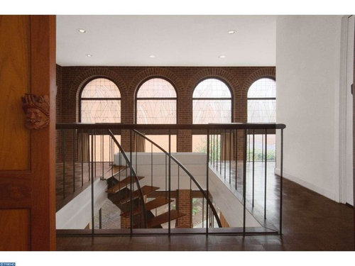
    I LOVE institutional feeling spaces. This seems like it would have a lot of potential. The arched windows aren't really for me although I do love the leaded glass designs at the top. It seems to have a nice balance of brick/brown and white/drywall/plaster. Is the upper brick/windowed area off what I am assuming is the master like a sleeping porch? Greenhouse? https://images1.estately.net/27_6958567_17_1491509862.jpg


  • 9 years ago

    The upper porch was at one time open and was glassed in in the 1980s that is the only change that has been made to the house.

  • 9 years ago

    I remember reading an article about how glassing in a porch generally converts a nice outdoor space into a terrible/uncomfortable indoor space and I can see that being applicable here, although the glass likely keeps out the pigeons pretty well.

  • 9 years ago

    Very interesting home and a good use of a small lot. I agree the kitchen needs to be redone, but the wood, glass and steel are right up my alley. The decorating (what there is of it) doesn't do justice to the scale and architectural lines of the main rooms.

    A perfect place for art, sculpture, and all the rugs I'd ever want. Woohoo!

  • 9 years ago

    I can see why it's a subject of discussion. It's a very interesting piece, with the almost-commercial exterior and sharp lines contrasting with the rounded windows.

    I like best the main living area, with the terrific staircase. Although, I admit, the open treads would scare me and it's a long way to haul a dog ;)

    I did have to suppress a laugh at the large round window in the closet with the direct view into the neighbors. Just about the 2nd to last place you'd want that much exposure.

  • 9 years ago

    Luckily that neighbor is not a residence, and I am not sure if the entire building has even been in regular use over the years. In any case the round and oval windows would probably get round and oval shutters if I were buying it.

    -----

    Modernism can be really tough. Modernism in the hands of someone like Frank Lloyd Wright is so dictatorial that even the wrong piece of furniture can be deadly. I remember the first time I saw pictures of Fallingwater in its entirety one of the bedrooms had a limp sort of 1930s bedspread and I remember thinking that the entire room looked "messy".

    On the other hand modernism like this looks too blank without any furniture, in many of the rooms. The main room with the spiral staircase and fireplace looks fine empty because there is a lot of visual interest going on, but the rest sort of needs furnishings and such to be interesting.

Sponsored
AIS Renovations
Average rating: 4.5 out of 5 stars15 Reviews
Custom Craftsmanship & Construction Solutions in Franklin County, Ohio