Software
Houzz Logo Print
pippiep

Using two paint colors in MBR?

9 years ago

I really cannot decide whether to go moody blue or serene cream in my bedroom! My room is around 24x17.

Does anyone still do an accent wall? I would use the moody blue behind my bed, which is reflected in the floor mirror across the room from the bed.

Or do top half/bottom half paint?

Or is this nutso? I just need to pick one color and GO, right?

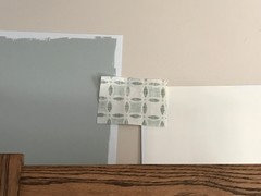
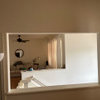
This is where I stand. Except the left navy blue fabric is a stand-in until the actual fabric being considered shows up. Color swatches from left to right are BM Tranquility, Vanilla Ice Cream, and to the right of the window, Linen White.

Linen White is looking SO YELLOW right there! It was much paler everywhere else in the room. I'm leaning toward Vanilla Ice Cream.

I really like that little fabric sample between the Tranquility and Vanilla Ice Cream -- it's very light and airy. I also surprisingly like the beige/white one to the right, more than the birds.


Comments (29)

  • 9 years ago

  • 9 years ago

    I did an accent wall while not loving accent walls..:) it's an opening though, kind of a frame. I love it.

    I say-why not if you can explain to yourself your "why"..behind the bed is the most logical spot for it. I do love wallpapers for accent walls, more than paint..but hey, taking risks pays off, usually.

    Are you planning to paint the ceiling as well? I think should pick up that cream.

    Or.

    Cream walls, blue ceiling? Not that I'm sure lol

    Or. Blue accent wall plus same ceiling, the rest is cream? Like a canopy?

    Sorry I don't remember the color of your floors. Can you remind me? Light, medium, dark? I think it plays a role when choosing the direction.

    pippiep thanked aprilneverends
  • 9 years ago

    Floor is carpet in a bad shade of neutral. We're going to either replace with carpet in a much lighter neutral, or rip out entirely and replace with unstained red oak. My husband is concerned that going all blue/gray will limit our options for a persian rug later on when we can afford it. I'm worried that the room will end up too dark. With the cream, I'm worried it will end up yellow, or white. Our last house had so much yellow and white... I really want a change after 14 years!

  • 9 years ago

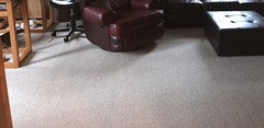
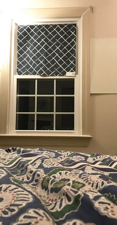
    Here's a pic with the carpet, and also the actual blue fabric we'd use if we decide on that, on the right window.

    I don't think we'd paint the ceiling, because we'd have to plaster it smooth first. I wouldn't spend the money to paint it while it's rough.

  • 9 years ago

    your trim is so nice.

    wouldn't go half and half on the walls..not enough height, at least from what I see

    you want change and blue will underscore your nice trim

    what about reversing the roles? all the walls blue, cream behind the bed?

    pippiep thanked aprilneverends
  • 9 years ago

    We actually hate the trim... it's a dreary pinky-beige. We're going to paint it BM Mascarpone. The window casings will be completely covered by the roman shades, because I have to do an outside mount.

    We hate the current trim color, the wall paint, and the carpet. It's all really awful in person.

  • 9 years ago

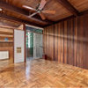
    This is a good pic of the carpet color, trim color, and wall color.

  • 9 years ago
    last modified: 9 years ago

    My husband likes the birds, and thinks we're "done" looking. ;)

    I picked it out initially because I wanted something that disappeared into the walls if we were using a creamy color, so that we can keep the bedding and (future) rug colorful.

    Ugh, why am I waffling so much? The fabric is inexpensive and I can make all four shades in less than a week. Even if we hate them after a while, I can buy new fabric then and remake the shades.

    Now painting... I want to paint ONCE because our furniture is heavy and huge! If we pick the "wrong" color, we're stuck with it.

    I have a walk-in closet, so maybe I can do the moody blue in there. (ETA: It has a window.)

    Here's a photo of my family room carpet, which I like very much. If we stick with carpet, we'd do something like that in the MBR.

  • 9 years ago

    Have you tried softer, lighter blues? Look at SW Lullaby. I have similar bedding (navy and white print) and Lullaby looks nice with it. I have white trim though and white furniture but navy pillows

    pippiep thanked decormyhomepls
  • 9 years ago

    We have BM Ice Cap in our bathroom, and love it. But I wanted something a bit darker in the bedroom. We both don't want a color that looks BLUE... more of a we want more of a blue-gray-green. Also considering Silver Marlin and Gray Wisp, maybe even Crystalline.

  • 9 years ago

    Also, in my other thread about fabrics (rather than paint... so undecided about both), the consensus seemed to be that the birds didn't really tie into my room, both in color and pattern.

  • 9 years ago

    Our house is open concept where one wall can be a part of 2 - 3 rooms. Having accent walls was the only way I could make having some color work and I get compliments on it all the time. I definitely thing that when done right, it can be a great option.

    pippiep thanked User
  • 9 years ago
    last modified: 9 years ago

    pippiep, That navy and white fabric at the right window above - does it look good in person with the blue paint you're considering? I'll be honest and say that I can't see those two together. You mention that you don't want the room dark, yet that navy and white fabric will have that effect, and call attention right to the windows, as it's so bold in comparison to the walls.

    I can't see the 'bird fabric' well, but can you put up a pic of it next to the blue paint sample?

  • 9 years ago

    If we did the navy fabric, we'd keep the walls light.

    If we do the blue/gray walls, I might want a more tonal fabric. At this point, I think the birds would only be used with the cream paint. (Vanilla Ice Cream on top, Linen White on bottom.)

  • 9 years ago

    I used Gray Wisp in my bedroom and laundry room in my last house, and it definitely looks more blue than green. Beautiful color, though.

  • 9 years ago

    Here is the blue fabric with cream... but four of these at 40x60" would be a lot of darkness (no window trim will be visible). I do plan to open and close them daily, so for nighttime, dark is good...

  • 9 years ago
    last modified: 9 years ago

    Ugh, these decisions are so hard to make. I think you are waffling because you aren't sure which look you really want. I understand, because I had the exact same issue when trying to figure out which direction to take our living room. Every other day it was light, no, dark, moody, no, bright, cozy, no, airy. And round and round my mind spun. Over the several years of planning and dreaming, I collected over 1k images in Pinterest of living rooms that had certain aspects I liked (some were layouts, ceilings, etc. Not all were color stories.) The hunt was fun, but narrowing my choices down was incredibly challenging. I don't recommend collecting that many images, lol. Talk about overload!

    Try to think of how you want to feel in the space. Come up with a short, concise list of descriptors. You can use these descriptors in helping pick out your fabrics. You could start a couple of pin boards for contrasting styles. Collect a handful of images that fit the categories you are considering, and then you can compare the boards to see which you (and probably your DH, since I know he has strong opinions on these things : )) like the most.

    For my living room descriptors, I chose "soft, calm, warm (but not stifling), and cozy (but not too dark) so that once in here, people would want to stay a while, and finally, peaceful." I wanted the space to be a little bitty bit rustic and country, and have the feel of, I don't know, sort of a barn converted into a room a little like an English library, yet without it being so packed that it felt dusty and sneezy. Since our living room has a large picture window that gives us a lovely view, the outside environment wound up influencing the decision as well.

    A piece of fabric that I liked that had beautiful colors really helped pull everything together, too. Now, I don't feel compelled to use that fabric forever. But since its colors were orchestrated by a designer, I knew that using it to pull my colors from would ensure that those shades would easily work together. I love the little circles of color registration marks that come on the sides of fabric when it's bought from the bolt. It's like an instant color chart that says to me, "Use this combo, and it's almost foolproof."

    Now if you listen to Christopher Lowell, he'll tell you that I just gave you terrible advice since fabrics go in and out of style so quickly, but this method has worked well for me for years. I appreciate his "seven layers of design" ideas (they can be found on YouTube) but I still like using fabrics to help with picking out colors. : )

    pippiep thanked laughablemoments
  • 9 years ago

    laughablemoments -- THANK YOU!! You're right that I hadn't figured out a direction. I didn't/don't really have inspiration pictures of the exact look. Nothing that has made me say YES, that's what I want.

    But this morning, laying in bed sick with my favorite sleepy-time New Age playlist playing... I realized that what I want is a spa feeling. I've been running my diffuser with lavender, and the music today was just perfect. I had Tranquility and Linen White on the far wall, so if I sat up a bit, I could see the colors, and strongly preferred seeing Tranquility.

    Looking through Houzz and Pinterest, the rooms I like the most are the ones with more color on the wall. I also love my current bedding and don't want to swap it out even though it's not spa-like.

    So, my words are: retreat, spa, calm, peaceful

    A place to get away from chaos and mess. A room where I can breathe in every new day with a positive energy.

    I now know that I need to pick a fabric that does not evoke chaos. Both in its pattern, and also in my reaction if I end up choosing a fabric I'm not sure about. I don't want to feel prickly every time I open/close the shades. I also pick fabrics based on how they literally feel. There is one pattern that I love, but I can't stand the way it feels. I won't even use it for pillows. I just want to get rid of it.

    As of this morning, I'm leaning toward this fabric.

  • 9 years ago

    You're very welcome. : ) It sounds like you're really narrowing in on the feel you want for the room. (Isn't it funny how sickness can be a blessing like that? I remember someone once commenting on here that they picked their bathroom decor based on what they'd want it to feel like in there especially when they didn't feel well.)

    Hope you feel better soon!

    pippiep thanked laughablemoments
  • 9 years ago

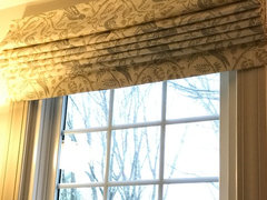
    Went with the birds! We decided we wanted a neutral color for the windows. We'll figure out the rest later!

  • 9 years ago

    Very, very pretty!

    pippiep thanked nosoccermom
  • 9 years ago

    I'm so glad that you chose the birds since you want peaceful & spa like for your bedroom. Easy to change your bedding to all cream with the accents of your bird fabric!

    pippiep thanked Peppapoodle
  • 9 years ago

    Very pretty, they came out really nice!! I use something with birds in every one of our rooms. They make me happy.

    pippiep thanked User
  • 9 years ago
    last modified: 9 years ago

    out of interest, went to count something with birds/bird patterns just in the living-dining-kitchen-family area..just these in the plain sight..drawers/cupboards etc excluded..counted twelve, minimum? gosh

    (i'd love to be as talented as you are pippiep. I have so many friends that know how to make things..it's a good thing to have so many people around to admire..)) it's a pity i'm not one of them. such a tiresome thing, to rely on others..)

    pippiep thanked aprilneverends
  • 9 years ago

    aprilneverends (and everyone) -- thank you so much! I'm truly amazed that I was able to do these at all. I'd only ever hemmed pants before, and even that I only did once every few years. I'm addicted to the feeling of the fabric now, and don't want to run out of windows, LOL! I have 5-8 more windows that I can make shades for in my house. I'll be sad when I don't have to pick fabrics anymore.

    As for paint... now that the shades are up, I can focus on a color. My current top picks are Gray Wisp, Silver Marlin, and Woodlawn Blue (all Ben Moore). I just placed an order for more color sheets, because I want to see Quiet Moments, Beach Glass, and a few others. By a few, I mean 15+ colors. But that includes a few off-whites for the hallway.

    I'm going to stick with a single color in the MBR instead of having an accent wall. If I really want to, I can paint my walk-in closet a different color.

    I LOVED waking up with the birds this morning! They let in just the right amount of light.

  • 9 years ago

    Gorgeous, you're doing a great job! Keep us posted on your progress. : )

    pippiep thanked laughablemoments
  • 9 years ago

    Also take a look at Glass Slipper paint.

    pippiep thanked Yayagal
  • 9 years ago

    Yay for the birds : ) .

    If you really need another fabric project, you can always make another duvet cover for the bed. It might not be a bad idea to have an alternate cover, handmade or storebought, in case you decide that the current cover -- as much as you love it -- doesn't work with the spa look you've finally identified.

    pippiep thanked beckysharp Reinstate SW Unconditionally