Software
Houzz Logo Print
nhbaskets

Backsplash help for friend

9 years ago
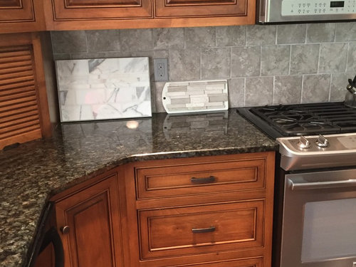
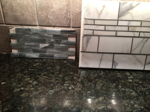
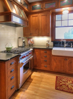
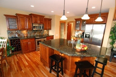
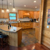
A friend who lives in another state is looking at replacing her existing backsplash. Home was built by her contractor husband ~5 years ago. Cabinets are knotty alder custom built by Amish. She believes her granite is something like Verde Peacock. Walls are gray. Existing backsplash is a gray. She is bored with it and was looking for my thoughts on a few samples she had. I offered to post here to tap off the collective wisdom of this board. She is leaning toward a marble, as she feels it's classic, but her DH is not convinced.


Any suggestions?

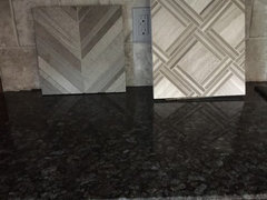
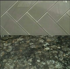
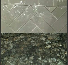
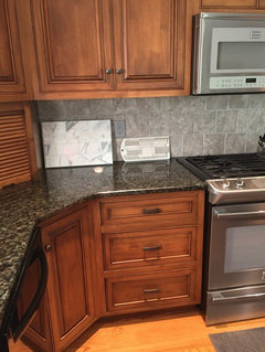
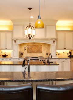
Close up of granite with samples she had.

Comments (38)

  • 9 years ago
    last modified: 9 years ago
    There's a lot going on in that granite. I'd go for Glazed ceramic tile, not stone.

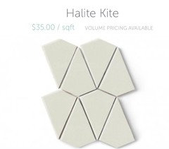
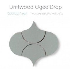
    I'm not a huge fan of the original choice, and none of the samples look good to me either, so we may just have different ideas of what looks good together, but I'd explore the verde in her peacock verde granite. Here are some options in pretty shapes from Fireclay.

    nhbaskets thanked eam44
  • 9 years ago
    I thought something less busy too. What about a glass tile?

  • 9 years ago
    Glass is just another material. There's nothing even remotely modern in that space, so I don't know what glass would bring to the party, but if they find a glass tile they like, why not?

    nhbaskets thanked eam44
  • 9 years ago
    Thank you eam for your thoughts. I would agree that the house is not modern. Your shapes above would definitely add some interest, which I think what she's looking for.

  • 9 years ago

    I don't think any of her samples compliment the granite or cabinetry at all.

    nhbaskets thanked palimpsest
  • PRO
    9 years ago

    Beautiful cabinets and countertop. Would use a solid color ceramic tile, in a color that is in the countertop. Daltile seems to have most every color available. Would not add any more pattern/mixed colors.

    nhbaskets thanked mdln
  • 9 years ago

    B/S should be plain and quiet... the granite has a lot going on...i wouldn't add another busy element. i would definitely go lighter and no glass tile.

    i also don't like any of her samples.

    nhbaskets thanked sprtphntc7a
  • 9 years ago

    pal, I agree that none of the samples work. Any suggestions?

    mdln, would you suggest subway pattern?

  • 9 years ago

    I like the first 2 that eam44 suggested. I agree with others that the counter is busy enough so a solid colour would be best. I like the idea of pulling that bit of verde out of the counter and using it. Very soft and nice colour. And the shapes of the first 2 samples would add some interest and compliment the pattern in the granite.

    nhbaskets thanked silken1
  • 9 years ago

    if they like the 6x6's, then just use that same size in a different color and stack them instead of off-set. won't be as busy that way b/c of grout lines.

    maybe something in a light green, matte finish.

    nhbaskets thanked sprtphntc7a
  • 9 years ago

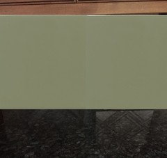
    Another vote for simple:


    nhbaskets thanked jhmarie
  • 9 years ago

    I think a pale green --something pulled from the granite, or a lighter tint of that--would be a nice complement, and I would probably do a ceramic or porcelain tile too. I am a fan of boring squares or rectangles with such a traditional cabinet, but a Fireclay shape could be interesting, although I would want the grout to be a pretty close match rather than a contrast.

    nhbaskets thanked palimpsest
  • 9 years ago

    Verdi Peacock is not a real busy granite. Without all the bright lights shining on it, it probably looks mostly black (just like my kitchen table). That said, it is a perfect choice for her floor and cabinets. She may have some gold in it. She simply needs to shop at tile stores to see colors in person, because with computer images it is impossible to recommend tile. See if she can find a store to find samples of Encore ceramic jewel tiles. I think she might find the subtle sparkle glaze pretty with her granite.

    nhbaskets thanked voila
  • 9 years ago
    last modified: 9 years ago

    This is the curmudgeon speaking:

    This is what happens when people are tired of something, and want to do a light update or refresh, and all they can think of doing is something that is on trend.

    (and I do think her choices are still on trend in some areas and to people who aren't up on the latest-latest--which is really the vast majority of people, people who do not really follow design all that closely)

    Anyway, she is making a typical mistake of picking something fresh (whites here, and a glass mosaic), something that has absolutely no relationship to the context of what she currently has. I don't particularly care for the original tile much either, the mottling is way too similar to the scale of the movement in the granite for my taste--but it's better than any of the newer choices.

    This is a kitchen that honestly would look fine with a matching granite backsplash or even a short matching granite backsplash (as horrible as some people think short splashes are), because it is a traditional middle of the road kitchen and either of those choices are traditional middle of the road choices, that really there is nothing the matter with.

    nhbaskets thanked palimpsest
  • 9 years ago

    Pal, go mix yourself a drink,...tee hee! I do happen to agree with you, but the woman deserves to have a little excitement in her life. And, Gads, her husband is a contractor who knows tile people and may get a discount. ;-)

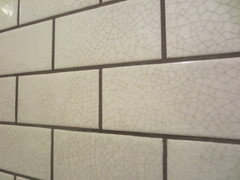
    It was crackle, not jewel Encore I was thinking of. Here is Pond color crackle: http://encoreceramics.com/product/pond-crackle-glaze/

    They also have lighter greens and blue/green waterfall color.

    nhbaskets thanked voila
  • PRO
    9 years ago

    nhbaskets thanked mdln
  • 9 years ago
    last modified: 9 years ago

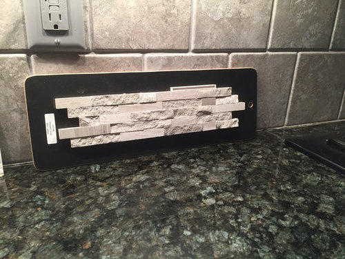
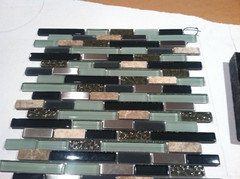
    Thank you for everyone's input. My friend has returned her initial samples and looked at some Encore tiles and felt they were to sparkley. She came home with these two new samples. Comments?

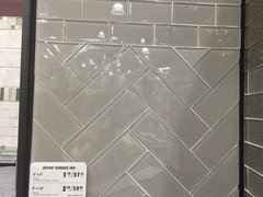
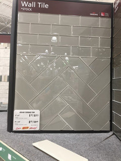
    ETA: Here's another she just sent me. She likes the herringbone pattern. Glass. Yes or no for this space?

  • 9 years ago

    Warm wood and cool grays do not work together well. Neither does anything for the other and they end to look drab together - not surprising - brown and gray, not the two most inspiring crayons in the box. Grays were formulated to go with the popular white cabinets and trim. (Still can be drab if not done right - as the many post on "help my gray drab kitchen" attest to.). Her present gray backsplash is part of the problem. Her gray walls are probably not helping - she is trying to use all the trendy stuff in her lovely, but traditional kitchen. Sometimes, a barely there gray - which often looks more white than gray) can work. Her husband is probably seeing people do gray in their new construction and remodels, but many of the pros here have remarked they are seeing a waning of the gray trend. It has been so overused. Please tell her to turn off HGTV if she is a fan:)

    The best colors with warm wood cabinets are cream (which is making a comeback), creamy beige, blues and greens. The blues and greens can have gray undertones.

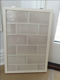
    Her warm cabinets would look good with cream (see pic I posted above) or as also has been suggested, pale green - maybe - depends how it looks with the counter.

    I have warm wood cabinets. Many similar cabinets have grain, which gives the cabinets some movement. The countertop also has movement. If the backsplash has movement, then there is no place for the eye to rest and the overall look is busy, even if each surface is pretty by itself. So, subtly pretty and simple is best for this kitchen.

    nhbaskets thanked jhmarie
  • PRO
    9 years ago
    last modified: 9 years ago

    I like this combo the best.

    nhbaskets thanked mdln
  • 9 years ago

    You could have her look at Daltile Rittenhouse Square in Garden Spot. Daltile is reasonably priced although the Garden Spot will have lead time.

    I had Verde Green behind my cooktop in my first kitchen with a laminate countertop in a color much like Gardenspot. It may be too yellow in real life, It is hard to know online.

    nhbaskets thanked palimpsest
  • 9 years ago
    last modified: 9 years ago

    This is not a modern kitchen. if she wants a glass bs, she should redo the entire kitchen so that it will belong in the space. Or she can choose the exact same grey in a glazed ceramic tile and it will look great.

    That said, I'm well aware our standards here are a little high. Her original bs choice was, well, not attractive, and her new candidate tiles indicate that she's clearly not listening to our advice now. She should choose whatever makes her happy.

    On a related note, I THINK WE SHOULD SAVE OUR EFFORTS FOR PEOPLE WILLING TO JOIN HOUZZ, SET UP AN ACCOUNT, AND ENGAGE WITH US DIRECTLY. "Thread for my friend" is a massive soul-killing time waster - even when brought to us by someone as awesome as nh.

    I'm out. Microphone dropped.

    nhbaskets thanked eam44
  • 9 years ago
    last modified: 9 years ago

    I had a sample of her granite home--was offered a killer deal on a remnant for a bath remodel. In sunlight, the green is a blue-green and very beautiful. In my home with artificial lighting, it went almost solid black. If she used a green tile, it needs blue undertones. A wider photo of the kitchen including the gray walls would help us see
    how gray interacts with the granite and cabinets. Maybe a gray with
    blue green undertones would work.

    The samples she's brought home this time don't feel like kitchen backsplash to me. The second one looks like bathroom flooring tile. I don't object to the glass tile as it can read transitional in a subway tile. Herringbone layout is also transitional/traditional. But it seems that she likes bold geometric shapes as that's the common theme in all three of her latest selections.

    Does she have a Houzz account? I don't think she has to post...mic drop, eam??...but an Ideabook might be really helpful to narrow her focus. You could even link to her Ideabook for us.

    nhbaskets thanked User
  • 9 years ago
    last modified: 9 years ago

    Since she picked out a diamond shape, maybe she'd like a large hex or an elongated hex in hand-glazed ceramic. This is a grayed green with a touch of blue, but probably too green for the granite. The elongated shape is more modern but I think it's fine in a traditional kitchen since it's ceramic. These are Pratt and Larson.

    The St. Clair · More Info

    But I noticed she hasn't picked out one glazed ceramic tile, so maybe
    she doesn't like them. Has she seen matte ceramic tile like Sonoma
    Tilemakers' Stellar line?

    nhbaskets thanked User
  • 9 years ago
    last modified: 9 years ago

    Hi Nhbaskets --

    You didn't know what you were in for when you volunteered to help your friend, eh?

    I'm in camp "let her live a little" but agree that her selections thus far don't seem to do justice to those gorgeous cabs, which work well with their counters. [But I see why she wants to move on from the current 'splash as it doesn't complement them either.]

    Also singing with the chorus re investigating green/blue-green/grayish greens/blues.

    However -- here's where personal taste really kicks in. From your friend's selections, it seems like she's craving some kind of drama with her backsplash. [Yes, I may be projecting as I love dramatic tile.]

    But I see:

    • exaggerated rough texture
    • highly variegated marble
    • shiny glass
    • boldly patterned tiles
    • plus/minus a more exciting install pattern

    If that's what she's looking for, I think that's great -- but there are so many tiles that might work better for creating a cohesive look.

    I do agree that having her pull kitchens she's drawn to (not backsplashes -- totally looks) will help her -- or GWebbers -- focus.

    Is it the shiny, the texture, the shape/install pattern that calls to her most? Or does she need 2 or more of those?

    And boy, if they want handmade + wow, Sonoma has an insanely gorgeous line called Euphoria and Pratt and Larson have a metallic glaze. Both manufacturers have shamefully underwhelming photos of their beautiful-IRL-offerings!

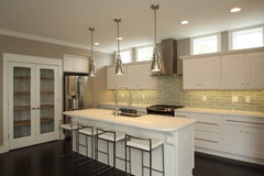
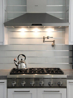
    A more sedate but still glammed-up look is this one, which alternates a standard field tile shape with strips of stainless. Credit to DP Principle Design.

    That in a non-white [and non-grey ;) ] field could work really well IMO.

    nhbaskets thanked House Vixen
  • 9 years ago

    Thanks again for everyones comments. I don't believe my friend has a Houzz account, but has been following the comments as I provided her the URL for the thread. When she provided me with her last few samples, I told her I'd post them and not to be offended by comments that may be received. It's a serious crew here! I will encourage her to create an account and start saving to an Ideabook.

  • 9 years ago

    I agree with so many points made

    But just to add something..would be great to know her budget? Encore, Pratt and Larson, etc...this is very high end tile. Very expensive. Well you can always find even more expensive lol. I'm a tile geek(c) I know places)) But this is something out of reach for most..also depends on how much you need of course, since if it's not a lot it's doable..but if it is we're talking thousands of dollars here..and a lot of cuts if it's shapes..

    Say she gets them with a discount, her husband being a contractor and all. Well still will be thousands with the brands you mention.

    What's her budget for sq f?

    I do agree that all her choices -by now-are a miss. Not because it's gray per se with brown per se..gray with brown can be amazing, but-it has to be a totally different gray..depending on a shade of brown too. Her grays don't work..Glass -not every glass but this glass-falls too flat, doesn't relate much to the kitchen..Two different stones-hard to pull off together. Frankly I'd go with ceramics.

    I'd go with a nice subway(or not subway but simple field ) tile, handmade if possible to get this subtle variation..maybe put it in an interesting pattern..maybe make it bluish green (or greenish blue)) as was already suggested..it will be interesting enough.

    She has great cabinets and nice relatively busy granite..I wouldn't take away from these but go with a backsplash that will complement them and differ ever so slightly. It won't be boring. Why? because backsplash is not something you look at separately. It's a part of a whole. She has her kitchen in, changes just one element..she already has a lot of her whole. As long as the whole is beautiful-that backsplash won't seem boring.


    nhbaskets thanked aprilneverends
  • 9 years ago

    Awwww April, it's a rainy Friday here. Can't I spend invisible people's money on luxury tiles haha?

    Good points, of course. Though I tend to advocate finding the look, then "the look for less" if needed. It only hurts until you recheck the savings. ;)


    nhbaskets thanked House Vixen
  • 9 years ago

    She needs to realize that the 2 she picked are a small sample when you cover a large space with that much "design" it's going to be very different and very busy and not match. My suggestion is to get several of the sample packages, which can be returned, and line up a larger space. That gives you a much better perspective.

    My vote is no to all of the samples she selected.

    nhbaskets thanked ravencajun Zone 8b TX
  • 9 years ago
    last modified: 9 years ago

    I did a search in Houzz kitchen photos for her granite. There were an astonishing number of stone backsplashes with this counter! I maybe saw one ceramic in a goldish tone. This slate isn't my style, but I thought it worked.

    Mill Creek Mfg Ltd · More Info

    I think the gray is harshing her beautiful finishes. If green won't work, and she wants marble, might she consider moving into a creamy marble, like marfil?

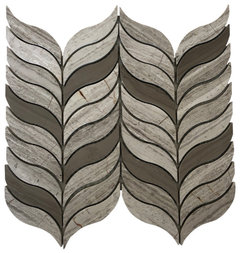
    I also found the next tile in Houzz shop - gray glass offset with a warmer tone. (Everyone will say it's too busy but I'm trying to kind of work with what she seems to like.)

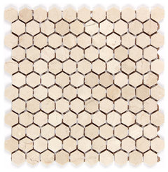
    12"x12" Crema Marfil Polished Marble Honey Comp Hexagon Mosaic · More Info

    Feather Oyster Grey and Athens Grey Waterjet Mosaic · More Info

    nhbaskets thanked barncatz
  • 9 years ago
    last modified: 9 years ago

    One of the reasons I was offered that granite at a discount is it's an "older" granite. You see it with stone backsplashes because that's what the older granites were often paired with--stone with stone. All the old gold granites have stone backsplashes too, usually travertine.

    nhbaskets thanked User
  • 9 years ago

    Exactly mayflowers.

    To recap: no glass, stone or marble.

    I would do a ceramic tile, in a very light blue/green color.

    nhbaskets thanked eld6161
  • 9 years ago
    last modified: 9 years ago

    Yup, most of the photos were 2013 vintage, if you consider that old. There were a couple from 2015, both of which used glass mosaic. Here is a Christopher Peacock kitchen from 2012. I thought this was ceramic, as I posted above.

    To recap: I don't think there's only one answer.

    Inverness Residence Kitchen · More Info

    nhbaskets thanked barncatz
  • 9 years ago
    last modified: 9 years ago

    Haven't read all the replies, but if she wants something more interesting, what about a porcelain tile in a color from the granite, like a green, cream in a herring bone. Or how about a crackle tile?

    Not these colors but rather, style.

    nhbaskets thanked nosoccermom
  • 9 years ago

    I like the ones that mdln posted above. I'm sure you could find that color in a ceramic tile too since that might be better with the more traditional cabinets

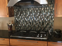
    I have Verde Peacock granite in my kitchen too and as noted above it does look mostly black from a distance but up closer the blue/green colors and the gold flecks in it are beautiful. My kitchen is more contemporary and I used a mosaic just behind the cooktop. The lighter green in my mosaic is very similar to the green in mdln's post.

    I think a mosaic is too modern for your friend's kitchen but here are a couple picture so you can see the colors

    nhbaskets thanked badgergal
  • 9 years ago
    last modified: 9 years ago

    I'm not a fan of glass mosaics per se(unless they're so elaborate that are already prohibitively expensive), but sometimes these might be cool, in small proportion. for example when they create this vertical rainfall effect as on the badgergal's pic

    the problem here-the friend of the OP doesn't have a hood but has a microwave so all this waterfall effect would be lost because of the shorter, squarer space

    nhbaskets I hope I do not overstep but you mentioned initially your friend lives in a different state..what state is that?

    i was just wondering how much out of place something like geometrical patterned cement tiles would look..:) I can hardly believe I suggest it since it's not something I'd personally pick for that kitchen ...yet it might work who knows..she'd have her pattern, she obviously loves stronger lines..and the colors might be good enough to pick up what she already has, and at the same time not to clash.

    since the patterns are painted and the tiles feel "soft" and are matte it will still look like less competitive surface to granite..or so i believe..?

    no, i don't believe she won't become bored with these too, in her particular kitchen..but they might be something that will have a potential to make her happy without being too off

    what do you say?

    nhbaskets thanked aprilneverends
  • 9 years ago

    say, their suggested colorways here..or taupe and green

    https://www.villalagoontile.com/props-cement-tile.html

    (sizes should be verified of course..I believe shouldn't be bigger for 6 by 6 for this backsplash)

    or: sage and forest green

    https://www.villalagoontile.com/props-cement-tile.html


    or less geometrical more fluid..these are too big though I believe?

    http://www.cementtileshop.com/in-stock-encaustic-cement-tile/Sofia.html

    http://www.cementtileshop.com/mm5/merchant.mvc?Screen=PROD

    nhbaskets thanked aprilneverends
  • PRO
    9 years ago

    @ badgergal, I used one of the tiles she selected, it got cropped with my app. While I would pick a ceramic tile (vs. glass), I think this is the best of the ones that she selected.

    nhbaskets thanked mdln
Sponsored
Bella Casa LLC
Average rating: 5 out of 5 stars17 Reviews
The Leading Interior Design Studio in Franklin County