Software
Houzz Logo Print
dvhart

Paint colors for a 1957 Split Entry with lots of Brick.

13 years ago
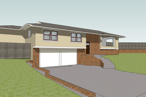
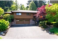
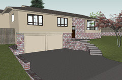
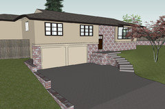
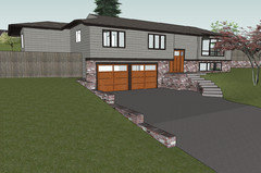
We're working on window design, trim, and paint as it looks like we'll be painting the place this summer. Paint colors are HARD to simulate. I'm considering something like a clay (greenish taupe), cream trim, and either burgundy or dark brown or black window sashes. The gutters are currently very dark brown, and I was planning on keeping them, but they didn't look very good in the model. Anyway, here's my updated model. Still needs a lot of work on windows and such. I've added the white water table to the bottom of the upper story as I don't like the look of board and batten with no termination at the bottom. Love to hear your thoughts.

Comments (24)

  • 13 years ago
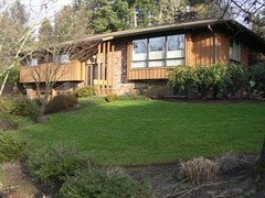
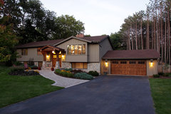
    The house as is it looks today:
  • 13 years ago
    last modified: 13 years ago
    Thanks for the thoughts and the compliment. I'm relatively new to sketchup, so my models are the result of more brute force than any sort of finesse :-) We are considering replacing the windows, possibly only in the living area (to the right of the front door) at first, the rest later. We do feel that the windows above the garage are too short, giving it a squinting appearance. You might be on to something with the casements. I am a huge fan of craftsman architecture, and I tend to lean that way when doing things unless I make a concious effort not to! In this case, I'm thinking "modern prairie":
    http://www.houzz.com/ideabooks/6400214/thumbs/Modern-Prairie
    with its hip roof, deep eaves, long footprint, etc. is probably a better fit for this home than craftsman. These are kids bedrooms above the garage, can casements be restricted to 4" openings? Do they meet egress requirements? Thanks for the textures link - the stock ones are pretty limited!
  • 13 years ago
    For modern prairie you could do a long series of high windows across the rooms to echo the clerestories you see above, and you can make them sliders, awnings or casements. 24" high the width of the room from 66" to 90" aff. Inside you can run trim at 6' around each room to advance the prairie look. Even bronze aluminum (not great for insulation but great for the look) in a new profile would work.

    Like the belly band - note that closed eaves, expanded glass at entry, modern garage door and horizontal siding in your paradigm are steps that will help you achieve your look. The pilasters a the end of site walls could be added with brick you need to remove around your entry to get the open glass feel there. There would need to be a stacked and turning wider stair entry approach with groups of fewer stairs between multiple larger landings jogging at each landing along a path moving at right angles from drive to entry. The Mid-Century Modern style of the house itself is quite charming on its own, though some adjustments would serve both.

    For now, look at the range of color in your brick - to get the look you want, you'll want to lightly stain it, so it still has tonal range but all is in the same color family. A light tan stain should do that - but the brick you've got needs a bit of help to head in the modern (prarie or mcm) direction

    For now, consider painting a pale taupe that will relate back to that dark brown brick. Like siding http://www.sherwin-williams.com/homeowners/color/find-and-explore-colors/paint-colors-by-family/SW7543-avenue-tan/
    trim in naturel http://www.sherwin-williams.com/homeowners/color/find-and-explore-colors/paint-colors-by-family/SW7542-naturel/ - belly bands, eaves/ fascia - don't pick out the window trim, but look below for sashes / dividers and garage doors http://www.sherwin-williams.com/homeowners/color/find-and-explore-colors/paint-colors-by-family/SW7546-prairie-grass/

    These colors will work for now against the brick as is. If you can paint the living room window sashes paint them a dark wine red that relates back to the brick and do this on the front door too - this is a good shade to test http://www.sherwin-williams.com/homeowners/color/find-and-explore-colors/paint-colors-by-family/SW2802-rookwood-red/
  • 13 years ago
    Great thoughts! Thank you. I need some time to think through them all and see how they relate to the house and the various stages of the project.

    For now, here is an updated site model with updated terrain and and hardscape geometry to provide some added context.
  • 13 years ago
    libradesigneye, updated with your color suggestions. I've heard others recommend very similar colors for body and trim (sometimes even the same with a slightly different sheen). I am very accustomed to calling out the trim, so I struggle with it. Is SketchUp doing a decent job representing these colors - is it close to what you had in mind? They appear slightly pinkish to me.
  • 13 years ago
    Don't change anything at all. Your house and garden is adorable.
  • 13 years ago
    Thank you Annettegladman, what a wonderful thing to say! Most changes we make will be subtle, but there are some functional things that need to be reworked. The entry is horrible. You're equally likely to get a door in the back and thrown down the stairs as you are to safely traverse the split entry landing on the way to the basement :-) That will involve some sort of bump out at the front door to provide a proper entry space.
  • 13 years ago
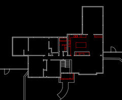
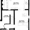
    Here's the floorplan showing the entryway and the proposed changes in red. I still need to figure out how this will translate to the exterior lines.
  • PRO
    13 years ago
    I would not deviate from the look you have right now. The house looks very natural with the garden, very whole.

    IF you are replacing the windows I would keep the same design for the three big windows you have on the main level and try to make the windows above the garage bigger and the same rectangular proportion as the main level windows. Prairie style is all wide rectangles. And I would keep the brownish color window frames as well.
  • 13 years ago
    I'm pouring over https://www.houzz.com/photos/midcentury-modern-home-design-ideas-phbr1-bp~s_2115 right now, and there are only a few that appeal to us. Inna Brodkin, we do plan to maintain the front room windows as they are (with the exception of raising the base of the one not shown to accomodate a built-in window seat). The windows above the garage are a real challenge. Because that area is a bump out, the roof intersects the wall about a foot lower than the rest of the house, which lowers the top of the window, which makes us want to lower the bottom of the window, but doing so quickly gets them lower than we feel comfortable with small children in those rooms. Perhaps the answer is a divided window with fixed panes at the bottom. The area above the garage needs something, but I'm just not quite sure what.
  • 13 years ago
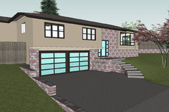
    Inna, what a wonderful idea to duplicate the front window pattern above the garage. The ones I modeled here have 18" glass panes, which I'm pretty sure will not meet egress requirements. I suspect there are things I can do to make something similar work (thinner frames, etc) without compromising the look too much. What do you think, is this what you were envisioning? (this new brick pattern is made from a photo of the actual brick, but it wasn't a good sample, none of the black is present and it comes through as pink at any distance, which it doesn't in meatspace).
  • 13 years ago
    Darren, colors shown are lighter than I was thinking - prairie grass is a pretty deep mid-tone taupe, though outdoors on a large field colors do appear lighter. If you are trying to come up with a mcm window pattern for the kids rooms, how about a wide grid of 6 squares 3 over 3 so that the front window pattern remains a feature rather than a repeat. You can even do sliding stacked threes, where the outsides slide to the fixed middle but you get that even squares appearance that references the modern look you want.
  • 13 years ago
    libradesigneye, interesting idea with the 3 over 3 in the bedrooms. Here's a shot visualizing that. I think I prefer the tall over short that mimics the front. My better half may prefer no division at all on the bedrooms. A simple geometric pattern that repeats itself throughout the home is something I associate with Prairie (I believe it was a Wright-ism) and something that appeals to my rather AAA nature. This shot restores the gutters to a dark brown which I like once again. Yay. I think we're starting to get somewhere. I can see a more modern front and garage doors really completing the look. Gotta do something about the brick though. Also, the house is currently clad in cedar "board and batten". Some of it is in rough shape, but re-siding just isn't in the cards right now (the kitchen is the priority).
  • 13 years ago
    last modified: 13 years ago
    I'm thinking six instead of nine for bedrooms - lose the lowest row for the mcm look. You can stain brick with no future maintenance and if you do a thin lighter color like a wash, you won't lose the variety but you will be able to tone it down.
  • 13 years ago
    Ah, duh, I read 3 by 3, but you said 3 over 3. I'm definitely considering the stain on the brick.
  • 13 years ago
    Here it is, 3 over 3, also with "Prairie Grass" for the body. I was playing around with more modern door designs, but they really aren't working for us. SketchUp isn't letting replace the brick texture at the moment (grrr). Time for bed :-)
  • 13 years ago
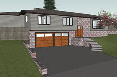
    Well, after much scouring of Houzz for exterior styles we like that would work on this style home with dark trim, we came up with something like this. I still plan to do something about the brick. I think the shingles do a lot for it (it currently has board and batten, which really works against it in our opinion). We like the idea of a mid-tone field with dark trim and natural wood accent (or fiberglass made to look like this, this side of the house does face west). What do you think?
  • PRO
    13 years ago
    I've been watching this thread, and I like this paint color best. I think the cedar-colored doors don't blend in, considering the color of your brick (from your photo). I'd probably go with the same paint color for the doors. Are you keeping the post supports on the entry? I like them... looks like a bench is mounted at the foot of the posts?
  • 13 years ago
    Thanks sstarr93! The posts and bench will definitely stay for the short-term (I need to add them to the model), longer term we plan to bump the entry out about 4 feet so we have a proper entryway and not just a landing, so that space will see major changes in the future. The color shown in the last rendering is CertainTeed's Heather from their SketchUp textures (I haven't figured out how to *easily* keep the shingle texture and change the color. I like this tone, but the hue is a bit too gray. Something between this and the ones above is probably where we would like to land.

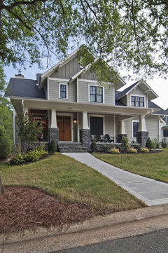
    This house has served as some color inspiration for us:

    Family room · More Info


    As for the doors.... I agree they don't quite work yet, but I think we could find a way to stain the brick (as Libradesigneye has suggested) and work with the wood stain to find something that works. We like the idea of the wood accents as seen on the photos mentioned here:

    Exterior · More Info


    This second one has a lot in common with our home. We like what they have done, although we would like a bit more differentiation of parts in the color scheme.
  • 13 years ago
    OK, making textures manually is a pain, but I really needed to get a better sample of the brick. I also thoughts the entry might look better with a bit less brick.
  • PRO
    13 years ago
    I think I like it better with the full brick wall at the entry. For me, cutting it midway emphasizes the split level identity of the house. The bricks look very accurate! The mature landscaping is beautiful, and really alters the appearance... could you add some of it in?
  • 12 years ago
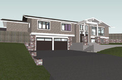
    We've really appreciated everyone's thoughts here. It's been a while, but we're still getting Likes here and there, so I thought I should post an update. We're still working through the design. We've decided MCM really isn't for us, and while we want to avoid ending up with something that looks forced, we're considering some changes that are perhaps best labeled as contemporary craftsman. Regardless of style, we are going to be bumping out the entryway so there is more than just a landing upon entering. Here is a screenshot of one of the current candidates.
  • 12 years ago
    We are trying to get more ideas on siding textures which do a better job differentiating the various parts in a separate discussion here: https://www.houzz.com/discussions/siding-and-texture-ideas-for-a-contemporary-craftsman-remodel-dsvw-vd~1166496