Software
Houzz Logo Print
bthurber81

Stuck on paint color

9 years ago

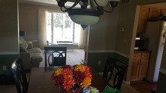
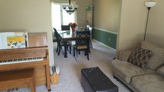
I am leaning towards Benjamin Moore Vapor Trails. We have lived in this house for over a year and I can't commit to a paint color. It is a two story with kitchen, living room, and eating area all open to each other. You can also see the dining room and foyer from the eating area. The entire house is painted one tan color. I am wanting to brighten it up and I don't plan on painting the kitchen cabinets. Looks like vapor trails is a gray that leans towards green. Do you think it will work? Thank-you!

Comments (29)

  • 9 years ago

    Just making it easier for people to comment - here is BM Vapor Trails -


    bthurber81 thanked My3dogs ME zone 5A
  • 9 years ago
    last modified: 9 years ago

    I understand that you do not want to paint the kitchen cabinets, but would you consider painting the fireplace bricks a wood surround? Here is a blog showing wall colors, including Vapor Trails. Scroll down to see her painted fireplace. http://www.simplyorganized.me/2013/08/my-home-interior-paint-color-palate.html The Vapor Trails might look very nice with your warm wood tones. You might also want to sample Winter Orchard BM 1555 to make certain not to end up with areas that are too dark. Good luck!

  • 9 years ago

    Yes I would consider painting the brick and surround. I do want to lighten up the space but I'm afraid of ending up with a green that is too "minty".

  • 9 years ago

    It should be cool, yes. If it looks like on the picture..make sure to sample it first before you commit. But generally, whether you pick it-or another color that's called differently but looks like you want it to-I think it's a great direction to go..another silvery green you might want to try is Serene Thoughts by Dunn-Edwards..it's a bit more intense, more saturated, in short-more green, yet still very calm color. But I'm sure there are many similar shades that can work in your place. Important to see how they behave in different rooms and different light-especially important since you have an open plan..so the color should work everywhere. These colors are so capricious and have mind of their own, so always test first. Make samples on paper and make sure you have white background around them to see the colors clearly..also easier to move the samples around see how the paint behaves in different rooms and next to different surfaces.


  • PRO
    9 years ago

    Looks like vapor trails is a gray that leans towards green. Do you think it will work?

    Yes, I do. Vapor Trails belongs to the green-yellow hue family as you can see on the color wheel below. In context of other colors in the same hue family, Vapor Trails is a warm green-yellow gray. Because it's over so close to the yellow hue family, it will at times look warm and gray and in certain shifts of light, you'll see its inherent greenness. Very subtle color.

    I would caution against placing color chips on a white background because of "Contrast Effect". Color experts never use a white background because they know (from science and also experience) that viewing color on a white background will make color feel bigger in mass and volume and at the same time weaken its chroma - in other words, white breaks hue so it looks duller.

    Which means a white background makes you misjudge color and you end up with color on your walls that's brighter and more colorful than expected.

    bthurber81 thanked Lori A. Sawaya
  • 9 years ago
    last modified: 9 years ago
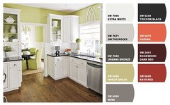
    I found the color on the housebyhoff blog. She used the color in different places and it looks different in each room, very grey, sometimes green and sometimes yellow, depending what she has near it. Thank you Lori, I think that helps give me the confidence to go with that color. What color would you suggest for the trim?

  • 9 years ago

    Lori. Very interesting. but if you put them (the samples) right on the wall which is already painted(in tan, in this case)-won't tan background skew a perception of a color, even if just a bit?

    What background should you choose as to get the most real representation of color possible (given it will still be relatively small sample-comparing to the whole painted space)?


  • PRO
    9 years ago

    What color would you suggest for the trim?

    Considering your cabinets, flooring, and countertops - I'd go with Simply White trim with Vapor Trails walls.

    bthurber81 thanked Lori A. Sawaya
  • 9 years ago

    Thank you..fascinating, and will have to re-read it in detail couple more times(getting older is no picnic lol)..don't want to hijack this thread but I hope somewhere to read about circle vs square

    PS at least don't need to re-read about 80% vs 20%..that I get right away, since here it's pretty simple lol ..of course it depends on location, so all this "timeless" talk about colors doesn't impress me..each place and its timeless. Everybody who traveled around just a bit knows. That's partially why I'll never tire of this subject..it's infinite enough to always amaze you.


  • PRO
    9 years ago
    last modified: 9 years ago
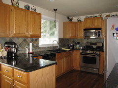
    don't want to hijack this thread but I hope somewhere to read about circle vs square

    In a nutshell....

    The process of choosing wall colors is hard enough and using a square or rectangle shaped sample board doesn't help. Take the edges off so you can focus on the color:

    "A rectangle with sharp edges take indeed a little bit more cognitive visible effort than for example an ellipse of the same size. Our "fovea-eye" is even faster in recording a circle. Edges involve additional neuronal image tools." ~Jurg Nanni, author of Visual Perception

    In my opinion, it also helps mitigate "area effect" which is the phenomenon of how color exponentially grows bigger, brighter and more vivid as it covers more area. In other words, you can use a 12 in diameter circle to effectively evaluate a paint color - you don't need to paint multiple square feet of wall in order to comprehend the color. A circle-shaped sample board is as smart as it is efficient.

  • PRO
    9 years ago

    Yes I would consider painting the brick and surround. I do want to lighten up the space but I'm afraid of ending up with a green that is too "minty".

    Here's a product idea for painting the brick. Been seeing a lot of their "afters" on Instagram - gorgeous.

    https://romabio.com/why-our-brick-paint-is-the-best/

  • PRO
    9 years ago

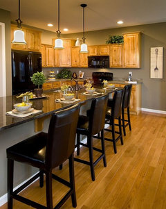
    Like the grey-green with that cabinet color.

  • 9 years ago

    I agree that is a nice color combination but too dark for what I am wanting.

  • PRO
    9 years ago

    Meant to illustrate how greenish-grey is complimentary, not the specific shade/tint.

    bthurber81 thanked mdln
  • 9 years ago

    The other color I am looking at is Sherwin Williams filmy green. I'm afraid that would be too much like a green you would find in a bathroom though. I usually like a little color on my walls. I am not one for white or beige walls. I'm unsure if the vapor trails would provide enough color for my taste.

  • 9 years ago

    Here is SW Filmy Green -

  • 9 years ago

    Take a look at BM sea pearl

  • 9 years ago

    Hi bthurber --

    Another fan of color-color on the walls, but I think your instinct about SW Filmy Green is good. IME the color in My3Dog's pic is pretty representative; in a sunny room the green intensifies.

    Great color -- and I wouldn't limit it to a specific room -- but for an open-floor plan like yours I could see it being a bit too much of a good thing.


    Why not do Vapor Trails or something like it in your K/LR/eating area and then chose something that looks good with your choice but has a little more oomph for your DR?

    Sounds like you could even do a 3rd shade for the foyer if you like.

  • 9 years ago

    Just like I wouldn't paint the kitchen cabinets, I wouldn't paint the brick either. They are features that add a warm character to the space. You could paint the book cases a soft cream though and I think that would give you that brighter happier look you're seeking.

    I think the biggest problem I see with the kitchen area is that the grain of the faux wood floor is fairly busy and is competing with the grain of the cabinets. Since it's vinyle, that could actually be a pretty affordable fix and something you may want to consider down the line.


  • 9 years ago

    Best paint colors with oak

    SW Comfort Gray below or Sea Salt (lighter)

  • 9 years ago

    House vixen and lukkiirish I think you are both right. There is an additional family room that you can't see that is through the dining room and then goes to the foyer. Maybe paint that room the same as the kitchen and living room? I never noticed that the floor was busy and clashes until you said that. I see that now. If I changed the flooring I would probably want to extend it into the dining room as well. I would be more comfortable painting the bookshelves and not the brick because there is no going back on painting brick and the shelves are not the bookcase is not in the greatest shape anyways.

  • 9 years ago

    I think comfort gray is beautiful. I would do samples of it, sea salt and the other two colors mentioned. Paint them on a large board and hang in each room. Funny things is, you could use three colors in three areas and they could all look the same due to lighting, where the room is facing (north, east, west etc) and the artificial lighting in the room among many other things (decor in the room.

  • 9 years ago

    Hi again --

    Seeing your additional rooms I'd just encourage you to get a-goin' with the sample colors then painting.

    With your preferences for color I bet living in a beige/tan box for a year is getting to you.

    One you have walls that contrast with your cabinets, flooring, carpet, and furniture I think you'll be much happier.

    The complex green-grey-blue shades mentioned in the thread are very easy to live with and flexible as far as adding your art, area rugs, etc.

    Good luck testing and let us know how it turns out!


  • 9 years ago

    My thought with sea salt and comfort gray are that they can turn blue depending on the light. You are so right when you say living in a tan box is getting to me! My last house had yellow in the kitchen and living area and orange in the office! I do like bright and happy feel as you said before. The upstairs is even worse because there very few windows and the same color walls alllllllllll throughout.

  • 9 years ago
    last modified: 9 years ago
    Oh man, if you're used to living and loving yellow and orange and are now in sand land...MAYDAY MAYDAY!

    I think you may need a yellow in your foyer, even if it's more of a low-key yellow-tan that coordinates better with whatever you end up with for K/LR/Eating. I find having that hit of sunshine first thing through the door really helps.

    And of course since you have few windows upstairs, yellow and orange are naturals there...

    Since you love the warmer shades, what about adding a little peppier yellow-green to your list of colors to sample for the 3 connected rooms?

    It's really hard to go wrong with any sort of green against wood-tone laminate or cabinets. I mean, it's possible, but the odds are in our favor. ;)

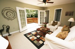
    "Palmetto" below and the other examples I'm showing might be too muted for you, really. You might have to look at spring greens/new leaf greens along the lines of "Shadow Green" or "Sassy Green":

    Photos for forum threads · More Info

    Explore Long Beach Washington, Quotations, and more! · More Info

    Even the complex muted greens can look great paired with a little (or lot) of color! So don't feel a more subtle wall color will lock you into sedateness with everything.

    Pin by House Vixen Design | Customized Color for Places and Spaces on Color insp · More Info

    Evolution of oval tile display board · More Info

  • 9 years ago
    last modified: 9 years ago
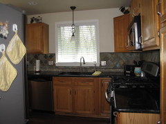
    We have the orangey oak cabinets as well and while most people don't care for them, ours have kind of grown on me and I don't mind them at all. Ironically, we also have a 2 story (colonial?) with the open floorplan where all the walls connect to more than one room. Looking at my cabinets, I'm kind of rethinking the suggestion of Sea Salt and Comfort Gray, they make a great bathroom or bedroom color, but I think you may need a green with more of an olive or earthy tone to it more yellow green than gray green. The color you're considering above IMO is definately on the right track though it reads a little light. I have a SW fan deck and will try to find the color I'm thinking of for you.

    Here's the thing though, I too tend to lean towards color as opposed to the neutrals but that wood tone ended up making it really hard for me to "live" with a color on the walls in the kitchen as well. After trying a couple of different options, I decided to just paint the walls cream and allow the cabinets be the primary color in the room. The difference was night and day; I can't begin to tell you how much calmer it made the space feel. I also ended up carrying the cream into the adjoining living room but only on 2 walls. The other two walls are a golden yellow, one of which carries the yellow into the foyer and up our stairs. When the rooms share walls the way ours do, you really have to get creative.

    Painting the built in shelves that surround the fire place will give those pieces a new life and really brighten the room, glad that suggestion helps. Regarding the floor, sometimes it really helps to snap a picture and look at your space. Some how it allows you to see the space from a different perspective.

    I think the rooms you put new flooring in should depend on the type of flooring you plan to install. For example, if you're going to put in hardwood, for a variety of reasons, it's best to do the entire first level or to at least do as many rooms that you can afford to do all at once. The exception would be the foyer area and/or a mud room which a lot of people like to install tile instead. I say this because if you install a few rooms now, but decide a couple of years later you want the wood everywhere, it will be much harder to match. If you're planning on tile, lamanent, carpet or even vinyl that's a different story because it's not as expensive and relatively easy to change.

  • 9 years ago

    Lukkiirish, I appreciate you looking for the color for me. Would you mind sharing a pic of your cream walls with the oak cabinets?

  • 9 years ago
    last modified: 9 years ago

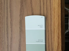
    Sorry for the delay. The greens I was talking about are yellow based colors like SW Softened Green, shown below, or Liveable Green which is slightly lighter. The pic below is Softened Green in a room I found on the internet. I've also posted a pic with a variety of greens that could/would work, including the two I've mentioned. My two favorites are SW Honey Dew and Behr Grass Cloth. Just keep in mind that the lighting in the room is going to pretty much dictate which color will work the best in your room. As you can see below, our kitchen is small and has just a limited amount of natural sunlight, that's another reason I used cream.


    SW Honey Dew.

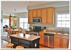
    This is an older pic of our kitchen with the cream (Behr Raffia Cream) for a little contrast, I used a slightly darker color on the ceiling.


    Here is the deck fan swatch against the cabinet closest to the window so you can see the green with it.

    Hope this helps!