

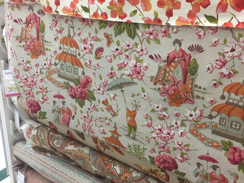
Coordinating fabric
9 years ago
Featured Answer
Sort by:Oldest
Comments (8)
 9 years agolast modified: 9 years ago
Related Professionals
Florence Interior Designers & Decorators · New Braunfels Interior Designers & Decorators · Tyler Interior Designers & Decorators · Sault Ste. Marie Interior Designers & Decorators · Jackson Interior Designers & Decorators · Bloomington Architects & Building Designers · Terre Haute Architects & Building Designers · Westminster Architects & Building Designers · Beckley Architects & Building Designers · Helena Architects & Building Designers · Hilton Head Island Kitchen & Bathroom Designers · Muskegon Kitchen & Bathroom Designers · Pocatello Kitchen & Bathroom Designers · Spanish Fork Kitchen & Bathroom Designers · Anchorage Kitchen & Bathroom Designers PRO9 years ago
 9 years ago
- PRO9 years ago






Related Stories
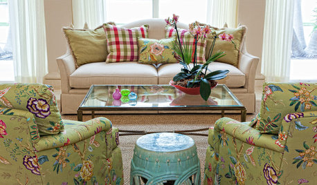
MATERIALSFabric Focus: Bridge Traditional and Retro Styles With Chintz
Decorate with this floral fabric to add color, dimension, romance and more
Full Story
DIY PROJECTSDining Set Makeover: Paint and Tea-Tinted Fabric Make Old Chairs New
Reclaim dated dining chairs for far less than buying new, using spray paint, modern fabric and a handful of tea bags
Full Story
PRODUCT PICKSGuest Picks: Whimsical Fabrics for Little Ones
Give a nursery, playroom or kids' bedroom a playful air with fabrics done up in bright colors and delightful prints
Full Story
DECORATING GUIDESTextile Textbook: Vintage Fabrics Tell a Story
We share a dozen ways to honor the past with heirloom textiles
Full Story
MATERIALSFabric Focus: Decorate With Grain Sacks for Quick Farmhouse Style
Vintage and reproduction grain sack material creates thick, durable upholstery for sofas, chairs, pillows and more
Full Story
LIGHTINGGet Turned On to a Lighting Plan
Coordinate your layers of lighting to help each one of your rooms look its best and work well for you
Full Story
COLORWhat Goes With Red Walls?
These coordinating colors and materials will make your red walls look right at home
Full Story
BATHROOM DESIGNKey Measurements to Help You Design a Powder Room
Clearances, codes and coordination are critical in small spaces such as a powder room. Here’s what you should know
Full Story
DECORATING GUIDES13 Ways With Window Valances
A swoop of fabric above the window hides the hardware and frames the view in style
Full Story



M&M Interiors