Software
Houzz Logo Print
teribrennan

My kitchen has no color....

13 years ago
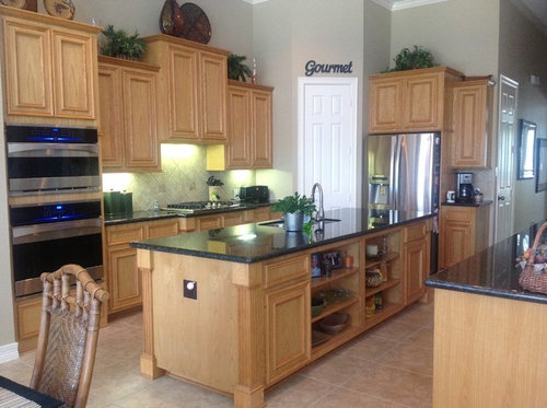
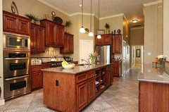
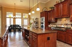
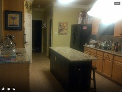
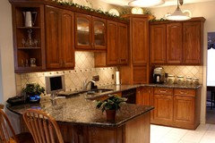
Just remodeled the kitchen. Going to put 3 pendant lights over island, and need some help. should I go with mini pendants with frosted white shades, green, amber, clear? Bronze or nickel rod? Just put the verde butterfly granite in, and all new appliances...still too much brown in the kitchen?

Comments (111)

  • 13 years ago
    My last house in Nevada was a custom, and I had a wood trim frosted glass pantry door. Have not seen any of those here in Houston.
  • 13 years ago
    last modified: 13 years ago
    Too much detail going on already, the stool backs, the dining room wall decor, the dining room chandelier, the dining room chairs, the cabinetry fronts, that white door (please paint that out to the color of the walls, including the other door around the corner), the word gourmet, the back splash, the flecks in the granite. It's all too much detailing already, adding pendant lamps next to that ornate chandelier would be over the top. Sorry to say.

    Lighting should all match when hung in close proximity. Because your dining room lamp is so ornate, you won't be able to hang anything successfully over the island unless it's from the same style family as that chandelier.

    So sorry to say, but that's just my design ethic. You've got a lot going on already, and in different styles.
  • 13 years ago
    Any ideas for the door? I don't think it looks bad as a whole, the crown molding matches and the great room next to the kitchen has built in cabinets and shelves in white as well.
  • 13 years ago
    Same house, different neighborhood. Their pendants work with their chandelier, they have a white door. I couldn't go with same color granite as my cabinets are oak and it would have been too much brown.
  • 13 years ago
    It doesn't quite work that way, the crown is part of the ceiling. Nothing in your kitchen is white, except that door, and the word "Gourmet" is wrong there.

    That white door should have been the same as your cabinetry. Your second best choice is to paint it the same color as the wall but in a pearl or satin finish.
  • 13 years ago
    White door looks badly here too. And pendant and chandelier are from the same family, as I said.
  • 13 years ago
    Thank you for your advice. I have moved five times in four years and just threw in the decor I have acquired at each home when I moved in. Which is why I posted this, for some ideas on color schemes, decor ideas and how to improve the look of the kitchen over all.
  • 13 years ago
    Take your time terri,
  • 13 years ago
    Leonoz, she is looking for help, do you have anything in mind that she can look at.
  • 13 years ago
    last modified: 13 years ago
    Thanks Angela, Leonoz did help a little (other than saying OUCH a couple of times). I will just look for a matching chandelier to go with the pendants and also un-clutter a bit. I have been renting the last four years and had to redecorate each time (based on whatever wall paper or colors were in the rental)
  • 13 years ago
    Nice to be a homeowner again :)
  • 13 years ago
    last modified: 13 years ago
    Sorry Teri for the ouches!

    You can go one of two ways. Either match the new island pendant to the hardware color of your existing chandelier, or, ignore it altogether, define your kitchen by painting out that white door to same color as the wall, paint your kitchen area one shade darker than the great room walls (you can do this because you have defining walls separating your kitchen), it will also make your cabinetry look warmer, and go with a stainless steel/brushed nickel finish pendant to match your appliances. Keep the shades either pure white, or clear glass.
  • 13 years ago
    If you can do the backsplash, look at the one that Geneveive posted earlier.
  • 13 years ago
    There is no other feeling like that to be able to do what you want
  • PRO
    13 years ago
    hello Teri - if you are open to changing out the back splash - I would go with ceramic subway tiles in an off-white which will brighten the kitchen. or perhaps glass subway tiles. The flooring can be laminate in maple. It looks classic. I like the fact that you have taken away the fake greenery from the top of the cabinets. I like your kitchen, and the table in the breakfast nook. If you put a beautiful painting in the nook with bright colors, you could perhaps bring in kitchen accessories pulling colors from the painting. But I like your kitchen. You're on the right track. As for pendant lights I would continue with something similar to the nice chandelier that you have over the dining table as suggested above.
  • 13 years ago
    last modified: 13 years ago
    I think for the backsplash I would like to just put some of the granite in it to tie it in together. For lighting I think staying with the pure white or clear glass is a good idea (less noticeable). I would like the chandelier and pendant rods in simple lines and to match the wrought iron dinette table, bar stools and candelabra. The last house I owned had all wrought iron so that is why I have these items. And they cost a fortune, so I am not replacing. The door...i do not like the idea of painting it to match the walls. Perhaps when I stain the cabinets next year I will replace the door and have it stained the same color. Removing the greenery has helped, will toss the gourmet sign too (it worked in the last rental). Now I have some shopping to do for the island shelves and the top of the cabinets to do as well. Thank you!
  • 13 years ago
    last modified: 13 years ago
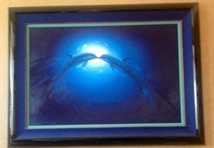
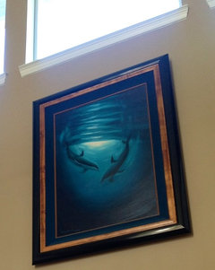
    BTW, I am a Wyland art collector. So my entire house is full of oil's and statues of sea animals. Blues, Green's, Black's. I needed the colors in the kitchen and walls to be somewhat subdued and not clash with the art :)
  • 13 years ago
    So perhaps that might open any suggestions for kitchen decor?
  • 13 years ago
    Wow, I went to play golf and this conversation really expanded since I left. Teri - I think it's a really nice kitchen and the white door is just fine. I wouldn't paint it either. I would probably remove the gourmet sign, but that's about it. I'm not sure I see the problem with the backsplash - it looks nice from the pictures.
  • 13 years ago
    Hope you had a great game Ann!
  • 13 years ago
    I added pendant lighting over my island and used a color to make it pop...I used oil rubbed bronze base and rods with mustard gold glass.
  • 13 years ago
    I usually like things that are unusual and give an intersting look , If I had a kitchen like yours I would choose different colours of pendants .

    http://recessed-lightings.com/2010/12/24/glass-pendant-lights-picture/
  • 13 years ago
    I agree Gen
  • 13 years ago
    Those are cool bullet pendants!
  • 13 years ago
    What about doing a different color for the island? I painted mine black and put the beadboard (sp?) on it. Here is a picture of it. It is not a very good picture and it was in my old house that I sold.
  • 13 years ago
    I had thought about a distressed green on just the island..but worried it might be too "busy"
  • 13 years ago
    I very much like what you have accomplished in this remodel to your kitchen. I would vote to tie the style of the kitchen pendants to the chandelier once they are in such close proximity. I would choose cabinet hardware to coordinate with lights. Next add a long runner on either side of the island and a rug under the table. Then, choose pottery for accessories using colors from the rugs. I think a Tuscany look would be so pretty with what you have going on. Would you like that look?
  • 13 years ago
    You have good ideas, thanks! Tuscany does not go with my art....I am more island look...Tommy Bahamas etc
  • PRO
    13 years ago
    I would recommend not to bring granite into your back splash only because the subway tiles in an off white would be giving it a classic look and the door would be coordinated with that. You will get tired of the bossy granite very soon. I would stick to the subway tiles only and they would work well with the counter top as well as the cabinets and it would break up the two dominant finishes in the space visually. The gourmet sign doesn't really go with the space. For the pendant lights I agree with your idea of going with oil rubbed bronze with clear glass shades to keep the space really bright. You can coordinate your hardware on the cabinets to go with the light fixtures as well as the door. Once the door gets a new hardware it will look good. Good Luck
  • 13 years ago
    What is a subway tile?
  • 13 years ago
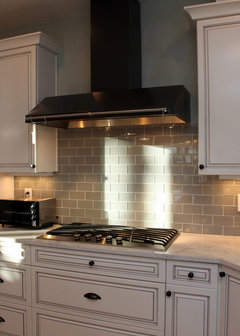
    This is subway tile.
    [houzz=
    White classic kitchen design · More Info
    ]
  • 13 years ago
    @Modern Age Designs, LLC. I'm curious....why doesn't the "Gourmet" sign go with this space?
  • 13 years ago
    I love TB too. Are you on an island or just love the style? Check out Company C for island inspired rugs. I am wondering if the round Porcelain Mocha rug appeals to you? There lots of fun runners. Maybe Ikat Tiles would be a good choice. Until the 31st they have "Buy 1Get 1at 50% off,". Order samples first if unsure.
  • 13 years ago
    Also, white subway tile is sleek and clean but is being overused right now. Here is another idea to consider. I would try a more natural look to create the TB style you like. I used 13" tiles places on the diagonal with 1/8 " grout. Over the range I inserted a 3" medallion accent tile since that space was a bit bigger. They placed it right in the center of a large tile.
  • PRO
    13 years ago
    I love your kitchen . Bring in more colour with your accessories , that way you can change them out to fit your mood or season ... Just a thought.
  • 13 years ago
    last modified: 13 years ago
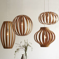
    Bentwood Pendants · More Info


    I think pendants like this would be interesting.

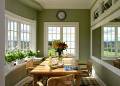
    I would put the color on the walls. It looks like your backsplash is green? If so, deepen that color for your walls.

    I love green with natural wood and black.
    Crisp Architects · More Info
  • 13 years ago
    If you just renovated, I'd imagine that you don't want anymore high cost expenses. The fact is that your kitchen is neutral.The best way to bring in color is by accessorizing. Since the dining area lighting is visible and you want to keep it, use the metal of that fixture as your guide for the metal hinges, faucet and pendant lights in the kitchen. The pendant shades should be at least one of the colors you want to bring in. Painting the wood of the island the color green you mentioned would break up all the brown and look terrific! If you do that, don't use green shades for the pendant lights.The white door is fine as it matches the molding and ceiling...I would not paint it. Some large clear glass pieces (you can find some fun ones at Marshal's or the Home Store) on the top of the cabinets get you started on the style you like... The Tommy Bahama look has alot of blue, green and golds (pineapples) and would go well with your art
  • 13 years ago
    Oh and colored baskets and placemats would help tie in color too. Do you have a nice large bowl you can place on the island countertop? You can put fruit in it...BTW, I love the gourmet sign...especially if you are letting everyone know you like to cook. Have FUN!
  • 13 years ago
    Danak527 has given the best solutions to your request.
  • 13 years ago
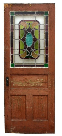
    is the white door for the pantry? i would replace the door with a salvaged wooden door with stained glass --which would bring in different colors (not the newer door with the word PANTRY on it, no way! ;). is it just me or is everyone hanging these pendant lights? it seems like such a fad that will go out of style too soon and in my opinion, chops the room in half. do you "need" the extra light or is it just decorative only? i love the height to the room as is. a colorful bouquet of flowers on the island would do wonders as well! good luck!
  • 13 years ago
    If you zoom in on the dinette set under the chandelier you can see the chairs are bamboo with green palm trees on black cushions, the table frame is weathered iron ropes. Pretty much the theme in my house. I got most of my furniture from South Florida and it goes with my ocean art. The kitchen I stayed with my theme (sand colors, green with accents of gold in the granite) but it just looks boring. Thank you all for helping me!
  • 13 years ago
    I think I will just get the cabinets done sooner than I planned. Dark walnut or cherry? Here is a pic of the granite with a different cabinet color
  • 13 years ago
    I think your cabinets look fine. With Houzz discussions, take from them what you like and can afford. There will always be some that basically say "start over altogether" but many others that will keep their suggestions within a more reasonable scope. If you do refinish your cabinets, cherry is beautiful with greens.
  • 13 years ago
    Teri, I love your focus on this project. The cabinets are a nice complement to your countertop. Pick up a large potted red bromeliad from a nursery. Place it in a special pot and add it to your island. If you like, consider 3 plants in a long rectangular tropical container. Instant tropical infusion. Ps: these are easy care plants:)
  • 13 years ago
    That is a beautiful kitchen. One of my friends has hand-blown glass pendants in the same place. They are in beautiful colors, and look like works of art.

    I would also get 3 large pieces of art to go above the cabinets, and hang them all at the same height. The smaller plants, the disparate pieces, and all the different heights are kind of confusing to the eye. The symetry of three large , but simple dramatic pieces would anchor the room. If you like the idea of colored pendants, you may be able to find some coordinating glass pieces for the wall. Nothing framed, you have so much wood, and square pieces. You could add a small up-light on the cabinet top, to focus on anything you may use. Beautiful remodel job.
  • 13 years ago
    Your kitchen is beautiful! I prefer the look of the oil rubbed bronze pendant lights above the bar. I have an idea for the white pantry door....purchase a thin board cut to the size of the door and attach with liquid nails to create a smooth surface (or buy a smooth door). Then paint with chalkboard paint and use to write menus or fun notes for the family. I also have an idea for the backsplash above the stove...instead of painting or replacing tile...you can hang a beautiful large decorative platter or plate, a large ornamental iron piece or faux ornamental iron. There are so many options depending on your design preference. I hope this helps :)
  • 13 years ago
    last modified: 13 years ago
    Hi Teri - I have skimmed the comments so I am sorry if you have already said that you are married to the breakfast nook chandelier. Sometimes we limit ourselves trying to coordinate with something that does not actually jive with our vision of the room and even though we are saving money we are making our lives more difficult. I did this myself with a light fixture I fell in love with for my office, but it just did not work. I like your breakfast room light, but you say your style is not Tuscan and that has a more old world feeling to me, as opposed to the beach vibe it sounds like you are going for. I think what I would do is set aside whatever my lighting budget is and try to find coordinating pendants and breakfast nook light. You can always try to sell on craigslist or reuse elsewhere. If you are open to this, I would love to throw some ideas out there.
    I also don't like when people respond to a design dilemma by suggesting very expensive do overs, but lighting can be an easy fix so I hope I have not done that to you!
  • 13 years ago
    Another thing I noticed was the lack of hardware on your cabinets and drawers. I think adding some will help to pull the kitchen together beautifully and you may change your mind about refinishing the cabinets.
  • 13 years ago
    Clean bright light is a popular choice in the kitchen with fluorescent bulbs being ideal. For directing light around the room, track or recessed lighting is useful.
  • 13 years ago
    I think your kitchen is beautiful. I tend to go for color but these neutrals look perfect! Don't change the door, it matches the trim. I would take the suggestion of choosing some different accents. Take your time with it. The biggest part is done and its great!
Sponsored
Bella Casa LLC
Average rating: 5 out of 5 stars17 Reviews
The Leading Interior Design Studio in Franklin County