Software
Houzz Logo Print
raphaelo

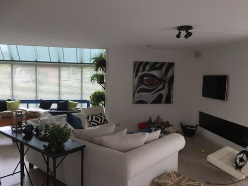
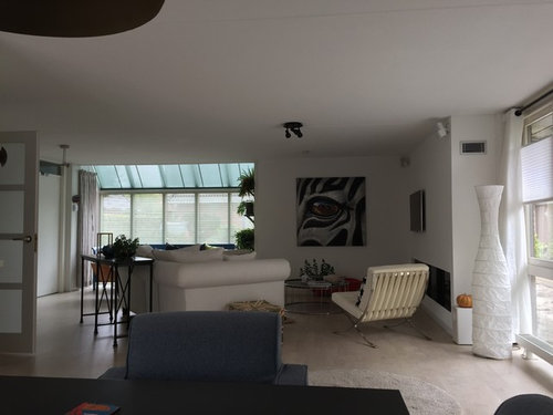
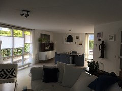
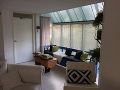
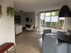
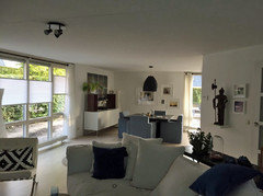
Something is wrong here, but what?

9 years ago
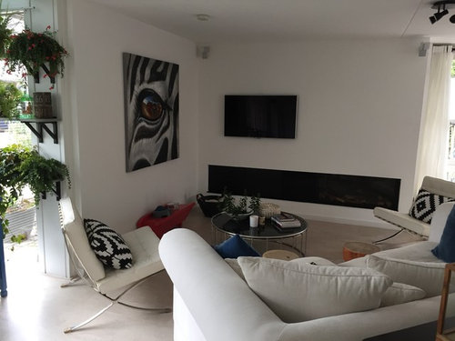
Hi,

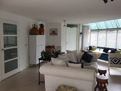
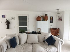
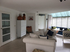
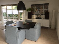
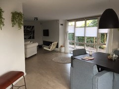
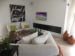
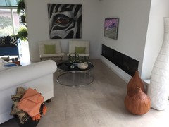
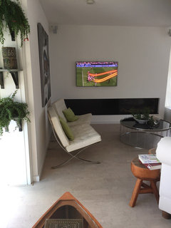
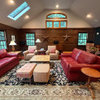
On most pro photos on Houzz everything looks right. We still have this corner that does not feel/look good. Im looking from our dining (3rd photo)

Who can tell me what is wrong at this last photo here?

Comments (55)

  • 9 years ago
    The couch is angeled because it's huge and we don't want to black the dining area
  • 9 years ago

    If you're just doing this for pictures/staging, what's missing is light. You need to light that corner. That will help it pop. I see you have some sort of ceiling fixture that looks like it could be aimed? Or, you could always do an uplight on the floor behind the basket. I love your furniture placement. But, I also would recommend moving the TV -- lowering it to about 10" over the fireplace -- aligned with the left side of FP. Then, you have options with the right side of that wall. I love a gallery wall there , but since you have a very modern esthetic, you could leave it blank. PLUS -- you might consider adding a graphic area rug to define that area. Great space!

  • 9 years ago
    last modified: 9 years ago

    Have you tried switching the canvas and the tv. Only center the canvas over the fireplace. To me it also seems like the size of the chairs and coffee table don't go well with the couch. I would also straighten the couch to face the fireplace and remove the sofa table, it seems too large.

  • 9 years ago
    It looks very antisocial: it's dark, and it's hard to get into. Surely St. Television would be better placed in another room. The eye art would be better in a place (?hallway?) where it doesn't attract such constant attention.
  • 9 years ago
    I have my TV centered over my wood burning fireplace, has been for 2 years and havn t had a problem. I think balancing out the TV and picture, adding light too! Beautiful place
  • 9 years ago
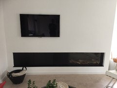
    I can't move the tv because of wires behind it. The couch is also on angle because there is a aligned wall behind it.
  • 9 years ago
    First your sofa table should go against the wall and have your sofa straighten perpendicular you seem to have enough room from your dining space and living space for it. Have the Barcelona chairs set against the pictured wall in an angle
  • 9 years ago
    I have read on houzz that we need something behind a free standing couch
  • 9 years ago
    then maybe just balance it with modern artwork? Or maybe just adding light to that area. Love your fireplace, I'm jealous!
  • 9 years ago

    Never mind looks like you already changed everything...yes I know I was referring by the first few pictures you post...did not know you added more furniture to this room

  • 9 years ago
    Claire, rotating the couch perpendicular is not a real option with this one. You would see it when you are here. By rotating it one end will meet a wall.
  • 9 years ago

    I like your home, it's unique and very pretty!

  • 9 years ago

    If heat from the fireplace is a concern, move the TV to the adjacent wall, where the picture is now. Wires can be moved. To be honest, until you solve the problem with the off-center TV above the fireplace your room will always look weird. If you are doing this just for staging, remove the TV entirely.

  • 9 years ago
    The cabinet/construction and fire place are designed to have a tv there
  • 9 years ago
    How can I balance the room?
  • 9 years ago

    The angled couch works. Not so sure about the chairs. I might put one of them flat on the wall under the art.


    But the two things that stand out to me are the TV so high over the fireplace and the sofa table behind the couch. The sofa table and its stuff is antithetical to your minimalist vibe (and no, you don't have to have something behind the couch if the back is attractive enough). The whole art/TV/fireplace vignette is a bit off balance. Can the TV be lowered?

  • 9 years ago

    The wall behind the sofa could use a little work too, but that's a different dilemma. Let me see what I can do with your TV corner.

  • 9 years ago
    Very simply, you need some color. I would add a colorful painting (or at least SOME color) on the wall over the fireplace, to balance the "black hole" of the tv, and a few accessories in color....a ceramic bowl, an interesting vase, some colorful books, whatever you like.
  • 9 years ago
    I like your place. Now things make more sense w other pics you posted.
    You seem to have a lot of stuff for the minimalist style of your home.
  • 9 years ago
    last modified: 9 years ago

    Personally, I like your TV not centered over the FP at all - more of an asymmetrical look which goes nicely with the modern vibe. The window featuring the next door neighbor's wall could have a window treatment that fuzzes the wall a bit - like a silhouette window treatment (Hunter Douglas type). The things that jump out at me are: too little lighting and too much stuff on your horizontal surfaces. That's it. Otherwise, I really like this room.

  • 9 years ago
    I would choose different pillows for the chairs; a solid color. The ones you have compete for attention with the eye picture. A lovely vertical plant to the right end of the fireplace would help balance the placement of the tv. It would also help soften the stark horizontal line created by the fireplace.
  • 9 years ago
    Raphealo

    I meant turning it so the back of the sofa faces the dining area..how wide is your couch and what is the width between of the door wall to the opposite and which pic is the latest.
  • 9 years ago
    I would also completely remove the table behind the sofa. The vertical lines of it's legs compete too much with the tall vertical lines of the windows in the next room and the vertical lines on the backs of the chairs. You are trying to cram far too many items into a small space.
  • 9 years ago
    The couch is about 2.5 meters . But to give you a sense of scale: in my first post is a floor plan (the furniture is different from that plan). Thank you for Some good advice and think abouts so far. I will keep Reading and looking for examples.
  • 9 years ago
    Thank you Trisha, your remarks are very specific (problem/solution) and helpful.
  • 9 years ago
    @Raphaelo

    in your pics there isn't an angled wall and the furniture layout is not bad the first thought came to my mind was to straighten your sofa the way it is in the floor plan and have the Barcelona chairs face each other on each side of the sofa but you have a pic with a tall cabinet in picture is that still there
  • 9 years ago
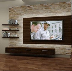
    How about adding wood and stone to fireplace wall to add some warmth to the room - here is an example of a modern look that might finish the room
  • 9 years ago
    last modified: 9 years ago

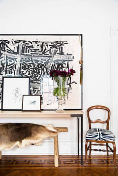
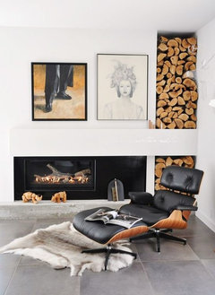
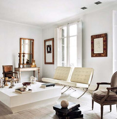
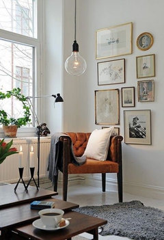
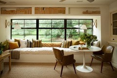
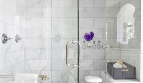
    Your room feels unbalanced and awkward. Really hard to tell, given the slanted wall (which doesn't look like its affecting anything), but I would move the console table under the large artwork (see 1st pic) and add a lamp, as you need better and low lighting. You don't have to have a table behind a couch and this will free up space/feel less cluttered. Edit your accessories (less is more) and consider more impactful pieces than lots of small things. Above fireplace, add 2 large prints one above the other...the tv is overwhelmed with the large space (see prints in 2nd picture for a great look that suits your room). Try Barcelona chairs side by side facing the artwork (3rd picture...really complimentary). On the back wall I would remove all items from cabinet and place the two vases on floor near fireplace. Place the cabinet across the corner, move chair to its left and combine all of your prints to make a collage and that wall will feel more grounded and feel more part of the room vs a back wall. A new ceiling light to replace your spotlight (see last picture for a nice style). Maybe consider painting the window seat/lower wall white and add cushions that better tie into your space. Imagine the pictures below for the feel of your room - organic/modern. Experiment, bring home items and test them out, and take your time creating a wonderful space.


  • 9 years ago
    I also like the off centered look of the tv. Can you lower it though. It looks a bit disconnected up there. Love your room!
  • 9 years ago

    The sofa will look better without the sofa table and with the stools moved somewhere else. I like what you've done in this room, but I think you need to edit and rearrange a bit.


  • 9 years ago
    Thanks you all. You have exposed the issues and gave me options. I will try to find more ideas in 'photos'.

    New suggestions are always welcome!
  • 9 years ago

    Raphaelo

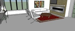
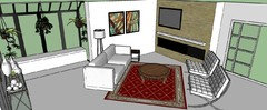
    this is the layout I came up with just to give that space some room

  • 9 years ago
    Now I understand. It makes it more open like that. I like the idea but below the tv are two doors for equipment. Furniture against that wall will block it.
  • 9 years ago
    Maybe paintings like that will balance the tv more
  • 9 years ago

    Raphealo

    Can you take a picture of your full dining room

  • 9 years ago

    maybe you had it right the first time going diagonally but just in the other direction like this

  • 9 years ago
    Dining area
  • 9 years ago
    And the other side with another seat
  • 9 years ago

    raphaelo, you've done a beautiful job with these rooms. Perhaps the TV wall can be solved by something as simple as this:

    I do want to come rearrange all your art, though. Much of it is hung too high and some of it seems hung a bit haphazardly. I would lower the grouping behind the dining table so the lowest piece is just above the back of the chair.

  • 9 years ago
    Raphealo

    I as well think you've done a nice job with the space but maybe you can bring the art you have in the dining room to the living area and the zebra to the dining have tried that also back up your dining table and chairs an inch. Your dining table would be centered with your buffet table
  • 9 years ago
    I think we placed art high because we wanted to optical lift the low ceiling.
  • 9 years ago
    Your ceiling does not look high because you hung the art high. It just makes things look off. Your house is beautiful btw... you have beautiful things you can rearrange to make things look awesome, like you see on Houzz! But try to get rid of some things bc I see too many things that makes things looks cluttered.
  • 9 years ago
    My two cents: the walls are out of balance with the furniture. I would get bigger picture or frame the eye (if you like the eye you keep the eye!!!! ) so it looks bigger and put something up next to the tv. Additionally I would consider a contrasting accent wall color, a warm tone, to really make it pop.
  • 9 years ago

    If art is hanging over a cabinet or seating, it generally goes 5" - 8" above so the pieces are connected. If there's nothing underneath it, art goes at eye level. Remember that in a dining or living room, that means seated eye level.

    Hanging your pictures too high actually emphasizes a low ceiling.

  • 9 years ago
    Update
  • 9 years ago
    One more
  • 9 years ago

    That's even better Raphealo

  • 8 years ago
    I repositioned the tv, the chairs. Thank you for your advice..
  • 8 years ago
    Your Welcome