Software
Houzz Logo Print
waltonglade

Advice on choosing kitchen flooring

9 years ago
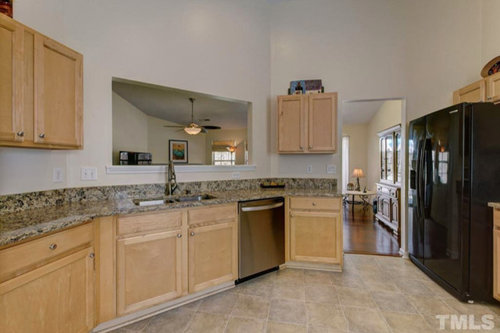
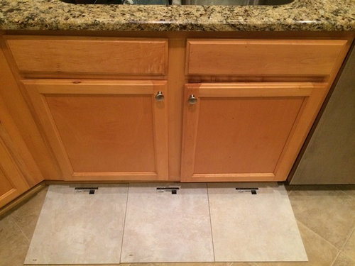
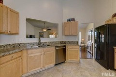
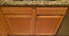
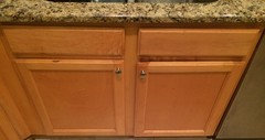
Here's my kitchen.

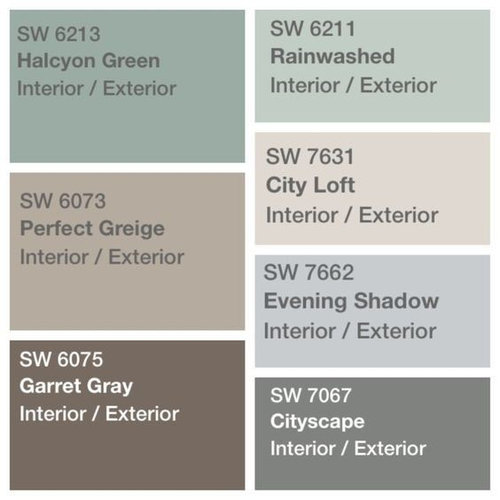
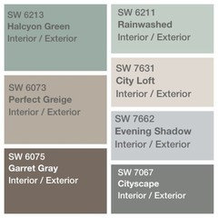
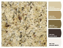
With advice from Houzz folks (thank you) I am planning to add accent walls and accessories of Rainwashed/this palettte

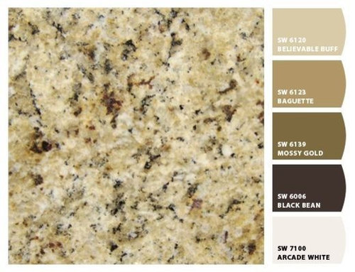
and a simple tile backsplash in a neutral color from this palette, to tie in with the countertop

Looking for advice on flooring now. My current options are attached. Granite and cabinetry will stay as is (limited funds).

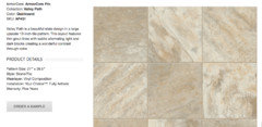
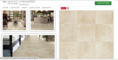
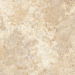
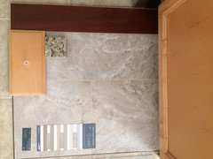
Which of these three floor tile options looks best (shown in evening and morning light)? I know they are plain but the room gets very little daylight so I can't do dark flooring, or match the wood in the adjoining space. Thanks

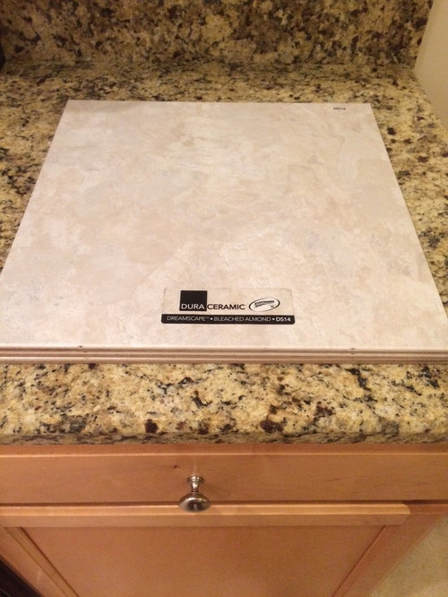
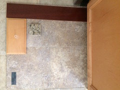
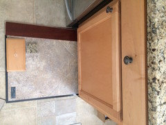
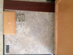
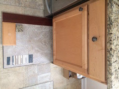
Bleached almond- morning light

Bleached almond- evening light


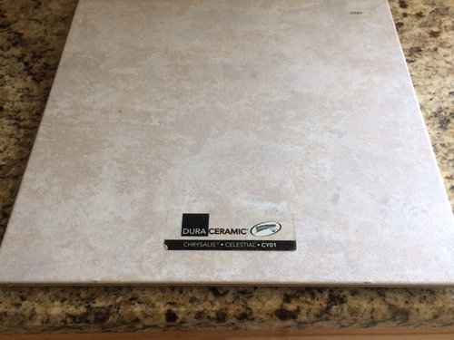
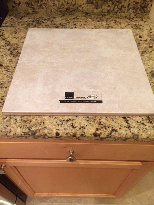
Celestial - morning light

Celestial - evening light

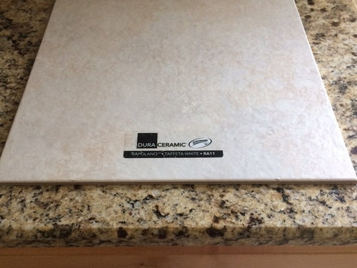
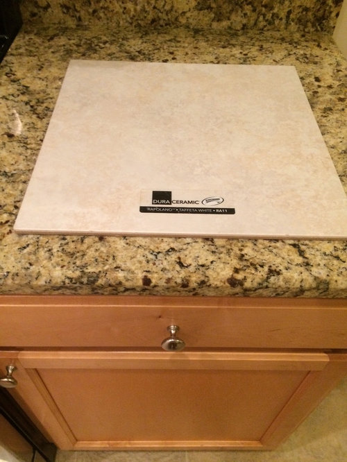
Taffeta white- morning light

Taffeta white- evening light

Comments (51)

  • 9 years ago

    Thanks, ideally I would like to do that but the kitchen has extremely limited natural light and is fairly dull already, so I feel like I really need to keep it light and brighten things up with some color on the walls (and replace the fridge for SS when it eventually dies..)

  • PRO
    9 years ago
    last modified: 9 years ago

    Stay away from the center tile, too much red undertone which will look pink and could fight the coloring in the counter. The tile on the left will give a cooler appearance in the room while the tile on the right will make the space feel warmer. Personally, I'm torn between the 2. Either one would look nice.

    Ceramic or porcelain are great for floor use. Make sure the products have a PEI rating of 4 or 5 (commercial ratings) for best strength of tile. Ceramic is perfect for a kitchen or any other floor application of the home.

  • 9 years ago

    Thanks Flo, these are DuraCeramic LVT. It would be much easier if I could just start from fresh with what I want but only if I win the lottery....I'm starting to get disillusioned with it all now! I'll see what else I can find

  • 9 years ago

    Thanks Cinar, these are vinyl. I too was leaning towards the outer two- one is more beige, the other more cream.

    I know that colors vary so much with different computer monitors so it's really hard to tell but I'll take a fresh look tomorrow just in case one of these could work - I have to return the samples then. If not it's back to the drawing board.

  • 9 years ago
    Please don't go with a dark floor. From experience it shows EVERY spill, paw print and dust bunny. My MIL had white tile installed In her kitchen and immediately regretted it because it too shows every tiny spill or crumb. I am not advocating ignoring dirt on your floors, but unless you want to sweep or vacuum several times a day, choose a midtone.
  • PRO
    9 years ago

    Vinyl huh? Well, it had me fooled. The name DuraCeramic is a special type of ceramic that is constructed similar to porcelain. Interesting.

  • 9 years ago

    I;m sorry, no you are completely correct- it's not vinyl. I was looking at LVT before I was put onto Duraceramic and I got my terminology muddled. Thanks for clarifying. I need more sleep.... I'm glad it sounds like the material is a good option.

  • PRO
    9 years ago
    Who said this was going to be easy? Lol. Look for creamy, warmer color if you want to stay in tune with cabinets, etc. avoid cool tones like grays and whites.
  • 9 years ago
    last modified: 9 years ago
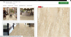
    Relsa- I agree on the dark floors. This is my first time in a place with wood rather than carpet and it's been an education (the floor was already laid when I bought the house). I have cats and yes everything shows up, especially the fluff (dark floor + white cat = lots of maintenance). But the cat stays....:-)

    I think the DuraCeramic has enough pattern to it that it can hide a lot

  • 9 years ago

    Thanks Flo. I always imagined that BUYING my first house would be the hardest part. I think that knowing what color to paint it has been more stressful! I really appreciate all your input, I am learning a lot

  • PRO
    9 years ago

    Ok so DuraCeramic is a fantastic ceramic bodied tile, constructed similar to porcelain. DuraCeramics are fired at the same temperatures as porcelains, have the same fire glazing, have a breaking strength of 400+ lb per square inch and are frost resistant. This ceramic bodied tile is perfect for outdoor installs and will resist freezing temperatures. Another great thing about this tile is that it is at a ceramic price point and not porcelain. This is an excellent product you have, no need to shop around for a better quality as this product more than likely is rated for commercial use. Excellent choice.

  • 9 years ago

    Thank you Cinar Interiors- looks like I should go back and reconsider some more options from that range. Much appreciated

  • PRO
    9 years ago

    I think your decision would be made EASIER if you painted up a colour swatch somewhere by the floor. Then put your tile choices on the floor and then walk away - and turn off the lights. Leave the tile samples there throughout the day. As the day light changes, you will "see" something that you DON'T like. Excellent. Take that tile and put in the "don't use" pile. Now keep going with the experiment until you are down to 1-2 tiles. Now choose the one you like the MOST out of your choices (if you have more than one left).

    The paint on the walls will have a HUGE impact on this space. Without the paint swatch, you could be stuck with an ugly surprise. Paint is easy to change...but it is still more work and more money to do it. A little forethought today = best chance of success tomorrow.

  • 9 years ago

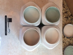
    Thanks, all makes good sense. I went out and bought tester pots of four paint colors today (the upper four of these).

    Unfortunately I now have to give the floor tile samples back but I can always ask to borrow them again. I only have those three designs that were anywhere close to what I was looking for, so at this point I'm looking for MORE options rather than trying to narrow them down.

    That said, once I have those paint ideas tried out maybe it will all make more sense. I'll paint some card and stick it up for a few days.

    I also started looking into whether I could reasonably have the existing hardwood put through the kitchen, though I still feel it's too dark, and I'm not certain it actually 'goes' with the kitchen. It's engineered curupay and is no longer available. I know it's said to be possible to match in but I think realistically that will be beyond my budget anyway. We'll see.

    Thanks again for your input. Hopefully the paint will give me inspiration.

  • 9 years ago

    On my monitor your granite has warm tones. I see some yellow/gold. The paint colors you are looking at are cool tone and cleaner.

  • 9 years ago

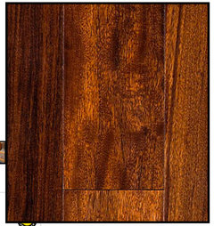
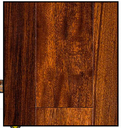
    I was able to find a decent photo of my existing engineered hardwood floor (which is in the main living area). Ignoring the logistical issues for now, would it even work color-wise to have this extended through into the kitchen? To me, granite maybe yes but cabinetry no...which brings me back to feeling like it's the cabinets that I don't like.


  • PRO
    9 years ago
    There appears to be a good bit of gold tones in the wood flooring so I think it would work well. Your existing cabs are yellow/gold, your countertop has golden look so I would do the wood look in your kitchen. It will integrate your spaces and be a big selling point in the future.
  • 9 years ago
    last modified: 9 years ago
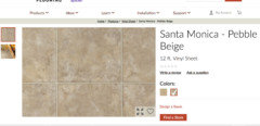
    Thanks very much Flo. Wish you lived next door!

  • 9 years ago
    last modified: 9 years ago
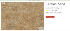
    I've now established that this wood floor hasn't been produced for years and it seems there's little chance of tracking it down. Given that it's engineered I understand that this poses more challenges with matching than real hardwood does. What's the general opinion on whether this is do-able in a way that doesn't look obvious? It's Curupay (aka Patagonian Rosewood), Warm Cognac. I'd need about 400sq ft. Thanks

  • 9 years ago
    last modified: 9 years ago
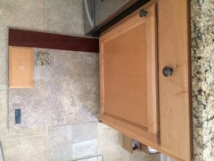
    I should add that this is a $180k cookie-cutter house so doesn't warrant a huge investment. I would consider laminate etc if it made the area more presentable

  • PRO
    9 years ago

    Since the flooring can't be matched, that means you have to go opposite for least cost and best look. I would go a medium gold/beige floor in a material that is least cost for the best look. Just not worth more money if you aren't staying for a long time. Bummer, but trying to match that flooring will never work. It will look like a "miss" and it will be. Haha! OK, moving on, let's find one that does work!

  • 9 years ago
    last modified: 9 years ago
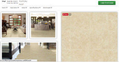
    Thanks Flo that was exactly my thinking. I'm heading back towards simple sheet vinyl that will get me away from the existing utterly loathsome floor and towards a more coordinated theme, but without major expenditure. Then I can live with that for a while until I decide if I want to invest more into it down the line. I found three that I think may be more along the lines of the suggestions I have been given.

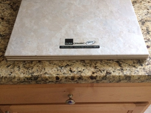
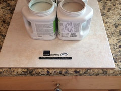
    I also went out and bought four SW wall paints from the palettes above, to get me started on ideas (these are sitting on top of the Duraceramic tile I originally liked). Pale green is Rainwashed, darker brown is Perfect Greige. I can certainly make use of these paints elsewhere in the house if not in the kitchen

    So- here's what I have now in terms of possible directions, along with key pics from above for comparison (keeping in mind the kitchen cabinets and granite, and the wood floor in adjoining room, need to stay).

    Anything any good here?

    Thanks so much!


  • 9 years ago

    um, is there a problem with the current floor? it seems like you're making big expenses for yourself when your current finishes all work ok together. I'd rather find a paint palette that will harmonize, rather than trying to retrofit a floor!!

  • 9 years ago
    last modified: 9 years ago
    The current floor is very old and is damaged so needs to be replaced regardless. The paint is intended to brighten up the room a little as it is currently rather gloomy.

  • 9 years ago

    I don' think any of the tile samples you have are going to work - they are all too light and pink and it's that much more apparent when you sit them on your countertop. I think a better plan would be: If you possibly have a piece of the countertop anywhere, take that with you and, if not, then take your color swatches for your backsplash. You made a good choice there because they all relate well to your granite. Your floors need to relate to your granite as well and I agree with other posters who suggest going a bit darker. Then, when you get some new samples, do as suggested by placing them on the floor and looking at them at different times a day. Don't put them side by side on the floor and the best way to view each of them is against a white background so you're not getting interference. Try the samples beside your wood floors as well. And please don't choose a busy patterned floor tile because you think it will hide the dirt. It only contributes to your kitchen looking like a hot mess. Also, I'd stick with the Rainwashed for the walls. The greys and greiges don't work at all with the warm colors in your countertop.

  • 9 years ago
    last modified: 9 years ago
    All sound advice- thank you. I'd be glad to see some examples of flooring (any material) that does potentially work (with the granite, cabinets and adjoining wood floor), if anyone knows of anything. That would really help me to get a good idea of what to look for.

    For example, what Cara Lewis-Watts mentioned above looks really nice, I agree, but I don't think it would work next to the existing hardwood floor, since they are similar but not enough to blend in, and not enough contrast to look intentionally different. I agree with Flo in that it really needs to contrast with the adjoining hardwood, so realistically a stone-look would be better than a wood-look. And yes, minimal pattern, definitely.

    Thanks

  • 9 years ago
    last modified: 9 years ago
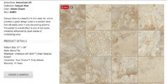
    Here's a few more I found that are darker. Some of these were suggested to me in a previous post. Is this more along the right lines, do you think? They mostly still look a little too red rather than gold to me but that may be my monitor.

  • PRO
    9 years ago

    I like the mix of light a darker in the Odessy - Maui and I like the Limestone laminate if you go that material direction. Most of these would work though, so get some samples to test with your cabinets etc. That is the only way to be sure of the colors. Colors on the Internet are pretty inaccurate.

  • PRO
    9 years ago

    Make sure to settle on your flooring before you select any paint color. Backsplash too if you are doing backsplash. Just make sure on the flooring first. Paint is last.

  • PRO
    9 years ago

    btw, the SW paint samples are eggshell finish, so be careful using them on walls, they are not meant for doing walls, just for sample boards. Now an eggshell finish in the kitchen might be good in areas that will need wall washing, but if you do a backsplash you don't need it. Flat finishes are nicer looking.

  • 9 years ago

    carry the hardwood into the room? just a thought.

  • PRO
    9 years ago

    She explained the wood in other room is not available and matching is a problem.

  • 9 years ago

    None of those options in the main post really work with the color palette. If you can't extend the hardwood, what you put in won't be much better than what's there now. Just spend the money on changing your fridge to match your dishwasher. Whiten up the color of the place and change over to Decora fixtures in the wall. It will look much better.

  • 9 years ago

    Thank you so much Flo, that really helps, now I have an idea of where I should be aiming with the floor and I think the rest will follow. Now if I can just persuade you to move in next door.....

    Greatly appreciated!

  • 9 years ago

    You are lucky to have found a Pro in Flo who is very generous and right on with her advice. You have to get the floor right. Color expert/designer Maria Killam says your floors should be like a pair of denim jeans - they go with everything. but that can only happen if you get them right to begin with or work with them properly to begin with. And paint should be last. I agree with Flo - of the new tiles you'e pulled, I like the Odyssey - Maui best. But that's on the computer and in pics. The only way you can know is to test it. AND IT IS NOT EASY. A couple of years ago, I went through the exercise (days, weeks and months with great help from my rep at the flooring store) in preparation to refloor my #10 envelope floor with way too much 30-year-old truly neutral beige carpet and too many stamps and stickies of pinky beige tile. I finally found what I believed was the perfect 12x24 tile for my entire house. The rep allowed me to keep the sample and I moved it all over the house and checked at different times of day. I finally realized that one piece of tile was not enough to give me a real feel for how the floor would actually look in my house so I bought a box of the tile and repeated the "move around" exercise. In the end, while I realized I had picked the perfect tile in color, undertone, pattern, etc., I didn't like the overall look of a tile floor all over my house. So back to the drawing board with only the cost of a box of tile and a lot of time but no costly regrets. Although you're having some difficulty now, you asked for and you're getting great advice and I believe you are absolutely on the right track. Good luck on getting Flo to move in next door or at least send over a clone of herself.

  • PRO
    9 years ago
    Hey! I am right here next door thru the magic of the Internet. Great point by (above commenter I forgot the initials used. Forgive me I am on iPad so can't see name). But once you find one you think is best do get a box. Returnable if possible! That way you can layout a block and assess close to wood and close to cabinets.
  • 9 years ago

    Thanks yytcm, that's useful advice. You are so right, one tile isn't nearly enough to get a good feel for how a product looks, especially given how much variation there can be from one tile to the next.

    And thanks Flo-Pro, I'm so grateful for your time and insight, and also your patience. I have no idea how you get anything done with all the time you spend giving out advice

  • 9 years ago

    Firstly I hope all folks in Texas are safe

    I'm back with more flooring samples....waiting on more. I'd be grateful for opinions as to whether any of these look more promising than the ones I originally picked (above). All these below are Shaw vinyl tiles.

    To recap- existing kitchen floor is sheet vinyl and damaged so needs to be replaced. I'm not doing any major remodeling, house is entry level value.

    Looking for budget-conscious flooring option that's not overly busy (hard to find...), which works ok with the cabinets (maple- staying) and granite (also staying- Santa Cecilia/New Venetian Gold- not sure which), and the hardwood in the adjoining rooms (cognac engineered hardwood- staying, unfortunately can't be matched in to run through the kitchen as well). Thanks in advance


    #1 Fiji


    #2 Cashmere

    #3 Centennial


  • 9 years ago

    Interestingly in all these pics the tiles look far more pink-ish than they really are. So maybe I need to wait for better light. Any thoughts appreciated in the meantime

  • 9 years ago

    Here are stock pics of the tiles, which look more true to the real color


    Fiji

    Cashmere

    Centennial

  • PRO
    9 years ago

    Centennial unless you can find one even lighter. Worry a bit about too much gold and yellows?

  • 9 years ago

    Thanks Flo- of these I definitely like the Centennial best. Do you mean you'd worry about the other two, or all three?

  • 9 years ago
    I would try to find a hardwood that matches (or complements) the living room. It might take time - but, by far, IMHO, the best option. Patches of different flooring (both in material and colour) tend to "cut up" the layout and impedes the flow. Anyway, just one opinion ....
  • PRO
    9 years ago

    I meant all three have a lot of yellow undertones. But Centennial is the best if it is good in your light. Wish color on monitors was more precise but alas kind of a crap shoot!

  • 9 years ago

    Thanks jdtm1. Would you be able to show me an example of what you would suggest? I agree that ideally all the flooring would be the same throughout but it's just not feasible. What kind of hardwood would complement rather than clash?

  • 9 years ago

    Realistically, I'm really not loving any of those three options, they all just seem to add to the gold/beige-ness and the busy countertop pattern. Would you say these last three are more suitable than the first three (Duraceramic tiles) I mentioned in my original post, or less so? I'm struggling to get a good handle on what colors to aim for and what to avoid.


  • 9 years ago
    last modified: 9 years ago
    Flo thanks for your reply, for some reason it only just showed up.

    I read in another post that you are in an area of Texas where things are pretty rough right now, I hope you are doing ok. Best wishes to all those affected.

  • 9 years ago

    Paint your walls, change the door hardware to satin nickel, spend the floor money on a stainless fridge, the floors are not really the issue in this room.

  • 9 years ago
    last modified: 9 years ago

    As I mentioned earlier the flooring is damaged so I have to replace it, regardless of anything else. It's not the best looking kitchen, for sure, but it's my first house and I'm keen to learn as much as I can from this exercise. I'll keep looking