Software
Houzz Logo Print
ms_vivlee

Need help with our backsplash! Too busy?

9 years ago
last modified: 9 years ago
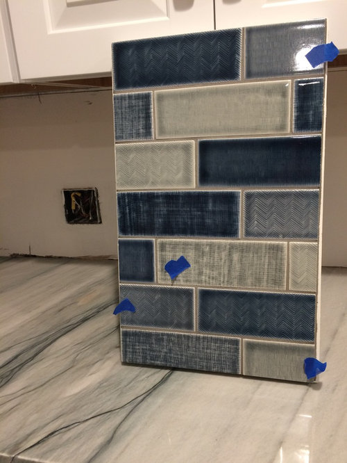
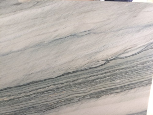
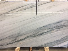
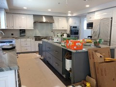
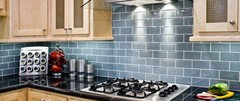
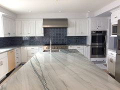
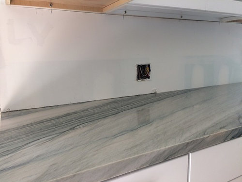
We could really use some help with our backsplash! We chose this beautiful quartzite called, "Florida" which has lots of grays, dark blues and subtle shades of sage. We don't want white subway and we don't want green. We're hoping to pick up the dark blue streaks in the stone. While the stone itself has lots of character, we hope that our backsplash will have its own character and uniqueness without overpowering or competing with the stone. We found this beautiful tile from Pratt & Larson that we believe compliments the colors of the stone nicely. (See photos....please excuse the messy kitchen, we just moved in!) The sample board had 3 colors with 3 different textures in it. While we love the sample board on its own, we feel it could be too much for the stone. P&L offers about 10 different textures. We're thinking of paring it down to possibly 2 colors and 2 textures and maybe throwing in some solid colors to tone it down. What do you think? Still too much? Thanks, any advice would be greatly appreciated!! (the tile is on the P&L website - see link) http://prattandlarson.com/product-category/field-tile/textured-field/ ......oh, and we have light gray on our walls, but there's not much paint in the kitchen, just in the adjoining great room.

Comments (16)

  • 9 years ago

  • 9 years ago

  • 9 years ago

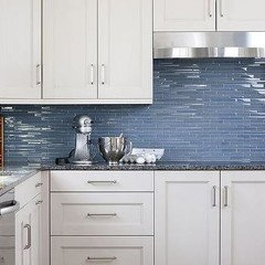
    I personally find the backsplash way too busy as it is, but LOVELY countertops!! my first thought when I saw the pic: deep blue glass backsplash to really bring out the blue in the counter, so the counter takes centre stage. However, if you are really leaning towards more colours and textures using the one sample board I would personally choose the tile in the bottom right (looks grey? taupe?) and do an accent strip in the dark blue (I prefer the solids, I think adding texture is too much imo).


  • 9 years ago

    Hi Steph! Thanks so much for your input! Initially I was thinking stacked glass tile and then maybe a herringbone over the range top. It's still a consideration, but I haven't found a complimentary glass tile yet. I hear what you're staying about being too busy.....but ideally I'd like to find the balance of unique and toned down too. Don't know if it's possible! :-)

  • 9 years ago

    Oh, and btw, the bottom right tile (the one with blue tape) is a gray. It's so pretty!

  • 9 years ago

    Your stone is gorgeous

    Love the tile too..I think it's a great idea to choose a slightly more subdued combo..maybe one color, different textures? say blues? can Pratt and Larson give you samples of separate tiles so you can play with them, in different combos, see more how it works in your kitchen next to your stone?

    even though with such a quality tile, even picking one will give you enough of this slight variation..

    but I think the best way is to get samples and lay them out, vertically of course.and you know..just to stare at different combinations for a while:)

  • 9 years ago

    Great idea! I am actually coming up with a combo to do just that! I'm thinking the light blue or light gray in one texture or maybe one texture combined with a plain one. They are all so pretty, it's hard to choose!

  • 9 years ago

    I'm so confused because 2 different people at the tile store said to use exactly what the sample board shows, but my gut says it's too much!

  • 9 years ago
    last modified: 9 years ago
    How did these two people impress you otherwise?

    I met two amazing-amazing!-designers in two different tile shops(both very upscale). It was like seeing magic. The space didn't even exist yet..I started describing it..in a very awkward way..and that lady, she just started drawing as I spoke..that was the first time when I actually saw my future bath..three-dimensional and all..and I and my DH, we kinda designed it, and talked it over with the GC, and there were blueprints, so I was supposed to know it, right?

    and she never heard of it even..yet she was able to show me the space that existed just in my head, and to show it better than I imagined it myself. That was incredible. I'll never ever forget it

    So if people who told you that..if they amazed and inspired you like this lady amazed me-then consider, of course

    otherwise..go with your guts:)

    because I've been to many many tile shops and met many people..and I remember only these two ladies.

    Ah, and the one I actually told you about-she also owned the shop..and couple others. 30 years in business, something like that. Maybe 40, I wouldn't be surprised. experience and knowledge of what you sell count.

    And I hope you did show them the kitchen..right? not only the stone? or tried to draw the plan, describe it otherwise?

  • 9 years ago

    I'm not an expert by any means in this area, so when 2 designers in the tile showroom say it looks fabulous, I sorta believe them. :-) But, many more people say it's too busy. So hopefully I will find a happy medium! I definitely don't want to make a mistake. These 2 designers are very young....mid 20's, so they don't have the 30-40+ years of experience you encountered.

  • 9 years ago

    Did these designers see your countertop? It's the combination that is important, not what looks good on a sample board. I think your gut is right.

  • 9 years ago
    Yes they did. I had a sample, but the sample didn't have any of the veining of what's on my counters. I did show them many photos of the entire slab and of the whole kitchen. But it really is hard to base it on photos. At the store, my husband and I thought it looked great and were sold. But when we brought the sample board back home to the kitchen, we had second thoughts.
  • 9 years ago

    Go grey or blue glass tile. (I prefer subway.) I think the original tilcbacksplash is pretty but not as your backsplash.

  • 5 years ago

    Hi Violet,

    Your kitchen is beautiful! Wondering if you would post a pic of which backsplash you ended up picking. I just installed a quartzite similar to yours and am struggling with choosing a backsplash.


  • 5 years ago


    We went with a simple blue subway tile and coordinating accent above the stove. It wasn't my first choice (I didn't have a first choice) and I really didn't like it for awhile, but now I'm used to it.