Software
Houzz Logo Print
crossh12

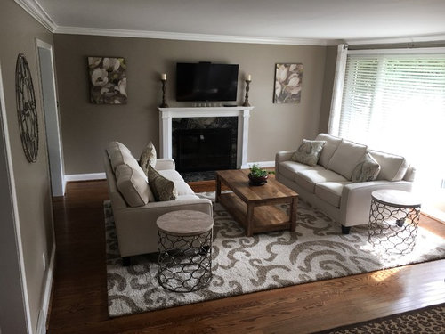
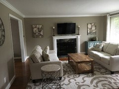
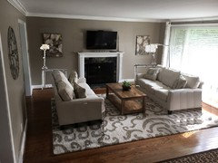
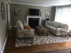
Please help me finish this LR!

8 years ago
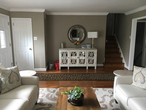
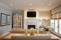
I'm almost done this room, but having trouble finishing it. Thinking about matching cabinets under the artwork? Lamps on the end tables? Accessories? I'm so bad at the finishing touches, which are the most important part! Willing to hire a designer to help, if necessary. Thanks!

Comments (43)

  • 8 years ago

    I'd check the height of those artworks. Should be about 57" to the center from the floor.

    You do need a lamp, but how would you manage cords on those end tables?

    How about a floor lamp left of the fireplace.

  • 8 years ago
    I can run an extension cord from the right corner under the rug for lamps. The center is 63".
  • PRO
    8 years ago

    Everything in your room matches so well! I do think floor lamp may be the way to go so there isn't cords visible, maybe you could place a nice plant on one of those tables. When looking at this room one thing that comes to mind is if you intend on watching that TV often it may be troublesome after a while to not have a couch directly facing it.

  • PRO
    8 years ago
    last modified: 8 years ago

    Gorgeous room but seems to be lacking life. With so much balance in the room, I feel like you need some asymmetry. Like, Verona Home Design suggested I would do a floor lamp in one of the corners. I would also do a table lamp on one of the side tables. Then, add more indoor plants as well.

    Hope this helps!

  • 8 years ago

    I agree the artwork is too high. Lovely room!

  • 8 years ago

    Wow, this room is beautiful, I really wouldn't add too much, but perhaps a medium sized fiddle leaf plant/tree on the left wall of the fire place. I would do a nice white pot, good size one or a burlap style sac, pot! maybe a stack of cute books on one side table and small stone material figures, or try a small square tray (glass) for a couple drinking glasses and a bottle of liquor! everything you have looks great really

  • 8 years ago
    Ok, so break up the symmetry (this is very hard for me as I am a software developer in a logical balanced world )
    Should the floor lamp be next to the sofa or in the corner?
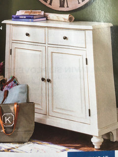
    What about adding this cabinet under one of the pictures?
  • 8 years ago
    Although I was thinking two of these in gray may complete the balance.
  • 8 years ago
    This room is very attractive, but very very safe. Everything is symmetrical and matching, even the pictures (which are definitely hung too high) are practically identical. It feels a bit like an attractive, but impersonal, reception area.
    This room needs a little bit of shaking up, ideally by adding some more interesting artwork, pillows that don't match perfectly, things that make it feel personal and unique.
  • 8 years ago
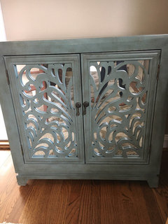
    Lol drdeb1234! I agree, this is why I'm reaching out. Just moved the blue cabinet in.
  • 8 years ago
    And lowered the art
  • 8 years ago

    Ooh, I really like it there. See if you can find a matching pillow cover for the couch on the left, then you can tackle the lamp issue...

  • 8 years ago
    Acm are you saying to have different pillows on each couch?
  • 8 years ago

    HC. Do you have any:

    -original artwork (including abstracts done by toddlers!)

    -wall hangings, decorative objects, or such from a vacation

    -interesting old things (an old typewriter for instance) that could be displayed or form part of a vignette

    -something inherited or given to you from someone you value

    These are the kinds of things that will make an "attractive reception type area" look more like an interesting personal home. Ideally when people are visiting, and ask about your stuff, you'd like to be able to say "let me tell you about this ....".

    If you only thing you'd be able to say about it is that you got it for a good price at hobby lobby, that's not going to add interest to your home!

    Don't be afraid to experiment! It's not life or death, only decor!

    I hope this doesn't sound harsh!

  • 8 years ago
    Drdeb you crack me up!! I have some stuff like that, but it's in my family room. I think I was going more for the uncluttered look in this room, but totally get what you're saying. I appreciate the comments.
  • PRO
    8 years ago
    last modified: 8 years ago

    The blue cabinet looks great there!

    I would balance out the other side of the fireplace with something BUT not necessarily another cabinet (and especially not matching). You can achieve balance (to ease your software developer mind and design-eye) by adding "visual weight" to the left side of the fireplace. A floor lamp and shorter potted plant (plant that is shorter than the floor lamp shade) will achieve this.

    Does that make sense?

  • 8 years ago

    Ha! I work with data and software development too, but guess I'm slightly off balance...

    The cabinet is definitely an improvement and I agree a "not-cabinet" item should go on the other side. A lamp and plant would be great.

    What about blue throw on the sofa opposite side of the cabinet that picks up it's color/pattern?

  • 8 years ago

    Just so you know, I'm certainly not advocating clutter! I'm just suggesting that the things that you DO have in your space should be as much as possible meaningful and personal

  • 8 years ago
    Ok no cabinet on the other side. Thanks for giving me strength to say no. Ha ha! I'll look for a floor lamp, throw and plant. It will be easy to find accessories that color. Blue's very popular now.
  • PRO
    8 years ago
    last modified: 8 years ago

    It's nice that you have such good taste and will be able to add simple touches to easily complete this room!

    Also, I just noticed all your throw pillows are the same. I suggest replacing two of the pillows with one pale blue patterned pillow and a neutral patterned (or solid colored texture) pillow...just to mix it up a bit ;)

  • 8 years ago

    yes, to mix it up and to balance the distribution of color a bit, which is why I was suggesting just one on the left couch. you can revisit that color if you decide to add a reading lamp at some point too.

    love the room!

  • 8 years ago

    Love the cabinet!

  • 8 years ago
    Have you ever thought about two swivel chairs at the top of your furniture arrangement...facing the tv with one of your side tables in between...
  • 8 years ago
    Kjoy I originally wanted to put two chairs in that spot, but when I added a couple armless chairs it looked too crowded. It's not as much space as it appears. The furniture is smaller scaled to make the room feel bigger. I am wondering if I can find a 1 1/2 size chair, two smaller chairs or maybe a bench.
  • 8 years ago
    I'm not fond of the candlesticks on mantle. Also can you add another panel to your drapes. They look a little stingy.
  • 8 years ago
    Have you tried L shape with the two sofas? Do you have some furniture sliders for carpet and wood floors? I would either leave the window wall open, or the wall with doorway, but with the tv over the f/p , you are forced to lie down to watch it. Put one sofa directly facing the f/p and then put one of the tables where the two meet. That is a place for a lamp.
    In the new open corner of f/p wall you can add a single chair, maybe footstool and floor lamp. That would give you the asymmetry you seem to need.
    Not sure it would fit but you can easily move things around and find out.
  • 8 years ago

    Nice room and good ideas here. Interested to see how it comes out.

  • 8 years ago

    I think I would add a second cabinet...because I am OCD like that;)...

  • PRO
    8 years ago

    Lower the art

    Get rid of the candlesticks. Once you put a TV over the fireplace then nothing is placed on the fireplace mantle.

    Get rid of the two round tables they are too large for the space

    Select two narrow consoles for under the art and place buffet lamps on the tables

    Add a floor lamp if necessary

  • 8 years ago
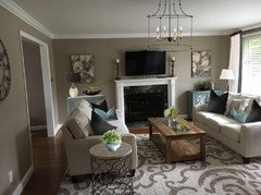
    Wow, so I've gotten comments from it looks great to totally change everything. I guess it's a vanilla/chocolate thing. new photo with lamp I had in another room
  • 8 years ago
    Kjoy1 I love the chandelier!
  • 8 years ago

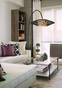
    Since you like balance and probably numbers, here's a trick for you 5-5-75 - that is center art 5' above the floor, or if above furniture 5" and keep the proportions of art at 75% of the furniture's width that it hangs above. You might exchange your pillows for some that have a touch of the blue in them. Good to sprinkle an accent color around the space like you did with the two little pots on the coffee table. They are too small to carry the weight of the table by themselves. Do you have a tray they could sit on? The lamp is a good idea, but you can do better style-wise than a 1980's torchiere. How about an arc lamp that arches from the corner to hang above the coffee table?


    Contemporary Living Room · More Info

  • 8 years ago

    Not a fan of the two matchy pictures. I would rather see no pictures. Have you tried doing an L shape with the furniture, so one sofa faces the tv for viewing. Can you try putting the two end tables together for your coffee table. The wood looks a little heavy. If it`s not new, could you paint white. remove candle sticks.

  • 8 years ago

    I like kjoy1's rendition the best. I think it was matchy, but adding the teal and accessories helped. Maybe do something different to the L side without the art.

  • 8 years ago
    I would move the round end table on the left to the other end of the couch. This will break up both tables being on the same end. Then add a floor lamp next to the newly placed end table or a table lamp on it.
  • 8 years ago
    Sorry -- but I think there's already enough matching pairs of items, so I wouldn't add the bookcases and lamps. Single, one-of-a-kind items are your friends at this point.
  • PRO
    8 years ago
    last modified: 8 years ago

    Maybe you're right! Deign is all subjective, if it works then it works! That's the beauty of it!!

    I personally feel a balanced look on the tv wall is necessary and the best route because of the structure of the room. Too many unbalanced and different sized pieces in this small space could feel cluttered, disproportionate and badly designed.

    So if you go that route, it has to be perfection!

  • 8 years ago

    Not digging the matchy art either. Sorry. they're just a bit blah.

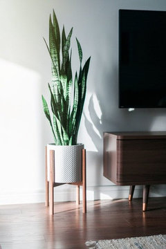
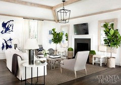
    I like Clarece's idea of the tall cabinet. you might put it on one side and on the other a tall plant. the fig leaf, a ficus, something tall and green.

    if you want symmetry, do two of them!

    you need some life in there otherwise it starts to look like a hotel room.

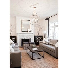
    this room set up is similar to yours. they did two different cabinets.

    I feel like I want to move both sofas back a few inches. It's like you're trying to squeeze everything on that rug. Other than that, it's a beautiful space and great furnishings.

  • PRO
    8 years ago

    Love the second photo Beth!

  • PRO
    8 years ago

    Great room. We were thinking you need to add either a tall lamp or a tall plant under one of the pieces of art.

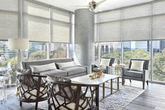
    The Luxe in Midtown · More Info


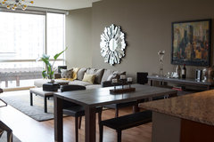
    Terminus Place · More Info

  • PRO
    8 years ago
    Well done and well balanced.

    I would suggest moving the side tables to the other side of couches by the wall under each picture. Move the couches to be in place of the side tables so they are further away from the TV and the guests would not have to till their heads up to watch TV.

    I would then put the pictures lower as other pros suggested.

    I would also add in a white curtain to replace the blinds.

    One last suggestion is to put in a larger mirror and move out the cup board with everything on it to be behind the couch by the wall.