Software
Houzz Logo Print
m_gabriel

Backsplash Help Please with Curava Savai Countertop

8 years ago
Kitchen was completed late 2016, Marmoleum floors went in around April 2017 and I've been trying backsplash samples/ideas on and off since then while dealing with other house projects. I am fully aware that our kitchen design choices skew more towards "party" than classic/neutral and that our floor and countertop do not necessarily work that great together but our love for each individually makes us hope that there is a backsplash choice that will pull them together.


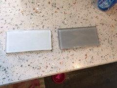
I was surprised to like two new samples from Tilebar but they are different styles:


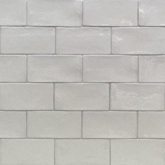
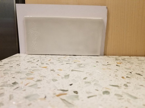
Below isLancaster Dove that I find so pretty and calming to look at and has a brighter look in our kitchen. Tone is similar to the main countertop material but it is more of a gray vs a "match." This coordinates with our floor (pic to follow) but will it be too much of a new color next to the countertop? Is it too much of a different style from all the glass in the countertop or does it offer a nice counterpoint?


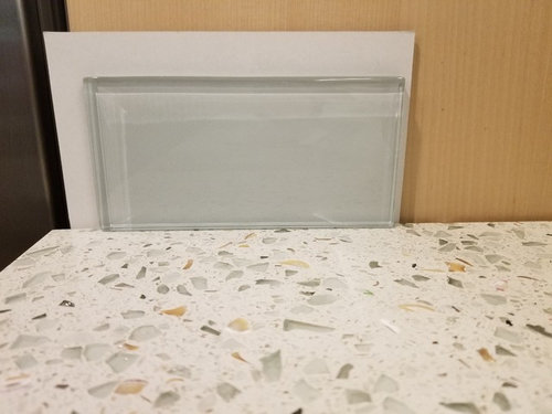
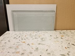
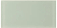
Next is Natural White glass. After trying various pale greens that read much too dark, I was delighted with this "white" that is actually a pale greenish/grayish and it is almost a perfect match to the glass pieces in the countertop. Is this a no brainer? I don't want it to be TOO green (while recognizing that I locked myself a bit into green with this countertop) but I hope that it will read as very pale green/gray with the right grout. This is exactly what I have been looking for so I'm not sure why I'm not sure. Am I just too wedded to "the search?" Or is it just going to be too much of a clash with our floor (pic to follow)?


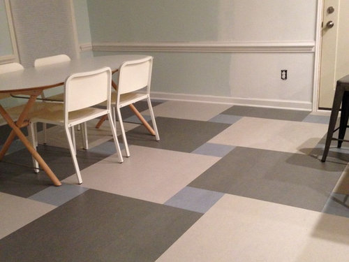
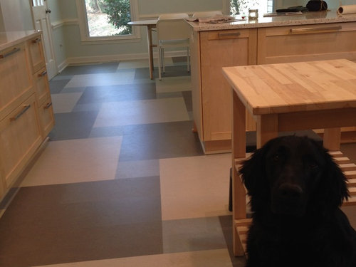
Our floor is a Marmoleum pattern that we LOVE and will not be breaking up with BUT realize that we will probably need to plan an allowance for future buyers to redo so it's not necessarily permanent to the house itself. (Install issues and damage from other contractors led to combined refunds that covered 75% of the cost of the floor/install.) The light gray in the floor is very similar to the light gray backsplash contender.


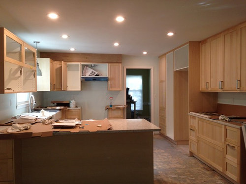
Here is a view of the kitchen layout while install was in progress. There is a lot of space for backsplash:


Anyone want to chime in? I know our choices are not everyone's style and our kitchen is not perfect but we are very happy that we were able to go from a "before" of maybe a 2 out of 10 to what we consider an "8".

Comments (36)

  • 8 years ago

    I surprised myself by liking the gray so much - it's just so pleasing to the eye - but I fear that it will look "off" with the countertop being sort of a cooler toned cream but maybe it would be a home run and bring out the grayer glass pieces while tying in the light gray of the floor? Maybe I just need more tiles for a better visual? If the glass turns out to be really green over a wide expanse, it will be too much commitment to green and the blue in the floor will look off. I don't know why I am not doing a happy dance to have finally found glass tile that matches the countertop pieces.

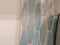
    The glass I'd go for if I had unlimited $$$ is the Vihara Ichika Silk in the elongated hex shape. I had a mounted sample here from a tile store and it was both "crazy" per my style but so stunningly beautiful that there was no arguing with it. (Left side of the sample is the silk, right side is the iridescent version.)

  • 8 years ago

    I like the grey and your newf!

    m_gabriel thanked dogs4kare
  • PRO
    8 years ago

    The glass tile works best with everything; the gray tile has "hand made" look to it and it's not in keeping with the rest.

    m_gabriel thanked Skippack Tile & Stone
  • 8 years ago

    Put me in the glass tile camp! I think it will go great. I also second sallypope on getting a real pro to install.

    I think it's great your kitchen isn't like the "norm". It's different and colorful and you. ;) And good on you for the future buyers getting a break for a new floor. Good job.

    m_gabriel thanked beth09
  • 8 years ago

    I vote for the glass also. And while I like the hex, I think it would be too busy with the floors and counters. I like the floors! It's great that your taking your time to get it perfect!

    m_gabriel thanked kulrn
  • 8 years ago

    I vote the glass tile.


    m_gabriel thanked tmcorkum
  • 8 years ago
    Love your kitchen and going out of the box and love tile #2
    m_gabriel thanked Laurie Hutch
  • 8 years ago

    I think the glass is perfect. I love your floors.

  • 8 years ago

    Thank you so much for all the chiming in! I think our tile guy who did our master bath would do a good job - he's a perfectionist. Of course, he would not do it with joy in his heart and he'd have to make sure I knew how hard it was, but I think it would end up well done. That, or if he did not want to work with the glass, he'd just say so. I'm going to take a better look at the glass. The tile itself is thick and beautiful so no worries there. I just need to visualize with grout and try to picture the whole thing. Last night, I realized that part of my confusion is in the difference between looking at the tile up close to the countertop where the glass wins hands down vs. the "across the room" view where the countertop reads a lot more like a normal light colored quartz so the backspash will stand out more as its own thing. I'm not accustomed to being in the position of having two pretty options!

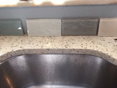
    Below you can see how far I've walked back from "too much."

  • 8 years ago
    last modified: 8 years ago

    Yeah that last pic is a HUGE no!! I'm going to go against everyone & say I like the gray better. The glass will look nice too, but I would go for the gray.

    Have you looked for a subtle light gray glass? That might work well. I'm just not feeling the coolness of the greenish glass.

    m_gabriel thanked mark_rachel
  • 8 years ago
    It's very hard to judge with just one piece of tile sample. I would get a piece of foam core or stiff cardboard and mount a number of tiles using transparent tape. It will give you a better impression of how the color works with your countertop, and you can move it around and see it in different light.
    m_gabriel thanked hummingalong2
  • 8 years ago

    Ok, I'm lost. I thought we were talking about one glass tile, the one below.

    However, now you posted a pic with many colors. I would have to say no to that. I do not think it would go. I would echo m_r in looking for a light single colored glass tile, similar to what is in the pic here.

    m_gabriel thanked beth09
  • 8 years ago

    You're right, beth09, it was just about the single glass vs the gray ceramic. The last pic was just to laugh at myself and show that I've made progress over the months walking it all back from "circus crazy style."

  • 8 years ago

    Ok, thanks! That one whizzed right by me. lol

    (yay) ;)

    m_gabriel thanked beth09
  • 8 years ago

    I like the glass, but the gray might do a better job of pulling the floor in -- maybe you can put that sample down on the floor so I can see if the grays are even in the same ballpark. Otherwise, either will be great, so go with what makes you happy.

    1) might help to attach several to a board so you have enough to really see from across the room

    2) I'd try to match either with a same-colored grout, if at all possible, so I wouldn't really factor that in.

    There are light greens out there, if that's still something that appeals. I had a lovely pale bottle green in a matte finish from, I think, Glass Tile Oasis some time back.

    but the color you have may be complexity enough. :)

    m_gabriel thanked acm
  • 8 years ago

    Thanks, acm, for the visual examples of light gray ceramic. I agree - same colored grout. In fact, the rustic-ness of the thicker grout lines in those examples gave me pause and another factor to consider. I was picturing the gray tile going in kind of like this example (but even lighter grout) so they would be closer together for a sort of modern vibe. I like the "touch me" feel of tiles with variation catching the light differently, even though the gray ceramic is not necessarily modern in and of itself:

    When I look at the gray tile, I say to it, "You're so sweet." We have kind of funky, colorful, casual style but very friendly, not edgy. Our house is already over-improved for what we'd be able to sell it for and it will never be more than a mid-range family home.

    Here is the gray tile with the floor - it's spot on with the light gray squares if just a tad warmer. Most of downstairs is painted SW First Dawn which is similar color. Adjoining dining area is painted SW Glimmer (well, half painted after a bunch of work was done on the walls for structural issues) which reads a more bluish light green/gray. We like the cheeriness of this color, especially as winter approaches.

    This has all been great feedback - thank you all! I pivot back and forth among different projects and then sit with the ideas for a bit.

  • 8 years ago

    I too love to get advise, take some, ignore most, stare at my project for hours, turn to a different project for awhile, then come back to it & stare some more. The right choice will come to you. I don't think you can go wrong.

    m_gabriel thanked mark_rachel
  • PRO
    8 years ago

    I like the glass tile, but make sure you know what the end result will be. Pay your tile installer to use the mastic and grout you've chosen and install a couple square feet on a scrap piece of cement board. My bet is that it looks different installed than it does in your hand.

    m_gabriel thanked Carolina Kitchen & Bath
  • 8 years ago

    I like the glass better. The first one looks a bit 'dirty' compared to the counter...it might be the photo. The counter seems to have some green, which would go well with the green glass tile posted above by acm. The paint on the wall also seems to be green. I do love the floor

    m_gabriel thanked printesa
  • 8 years ago

    What do you think it would look like installed, Carolina Kitchen & Bath?

  • 8 years ago

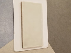
    Sorry to be repetitious but the instant I saw it I also said 'get the glass!' I understand your dilemma, it's not exactly matchy-matchy with the marmoleum pattern you have, but I think the natural pale green of the glass (you'll need to be sure to paint the drywall a very white-white as in the paper sample you have behind it first) very much compliments your counter and walls. The pale gray you're showing just seems too safe for your tastes, IMO.

    m_gabriel thanked 2ManyDiversions
  • 8 years ago

    Thanks for the tip on painting the drywall, 2ManyDiversions!

  • 8 years ago
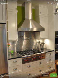
    Are your appliances stainless steel? If so, have you considered stainless steel subway tile? I think it would look great with your floor, which I love, and your counters and cabinet color as well. We used it in a previous kitchen, my husband installed it in a herringbone patter behind the stove and it was really pretty and easy to clean as well. I love your style and hope you will post pics when its all done!
    m_gabriel thanked chrispeggyleavitt
  • 8 years ago

    Thanks for the encouragement, chrispeggy! I don't think I've seen stainless steel installed. I'l look for pics.

  • 8 years ago
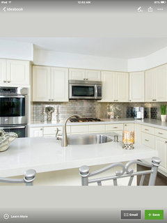
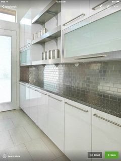
    Here are a few with stainless tile that I found on Houzz
    m_gabriel thanked chrispeggyleavitt
  • 8 years ago

    curious to know what you went with...I have same countertop

  • 8 years ago

    Definitely glass tile. Both, green and grey work in your kitchen, but I feel like the style of the glass tile more closely matches your floor and cabinets. The grey tile is more "rustic" to me. Your kitchen is more "retro-modern" if that makes sense, and a glass tile would just go so much better with it.


    m_gabriel thanked Jules
  • 8 years ago

    Sgard, we did not start the project yet but decided to go with the glass tile: https://tilebar.com/loft-natural-white-polished-3-x-6-glass-tiles.html. It's a good match with the lightest glass in the Savaii countertop. (In our case, we are trying to avoid the greener glass colors b/c we also have a Marmoleum pattern floor with blue and light and dark gray so we did not want to introduce a greeny-green.) We may get it done this summer and will have a sample board done to ponder grout color (and confirm tiler's skill with cutting glass tile).

  • 8 years ago

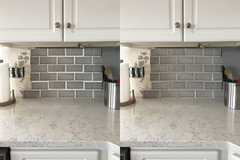
    I've found that glass looks better. However, I want to pick up the aqua. You may be interested in the gray or white handcrafted glass tiles from Lowe's - I like it a lot, but it's too gray for me. The last pic is something I found on the internet (https://www.facebook.com/pg/QTCIRI/photos/?ref=page_internal) where they alternate regular glass with matte glass in same shade. I think that's the look for me. pics below:


    m_gabriel thanked sgard314
  • 8 years ago

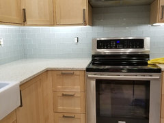
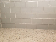
    UPDATE: Backsplash finally went in! We chose the green/blue/gray glass tile from Tilebar. Now that it's in, it seems like it was the obvious choice. The pictures below don't do it justice, but the color and tone are spot on in person. I'm very pleased! Thank you to everyone who pondered with me.


  • 8 years ago

    Pretty!

  • 8 years ago

    Looks great! I like how refreshing your kitchen seems to be :)

  • 7 years ago

    I found this thread because I'm intrigued by Curava Savaii. And I love the backsplash you chose! Are your cabinets maple?

  • 7 years ago
    The cabinets are IKEA Bjorket, which I think is birch but closely resembles maple. I really like our Curava!
  • 6 years ago

    I like your option 2 better, that or a gray version of it. If you had different floors I would suggest something that ties in with the rust colored specks for the contrast, but I think the glossier glass will provide a better contrast over the tile option.