Software
Houzz Logo Print
jwatkins99

Advice needed for fireplace refresh

8 years ago

This fireplace facade is very large and dark. It's also problematic because it is asymmetrical. The right side is recessed in further than the left, so a standard screen will not sit right in front of the firebox. I've toyed with many different ideas from bringing the edges inward with drywall, to stone veneering the whole thing, to just ripping it all down and starting over. Any and all opinions are welcome. Thanks!


Comments (26)

  • 8 years ago
    last modified: 8 years ago

    Paint it. Sorry but I cannot see any other option, other than ripping it out. If it was a pretty brick I would try to suggest something to "enhance" it, but it's just not. Is that tile on the hearth? What color, black? Looks like your furnishings are beige. I think white or even a dark brown may work. Good luck!

  • 8 years ago

    Yes, it is black floor tile. What were they thinking? lol That part will come out regardless of what else is done. I'm thinking limestone with a chipped edge front.


  • 8 years ago

    Yeah, the color is faded and dated. I’d rip it out and start over ($$$$) or paint it.

    Is it the angle of the picture, or is the room really small with too much furniture?

  • 8 years ago

    That's correct. It's a transition area, and it's the only room in the house that doesn't have patio doors in it, making the dark wall even more problematic. The ordering of the more appropriate furniture is what spurred this discussion about what to do with it.

  • 8 years ago

    Ah, that makes sense. Personally, I’d cut the furniture by half. And I’d remove the track lighting. I had that in my last house (built in the mid 70’s).

    I like your floors.

  • 8 years ago

    That's the plan. :)

  • PRO
    8 years ago

    Have you considered removing the brick at the right wall inset, drywall, and perhaps add a built in cabinet there? Or leave that area open. And then, install a light colored ledger stone over the rest of the brick.

  • 8 years ago

    I actually like the asymmetrical look of that fireplace and think it would look great if you paint it an off-white. And I don't see a need to try to center a screen above the firebox. Center it on the larger, left side and go with the asymmetry. Maybe add a shelf for a decorative item to the recessed right side if you want to give it a purpose.

  • 8 years ago

    Oops! I misunderstood your point about the "screen" and the fireplace. (I was thinking about a TV screen above.) If you need something for safety and not just decorative, I would think a fireplace store could help you retrofit a screening fixture that you could hang from underneath the brick above the firebox--like those hanging "chains" that slide open and closed.

  • 8 years ago

    All good ideas. Thanks much.


  • 8 years ago
    last modified: 8 years ago

    I'd just paint it white. Easy, quick, cheap...and it would leave the nice brick texture. That room would brighten up immediately!

  • 8 years ago

    The brick patterns have me puzzled. Wonder why there is stacked pattern on the left of the firebox when all of the rest of the brick is staggered. It is very odd that a brick mason would build a firebox uneven. I wonder if that stacked brick was added at a later time for some unknown reason. There could be a firewood box behind there. Can you see another layer of brick under the stacked brick? I would first take out the stacked brick. It looks like your fireplace box would be even to put in a screen in.

  • 8 years ago

    Lose the track lighting.


  • 8 years ago

    We have wondered that about the brick patterns also. Unfortunately it would not be even if that one layer was gone because they bumped out the left side with what appears to be 1/3 of a brick spacers behind that stack. It's all very strange. This house was an 1,100 sq ft ranch from the 50's that was bumped out to 4,200 sq ft by the architect who owned before us. He was a big FLW fan, so that speaks to a lot of his choices.


  • 8 years ago

    John, was this bumped OUT, as in all one level? This is a cool space that screams for some natural light! Can you add a skylight or two, maybe even some wood? (though it would be hard to know where to stop with the continuity of the rooms...) I do think the fireplace is kind of funky in a cool way, but it definitely needs some refacing or painting. Just don't lose the linear stepping! Good luck!


  • 8 years ago

    Yes it is all one level. It just goes and goes. We love it. It desperately needs natural light in this area to make it congruent with the rest of the house (17 patio doors), but there are hips everywhere in the roof, so vaulting the ceiling or putting a recess in between joists/rafters would require a rework of the roof system. Here's an overhead view. Red arrow is where the fireplace is.


  • PRO
    8 years ago

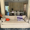
    That is a beautiful fireplace wall and I'm not sure why all your furnishings are clumped in front of the FP when you have a lavish amount of room.

    This is a contemporary, sculpture home and items should be carefully placed. I would paint the brick black and place a sculptural metal item on the face of the wall for contrast. Maybe an item in a soft bronze/brass metal item to contrast all the rectangles in the room.

  • 8 years ago

    Thanks for taking the time to mock that up for me. It looks nice, but I don't think it's really our style. The reason the furniture is bunched up is because it's too large for the space and there is a walkway right behind the couch. New furniture is on the way.


  • PRO
    8 years ago

    Paint it white and switch out furniture for something lighter-colored!

  • PRO
    8 years ago

    P.S. The accent panel of brick to the left of the fireplace opening is called a "stacked" bond. It is a typical MCM detail, but it isn't very strong structurally because the mortar joints are aligned. The rest of the brick is a common, or running bond. Those are not typically sized modular bricks; they are a little longer than what we usually see today, which adds to the horizontal emphasis.

  • 8 years ago

    Thanks for that insight. Makes sense. Do you think there is anything structural about it, or is it strictly a facade?

  • PRO
    8 years ago

    I think your approach to your home is self-limiting. You need some fresh eyes before you make any new purchases. You certainly have enough room to accommodate a layout like this which would visually open the space.


  • 8 years ago

    We are doing almost exactly that, except with four chairs. Like anybody else, we just filled the spaces with furniture we had when we moved in. We wanted to wait and see how we would really use the rooms before we committed to new furniture. It's odd having this lounge area directly adjacent to the family room, but we do use it a fair bit.


  • 8 years ago

    I'm so glad to see you are going with chairs, not sofa! That was my first thought, that space just calls for 3 or 4 low chairs and a cocktail table.

  • PRO
    8 years ago

    Hi John - usually the veneer (the brick that is visible) is simply that, a veneer, but in this case, with the cantilevered bump-out over the top, I would be hesitant to try to remove it. The portion above is probably keyed back into the brick behind, at least on the right side, making it difficult to make a clean break of it.

    It would be easier to add to the recessed portions to make them flush, although I'd hate to see you do it. :-)