Software
Houzz Logo Print
jbhetman_94

which backsplash

8 years ago
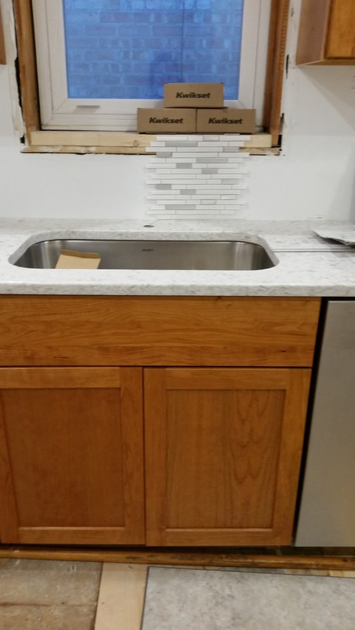
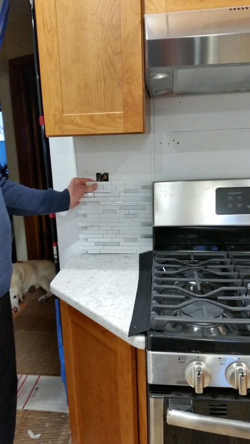
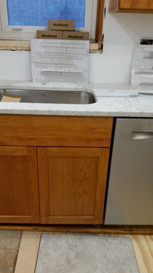
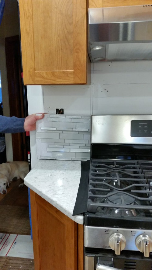
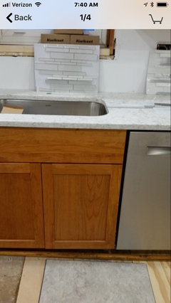
the first two are same just different placement. the next two are same just different places.

I seem to like the small white glass with stainless steel but cant see the whole picture in my mind. I don't want it to look busy.

Comments (20)

  • 8 years ago
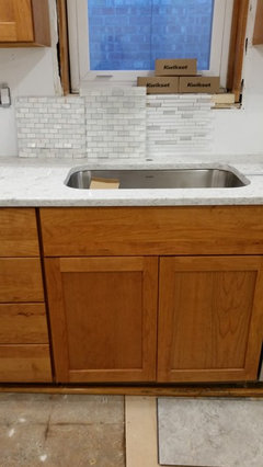
    I also have 2 other whitish backsplashes. the third one here is same from above 1st picture.

    I cannot see the big picture!!!
  • 8 years ago
    oh, and that is my floor. thanks in advanced!
  • 8 years ago

    HI -- Go with the one you like the most .... they are all nice .... just remember the look will even out once the grout fills them in .

  • 8 years ago

    I tend to like these light subtle styles. Problem is the other three people in house want more color, deeper color. Normally I do what I want, but this is my weak area, and I don't trust myself.

  • 8 years ago
    b h, I absolutely agree with the commenter who said to get what you like. If you do the majority of the kitchen work then the space should be one that you love and want to be in. Tell the other three people to go paint their own rooms deeper and darker!!!! All the best to you and go with your true gut feeling, you’ll do great.
  • 8 years ago

    I would not be picking out a back splash until I addressed those cabinets. Are you trying to do some sort of a farmhouse look? I'm not getting the look you're trying to do with gray and wood (?) I would decide what you're doing overall style wise, I would address those cabinets in some way, and then I would pick out a back splash.

  • 8 years ago
    I like this one with your flooring:)
  • 8 years ago

    Wood cabinet have movement because of the grain. They almost always look best with a simple backsplash. A backsplash with too much movement, no matter how pretty can overwhelm when all over the space and combined with the movement in the wood. Your backsplash are not too bad movement wise compared to many which is why they are managing to work. But while they may be good, I am wondering if something in a larger format might be better. It would not hurt to get some sample of larger glass tiles and ceramic tiles - lots of samples to get the big picture. I agree to wait for the floor to be in. You will have floor, cabinets and countertop with some movement. You might find you need a place for the eye to rest.

    Do be cautious of combining too much cool gray with warm wood - neither brings out the best in each other. Your countertop looks good. On my monitor, the flooring looks a little cool. One of the biggest sources of expensive mistakes we see here is the attempt to mix warm surfaces with more "modern" cool surfaces. It can be done, but usually by using a warmer version of a modern surface.

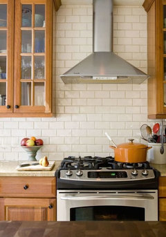
    Here is a larger format with mild contrasting grout:


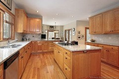
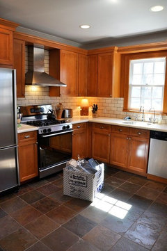
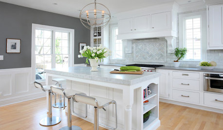
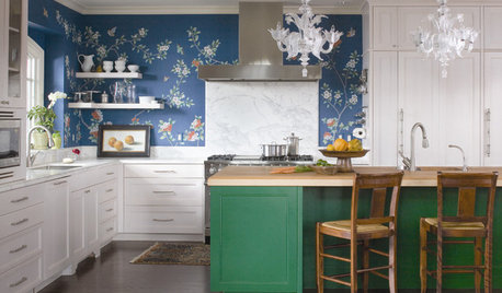
    Here are two kitchens which did a good job mixing in grays - neither has a cool gray floor:


    I am not saying you should not use one of you picks, just go slow, wait till the floor is in and get lots of samples so you can get the all over effect.

    I tried to find a pic that would give you an idea of the overall effect. This is not the same backsplash - just nice, subtle color changes like the one you are considering. Click on it to see the enlarged version - not too much movement for many, but possibly for some:


    You should not use a mosaic that is not subtle. The ones with many varieties of colors ranging from dark to light are very busy and the most common backsplash put in that is then ripped out.

  • 8 years ago
    thanks JHmarie, you have been very helpful with constructive criticism that is welcomed. a few people were outright insulting.

    I didn't think to get several samples to see big picture, great idea. too late on the floor bc I now bought it. I struggle with putting all this together. I think i will lay out several floor pieces, and buy several backsplashes. hope I can find something to go with this cool floor, warm cabinets. oh and the counter has white, gray, and hints of brown in it. your comments are well appreciated.
  • 8 years ago

    It is very difficult to get true colors on a monitor, so no one here is seeing exactly what you are seeing. I have a similar countertop - older kitchen:)

    https://www.houzz.com/photos/my-pics-work-in-progress-phvw-vp~58830972

    I am drawn to simpler styles, but everybody is different - a good thing as wouldn't it be boring if we all had the same kitchen!

  • 8 years ago

    I like the first one you posted also. Very light grout for subtle contrast.

  • 8 years ago

    Another advantage of a larger format is fewer grout lines to clean. With small tiles and light grout, even if sealed, keeping it clean can involve work. Being essentially lazy, I like larger tiles and darker grout.

  • 8 years ago

    I agree with jhmarie about taking your time. I will be the outlier because I don't like either your first or second choice with your patterned counter (pretty!) and floor. I think generally it is the mosaics with the different size tiles that are too busy. When combined with color or material variations, they often look dizzying in a backsplash. The duplication of so many disparate elements, charming in a sample tile, becomes less so when repeated, like heavily patterned wallpaper.

    So, I think the first one is likely to look polka dotted. The second is also going to look busy and pattern intensive especially because of the different tile thicknesses.

    I like the two mosaics (left and center) in your last photo. Those types of uniform small mosaics tend to read almost as one surface. I think either would be a lovely choice.

  • 8 years ago
    I don't think anyone was insulting. If you're trying to stay away from busy, stick to a larger tile and avoid mosaic types.
  • 8 years ago
    Finish the floor first. And continue to research larger scale tiles. Those mosaics are way too busy w your counters.
  • 8 years ago
    thanks that is the plan. I laid out the floor, and the mosaics do look busy. It helped.
  • 8 years ago

    The floor is where the money is going. Focus there and get that done first.


    It will will help simplify and clarify your back splash choices. I'm not a fan of white on white.... I need more contrast, unless I'm in a hospital surrounded by medical professionals...


    On a more helpful note--- larger tiles, something other then mosaics. What would I do? Square light gray tiles and done! Squares on the floor, square cabinet doors, square back splash tiles...


    In my brain, that works best, as well as being less likely to aggravate the astigmatism and glaucoma of older, super critical relatives... (in-laws).


    Best Answer: JHmarie. She/He nailed it.

  • PRO
    8 years ago

    A simple subway tile might work best, but like everyone said above do get the flooring done first and then choose. It might be easier to decide then.

  • 8 years ago
    unfortunately I can't do floor first, just the way it gies...but I did lay out the floor for whole look.

    I really thank all who are giving their opinions, as this is my worst area for decisions.

    so I've settled on plain subway, not tiny bc I don't want all that grout. between white to shades of white.

    does it matter on matte or glossy??????? my counter is quartz and it seems shinier than the smaller white matte subway. yet the bigger subway seems shinier than the counter.

    then I was thinking (not white grout) but a light gray for some contrast, pulled from my counter, and easier to not notice if dirty. Thoughts?