Software
Houzz Logo Print
chisue

Paint Color Help Needed

8 years ago
last modified: 8 years ago

Traditional home north of Chicago. Medium-dark wood floors. Wool orientals. Wide, open arches between Foyer, LR, DR. Trim BM White Linen. 9-foot ceilings with medium-heavy crown, 4" casings, 6" baseboards, 36" three-panel doors. Baldwin 'Edinburgh' polished brass handles.

Foyer is 15 X 16 and faces north; light from sidelights around arch top mahogany stained wood door. BR hall (42" X 18') same as Foyer?

Sorry, not photo-smart. Rugs are light tones. Thinking goldy-yellow paint?

Comments (7)

  • 8 years ago

    What colors do you have going on in the adjacent spaces? Living and dining room furniture?

  • 8 years ago

    What other colors do you have in the house and what colors are in the rugs - light tones can mean many different things. Is there a runner in the hall or is it bare floor? Generous sized foyer so I'm assuming you have something in it - bench or console table, mirror or ??? Maybe art? I generally like to keep walls in transition spaces light in color or neutral - you're walking through them on your way to someplace that offers more visually and/or in activity.


  • PRO
    8 years ago

    I think of BM Linen White as a wall color instead of a trim color, and so perhaps you could paint the walls the same color, but matte instead of semi-gloss. If you want a darker color for the walls, you could consider BM Oat Straw, but that color has been overdone IMO and would be too dark for me.

  • 8 years ago

    Off BR Hall: MBR (SW) is getting new paint -- a mauve-peach from the rug border. (This needs to be OK with MBA's pink-tone beige tile.) Guest Rm. (S) is more blue than aqua.

    Adjacent to Foyer is Hershey brown semi-gloss Library w/predominantly black oriental. Doors from Foyer and BR Hall.

    Kitchen and eating area will be a cream color between BM Linen White and the cream of the cabinetry -- counter tops are Costa Esmerelda (?) a 'money green' granite. Off the Kitchen is a Back Hall with laundry, powder room, closets, door to Garage.

    The house is 2900 sq ft. The formal staircase goes to full height attic. A future owner can add dormers and go to 6000 sq ft that code allows. We wanted to 'fit in' with existing neighborhood of larger homes.

    Foyer has a low rectangular hall table and a small chair. Polished brass hanging fixture.

    LR has a gold couch, pair of green chairs and a round ottoman, pair of coral tub chairs. Five Baker tables in medium brown. Fireplace with flanking bookshelves (Linen White).

    DR has Baker piano finish oval table and side piece w/matte black touches on legs; black-finish chairs w/coral seats. Rug has brown field, gold and bluish green. Polished brass chandelier (no shades).

    BR Hall has two runners -- same tones as Foyer and LR rugs.

    These are modern-made (Iranian?) orientals -- not antiques. LR is pale green background with double border in gold-yellow -- many colors (no blue). Foyer is cream background with gold-yellow border w/green -- and some violet touches.

    I have no window treatments other than roman shades in bedrooms and MBA. Pella windows have internal pleated shades.


  • 8 years ago

    My house is pretty traditional -- I like an English country look -- and we have a lot of mahogany and cherry vintage, repro, and antique furniture, wool orientals, antique brass and matte black light fixtures. I tend to treat art as art and not as furnishings, so I don't think that art (vs. the frame) needs to match its surroundings. Ceilings and trim are BM Cotton Balls and the paint color on the walls throughout the main floor (hallway, living room, dining room, kitchen) is BM Copacabana, a warm yellow. It works well with the natural light here in central Alberta, and is also a shot of sunshine in an area where winters are long.

    If I had used the color onscreen to help me decide, I never would have picked it lol. I looks completely different on the wall and on the paint samples/chips -- more yellow -- than it does on my screen, where it seems more peachy,

    https://www.benjaminmoore.com/en-us/color-overview/find-your-color/color/284/copacabana?color=284

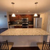
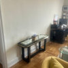
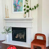
    A couple of pictures from a few months ago (still a work in progress), but maybe they'll help a bit; taken a few weeks apart. Kitchen cabs are Ikea Edserum for color reference.


  • 8 years ago

    beckysharp -- Your kitchen and eating area are going to be lovely!

    What a contrast in the color between the brightly lighted kitchen and the dining area. I have a BM color fan. # 284 looks much, much paler than the photo of your kitchen.

  • 8 years ago

    Thanks, chisue.

    Yes, the color is very changeable, depending on whether it's natural or artificial light, the exposure, time of day, etc. But it's definitely a warm, rich yellow and not a paler pastel one. The dining room faces south and has windows on three sides, so it gets lots of natural light which can make the color look a bit washed out, in real life and in photographs (esp when I am lazy and taking pics quickly).